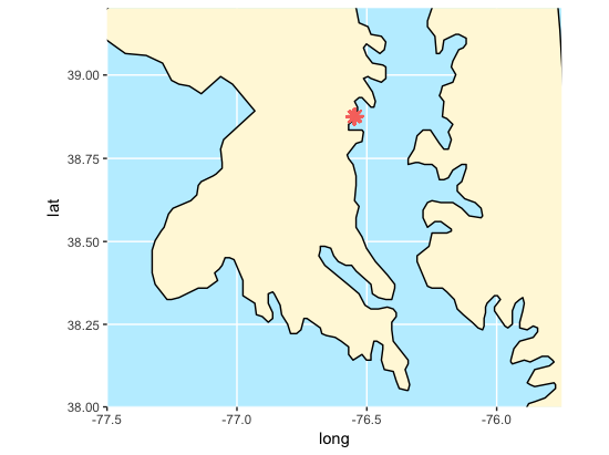
This is an on going research area in the McLachlan Lab at the University of Notre Dame. The goal of this project is to implement a similar methodology implemented by Meghan Vahsen (a graduate student in the lab who classified Tamarisk in the Colorado River Basin) to monitor population abundance of species of sedge and grass in the Chesapeake. In particular, we have data from the Smithsonian Environmental Research Center's marshland plots; their location in the Chesapeake can be observed below.
In order to do so, a Biology student from Notre Dame, Luke Onken, and I have analyzed Landsat 8 OLI Satellite image data. The satellites orbit the Earth in roughly two week increments. Landsat images are particularly useful because they have been flying since 1972 when the Earth Resources Technology Satellite (later renamed landsat) was first launched.
40+ years of images would allow us to analyze sedge and grass population abundance over a long period of time in the hopes of analyzing significant species change. Specifically, the phragmites population is of interest. Phragmites is an invasive species to the Chesapeake Bay area, as well as the Connecticut coast, Ontario, Ohio and many more areas around Eastern United States and Cananda. It has been known to grow in abundance and suffocate other species grass and sedge out of areas. This shift in grass populations has the power to disrupt the ecosystems in several ways, including posing more forest fire risk during dry seasons, inducing the erosion of soil composition from a lack of roots, and causing the extinction of certain plants or animals that rely on these grasses.
This visual shows the approximate location in Latitude and Longitude of the SERC marshland region that we will be investigating. The map is produced using the ggamps and maps packages from Google. The dots represent the most dominant grass species within a 1 by 1 meter plot surveyed every 20 meters.
# Google Maps Visual
plot.map <- get_map(location = c(-76.54616, 38.87471), maptype = "hybrid", source = "google", zoom = 16)

ggmap(plot.map) +
  geom_point(data = species.map,
                             aes(x=lon,
                                 y = lat,
                                 color = species.map$species)) +
  theme(legend.position="none")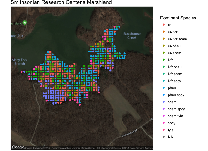
Below are two stacked bar graphs to show the overall distribution of the dataset. The first visual shows which species should be easiest to classify based on the overall size of their bars and how large of boxes their extremes (0 - 1 and 4 - 5) are. The second plot shows the overall distribution of the ordinal scores. As expected, having no species present is the most prevelant group.
# stacked bar visual 1 - species distribution comparison
ggplot(data=bar.plot.data[bar.plot.data$order !="NA",], aes(x = order, fill=species)) +
  geom_bar(stat="count") +
  coord_flip() +
  scale_fill_brewer(palette = 5) +
  labs(title = "Species Distribution in the Chesapeake Bay", fill="Species", x="Denisty of Population (ordinal)", y="Frequency")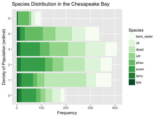
# stacked bar visual 2 - population density comparison
ggplot(data=bar.plot.data[bar.plot.data$order !="NA",], aes(x = species, fill=order)) +
  geom_bar(stat="count") +
  coord_flip() +
  scale_fill_brewer() +
  labs(title = "Species Density (per plot) in the Chesapeake Bay", fill="Pop. Density", x="Species", y="Frequency")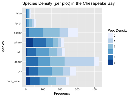
The training.R file builds are training set while the run_classifier.R file runs the random forest algorithm on the constructed data frame, which can be accessed by loading the training_set.rda file.
The first step was to import the bandwidths we would like to use from our Landsat GeoTIFF file. Then, we need to crop the region to focus on our SERC region and so that we are not dealing with such a large dataset. Finally, we convert the raster image to a matrix using the rasterToPoints() from the raster package.
# create our crop region layer
e <- as(extent(365375, 366400, 4303600, 4304800), 'SpatialPolygons')
crs(e) <- "+proj=utm +zone=18"

# import bands, crop them to the SERC region and raster to a data frame
band2 <- "LC08_L1TP_015033_20160718_20170222_01_T1_B2.TIF" %>% raster() %>% crop(y = e) %>% rasterToPoints()
band3 <- "LC08_L1TP_015033_20160718_20170222_01_T1_B3.TIF" %>% raster() %>% crop(y = e) %>% rasterToPoints()
band4 <- "LC08_L1TP_015033_20160718_20170222_01_T1_B4.TIF" %>% raster() %>% crop(y = e) %>% rasterToPoints()
band5 <- "LC08_L1TP_015033_20160718_20170222_01_T1_B5.TIF" %>% raster() %>% crop(y = e) %>% rasterToPoints()
Next, we would like to compile our covariates (variables to determine the ordinal score of a species) for the model. These formulas were gathered from various research papers where other people used remote sensing for classifying vegetation, buildings, water, and more. In our case, we focused on variables that be believed would influence vegetation detection and also the bands that were commonly used. We then inserted our varaibles and original bandwidths into a data frame called full.data.
# covariates for model and dataset construction
evi.value <- 2.5 * ((band5[1,3] - band4[1,3]) / (((band4[1,3] * 6) + band5[1,3]) - ((7.5 * band2[1,3]) + 1)))
ndvi.value <- ((band5[,3] - band4[,3]) / (band5[,3] + band4[,3]))
ndwi.value <- (band3[,3] - band5[,3]) / (band3[,3] + band5[,3])
savi.value <- (1.5 * ((band5[,3] - band4[,3]) / (band5[,3] + band4[,3] + 1.5)))
full.data <- data.frame(x = band2[,1],
y = band2[,2],
band2 = band2[,3],
band3 = band3[,3],
band4 = band4[,3],
band5 = band5[,3],
ndvi = ndvi.value,
evi = evi.value,
ndwi = ndwi.value,
savi = savi.value)
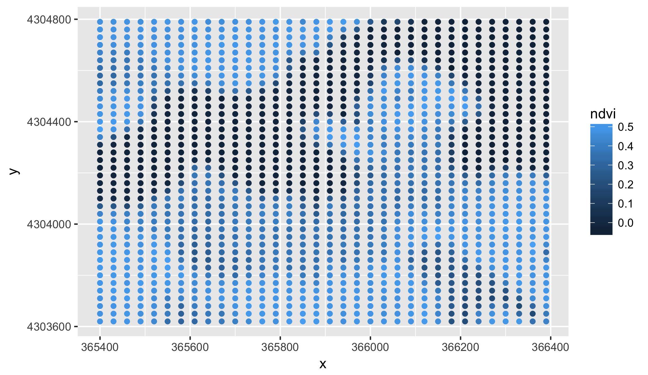
ggplot(data = full.data, aes(x=x, y=y)) + geom_point(aes(color = ndvi))Here is a visual of our NDVI score to make sure the plot region is correctly constrained and that the score fluxuates enough. In both cases, this was true for our NDVI score and crop layer.
The next step is to pull in the grass species data from the Smithsonian's marshland plots. This code was gradded from the descriptive.R file and is needed for the next step, which involves determining what SERC plots fall within the 30 by 30 meter Landsat resolution spaces.
# compile the full dataframe to run

# Species Map Import
species <- read.csv("~/Documents/Junior_Year/DISC_REU/DISC_chesapeake/DominantSpPerPlot.csv")

# remove plots with no location, if any
species <- species[!is.na(species$easting),]
species <- species[!is.na(species$northing),]

# convert UTM to lat, long
utm.coor.serc <- SpatialPoints(cbind(species$easting,species$northing),
                               proj4string=CRS("+proj=utm +zone=18"))

# Convert to lat/long
long.lat.coor.serc <- as.data.frame(spTransform(utm.coor.serc,CRS("+proj=longlat")))

species.map <- data.frame(species[2:9],
                          lat = long.lat.coor.serc$coords.x1,
                          lon = long.lat.coor.serc$coords.x2,
                          easting = utm.coor.serc$coords.x1,
                          northing = utm.coor.serc$coords.x2)
Now that we have this data, we can calculate which Smithsonian plots fall within the respective Landsat resolution spaces.
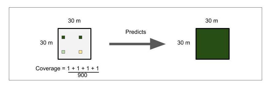
This figure describes how the plots could fall within a resolution space. The tan and green boxes represent different ordinal scores that were surveyed by the Smithsonian research center. The white box encompassing the four others represent the resolution space for one light band captured from a Satellite image. For every Satellite pixel (resolution space), we may be training the model with 1 to 4 different ordinal scores. The hope is that the random forest model will be able to average these scores to make a more accurate prediction about the whole space. Although, this way of training will also mean that are trees within the model will be more complex and that our class error scores will not accurately describe the model's accuracy in predictions because it is checking its single prediction against potentially 4 different ordinal rankings depending on which plots are selected for the training set of 60% of the original dataset.
count <- 0
for(i in 1:nrow(full.data)){
 for (j in 1:nrow(species.map)){
   if (species.map[j,11] - full.data[i,1] < 30 & species.map[j,11] - full.data[i,1] > 0 &
                 species.map[j,12] - full.data[i,2] < 30 & species.map[j,12] - full.data[i,2] > 0){
     count = count + 1
     training$plot.id[count] <- i
     training[count,-c(1)] <- c(full.data[i,1:2],species.map[j,1:8], full.data[i,3:10])
   }
 }
}
paste("Yes count:", count)
nrow(training)
In this section of code, we assign the spatial resolution (the light bandwidth covariates and calculated fields) to each ordinal SERC plot if the difference between the two UTM coordinates falls within 30 meters. When there are multiple SERC plots in a resolution space, we duplicate those light band scores as a new row in our training set. The final assignment looks something like this.
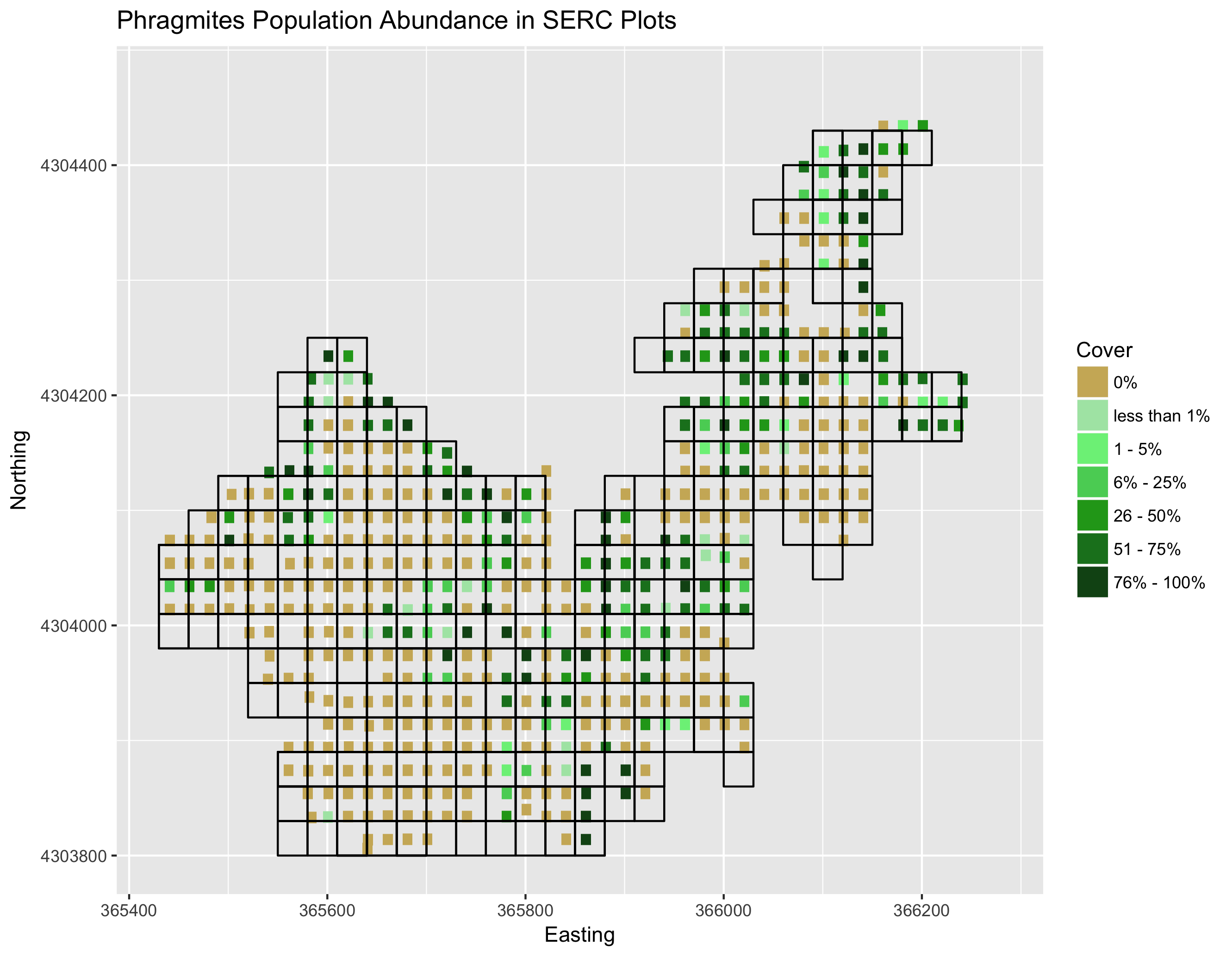 If you would like to visualize this figure yourself, run the code for the final visual (serc.plots) in the training.R file
That essentially wraps up our training set. The last two steps I am about to show are optional. The first step assigns a character string to each ordinal group. However, it has actually been pointed out to me that "few" and "little" are hard to differentiate so my recommendation would be to relabel them by their scales, like "less than 1%" or "1-20%", for more clarification. I will do this later in our final figures. Again, this step is not necessary so long as you change the integers to factors before you run your final model. The last step is to save your training set, which I saved into the training_set.rda file I mentioned at the beginning of this section. I would advise saving the file to make running the model more straightforward. If you would like to work with my specific dataset, you can download this repository and load my public training set.
# reassign ordinal values words
for (z in 5:12){
  training[which(is.na(training[,z])),z] <- "none" # or 0%
  training[which(training[,z] == 0),z] <- "few" # or less than 1% and so on
  training[which(training[,z] == 1),z] <- "few more"
  training[which(training[,z] == 2),z] <- "little"
  training[which(training[,z] == 3),z] <- "some"
  training[which(training[,z] == 4),z] <- "most"
  training[which(training[,z] == 5),z] <- "all"
  training[,z] <- as.factor(training[,z])
}

save(training, file = '~/Documents/Junior_Year/DISC_REU/DISC_chesapeake/training_set.rda')
This concludes the creation of our training set. You're essentially half of the way there!
Navigate to the run_classifier.R file. The first step in our model will be to set our primary working directory, load our training set in and select a species to investigate. Because we've been talking about phragmites in the introduction, I will use "phau" for this walkthrough.
setwd("~/Documents/Junior_Year/DISC_REU/DISC_chesapeake/")
load(file='training_set.rda')

set.seed(2000) # if you want the same results as me, set your random seed to 2000

curr.species = 'phau' # select the species you want to investigate
Now, it is time to create our first classifier. In supervised machine learning algorithms, you generally want to train your models on over a majority of the data. Some even argue that as much as 80% of the data should be used and only 20% should be used for validation. In this case, we train the model on 60% of the ordinal data and then predict 40% of the plot data. We create "samp", which is a vector of integers that represent what rows we shall grab from our training set for the 60% of training. Then, we create a subset dataframe of our training set called train. Test is the remaining 40% of our data that we shall use later for our model validation. The following step runs the model. If you have ever run a regression model. You might recognize the formula "phau ~ .". This just says that our variable phau is dependent on all of the other columns in the train dataframe. You may notice "data = train[...]", which indexes and removes some of the columns we have decide to disclude from our robust model. These variables include plot overlap, the SERC ordinal data of other species, longitude/latitude, and northing/easting. "keep.forest = TRUE" allows us to access this model later for predictions.
samp <- sample(nrow(training), .6 * nrow(training))
train <- training[samp,]
test <- training[-samp,]

model = randomForest(phau ~ .,data = train[,-c(1:4,5:7,9:12,18)], keep.forest=TRUE)

model

save(model, file=paste("Classifiers/",curr.species,"_model.rda",sep="")) # save your model for future predictions if you'd like
You will see the out of bag error and class error of our model when you run "model". Do not be discouraged by the low number. I imagine that the out of bag error will be around 50%, which should mean that the model guesses the ordinal ranks incorrectly 50% of the time. Class error normally tells us how well it predicts an ordinal class. With that being said, it may be checking its prediction on an ordinal rank that represents a tiny proportion of the Landsat plot, which would mean that our model's prediction is not necessarily incorrect. When you see the final figure, you should be less discouraged by your results. If you notice, the model predicts one class, none (0%), with only 15 to 20 percent error. This means that our classifier for a specific species can still predict presence and absence from a spatial resolution with 80 to 85 percent accuracy.
After running plot(model) and varImpPlot(model), you will generate both of these figures below for a specific species classifier. The red line shows the accuracy of our model that we mentioned before for predicting absence well. The next figure shows the importance of each variable in the ability of our final random forest model to predict ordinal rankings for a species. This importance is determined based on the homogeneity that would be lost in the reproduction of trees if a variable would be removed.
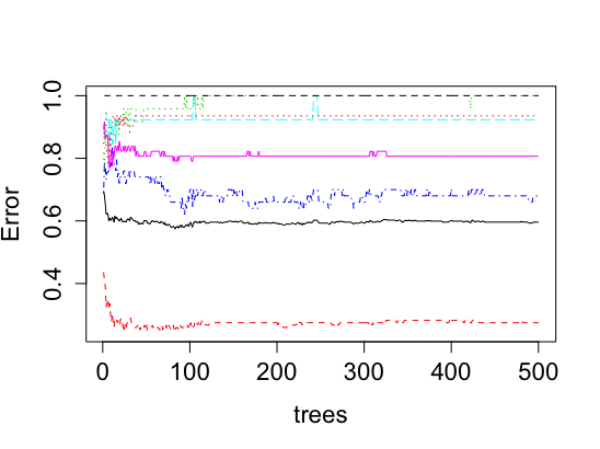
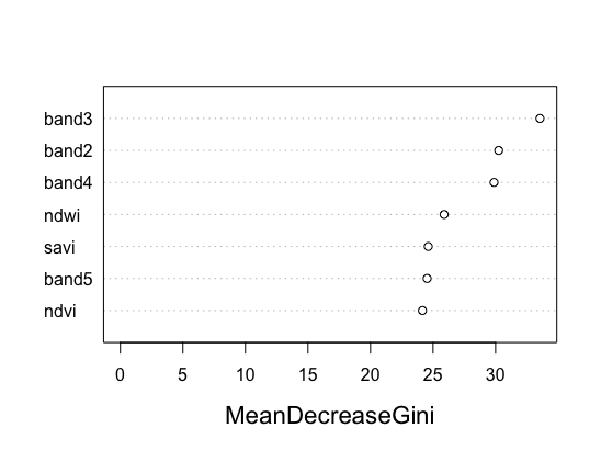
As you can see, all the covariates are relatively similar in their impact on the classifier. Previously, we had two variables that had low impact compared to the rest and were removed because of this. Use this figure as a tool to see what unnecessary covariates should be removed from your model.
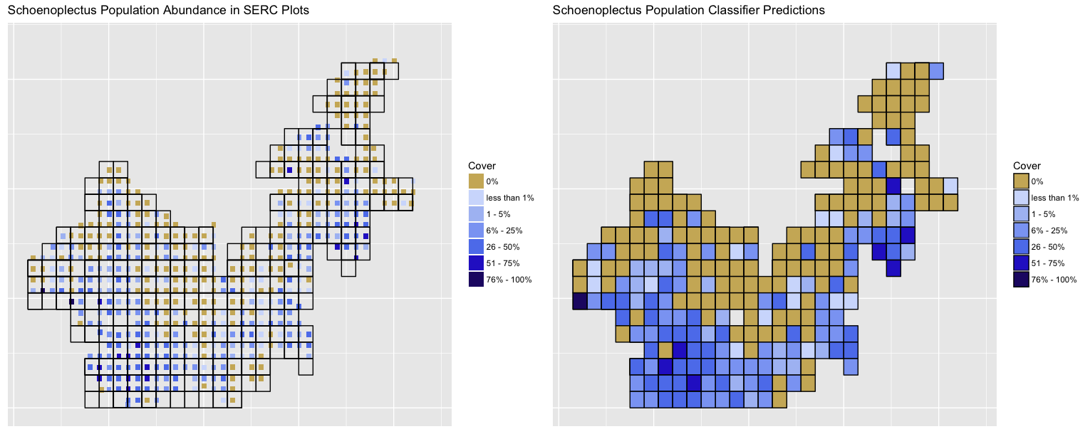 Here are our results of the finalized model (on the right) trained just on Landsat data compared to the original SERC ordinal data for Schoenoplectus americanus with the Landsat plot gridlines layed overtop (on the left). As you could see from our previous tables and OOB error percentage, the classifier is good at predicting when a species is present or absent, but rather poor at predicting ordinal levels of species within a plot. With that being said, when we predicted the remaining 40% of our plots, it became apparent that the random forest classifier was still effective at predicting plot ordinal scores across multiple SERC plots within one Landsat plot. This tells us that the model was trained well enough on the 60% of the data we fed it to detect the "relative" true scores of population abundance. There is still some noise, but the classifier does a good job at predicting orders given its training and our actual plot data. This is given that the plant species cluster around one another or that the 1 by 1 meter plot present accurately represent the population within their 30 by 30 meter space.
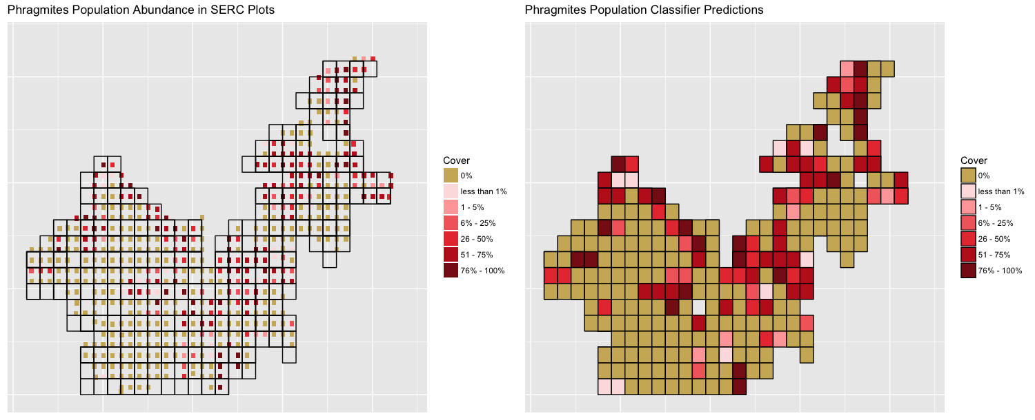 Here is the same figure, but for our Phragmites model. This figure also shows the prediction for all plots. In reality, the model should only predict the remaining for 40% of the data, but we present the entire prediction so that it is easier to compare the training set to the predictions.
This section is essentially a work in progress. We are planning on running the model on past Landsat images and validating the classifiers predictions on a dataset of 10 ordinal scores of plots for previous years given to us by SERC. If these plots are somewhat represented accurately by the model, we can have some intuition that our model is correctly predicting species abundance for past years with some noise. Then, we can correlate the changes abundances with the changing levels of CO2 and shifts in Phragmites abundance to support ongoing research conducted by the Smithsonian Environmental Research Center and the McLachlan Lab.