[Enhancement] Better blur for fill of ebook covers in 1:1 covers #216
Comments
|
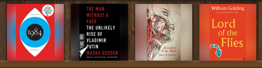
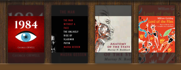
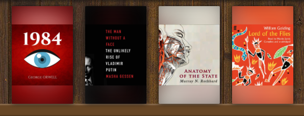
I put together some samples and some of them look better to me using the current version, and some of them look better using the increased blur. I think we need some more opinions on this, I could go either way.
|

|
I think 2nd option with more blur looks better, you can more focus on the cover. Of course most people will use one covers or another so this is only escape method. Thank you for you hard work! I took this idea from IRFANVIEW (SHIFT + V) |
|
That makes sense, it does make the cover stand out more. Do you have suggestions on how to include the title and author on the book grid? |
|
Not yet, I will try prototype something for you and show best solutions , tommorrow or sunday. There are many options to consider. And there is no pefect solution. I will do some reasearch and show you what I know. So you can focus more time on develepoment. For me the top priority where you should invest your time is chapter view in android app. (smart audiobook player) use the easiest trick by adding another timeline for chapter. I'm currently listening to 38 hour book, and it is impossible to navigate. Thank you for you time. |
|
I included the updated cover blur in |
|
Thanks for helping with designs. You can open up a discussion with those when you are ready, I'm going to close this one. |
I made it for you, you can use it or not. I have edited someone else work, as my skills are low. I really love your work! So it's just a suggestion maybe someone else will have better idea. Main idea is to set background image with the same height of top image so they match.
Version 1:
https://codepen.io/superpawko/pen/WNZvqYa
Version 2:
https://codepen.io/superpawko/pen/vYeOoJj
The text was updated successfully, but these errors were encountered: