Logger.report_plotly changes the original plot/ screws up formatting #247
Comments
|
Hi @lakshaykc Thank you for the code sample, this is great! Regrading the colors, the UI enables to you change the colors in real time and it will remember the selected colors. We are working on improving the automatic color selection, the new implementation will find a palette that separates different series inside the same plot (but colors on different plots could be shared) Regrading (2) , I ran your code sample, and I have the Y-axis labels, that said the heading (plot title) is missing. I'll look into that. Specifically to your example, I would actually report the 4 joined plots as 4 individual plots. This will allow the UI more flexibility in |
|
Thanks for the response @bmartinn. Having automatic color scheme is nice. But I notice the color scheme changes even if I run the same experiment again. I was wondering where that randomness is coming from. This is not a big issue, but having consistency helps to understand plots slightly faster. For my case, each experiment has between 20-50 plots, so that's why color default color scheme becomes important. But I do understand your point of having the ability to change the color for comparison. It is quite helpful. Not that our points are contradictory. As an example, I use a plot like this where I'm looking at two different loss metrics. It is one experiment where the model is an ensemble of 10 models. So for each loss metric I have train-valid curve for each ensemble model member.
I was thinking about it but it would be harder to quickly analyze the run for this use case. Here there is only one row for each loss metric. But in other cases I also have to plot multiple rows where each row signifies something (eg. time period of training). So the formatting might be better if I create individual plots but it would be more work to go through them. That being said, it is still quite doable. I was just wondering if using sub plots for such cases would be more optimal. Thoughts?
Thanks for the tip on showing/hiding the legend. Did you notice the labels on the legend have random sting attached at the end of them? In the image in the original post the string is '.80e' but in other cases it goes as long as 10-12 characters (eg. train-use.80ejsh83si8dsh). I'm not sure where they get changed.
That's strange. I still don't see the y-axis labels. I'll try another sample and see if I can get it to show. |

|
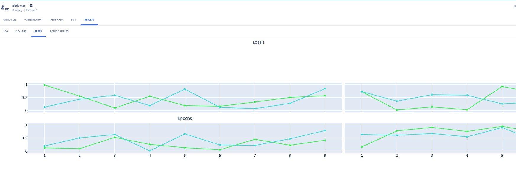
Hi @bmartinn I tried what you suggested of having individual plots instead of subplots. Here is a simple script to create this example. As you can see in the gif below, only the title of the first plot 'Loss 0' is shown. Other titles are missing. Also, y-axis titles are missing for all the four plots. And finally it would be nice to have the figure fit into the plot window instead of scrolling left and right. What do you think?
|

|
@lakshaykc thank you for the screen garbs they are very useful !
Now for usability:
Maybe it is just me, but I would put all 10 losses on the same graph, in the UI you can enable / disable each series by click on the name itself (double click to get a solo view of the series). At least in my mind it is a lot easier to compare, no?!
That is strange, I ran your code against the demo-server (see here) |

|
@bmartinn When I launch the demo-server link you put above on safari and chrome, I still don't see the y-axis labels. See the gifs below. Safari's formatting is weird - too much scrolling to do and the window is only using half of the screen (bottom half of the window is dark). Chrome is at least getting those things right. Another difference between them is that Safari Chrome |


Ok, that is good to know. Why is the series name constantly changing? In the code samples above, I set the series name to be constant ('Series 1', 'Series 2') for a figure. Why doesn't the demo-server example not have task id at the end?
Got it. Thanks. From the examples above, it seems more like a browser issue. |
Looking forward to the group/split toggle switch! Regarding putting all 10 losses on the same graph - I should clarify the comparison first. Here the 10 models are not comparable to each other. They might have different validation sets. The comparison is done between the training loss and its respective validation loss. So comparing all the 10 models with each other is irrelevant. Having all 10 models in the same plot would cause confusion. Manually selecting/deselecting the right curves would be some manual work. With the example figure I posted with 10 columns, I can get a good snapshot without much effort. The basic idea is to see how training is progressing for each of my models where these models are independent of each other. I hope this makes the use case a little more clear. One thing that confuses me a little bit - if all trains cares about is a plotly figure, a normal figure or a subplot shouldn't make a difference right? That being said, I do understand my use case might be niche and not as widely applicable wrt to number of plots. That's why I was focussing on doing all the work on plotly side rather than trains side. |
|
Not related to any of the bugs mentioned here, but for UI plot consistency, it would be great if there is some name matching across different plots. For example if I report the following values: It would be great if "train" would be the same color in both plots, and also that this color stays the same for any experiment in the same project. |
|
@lakshaykc I think figured what the issue is, go to the profile page (here) and disable the HiDPI support (I think there is a bug there with the plots and HiDPI, and I think this is the culprit of the scroll issue, Y-axis is a derivative as it is on the right of the plot which is hidden)
Understood, that makes sense. If this is the case maybe just 10 different graphs (no subplots) then you can just toggle them on/off in the left panel?!
In theory, definitely correct. In practice since we do change the plotly layout a bit (legend colors etc.) bugs might pop, as you have noticed :) @NumesSanguis this is a good point. The color design for the next version is the following (I might be missing details but this is the general gist). Per plot (i.e. graph) select colors (from a pre-made color palette) based on the series names. |
|
@bmartinn Thank you for the breakdown of the new functionality. In my specific use-case this would still fall short (without manual modification), because for some metrics I would calculate "train", "val" and "test", but for others only "val" and "test". Just to let you know 1 user's use-case ^-^ |
|
Thanks @NumesSanguis ! |
|
@bmartinn Bingo! That was it. The After disabling HiDPI, the UI is working as expected and the plots are looking sharp. I'm guessing HiDPI stands for Higher DPI for the image?! Do we need to create a bug report/new issue for this problem or this issue is good enough? Also, I've noticed the UI on Safari is not as good as Chrome (haven't tested on Firefox). The formatting and layout is not optimal. Dimensions of the web pages (fonts, icons, etc.) are much smaller.. I will create a separate issue for that. |
|
@bmartinn looks great now! I'm still seeing the task id appended to the legend label. Is that a bug too? |

|
Yes @lakshaykc you are correct the "task id" appearing in the legend is a bug (Third one on my bug list) Regrading browser support, we test on both Chrome and Firefox, together they cover almost the entire market, I guess these days even on MacOS Safari is left behind :) BTW: |
|
Great, thanks! Yes, I agree re Safari. I'm trying out the new Safari that comes with OS Big Sur. Will stick to Chrome when using trains :) |
I'm trying to report plotly figures via
Logger.report_plotlymethod. Many of the figure attributes are missing when I view in the web api and other elements (such as colors) change randomly.Here is the original figure

and this is what happens in the web app
Below, I log the differences between the original and the web-app plot.
Line colors are specified in the script (i.e I'm not using default colors). The line colors randomly change in the web app plot. Every time I re-run the experiment, the color scheme changes on the web app.
Heading and Y-axes labels are missing.
Space formatting/ aspect ratio of the figure is not ok. I have to scroll left-right quite a bit. The figure should have better default sizing that fits into the window
Legend location is specified for the original figure but it gets changed for the web app. Also there is some strange string that appends to the label. Here the labels should be "train_mse", "valid_mse" but instead they are "train_mse.80e", "valid_mse.80e". I don't understand where the ".80e" is coming from.
I have following questions:
Logger.report_plotlynot log all the figure attributes? Where does the plotly figure object change?Here is the script that I used to generate this example for reproducibility.
The text was updated successfully, but these errors were encountered: