Date input #42
Comments
 govuk-design-system
created this issue from a note
in GOV.UK Design System Community Backlog
(In progress)
govuk-design-system
moved this from In progress
to Published
in GOV.UK Design System Community Backlog
govuk-design-system
created this issue from a note
in GOV.UK Design System Community Backlog
(In progress)
govuk-design-system
moved this from In progress
to Published
in GOV.UK Design System Community Backlog
 timpaul
added
the
component
timpaul
added
the
component
|
Consider how some users might be entering a date from reading it off material where it's displayed as letters. e.g. a passport. so consider allowing various formats for month e.g. 3, 03, MAR and MARCH in our testing we see users enter months as numbers |
|
There used to be documentation with this component explaining a hack to make inputs work as users expected in iOS (specifically activating the numeric keyboard on number inputs). Is this still relevant? I notice it's not in the current page |
Hi Paul, It's still relevant – I believe that guidance was removed because we are now providing code examples, which we were not able to do when this content was in the service manual, and so it was more important to document 'implementation details' like that. The code examples on the date input all use the |
|
Testing the "Apply for a Blue Badge" service. We saw two users with Voiceover on iOS run into issues when entering their date of birth. The first user expected it to auto-tab, getting stuck in the day field and then had issues getting back into the month field. The second user wasn't sure of what to do after entering the day, they said “I didn’t hear that one. Do I have to put dot there for month? Oh I have to go, ok. I’ve just done the day, and then” he then tried to find the dot button and gets stuck in the International keyboard, swiping the screen he finds year… swipes the screen until he finds the month input “I just want to go to month”. |
|
I don't think the documentation specifically shows how to display a formatted date. It has "31 3 1980" in the examples, but this is not specifically spelt out in date patterns or a-z style guide. One of the reasons this has come up is that in my 30 years of non-government development, I've never come across a date format (anywhere in the world) where spaces are the separator! |
|
Hello all. I'd like to understand why the text input based date picker is more usable / accessible than more a select element, or a calendar. Could you tell me or point me in the right direction? I remember that there's been usability findings pointing to that direction, but it'd help me to understand what the these findings so I can be convinced myself and convince colleagues. Is there an article / blog post anywhere recapping on this? (Thanks for the excellent work on the design system and its documentation). |
|
Hi @jfhector that's a good question, you can read some research here: https://designnotes.blog.gov.uk/2013/12/05/asking-for-a-date-of-birth/ We found similar problems with dropdowns regularly, which is why we generally recommend against them. In terms of calendar controls, we haven't found a need when it comes to asking for a memorable date (like a date of birth), though it could be useful in other situations. The problem then is, if you use built-in browser calendars the user experience can vary wildly. If you use a custom calendar control you need to make sure it's fully accessible. |
|
I always point people at @alicebartlett's talk about dropdowns from 2014. https://www.youtube.com/watch?v=CUkMCQR4TpY&t=1s |
|
Thanks a lot @joelanman @stevenaproctor , really helpful. |
|
Have any prototypes / services considered a 'today' option on a date entry screen, so a user can - for example - select a 'today' radio button rather than enter data into the date fields under it? I realise it would often be inappropriate but for some services where a user can cancel / deregister on that particular day it might be helpful? |
|
is there a way to add attributes to date items, such as maxlength=2 and aria-required=true |
This isn't possible using the macros at the minute – this is being tracked as an issue in the GOV.UK Frontend repo – alphagov/govuk-frontend#995. If you're using the HTML directly, then you can add the attributes as you normally would. |
|
While testing this pattern in the design system with Safari and Voiceover, I've noticed that the text inputs offer a number input as an incrementable input (stepper). I can't see how this input format is described in the markup. |
|
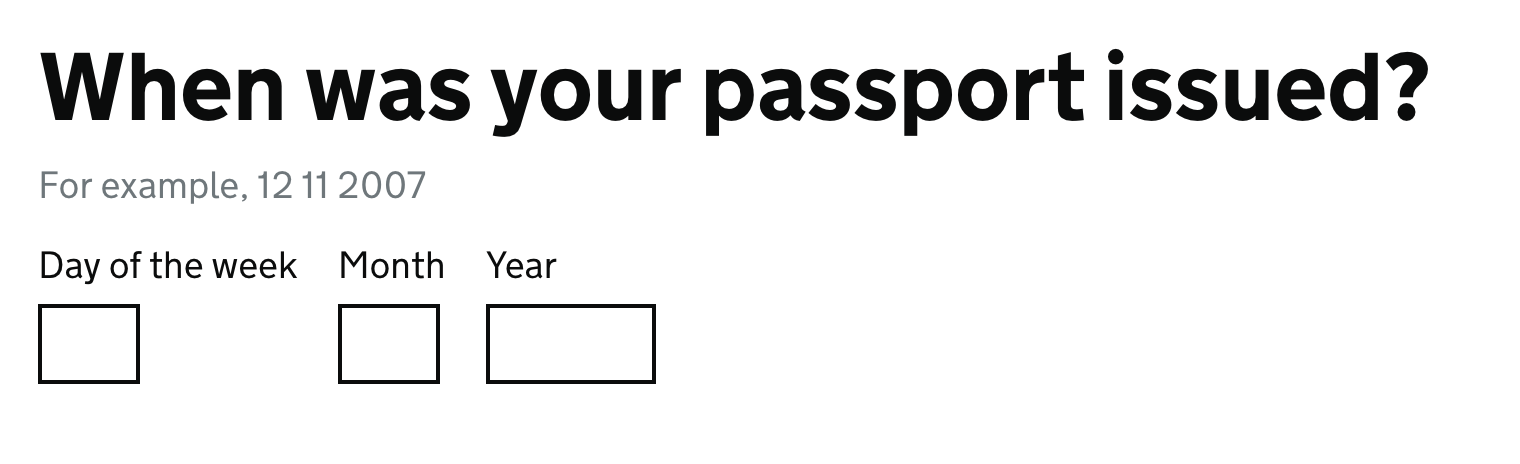
At https://design-system.service.gov.uk/patterns/dates/ the first example is '01 08 2007' and the second example is '31 3 1980'. This is a minor inconsistency but we should fix it. I've encountered users who believe they must use leading zeros because it's in the example on the service they're using. Even though the day and month are labelled, I think it's beneficial for the example to emphasise the distinction between day and month by using a day number that can't be a month number. I propose the guidance is updated as follows:
|
|
Hi Terry, That sounds like a sensible improvement. Would you be interested in creating a pull request with those changes? I think you'd need to edit… This line to update the first example: This line to update the last (error state) example: And add any additional guidance to the pattern itself: Let me know if I can help at all. Thanks, Ollie |
|
Thanks Ollie. I've never done a pull request before but I'd like to try. I'll ask a colleague for help and give it a go. Hopefully in the next week. Terry |
|
Recording an issue from @andysellick (alphagov/govuk-frontend#1250) and a PR from @colinrotherham (alphagov/govuk-frontend#1257) we need to consider how this component should adapt based on available size. While the component holds together inside a single column at our minimum supported breakpoint (320px) it will break if put inside a container smaller than this (such as a search filter panel), especially on tablet or desktop as the font size will be bigger (we are sizing the inputs with the Things to potentially consider when the space available cannot contain the 3 inputs inline:
|
|
When used with a Welsh translation, the day and month fields do not have adequate spacing between them:
(Reported on Slack by Jonathan King, Content Designer at DWP) |

|
@paulwaitehomeoffice As @colinrotheram has pointed out this example appears to be from an alternate frontend. GOV.UK Frontend behaves like this:
|
|
@dashouse Ah, sorry, I missed that. |
|
Why are we using a
https://developer.mozilla.org/en-US/docs/Web/HTML/Attributes/pattern |
|
@philsherry although it's technically invalid according to the specification, this was the best way to reliably trigger the numeric keyboard on older versions of iOS (< iOS 9.3 IIRC) – unfortunately using Thankfully things have moved on, and we now have an issue open to update the date input to use inputmode, but we've been able to prioritise it yet. |
|
hi team, I am looking for some help please on how to display error messages depending on whether the date fields have been left empty, invalid etc. The date-input error messages nunjucks example on the page, shows the error message as soon as the page loads, I was looking to display them on form submit. I am hoping that would be possible? Many thanks |
|
Hi all, FYI - on Apply for a NI number, we had feedback from a visually-impaired user who struggled with the error messages we'd used in the DOB fields (these were the standard ones in the pattern - e.g. 'Enter a valid date of birth'). He wasn't able to tell just from that message which field he'd made the error in. As a result of his feedback, we went back and added error messages for each individual field. So for DOB the error messages are specific to the day, the month or the year, e.g:
See attachment for details of how the error messages on the DOB screen have evolved. We presented this at our GDS live assessment in August 2022. |
Was there an update on this question from 2019? Does anyone have thoughts on limiting the number of digits in fields? Why do we allow more than 2 digits for date and month and more than 4 for the year? Update: colleagues have explained to me that it's not a good idea for reasons such as:
|
|
Can anyone explain to me why they've chosen the 3 separate input fields and not just 1? |
|
3 fields with labels makes the format of the date unambiguous - the order of the fields, and doesnt require the user to think about or enter a separator (is it slash, hyphen, space?). We don't autotab as that can cause confusion and errors if people don't realise it happened |
|
I was wondering, are there any reasons or research insights that would point against 'masking' non-numbers and/or more than the necessary digits for each field? E.g. should we stop users from adding letters or a 3rd digit on the month field? |
|
@EvaHageman @stagarz In a vague attempt to answer those questions without retreading ground too much. Why not a single input?Aside from the various problems with datepicker interfaces mentioned earlier in this issue, another problem with using a single If the user is in another country—such as an expatriate or a person travelling abroad—or their machine has an incorrectly configured locale, the browser may set the input to use a different date format. The user may not realise that's the case (e.g. being asked for MM/DD/YYYY instead of DD/MM/YYY) or may be confused if it's an unfamiliar format or incorporates non-English text on an otherwise English language page (such an input might read 2023年1月20日 in Japan, for example). This increases the likeliness of confusion, erroneous input, and prevents services from providing meaningful guidance to the user. (Fun story: I encountered this exact problem a few years ago. The singular date input on a hotel booking website was using MM/DD/YYYY format, despite both being based in the UK. Suffice to say, I spent the night sleeping on a bench in Heathrow Terminal 4.) Why not auto-tab between the three inputs?As Joe mentioned, this is unexpected behaviour for many users, and they often don't notice that it's happened. If I remember correctly, not all assistive technologies will announce this change either. There is also technical and UX complexity involved.
Remember that GOV.UK services are usually accessed infrequently by users—used every few months or years when a particular task needs to be completed—so they are unlikely to develop a mental model for this bespoke behaviour. Users who are less tech literate are also far more likely to stumble over this kind of functionality, as it often doesn't match their expectations for how forms work. Why not use a single text input with input masking?Input masking comes with many of the same complexities and downfalls as auto-tabbing does, the 'tabbing' just happens within a single input instead of between multiple inputs. Input masking comes with its own technical pitfalls, such as the value of the field usually being harder to parse and validate on the backend compared to having separate inputs. Input masking also won't work if JavaScript is unavailable. A particular feature that I've not touched on yet is that some service teams do the hard work to make it simple. Although we give an entirely numerical example of a date format in our examples (e.g. 22 9 1991), some users still try to enter the month as a word (as Frankie described above). Accounting for these situations without resorting to error messages is only possible because we don't apply limitations to the length or format of user input on the frontend—something we would need to do if we were to implement auto-tabbing or input masking. Ultimately, the date input is a pretty good example of keeping it simple being the option that works best in practice! |
|
Many thanks for the prompt and extensive response @querkmachine! In our case, we're keeping the 3 input fields, so the only reason to not set maxlength for each field would be for interpreting Oct as 10, right? I believe masking non-numbers requires js, so that may be a different can of worms. |
|
Thanks so much for taking the time to reply and going into so much detail. This is super helpful and super interesting to learn your thought proces behind it. 🙌 |
|
@stagarz we don't use maxlength as its an example of silent failure - if the user types or pastes anything over the limit for any reason, maxlength will silently truncate it. The user gets no feedback that this happened and this can introduce errors. Far batter to accept input and then display an error if needed (through form validation). |
|
My project is planning to add a date picker to the date input component to allow a user to select a future date. Context: Scheduling a future payment to HMRC using open banking User need: as the date entered is likely to not be a 'known date' having a date picker helps the user plan. The calendar view allows the dates to be seen in context . The user can avoid scheduling a payment on a Saturday or Sunday for example when payments may take longer to process, or can plan around incoming and out going payments to manage cash flow. We have decided to go with a version similar to the Digital Scotland one as this one is the most accessible I have been able to find, it fits in well with the style of GDS and you can select a date range. We are making a few changes:
We are interested to monitor this to see how users interact with the page This is a screenshot of our design |

|
I’ve opened pull request #2889 to suggest adding guidance that full or abbreviated month names should be accepted, based on the conversations here. Would welcome any input from @cjforms @joelanman @calvin-lau-sig7 and others! |
|
Thanks @frankieroberto for opening the pull request, I'm really pleased to see that this might become a thing. |
|
🆕 We've updated the guidance for Date input based on observed user behaviour and insights shared by @frankieroberto. We recommend accepting month names as well as month numbers, which can also helps users with dyscalculia (thanks @cjforms). |
|
With a bit of time to kill on the way back from Design System Day in Edinburgh, I did a little spike to 'scratch an itch' and investigating whether we could intelligently handle paste events on the date input and split clipboard data across the three fields. Screen.Recording.2023-10-12.at.11.56.28.movThe sort of use case I'm imagining is a user copying and pasting saved dates from their notes, password managers etc. The idea would be to listen for the paste event within the component and intercept it if ALL of the following are true:
Once intercepted, we then split the clipboard data across the three fields. Observations and findings so far:
The branch for the spike is here: https://github.com/alphagov/govuk-frontend/tree/spike-date-input-paste |
|
The error message for 'If the date must be between two dates' is ambiguous. 'Between 1 September 2017 and 30 September 2017' does not make it clear if these dates are inclusive, or if only 2 - 29 September would be accepted. Consider instead: 'The date your contract started must be from 1 September 2017 to 30 September 2017 when you were self-employed’. Thanks :) |
|
The accessibility audit we've had has fed back that we should validate on a per input basis and not the whole date component. We're using a standard GDS date component that displays the following validation messages should the user try to enter an invalid date;
The specific response from the accessibility audit team is as follows;
I've responded outlining the validation that we do and have been told it's insufficient resulting in a "Major Impact on Functionality" flag. I'm interested to understand if there's a general consensus whether this is a reasonable request and if so the guidance for the GDS date component will need revising? |

|
@andrewscrivener the guidance says you should highlight the field that is wrong if it is clear, as it is in this case (13 cannot be a month): https://design-system.service.gov.uk/components/date-input/#if-the-date-entered-cannot-be-correct |
|
@andrewscrivener If one of the date fields is left blank, this field must be highlighted when the error is displayed. "If you’re highlighting just one field - either the day, month or year - only style the field that has an error. The error message must say which field has an error". See: https://design-system.service.gov.uk/components/date-input/ So if year is missing, this field is highlighted and the error message refers to that field. Eg. 'Date of birth must include a year.' |
|
Thanks very much @joelanman and @jen-scott for the quick response. We've also been advised to include the hint text in the error message so it's repeated for screen readers. |
|
I've had a go at writing out the logic for date error messages and making some tweaks along the way:
Would welcome any feedback on this approach, experience from trying to do this in services, and whether you felt it would be a helpful addition to the guidance on error messages for date inputs |
|
Thank you @tomyems for this analysis, much appreciated. Recently I've been revisiting some old blog posts and one of them prompted me to return to thinking about the difference between 'mechanical help' (how to get through an interaction process based on achieving inputs acceptable to a validation process) and 'decision help' (how to review and think about providing an answer that is acceptable both to the user and to the further processes in the service). In my mind, your analysis covers the possibilities for mechanical help with dates, very thoroughly. A helpful addition. I'm not quite so sure that it deals with decision help. For example, what happens when:
I appreciate that many of these can only be dealt with by knowing a lot more about the context, and then embedding the date in other patterns. |
 and others
Use this issue to discuss this component in the GOV.UK Design System.
Anything else
Related to the 'date picker' component issue
The text was updated successfully, but these errors were encountered: