| $category@ | formats | teaser | |||
|---|---|---|---|---|---|
presentation |
|
|
| Description | A rich, visual storytelling format. |
| Availability | |
| Required Script | <script async custom-element="amp-story" src="https://cdn.ampproject.org/v0/amp-story-1.0.js"></script> |
| Supported Layouts | none |
| Examples |
|
{% call callout('Important', type='caution') %} This component is experimental and under active development. For any issues, please file a GitHub issue. {% endcall %}
[TOC]
| Version | Description |
|---|---|
| 1.0 | Current version, since 2018-07-16. |
| 0.1 | Initial implementation. Deprecated, and will be removed on 2019-03-19 |
As of 2018-07-16, version 0.1 is considered deprecated, and will be removed on 2019-03-19. This may cause minor breaking changes, as your stories will automatically be upgraded to use version 1.0. We recommend manually migrating your pages to version 1.0 before this date to ensure functionality and proper design.
We've added new capabilities to the amp-stories bookend, enabling richer component support and visual layouts. Some of the changes include:
- Share providers are sorted according to the JSON configuration.
- New bookend components:
- Call to action links
- Text box
- Portrait and landscape cards
To use these new capabilities, add an <amp-story-bookend> tag as the last child of your <amp-story> with the required attributes like so:
<amp-story standalone>
  <amp-story-page id="cover">
    ...
  </amp-story-page>
  <!-- `src` and `layout=nodisplay` are required. -->
  <amp-story-bookend src="bookendv1.json" layout="nodisplay">
  </amp-story-bookend>
<amp-story>
Learn more about the new components and how to specify them in the JSON configuration in the amp-story-bookend section.
We've added new metadata attributes to the <amp-story> element. These metadata attributes will be used for displaying a preview of the story across the AMP stories ecosystem. For example, these attributes can be used to render an engaging preview link in the bookend of a related story. Providing these attributes will also help ensure your story is future-proof for rich, embedded experiences in AMP stories surfaces to come.
<!-- `title`, `publisher`, `publisher-logo-src` and `poster-portrait-src` will soon be required. -->
<amp-story standalone title="My Story"
    publisher="The AMP Team"
    publisher-logo-src="https://example.com/logo/1x1.png"
    poster-portrait-src="https://example.com/my-story/poster/3x4.jpg">

<!-- `poster-square-src` and `poster-landscape-src` are optional, but strongly recommended. -->
<amp-story standalone title="My Story"
    publisher="The AMP Team"
    publisher-logo-src="https://example.com/logo/1x1.png"
    poster-portrait-src="https://example.com/my-story/poster/3x4.jpg"
    poster-square-src="https://example.com/my-story/poster/1x1.jpg"
    poster-landscape-src="https://example.com/my-story/poster/4x3.jpg">
Note that these metadata attributes supplement and do not replace any Structured Data (e.g. JSON-LD) on the page. We still recommend adding Structured Data to all your AMP pages, including AMP stories.
The new attributes:
| ATTRIBUTE | DESCRIPTION |
|---|---|
title [required] |
The title of the story. |
publisher [required] |
The name of the story's publisher. |
publisher-logo-src [required] |
The publisher's logo in square format (1x1 aspect ratio). |
poster-portrait-src [required] |
The story poster in portrait format (3x4 aspect ratio). |
poster-square-src |
The story poster in square format (1x1 aspect ratio). |
poster-landscape-src |
The story poster in landscape format (4x3 aspect ratio). |
The following guidelines apply to the image for the publisher logo:
- The file should be a raster file, such as
.jpg,.png, or.gif. Avoid vector files, such as.svgor.eps. - Avoid animated images, such as animated gifs.
- The graphic part of the logo should be legible on the background color.
 Preferred
|
 Preferred
|
 Avoid this
|
- The logo shape should be a square, not a rectangle.
- The background color should not be transparent.
- Use one logo per brand that is consistent across AMP stories.
- The logo should be at least 96x96 pixels.
The following guidelines apply to the image for the story poster image(s):
- The poster image should be representative of the entire AMP story.
- The poster image should be visible to the user when the user begins the AMP story. However, the image file URL used in the metadata does not have to match exactly the URL used on the first page of the story. The URL used in the metadata can include sizing, cropping, or minor styling changes for the preview purpose.
- The poster image should be a raster file, such as
.jpg,.png, or.gif. Avoid vector files, such as.svgor.eps. - The poster image should be in 3x4 aspect ratio for portrait, 4x3 for landscape, and 1x1 for square.
- If the poster image is derived from a frame in a video, the thumbnail should be representative of the video. For example, the first frame in a video is often not representative.
- Each poster image should meet the recommended minimium size:
- Portrait: 696px x 928px
- Landscape: 928px x 696px
- Square: 928px x 928px
The amp-story extension provides a new format for displaying visual content that you can assemble into a story-telling experience. With an AMP story, you can provide users with bite-sized, visually rich information and content.

An AMP story is a complete AMP HTML document that is comprised of pages, within the pages are layers, within the layers are AMP & HTML elements, like media, analytics, text, and so on.

The following markup is a decent starting point or boilerplate. Copy this and save it to a file with a .html extension.
<!doctype html>
<html amp lang="en">
  <head>
    <meta charset="utf-8">
    <script async src="https://cdn.ampproject.org/v0.js"></script>
    <script async custom-element="amp-story"
        src="https://cdn.ampproject.org/v0/amp-story-1.0.js"></script>
    <title>Hello, amp-story</title>
    <link rel="canonical" href="http://example.ampproject.org/my-story.html" />
    <meta name="viewport"
        content="width=device-width,minimum-scale=1,initial-scale=1">
    <style amp-boilerplate>body{-webkit-animation:-amp-start 8s steps(1,end) 0s 1 normal both;-moz-animation:-amp-start 8s steps(1,end) 0s 1 normal both;-ms-animation:-amp-start 8s steps(1,end) 0s 1 normal both;animation:-amp-start 8s steps(1,end) 0s 1 normal both}@-webkit-keyframes -amp-start{from{visibility:hidden}to{visibility:visible}}@-moz-keyframes -amp-start{from{visibility:hidden}to{visibility:visible}}@-ms-keyframes -amp-start{from{visibility:hidden}to{visibility:visible}}@-o-keyframes -amp-start{from{visibility:hidden}to{visibility:visible}}@keyframes -amp-start{from{visibility:hidden}to{visibility:visible}}</style><noscript><style amp-boilerplate>body{-webkit-animation:none;-moz-animation:none;-ms-animation:none;animation:none}</style></noscript>
  </head>
  <body>
    <amp-story standalone>
      <amp-story-page id="my-first-page">
        <amp-story-grid-layer template="fill">
          <amp-img src="https://example.ampproject.org/helloworld/bg1.jpg"
              width="900" height="1600">
          </amp-img>
        </amp-story-grid-layer>
        <amp-story-grid-layer template="vertical">
          <h1>Hello, amp-story!</h1>
        </amp-story-grid-layer>
      </amp-story-page>
      <amp-story-page id="my-second-page">
        <amp-story-grid-layer template="fill">
          <amp-img src="https://example.ampproject.org/helloworld/bg2.gif"
              width="900" height="1600">
          </amp-img>
        </amp-story-grid-layer>
        <amp-story-grid-layer template="vertical">
          <h1>The End</h1>
        </amp-story-grid-layer>
      </amp-story-page>
      <amp-story-bookend src="bookendv1.json" layout="nodisplay">
      </amp-story-bookend>
    </amp-story>
  </body>
</html>
The content in the body creates a story with two pages. Each page has a full bleed background image, with a simple string of text on top of it.
The AMP story HTML format follows the same markup requirements as a valid AMP HTML document, along with the following additional requirements:
| RULE | DESCRIPTION |
|---|---|
The <amp-story standalone> element is the only child element of <body>. |
Identifies that the document is an AMP story. |
Contain a <script async src="https://cdn.ampproject.org/v0/amp-story-1.0.js" custom-element="amp-story"></script> tag as the third child of the <head> tag. |
Includes and loads the amp-story JS library. |
Contain a <link rel="canonical" href="$STORY_URL"> tag inside the <head>. |
The link points to the story itself, identifying the story as the canonical document. |
The amp-story component represents an entire story. The component itself implements the UI shell, including handling gestures and navigation, and inserting the application shell UI (controls, progress bar, etc).
<amp-story
    standalone
    title="My Story"
    publisher="The AMP Team"
    publisher-logo-src="https://example.com/logo/1x1.png"
    poster-portrait-src="https://example.com/my-story/poster/3x4.jpg"
    poster-square-src="https://example.com/my-story/poster/1x1.jpg"
    poster-landscape-src="https://example.com/my-story/poster/4x3.jpg"
    background-audio="my.mp3">
  <amp-story-page>[...]</amp-story-page>
  <amp-story-page>[...]</amp-story-page>
  <amp-story-page>[...]</amp-story-page>
  <amp-story-bookend src="./related.json"></amp-story-bookend>
</amp-story>Identifies that the AMP document is a story.
The title of the story.
The name of the story's publisher.
A URL to the story publisher's logo in square format (1x1 aspect ratio). For example publisher-logo-src="https://example.com/logo/1x1.png", where 1x1.png is a 36x36 px logo.
A URL to the story poster in portrait format (3x4 aspect ratio).
Enables landscape orientation support on mobile devices and a full bleed landscape experience on desktop devices.
A URL to an audio file that plays throughout the story.
A URL to the story poster in square format (1x1 aspect ratio).
A URL to the story poster in landscape format (4x3 aspect ratio).
A "poster" is an image that displays in the UI until your story is loaded. The poster can generally be the first screen of your story, although you can use any image that is representative of the story.
If the supports-landscape attribute is specified on the <amp-story> element, it will:
- Allow the story to be seen when a mobile device is held in a landscape orientation.
- Change the desktop experience to an immersive full bleed mode, replacing the default three portrait panels experience.
Usage: <amp-story ... supports-landscape>...</amp-story>

The <amp-story> component contains one or more <amp-story-page> components, containing each of the individual screens of the story. The first page specified in the document order is the first page shown in the story.
The <amp-story-page> component represents the content to display on a single page of a story.


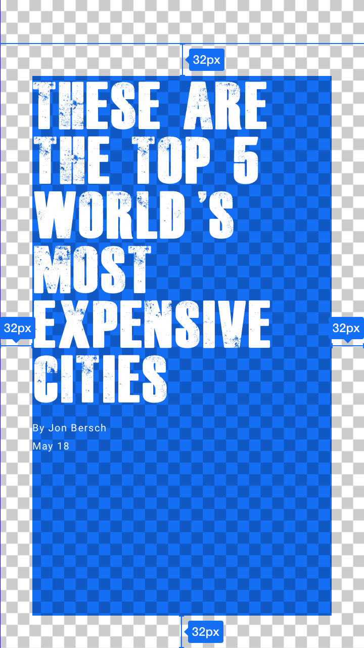
<amp-story-page id="cover">
  <amp-story-grid-layer template="fill">
    <amp-video layout="fill" src="background.mp4" poster="background.png" muted autoplay></amp-video>
  </amp-story-grid-layer>
  <amp-story-grid-layer template="vertical">
    <h1>These are the Top 5 World's Most...</h1>
    <p>Jon Bersch</p>
    <p>May 18</p>
  </amp-story-grid-layer>
  <amp-story-grid-layer template="thirds">
    <amp-img grid-area="bottom-third" src="a-logo.svg" width="64" height="64"></amp-img>
  </amp-story-grid-layer>
</amp-story-page>A unique identifier for the page. Can be used for styling the page and its descendants in CSS, and is also used to uniquely identify the page in the URL fragment.
Specifies when to auto-advance to the next page. If omitted, the page will not automatically advance. The value for auto-advance-after must be either:
- A positive amount of time to wait before automatically advancing to the next page
- An ID of an HTMLMediaElement or video-interface video whose completion will trigger the auto-advance
For example:
<amp-story-page id="tokyo" auto-advance-after="1s">A URI to an audio file that plays while this page is in view.
For example:
<amp-story-page id="zurich" background-audio="./media/switzerland.mp3">The <amp-story-page> component contains one or more layers. Layers are stacked bottom-up (the first layer specified in the DOM is at the bottom; the last layer specified in the DOM is at the top).
Layers are stacked on top of one another to create the desired visual effect.
The <amp-story-grid-layer> component lays its children out into a grid. Its implementation is based off of the CSS Grid Spec.
 +
+
 +
+
 =
=

The template attribute determines the layout of the grid layer. Available templates are described in the Templates section below.
This attribute is specified on children of <amp-story-grid-layer>. grid-area specifies the named area (from using a template that defines them) in which the element containing this attribute should appear.
Example:
<amp-story-grid-layer template="thirds">
  <p grid-area="middle-third">Element 1</p>
  <p grid-area="lower-third">Element 2</p>
  <p grid-area="upper-third">Element 3</p>
</amp-story-grid-layer>The following are available templates to specify for the layout of the grid layer.
{% call callout('Tip', type='success') %} To see the layout templates in use, check out the layouts demo on AMP By Example. {% endcall %}
The fill template shows its first child full bleed. All other children are not shown.
Names Areas: (none)
Example:

<amp-story-grid-layer template="fill">
  <amp-img src="cat.jpg"></amp-img>
</amp-story-grid-layer>The vertical template lays its elements out along the y-axis. By default, its elements are aligned to the top, and can take up the entirety of the screen along the x-axis.
Names Areas: (none)

<amp-story-grid-layer template="vertical">
  <p>Element 1</p>
  <p>Element 2</p>
  <p>Element 3</p>
</amp-story-grid-layer>The horizontal template lays its elements out along the x-axis. By default, its elements are aligned to the start of the line and can take up the entirety of the screen along the y-axis.
Names Areas: (none)

<amp-story-grid-layer template="horizontal">
  <p>Element 1</p>
  <p>Element 2</p>
  <p>Element 3</p>
</amp-story-grid-layer>The thirds template divides the screen into three equally-sized rows, and allows you to slot content into each area.
Named Areas:
upper-thirdmiddle-thirdlower-third

<amp-story-grid-layer template="thirds">
  <p grid-area="middle-third">Element 1</p>
  <p grid-area="lower-third">Element 2</p>
  <p grid-area="upper-third">Element 3</p>
</amp-story-grid-layer>An amp-story-grid-layer can contain any of the following elements:
Note: This list will be expanded over time.
| Area | Allowable tags |
|---|---|
| Media |
|
| Analytics & Measurement |
|
| Sectioning |
|
| Text |
|
| Lists |
|
| Tables |
|
| Links |
|
| Other |
|
We support inline links <a> as a descendant of amp-story-grid-layer. Whenever a link is tapped a tooltip will be shown - deferring the corresponding action until the user taps again in the tooltip.
You can customize the contents of the tooltip displayed on top of a user interactive element by specifying the following attributes. If they are not specified, a fallback value will be provided automatically.
Example:
Takes in a src where the icon image is located.
A string that will be shown when the tooltip appears.
Example:
<a href="https://www.google.com" role="link" data-tooltip-icon="./assets/ic_amp_googblue_1x_web_24dp.png" data-tooltip-text="Go to page">
  Click me!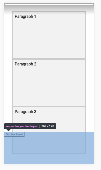
</a>The <amp-story-cta-layer> component allows the usage of <a> and <button> elements inside an <amp-story-page>.
- If specified, the
<amp-story-cta-layer>element must be the last layer within an<amp-story-page>. As a result, effectively every<amp-story-page>can have exactly one or exactly zero of the<amp-story-cta-layer>element. - Positioning and sizing of this layer cannot be controlled. It is always 100% width of the page, 20% height of the page, and aligned to the bottom of the page.
<amp-story-page id="vertical-template-thirds">
  <amp-story-grid-layer template="thirds">
    <div class="content" grid-area="upper-third">Paragraph 1</div>
    <div class="content" grid-area="middle-third">Paragraph 2</div>
    <div class="content" grid-area="lower-third">Paragraph 3</div>
  </amp-story-grid-layer>
  <amp-story-cta-layer>
    <a href="https://www.ampproject.org" class="button">Outlink here!</a>
  </amp-story-cta-layer>
</amp-story-page>
Complete example found in the examples directory
The amp-story-cta-layer allows mostly the same descendants as amp-story-grid-layer, and additionally allows <a> and <button> tags.
For an updated list of supported children, be sure to take a look at the amp-story-cta-layer-allowed-descendants field in the validation rules.

Attach additional content to a story page!
Story page attachments allow you to provide additional AMPHTML content to specific pages. This content can be revealed by users through a "swipe up" gesture, or a tap on the call to action element. A UI prompt to open the attachment will automatically be added at the bottom of every page that configured an attachment.
The <amp-story-page-attachment> element must be the last child of <amp-story-page>, and must have the layout="nodisplay" attribute. The attachment AMPHTML content is expected to be provided inline in your AMP Story, within this <amp-story-page-attachment> tag.
Story page attachments allow the same HTML elements as AMP Story along with additional components listed below, such as third party video players or social media embeds. This means you can add additional content that is too verbose or disallowed in an AMP Story page.
List of allowed AMP components in a page attachment
<amp-3d-gltf><amp-3q-player><amp-accordion><amp-audio><amp-beopinion><amp-bodymovin-animation><amp-brid-player><amp-brightcove><amp-byside-content><amp-call-tracking><amp-carousel><amp-dailymotion><amp-date-countdown><amp-embedly-card><amp-facebook><amp-facebook-comments><amp-facebook-like><amp-facebook-page><amp-fit-text><amp-fx-collection><amp-fx-flying-carpet><amp-gfycat><amp-gfycat><amp-gist><amp-gist><amp-google-document-embed><amp-google-vrview-image><amp-google-vrview-image><amp-hulu><amp-ima-video><amp-image-slider><amp-img><amp-imgur><amp-instagram><amp-izlesene><amp-jwplayer><amp-kaltura-player><amp-list><amp-list><amp-live-list><amp-live-list><amp-mathml><amp-mowplayer><amp-nexxtv-player><amp-o2-player><amp-ooyala-player><amp-pan-zoom><amp-pinterest><amp-playbuzz><amp-powr-player><amp-reach-player><amp-reddit><amp-riddle-quiz><amp-soundcloud><amp-springboard-player><amp-timeago><amp-twitter><amp-video><amp-video-iframe><amp-vimeo><amp-vine><amp-viqeo-player><amp-vk><amp-wistia-player><amp-yotpo><amp-youtube>
<amp-story-page id="foo">
  <amp-story-grid-layer template="fill">
    <amp-img src="https://example.ampproject.org/helloworld/bg1.jpg" width="900" height="1600">
  </amp-story-grid-layer>
  <amp-story-page-attachment layout="nodisplay">
    <h1>My title</h1>
    <p>Lots of interesting text with <a href="https://example.ampproject.org">links</a>!</p>
    <p>More text and a YouTube video!</p>
    <amp-youtube
        data-videoid="b4Vhdr8jtx0"
        layout="responsive"
        width="480" height="270">
    </amp-youtube>
    <p>And a tweet!</p>
    <amp-twitter
        data-tweetid="885634330868850689"
        layout="responsive"
        width="480" height="270">
    </amp-twitter>
  </amp-story-page-attachment>
</amp-story-page>Every element inside an <amp-story-page> can have an entrance animation.
You can configure animations by specifying a set of animation attributes on the element; no additional AMP extensions or configuration is needed.
The following animation effects are available as presets for AMP stories:
| Preset name | Default duration (ms) | Default delay (ms) |
|---|---|---|
drop |
1600 | 0 |
fade-in |
500 | 0 |
fly-in-bottom |
500 | 0 |
fly-in-left |
500 | 0 |
fly-in-right |
500 | 0 |
fly-in-top |
500 | 0 |
pulse |
500 | 0 |
rotate-in-left |
700 | 0 |
rotate-in-right |
700 | 0 |
twirl-in |
1000 | 0 |
whoosh-in-left |
500 | 0 |
whoosh-in-right |
500 | 0 |
pan-left |
1000 | 0 |
pan-right |
1000 | 0 |
pan-down |
1000 | 0 |
pan-up |
1000 | 0 |
zoom-in |
1000 | 0 |
zoom-out |
1000 | 0 |
{% call callout('Tip', type='success') %} See a live demo of all the AMP story animations on AMP By Example. {% endcall %}
Use this attribute to specify the name of the entrance animation preset.
Example: A heading flies in from left of the page.
<h2 animate-in="fly-in-left">
Fly from left!
</h2>Use this attribute to specify the duration of the entrance animation, in seconds or milliseconds (e.g., 0.2s or 200ms). The default duration depends on the animation preset you specified.
Example: A heading flies in from left of the page and the animation finishes within half a second.
<h2 animate-in="fly-in-left" animate-in-duration="0.5s" >
Fly from left!
</h2>Use this attribute to specify the delay before starting the animation. The value must be greater than or equal to 0, in seconds or milliseconds (for example, 0.2s or 200ms). The default delay depends on the animation preset you specified.
Example: After 0.4 seconds, a heading flies in from the left of the page and completes its entrance within 0.5 seconds.
<h2 animate-in="fly-in-left"
    animate-in-duration="0.5s"
    animate-in-delay="0.4s">
Fly from left!
</h2>
{% call callout('Note', type='note') %}
The animation delay is not guaranteed to be exact. Additional delays can be caused by loading the amp-animation extension in the background when the first animated element has been scanned. The attribute contract is defined as delay this animation for at least N milliseconds. This applies to all elements including those with a delay of 0 seconds.
{% endcall %}
Use this attribute to chain or sequence animations (for example, animation2 starts after animation1 is complete). Specify the ID of the animated element that this element's animation will follow. The element must be present on the same <amp-story-page>. The delay is applied after the previous element's animation has finished. For further details, see the Sequencing animations section below.
For example, in the following code, object2 animates in after object1 completes their entrance:
<amp-story-page id="page1">
  <amp-story-grid-layer template="vertical">
    <div id="object1"
        animate-in="rotate-in-left">
        1
    </div>
    <div id="object2"
        animate-in="fly-in-right"
        animate-in-after="object1">
        2 <!-- will start after object1 has finished -->
    </div>
  </amp-story-grid-layer>
</amp-story-page>Use these two attributes to further specify the parameters of your zoom-in and zoom-out animations. The value must be greater than or equal to 0, and decimals are allowed. The default will be scale-start: 1 and scale-start: 3 for zoom-in, and the inverse for zoom-out.
Example: An image zooming-in from 2x to 5x its size over 4 seconds.
<amp-img animate-in="zoom-in" scale-start="2" scale-end="5" animate-in-duration="4s" layout="fixed" src="https://picsum.photos/720/320?image=1026" width="720" height="320">
</amp-img>Use this attribute to specify the horizontal panning of your image in a pan-left/pan-right animation. The value must be greater than or equal to 0 in pixels. The default value will pan the whole width of the specified image.
Example: An image panning 200px to the left over 10 seconds.
<amp-img animate-in="pan-left" translate-x="200px" animate-in-duration="10s" layout="fixed" src="https://picsum.photos/720/320?image=1026" width="720" height="320">
</amp-img>Use this attribute to specify the vertical panning of your image in a pan-up/pan-down animation. The value must be greater than or equal to 0 in pixels. The default value will pan the whole height of the specified image.
Example: An image panning 50px down over 15 seconds.
<amp-img animate-in="pan-down" translate-y="50px" animate-in-duration="15s" layout="fixed" src="https://picsum.photos/720/320?image=1026" width="720" height="320">
</amp-img>To chain animations in sequence, use the animate-in-after attribute. All elements in a given chain must be present in the same <amp-story-page>. Elements without the animate-in-after attribute do not belong to a sequence chain, and will start independently on page entrance.
<amp-story-page id="my-sequencing-page">
  <amp-story-grid-layer template="vertical">
    <div class="circle"
        animate-in="drop-in"
        animate-in-duration="1.8s">
      1 <!-- will start independently -->
    </div>
    <div id="rotate-in-left-obj"
        class="square"
        animate-in="rotate-in-left"
        animate-in-after="fade-in-obj"
        animate-in-delay="0.2s">
      2 <!-- will start after fade-in-obj has finished -->
    </div>
    <div class="square"
        animate-in-after="rotate-in-left-obj"
        animate-in="whoosh-in-right"
        animate-in-delay="0.2s">
      3 <!-- will start after rotate-in-left-obj has finished -->
    </div>
    <div id="fade-in-obj"
        class="circle"
        animate-in="fade-in"
        animate-in-duration="2.2s">
      1 <!-- will start independently -->
    </div>
  </amp-story-grid-layer>
</amp-story-page>You can apply multiple entrance animations on one element (for example, an element flies into the page and fades in at the same time). It's not possible to assign more than one animation preset to a single element; however, elements with different entrance animations can be nested to combine them into one.
<div animate-in="fly-in-left">
   <div animate-in="fade-in">
     I will fly-in and fade-in!
   </div>
</div>
{% call callout('Note', type='note') %}
If a composed animation is supposed to start after the end of a separate element's animation, make sure that all nested elements that compose the animation have the attribute animate-in-after set to the same id.
{% endcall %}
The amp-story-bookend is the last screen of the story. It contains related links, sharing options, call to action links, and more.

To use it, include an <amp-story-bookend> tag as the child of your <amp-story> with the required attribute layout=nodisplay.
You can then specify the JSON configuration in a separate file and import it through the src attribute, or you can place it inline.
Importing the JSON configuration through the src attribute:
<amp-story standalone>
  <amp-story-page id="cover">
    ...
  </amp-story-page>
  <!-- `layout=nodisplay` is required. -->
  <amp-story-bookend src="bookendv1.json" layout=nodisplay>
  </amp-story-bookend>
<amp-story>
If you don't want to fetch the bookend configuration from a server, you can also specify it inline:
<amp-story standalone>
  ...
  <amp-story-bookend layout=nodisplay>
    <script type="application/json">
      {
        "bookendVersion": "v1.0",
        "shareProviders": [ ... ],
        "components": [ ... ]
     }
    </script>
  </amp-story-bookend>
<amp-story>
Next, you must fill in the JSON configuration. This is where you customize the bookend. The overall structure of the config looks like so:
{
  "bookendVersion": "v1.0",
  "shareProviders": [
    ...
  ],
  "components": [
    ...
  ]
}
It is required to specify you are using the v1.0 version by including the first line.
The bookend is made up of a variety of components. These components can be articles, call to action links, text, and more.
They are specified in the components field of the configured JSON. See the Example JSON response section below for an example.
The heading component has a text field, which can be used to append a title to a group of articles.
{
  "type": "heading",
  "text": "More to Read"
}

The small component can be used to link to related articles. This component requires the following fields: title, url, and optionally an image.
{
  "type": "small",
  "title": "This is India an the best places you should go",
  "url": "http://example.com/article.html",
  "image": "http://placehold.it/256x128"
}

The landscape component can be used for alternative formats of content, like videos. This component requires the following fields: title, url, and image. Optionally, you can add a category field, which displays a subheading above the title.
{
  "type": "landscape",
  "title": "TRAPPIST-1 Planets May Still Be Wet Enough for Life",
  "url": "http://example.com/article.html",
  "category": "astronomy",
  "image": "http://placehold.it/256x128"
}

The portrait component can be used to link to other stories. This component requires the following fields: title, url, and image. Optionally, you can add a category field, which displays a subheading above the title.
{
  "type": "portrait",
  "category": "Science",
  "title": "New discovery found",
  "url": "http://example.com/article.html",
  "image": "http://placehold.it/312x416"
}

The cta-link component lets you specify links for call to actions (e.g., Read More or Subscribe). This component has a links key, which specifies an array of links. Each link is an object with a text and url values.
{
  "type": "cta-link",
  "links": [
    {
      "text": "Sign Up",
      "url": "example.com/signup"
    },
    {
      "text": "Subscribe",
      "url": "example.com/subscribe"
    }
  ]
}

The textbox component lets you specify text inside the bookend (for example, photo credits). This component requires a text array, where each element of the array is a line of text.
{
  "type": "textbox",
  "text": [
    "Food by Enrique McPizza",
    "Choreography by Gabriel Filly",
    "Script by Alan Ecma S.",
    "Direction by Jon Tarantino"
  ]
}

AMP-to-AMP linking
For documents displayed in an AMP viewer, links typically navigate _top or open in a new window. Links to AMP pages, however, may continue to be displayed in the viewer. To enable this behavior, add "amphtml": true to a component that supports links. For example:
...
{
  "type": "small",
  "title": "This is India an the best places you should go",
  "url": "http://example.com/my-amp-document.html",
  "image": "http://placehold.it/256x128",
  "amphtml": true
},
{
  "type": "cta-link",
  "links": [
    {
      "text": "Sign Up",
      "url": "example.com/signup",
      "amphtml": true
    },
    {
      "text": "Subscribe",
      "url": "example.com/subscribe"
    }
  ]
},
...The configuration for social sharing is defined in the shareProviders field of the response object, and it's optional.
This field should contain a string, where each string respresents a share provider's name (e.g. twitter).
When extra parameters are required, an object with key-value pairs should be used. The object should contain a key provider with a value (e.g. facebook) corresponding to the provider's name. The next key-values will depend on the share provider.
The list of available providers is the same as in the amp-social-share component.
Each of these providers has a different set of available parameters (see data-param-*). The configuration object takes these parameters without the data-param- prefix (for example, the data-param-app_id would appear in the configuration object as app_id).
The <amp-story-bookend> must have a src attribute pointing to the JSON configuration of the bookend. It is described as a URL endpoint that accepts GET requests and returns a JSON response with the contents of the bookend. If omitted, the amp-story component renders a default UI for the end screen. The system is responsible for fetching the data necessary to render related and trending articles. This can be served from a static JSON file, or dynamically-generated (e.g., to calculate what is currently trending).
{
  // You must specify version v1.0.
  "bookendVersion": "v1.0",
  "shareProviders": [
    "email",
    "tumblr",
    {
      "provider": "twitter",
      // You can add custom sharing parameters depending on the social platform.
      "text": "This is custom share text that I would like for the Twitter platform"
    },
    {
      "provider": "facebook",
      // Facebook requires an `app_id` param
      "app_id": "MY_FACEBOOK_APP_ID"
    }
  ],
  "components": [
    {
      "type": "heading",
      "text": "More to read"
    },
    {
      "type": "small",
      "title": "This is India an the best places you should go",
      "url": "http://example.com/article.html",
      "image": "http://placehold.it/256x128"
    },
    ...
  ]
}
Branching is a set of experimental features that allow the construction of non-linear stories. By utilizing these features, you can create stories that start from somewhere other than the beginning, share specific pages of stories, or even allow users to jump around within a story. Example use cases include quizzes, choose-your-own-story experiences, and story table of contents.
All branching features are behind an amp-story-branching experiment. To turn on the experiment, enable it in your dev console:
AMP.toggleExperiment('amp-story-branching')
For more information see, experimental features.
The features listed below allow you to manipulate navigation within a story. When using branching features, navigation throughout the story from a 'branch-off point' will follow the path that a user takes. That is, if a user navigates from page-1 to page-5 and then page-6, navigating backwards will follow this exact path (page-6 to page-5 and finally page-1). The other pages will not be exposed to the user.
The goToPage action allows for 'jumping' from one page within a story to another. The action can be used with allowed elements in amp-story and their respective events. Clicking on an element with this action should bring the user to another page within the same story. Using this action requires that you give the amp-story element an id, a unique identifier, as the story itself is the target. Read more about actions and events in AMP here.
| Action | Description |
|---|---|
| goToPage(id=STRING) | Navigates to a target page. Id refers to the required page id |
The following example shows a story with a quiz experience. The first page acts as a branch off point that allows the user to select the path that the story takes.
<amp-story id="story" standalone>
    <amp-story-page id="cover">
        <amp-story-grid-layer>
        <p> What is your favourite food? </p>
          <button on="tap:story.goToPage(id=bacon-answer)"> Bacon! </button>
          <button on="tap:story.goToPage(id=boba-answer)"> Boba! </button>
          <button on="tap:story.goToPage(id=pizza-answer)"> Pizza! </button>
        </amp-story-grid-layer>
    </amp-story-page>

    <amp-story-page id="bacon-answer">
        <amp-story-grid-layer>
          <p> Bacon, of course! </p>
        </amp-story-grid-layer>
    </amp-story-page>

    <amp-story-page id="boba-answer">
        <amp-story-grid-layer>
          <p> Boba, because it's a perfect drink! </p>
        </amp-story-grid-layer>
    </amp-story-page>

    <amp-story-page id="pizza-answer">
        <amp-story-grid-layer>
        <p> Pizza, it's a true classic! </p>
        </amp-story-grid-layer>
    </amp-story-page>
    ...
</amp-story>The advance-to attribute specifies which page should follow a given amp-story-page as the user advances through the story. Without branching, the following page defaults to the next amp-story-page in the DOM. This will still be the default behavior if you choose to not specify the advance-to attribute when creating non-linear stories.
| Attribute | Description |
|---|---|
| advance-to | Specifies what page should follow when the user advances next. The id of the page that should follow is required. |
The following is a modification of the previous story with a quiz experience. By using the advance-to attribute, we create a fallback page to navigate to should the user not select any of the food items listed.
<amp-story id="story" standalone>
    <amp-story-page id="cover" advance-to="fallback-answer">
        <amp-story-grid-layer>
          <p> What is your favourite food? </p>
          <button on="tap:story.goToPage(id=bacon-answer)"> Bacon! </button>
          <button on="tap:story.goToPage(id=boba-answer)"> Boba! </button>
          <button on="tap:story.goToPage(id=pizza-answer)"> Pizza! </button>
        </amp-story-grid-layer>
    </amp-story-page>

    <amp-story-page id="bacon-answer">
        <amp-story-grid-layer>
          <p> Bacon, of course! </p>
        </amp-story-grid-layer>
    </amp-story-page>

    <amp-story-page id="boba-answer">
        <amp-story-grid-layer>
        <p> Boba, because it's a perfect drink! </p>
        </amp-story-grid-layer>
    </amp-story-page>

    <amp-story-page id="pizza-answer">
        <amp-story-grid-layer>
          <p> Pizza, it's a true classic! </p>
        </th>amp-story-grid-layer>
    </amp-story-page>

    <amp-story-page id="fallback-answer">
        <amp-story-grid-layer>
          <p> It looks like you like something else. You're very unique! </p>
        </amp-story-grid-layer>
    </amp-story-page>
    ...
</amp-story>
If the advance-to attribute had not been used with the fallback-answer value and the user advanced forward without selecting a choice, the story would have presented the the bacon-answer page.
We've added support for creating and sharing URLs to specific pages within the story.
With branching, AMP Stories now supports URLs in the form of:
https://www.mydomain.com/good-story/#page=<page-id>
where page-id refers to the unique id of an amp-story-page. You can also use the fragment parameter and the page-id value like an anchor link in some use cases. See Integration with Sidebar for Stories for an example.
With branching turned on, users will have the option to share the story from the page they are currently seeing. If a user selects the option to share from the page they are currently seeing, the URL generated will be in the form described above. Important, branching may expose the amp-story-page ids to the user.
The use of amp-sidebar is supported for use within amp-story. See the Sidebar for Stories documentation for information on limitations and caveats.
By using both branching features and amp-sidebar, you can create stories that have a table of contents. To do this, make use of the goToPage action and URL fragment parameter.
The following is a modification of the previous story with a quiz experience. We add an amp-sidebar that has in it both a table of contents and out-links to other links of interest. While there are two valid ways to link to pages within the story within a sidebar, we recommend using the goToPage action.
<amp-story id="story" standalone>
    <amp-sidebar id="sidebar1" layout="nodisplay">
            <ul>
                <li on="tap:story.goToPage(id=cover)"> Cover Page </li>
                <li> <a href="#page=bacon-answer"> Bacon page </a></li>
                <li> <a href="https://www.amp.dev"> External Link </a></li>
            </ul>
     </amp-sidebar>

    <amp-story-page id="cover" advance-to="fallback-answer">
        <amp-story-grid-layer>
          <p> What is your favourite food? </p>
          <button on="tap:story.goToPage(id=bacon-answer)"> Bacon! </button>
          <button on="tap:story.goToPage(id=boba-answer)"> Boba! </button>
          <button on="tap:story.goToPage(id=pizza-answer)"> Pizza! </button>
        </amp-story-grid-layer>
    </amp-story-page>

    <amp-story-page id="bacon-answer">
        <amp-story-grid-layer>
          <p> Bacon, of course! </p>
        </amp-story-grid-layer>
    </amp-story-page>
    ...
</amp-story>The following are other components usable in AMP stories that require some story-specific caveats.
For more generally usable components see the list of allowed children.
See amp-story rules in the AMP validator specification.
To localize your story, include the language code in the lang attribute on the <html> tag of your story, such as <html ⚡ lang="en"> for English. The supported language codes are:
- ar (Arabic)
- de (German)
- en-GB (English, UK)
- en (English, US)
- es-419 (Spanish, Central/Latin America)
- es (Spanish, Spain)
- fr-CA (French, Canada)
- fr (French, France)
- hi (Hindi)
- id (Indonesian)
- it (Italian)
- ja (Japanese)
- ko (Korean)
- nl (Dutch)
- no (Norwegian)
- pt-BR (Portuguese, Brazil)
- pt (Portuguese, Portugal)
- ru (Russian)
- tr (Turkish)
- vi (Vietnamese)
- zh-TW (Traditional Chinese)
- zh (Simplified Chinese)
Additionally, for right-to-left languages, you may include the dir="rtl" attribute on the <html> tag of your story. This may be used in conjunction with the language code as well, e.g. <html ⚡ lang="ar" dir="rtl">.