A collection of effects to make Widget Animations a breeze and Text animations look beautiful!
See a live preview running in your browser.
Supported Platforms
- ALL
# add this line to your dependencies
widget_and_text_animator: ^1.1.5
import 'package:widget_and_text_animator/widget_and_text_animator.dart';The Widget WidgetAnimator can be wrapped around any widget to let you do effects on it without worrying about vsync, stateful classes and all the usual boilerplate code required.
It provides you with three main features:
Incoming effects- effects that show when a widget first enters the screenAt rest effects- effects that are shown while the widget is visibleOutgoing effects- effects for if the widget is changed and is leaving the screen to be replaced
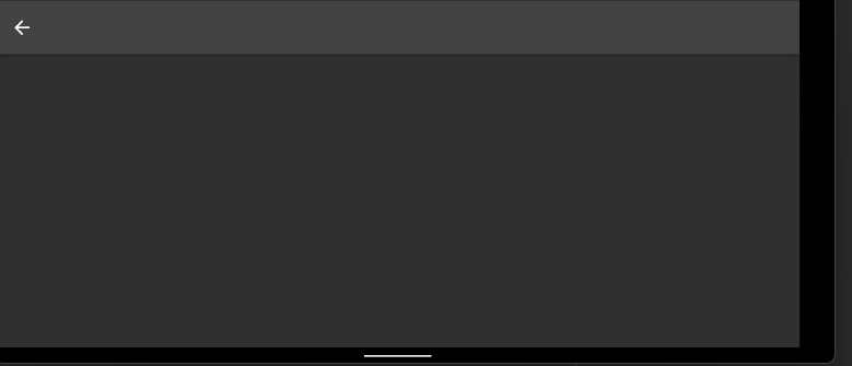
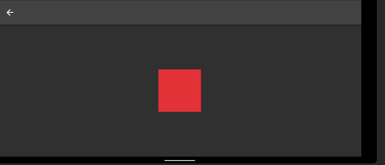
So for a really simple example where you might want to animate a Container appearing onto the screen you can just do the following:
  WidgetAnimator(
    incomingEffect: WidgetTransitionEffects.incomingSlideInFromBottom(),
    child: Container(
      width: 100,
      height: 100,
      color: Colors.blue,
    ),
  )
or maybe you would like it to swing backwards and forwards while displayed
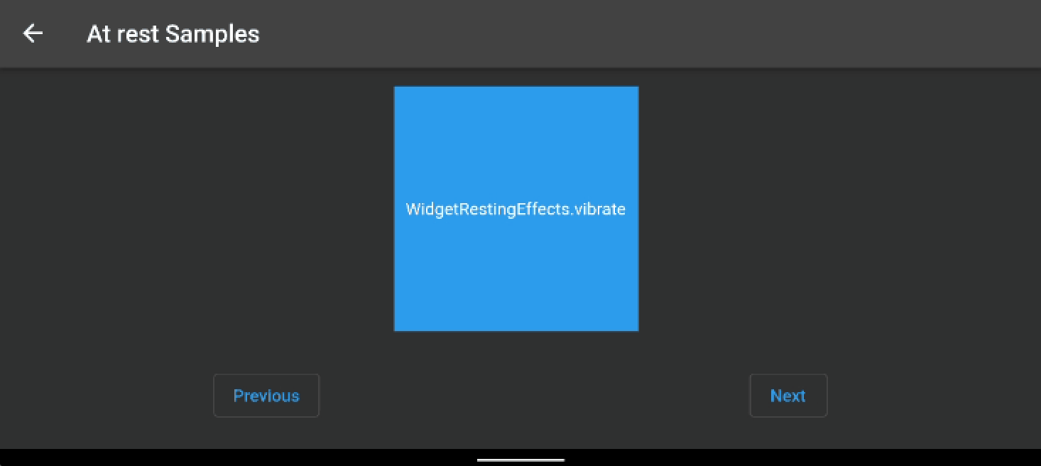
  WidgetAnimator(
    atRestEffect: WidgetRestingEffects.swing(),
    child: Container(
      width: 100,
      height: 100,
      color: Colors.blue,
    ),
  )
The library comes with a collection of constructors such as WidgetTransitionEffects.incomingSlideInFromBottom() to allow for a range of really simple effect to be created with minimal code.
WidgetTransitionEffects are used for both incoming and outgoing effects and WidgetAtRestEffects are used when a widget is at rest.
Extending the two examples above, here's a version where both the incoming and at rest animations are combined :
  WidgetAnimator(
    incomingEffect: WidgetTransitionEffects.incomingSlideInFromBottom(),
    atRestEffect: WidgetRestingEffects.swing(),
    child: FloatingActionButton(
      onPressed: (){},
      tooltip: 'Increment',
      child: const Icon(Icons.add),
    ),
  )
The library comprises of four main Widgets which all have their own purpose:
-
WidgetAnimatorAnimates any widget with effects such as opacity, offset, blur, skew, rotation, scale -
WidgetAnimatorSequenceAnimates a list ofWidgetAnimatoreither based on Time or a user pressing on the widget (or both) -
TextAnimatorCan be used as a direct replacement for the standardTextwidget, giving it animation superpowers -
TextAnimatorSequenceSimilar toWidgetAnimatorSequencebut works onTextAnimatorwidgets
Although you can animate a Text widget easily with the WidgetAnimator, it'll operate on the text as a whole. The reason TextAnimator exists is it allows
for processing effects on each character within a string creating some cool staggered effects. TextAnimator is a wrapper around WidgetAnimator
handling some of the trickier parts of doing this yourself manually.
Here's some examples below:
In the earlier examples WidgetTransitionEffects and WidgetAtRestEffects were used to create some basic effects, but just with some default values. Let's
take a look in more detail at what can be set for each:
| property | description | default |
|---|---|---|
offset |
set up the offset from the position that the widget would normally render, e.g. Offset(50, 20) would render 50 pixels to the right and 20 below the normal location, Offset(-50, -20) would render 50 pixels to the left and 20 above the normal location |
Offset(0,0) |
skew |
Skew, the amount of skew on the X and Y axis e.g. Offset(0.2, 0.5) would be a skew of 0.2 on the X axis and 0.5 on the Y axis |
Offset(0,0) |
scale |
The scale proportion compared to the widgets normal size, the default scale is 1.25x the normal size, use smaller numbers such as 0.5 to decrease the size and values larger | 1 |
blur |
Blur, the amount of blur on the X and Y axis e.g. Offset(2, 5) would be a blur of 2 on the X axis and 5 on the Y axis, note that this effect can be quite performance intensive, so try to limit the amount it's used |
Offset(0,0) |
rotation |
The rotation in radians, so math.pi/0.5 will rotate a full circle, math.pi/6 will rotate a small amount | 0 |
opacity |
An opacity range from 0..1 | 1 |
curve |
A curve for the animation tween the play, Curves.Linear if you want it the animation to play at a constant speed, but you can also use things like Curves.bounce to bounce the effect |
Curve.eastInOut |
builder |
The builder allows you to create your own more complicated version of the animations available by default, find more details about the builders below in the custom animation section |
null |
duration |
The duration the animation should play for | Duration(milliseconds: 300) |
delay |
The length of time before the animation starts to play | null |
There are a collection of default constructors available to make standard effects simple to create:
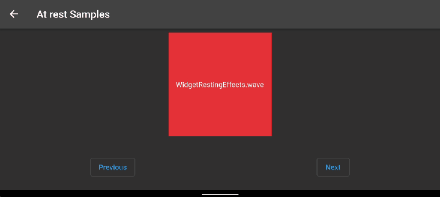
Wave the widget up and then down on it's Y axis
Pulse up and down the opacity of the widget
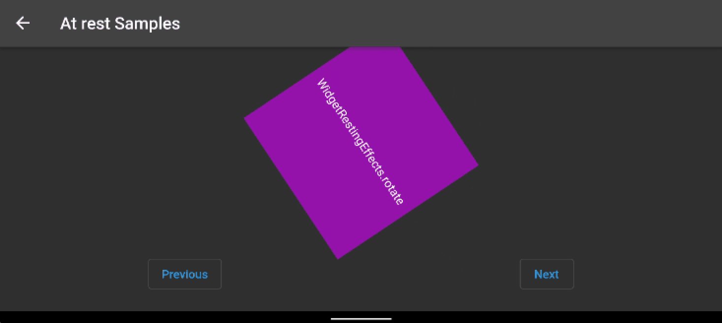
Rotate the widget around 360 degrees
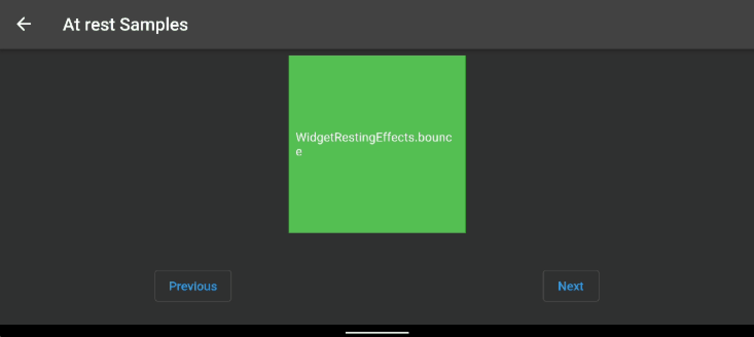
Lift the widget and then bounce it back down
Skew the widget from side-to-side based on a center axis
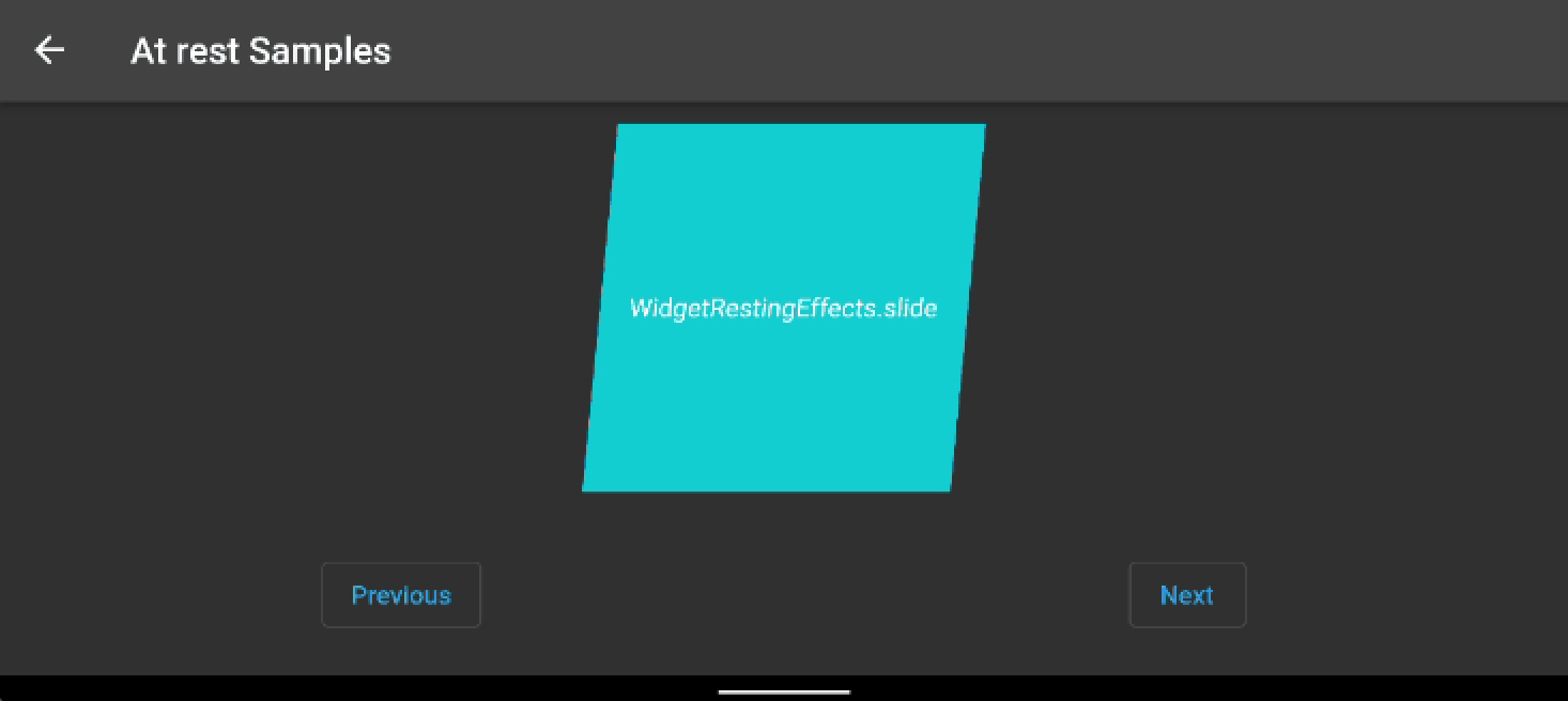
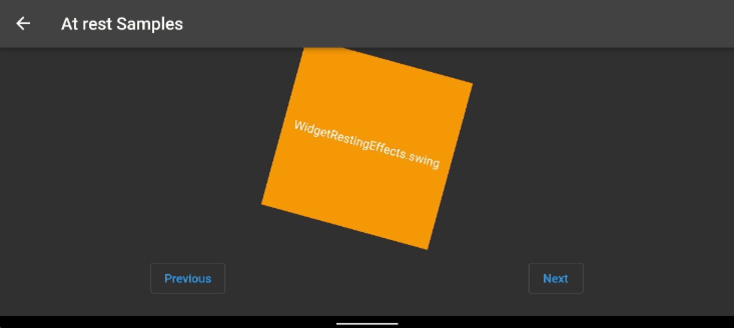
Swing the widget back and forwards using rotation
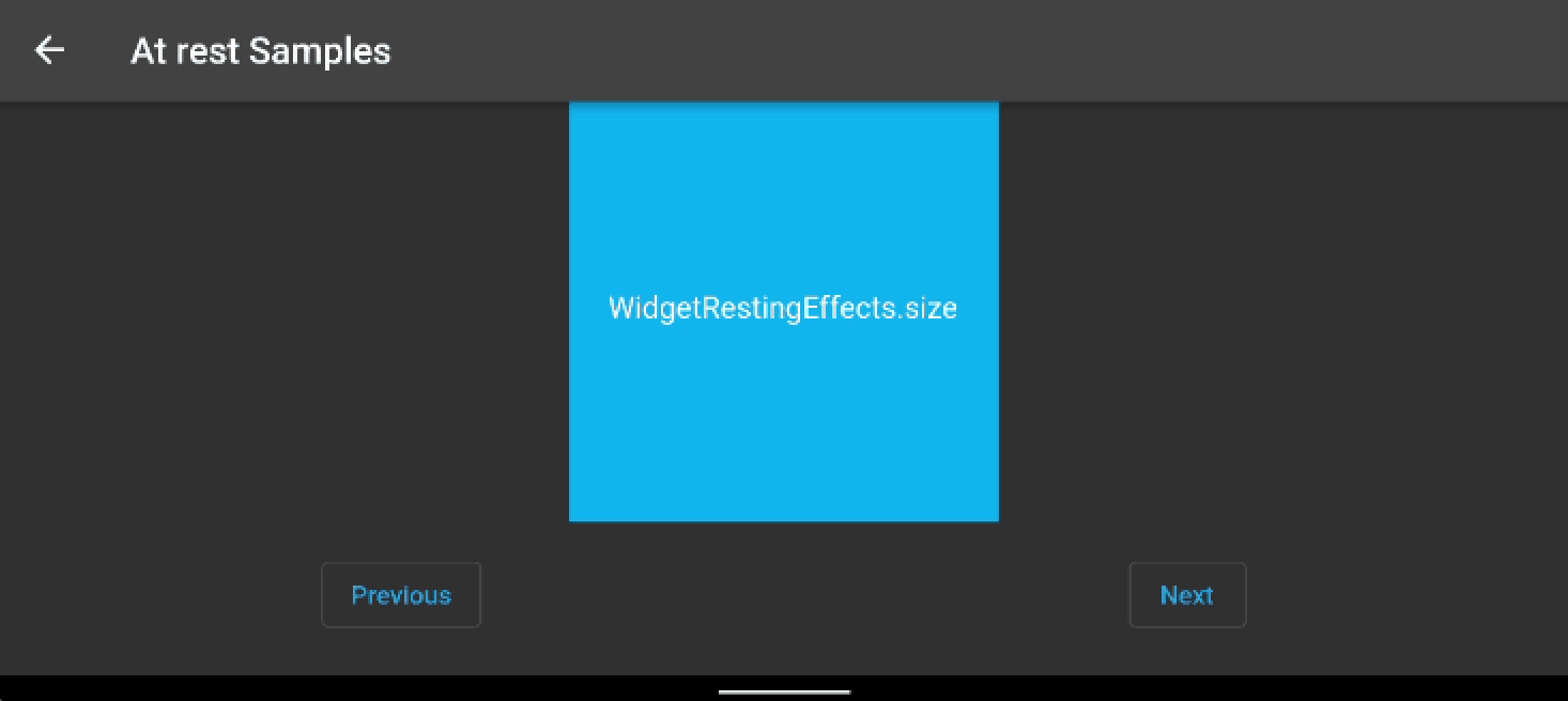
Change the size of the widget, by default larger - effectStrength parameter can make it smaller too
Randomly shuffle the widget on both it's X and Y axis

Skew the widget from side-to-side based on a top center axis
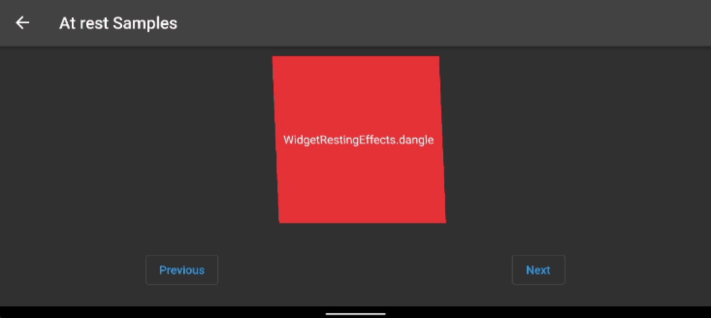
Randomly move the widget from its standard position on the X and Y axis
For more control you can specify a collection of properties into the constructors:
| property | description | default |
|---|---|---|
style |
Style requires an enum from `WidgetRestingEffectStyle' where 10 different effects are available |
WidgetRestingEffectStyle.none |
effectStrength |
Based on the style above, most effects have a default strength for them, for example when using WidgetRestingEffectStyle.fidget the Widget will randomly move about from it's original position. Changing the effectStrength you can increase or decrease the amount of movement that happens |
1 |
alignment |
Used only for skew based effects to change the position that the effect takes place from |
Alignment.center |
numberOfPlays |
The number of times the animation should play before stopping, negative values and null will cause the animation to play forver |
null (ie repeat forever) |
curve |
A curve for the animation tween the play, Curves.Linear if you want it the animation to play at a constant speed, but you can also use things like Curves.bounce to bounce the effect |
Curve.eastInOut |
builder |
The builder allows you to create your own more complicated version of the animations available by default, find more details about the builders below in the custom animation section |
null |
duration |
The duration the animation should play one cycle for | Duration(milliseconds: 600) |
delay |
The length of time before the animation starts to play | null |
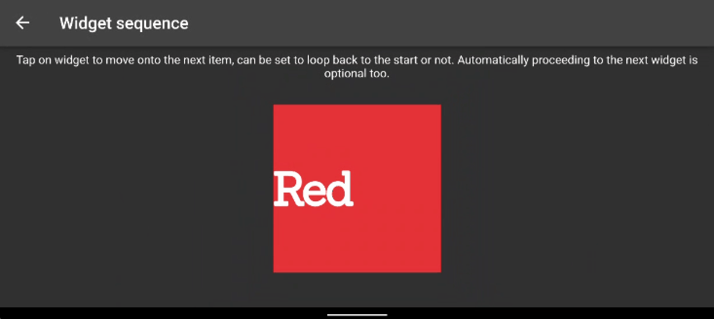
WidgetAnimatorSequence animates a list of WidgetAnimator either based on Time or a user pressing on the widget (or both). .
| property | description | default |
|---|---|---|
children |
A list of WidgetAnimator for the sequence to play against |
null, a list is required |
tapToProceed |
If true allows the user to tap on the widget and proceed to displaying the next child in the list of children |
false |
loop |
Once the list of children has been displayed, does the list loop back to the start | false |
transitionTime |
The length of time to wait between changing the widget once in input transition has completed, not specifying a duration will mean it won't change the sequence automatically | null |
onPressed |
callback function to perform if the widget is pressed on | null |
Here's an example displaying 3 containers that change automatically every 4 seconds and each have their own animation effects
    return WidgetAnimatorSequence(
      children: [
        WidgetAnimator(
            key: const ValueKey('one'),
            incomingEffect: WidgetTransitionEffects.incomingScaleDown(),
            outgoingEffect: WidgetTransitionEffects.outgoingScaleUp(),
            child: Container(width: 200,height: 200,color: Colors.red,child: Align(alignment: Alignment.centerLeft,child: Text('Red',style: GoogleFonts.sanchez(textStyle: const TextStyle(fontWeight: FontWeight.w900, letterSpacing: -2, fontSize: 56)),)))),
        WidgetAnimator(
            key: const ValueKey('two'),
            incomingEffect: WidgetTransitionEffects.incomingSlideInFromLeft(),
            outgoingEffect: WidgetTransitionEffects.outgoingSlideOutToBottom(),
            child: Container(width: 200,height: 200,color: Colors.green,child: Align(alignment: Alignment.centerLeft,child: Text('Green',style: GoogleFonts.sanchez(textStyle: const TextStyle(fontWeight: FontWeight.w900, letterSpacing: -2, fontSize: 56)),)))),
        WidgetAnimator(
            key: const ValueKey('two'),
            incomingEffect: WidgetTransitionEffects(blur: const Offset(2,2), duration: const Duration(milliseconds: 600)),
            atRestEffect: WidgetRestingEffects.slide(),
            outgoingEffect: WidgetTransitionEffects(blur: const Offset(2,2), duration: const Duration(milliseconds: 600)),
            child: Container(width: 200,height: 200,color: Colors.blue,child: Align(alignment: Alignment.centerLeft,child: Text('Blue',style: GoogleFonts.sanchez(textStyle: const TextStyle(fontWeight: FontWeight.w900, letterSpacing: -2, fontSize: 56)),))))
      ],
      tapToProceed: true,
      loop: true,
      transitionTime: const Duration(seconds: 4),
    );
Can be used as a direct replacement for the standard Text widget, giving it animation superpowers. TextAnimator uses WidgetAnimator as its basis for the animation, but splits the text
into characters and words to be able to create some nice effects.
| property | description | default |
|---|---|---|
text |
The [String] of text to display | null, but a string of text is required |
WidgetTransitionEffects |
The incoming effects to play when the text is first shown | null |
WidgetRestingEffects |
The effects to show when the text isn't incoming or outgoing | null |
WidgetTransitionEffects |
the maximum number of lines of text to show within the widget, used in the same way as the standard [Text] widget | null |
maxLines |
The outgoing effects to play when the text is replaced | null |
textAlign |
The [TextAlign] of the text, in the same was it's used in the [Text] widget | null |
textStyle |
The [TextStyle] of the text, in the same was it's used in the [Text] widget | null |
initialDelay |
The length of time to wait before starting to show any of the text | null |
characterDelay |
A delay to leave between each character of text to display to create a staggered text animation effect, if you want words to appear at once, then set a Duration of zero | null |
spaceDelay |
The delay to leave between each word before showing the next. If set the same as the characterDelay the timing will be consistent for all characters. It can be used to drive the timing per word if characterDelay is set to zero |
null |
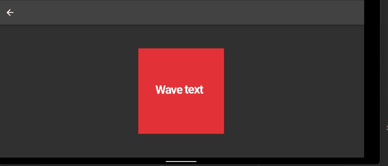
Here's a basic example of some text within a container using the TextAnimator to make the text wave up and down with a delay between each character
  return Container(width: 200, height: 200, color: Colors.red,
    child: TextAnimator('Wave text', atRestEffect: WidgetRestingEffects.wave(),)
  );
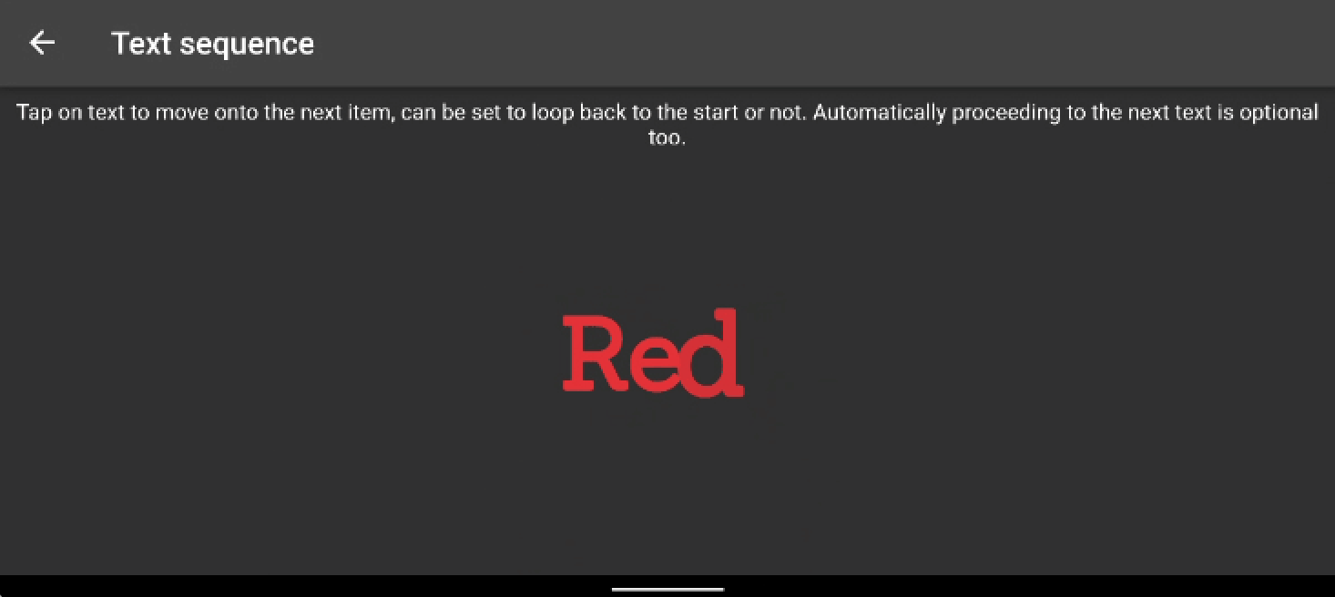
TextAnimatorSequence Animates a list of TextAnimator either based on Time or a user pressing on the text (or both).
| property | description | default |
|---|---|---|
children |
A list of TextAnimator for the sequence to play against |
null, a list is required |
tapToProceed |
If true allows the user to tap on the text and proceed to displaying the next child in the list of children |
false |
loop |
Once the list of children has been displayed, does the list loop back to the start | false |
transitionTime |
The length of time to wait between changing the text once in input transition has completed, not specifying a duration will mean it won't change the sequence automatically | null |
onPressed |
callback function to perform if the text is pressed on | null |
Here's an example which changes between 3 strings of text every 4 seconds or when clicked upon, each with their own incoming and outgoing animation styles
return TextAnimatorSequence(
  children: [
      TextAnimator('Red',
        incomingEffect: WidgetTransitionEffects.incomingScaleDown(),
        atRestEffect: WidgetRestingEffects.bounce(),
        outgoingEffect: WidgetTransitionEffects.outgoingScaleUp(),
        style: GoogleFonts.sanchez(textStyle: const TextStyle(fontWeight: FontWeight.w900, color: Colors.red, letterSpacing: -2, fontSize: 64))),
      TextAnimator('Green',
        incomingEffect: WidgetTransitionEffects.incomingSlideInFromLeft(),
        atRestEffect: WidgetRestingEffects.fidget(),
        outgoingEffect: WidgetTransitionEffects.outgoingSlideOutToBottom(),
        style: GoogleFonts.sanchez(textStyle: const TextStyle(fontWeight: FontWeight.w900, color: Colors.green, letterSpacing: -2, fontSize: 64))),
      TextAnimator('Blue',
        incomingEffect: WidgetTransitionEffects(blur: const Offset(2, 2), duration: const Duration(milliseconds: 600)),
        atRestEffect: WidgetRestingEffects.wave(),
        outgoingEffect: WidgetTransitionEffects(blur: const Offset(2, 2), duration: const Duration(milliseconds: 600)),
        style: GoogleFonts.sanchez(textStyle: const TextStyle(fontWeight: FontWeight.w900, color: Colors.blue, letterSpacing: -2, fontSize: 64))),
  ],
tapToProceed: true,
loop: true,
transitionTime: const Duration(seconds: 4),
);
In a similar way to which widgets such as AnimatedSwitcher work changes are detected on the WidgetAnimator by a change in type of the child widget or by the child widget having a different key, without either of these differences
the Widget will not be aware of the changes that have happened and you'll either miss any outgoing transitions or will have no change in widget at all.
So for example if you have two different coloured containers that you want to switch both would need their own key
  WidgetAnimator(
    incomingEffect: WidgetTransitionEffects.incomingSlideInFromLeft(),
    outgoingEffect: WidgetTransitionEffects.outgoingSlideOutToRight(),
    child: isBlue ? Container(key: ValueKey('blue'), width: 100, height: 100, color: Colors.blue) :
                    Container(key: ValueKey('red'), width: 100, height: 100, color: Colors.red)
  )
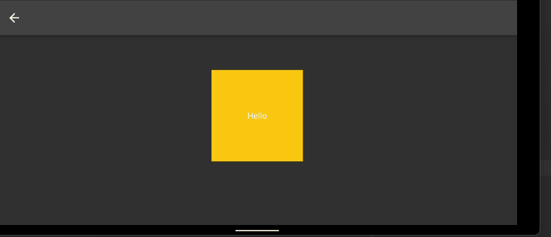
Do you want to create an effect that's not possible with the default effects? Then you may be able to create the effect you want with the builder properties. With these you need to return an AnimationSettings
object and you are then free to define your own animation settings for the properties available. Find an example below which draws a container and while it's at rest moves it in a trianglar pattern by adjusting the x and y
offset over the duration of the animation:
WidgetAnimator(
atRestEffect: WidgetRestingEffects(
duration: const Duration(seconds: 3),
builder: (WidgetRestingEffects effects, AnimationController animationController) {
  AnimationSettings _animationSettings = AnimationSettings(animationController: animationController);
  _animationSettings.offsetYAnimation = TweenSequence<double>(
  [TweenSequenceItem<double>(tween: Tween<double>(begin: 0, end: 150).chain(CurveTween(curve: Curves.easeInOut)),weight: 33.0,),
  TweenSequenceItem<double>(tween: Tween<double>(begin: 150, end: 150).chain(CurveTween(curve: Curves.easeInOut)),weight: 33.0,),
  TweenSequenceItem<double>(tween: Tween<double>(begin: 150, end: 0).chain(CurveTween(curve: Curves.easeInOut)),weight: 33.0,),],
).animate(CurvedAnimation(parent: animationController, curve: Curves.linear));

_animationSettings.offsetXAnimation = TweenSequence<double>(
  [TweenSequenceItem<double>(tween: Tween<double>(begin: 0, end: 80).chain(CurveTween(curve: Curves.easeInOut)),weight: 33.0,),
  TweenSequenceItem<double>(tween: Tween<double>(begin: 80, end: -80).chain(CurveTween(curve: Curves.easeInOut)),weight: 33.0,),
  TweenSequenceItem<double>(tween: Tween<double>(begin: -80, end: 0).chain(CurveTween(curve: Curves.easeInOut)),weight: 33.0,),],
).animate(CurvedAnimation(parent: animationController, curve: Curves.linear));

return _animationSettings;
},),
child: Container(
  width: 200,
  height: 200,
  color: Colors.amber,
  child: const Center(
  child: Padding(
  padding: EdgeInsets.all(8.0),
  child: Text('Hello'),
  )),
),
)
This widget can be used as a direct replacement for the GestureDetector. It only covers basic onTap gestures, but allows you to animate effects on the widget pressed with just a few properties:
| property | description | default |
|---|---|---|
duration |
The [Duration] of the animation | 150 milliseconds |
curve |
The animation curve to use | Curves.linear |
scaleSize |
The size to reduce or increase by when the gesture is triggered | 0.9 |
yOffset |
The amount of pixels to offset up or down the screen | 0 |
xOffset |
The amount of pixels to offset across the screen | 0 |
blurX |
The amount of blur on the x axis to apply to the child |
0 |
blurY |
The amount of blur on the y axis to apply to the child |
0 |
skewX |
The amount of skew on the x axis to apply to the child |
0 |
skewY |
The amount of skew on the y axis to apply to the child |
0 |
rotation |
The amount to rotate the child widget when the gesture is triggered | 0 |
opacity |
The amount of opacity to trigger when the gesture is triggered | 0 |
hapticFeedback |
The haptic feedback style to trigger when the gesture is triggered, this is useful if using triggerOnTapAfterAnimationComplete otherwise doing the haptic feedback in the onTap will seem delayed |
null |
triggerOnTapAfterAnimationComplete |
Delay triggering the onTap callback until after the animation has played, otherwise you may not see much of the animation if navigating to another page |
false |
onTap |
The code to call when a user taps on the widget | null |
child |
The child widget to render | null |
Here's a basic example of some text within a container using the TextAnimator to make the text wave up and down with a delay between each character
  return GestureAnimator(
    curve: Curves.easeInOut,
    scaleSize: 0.9,
    yOffset: -5,
    duration: const Duration(milliseconds: 150),
    // blurX: 2,
    // blurY: 2,
    // numberOfPlays: 4,
    // rotation: pi / 16,
    // skewX: 0.2,
    opacity: 0.8,
    hapticFeedback: HapticFeedback.selectionClick,
    triggerOnTapAfterAnimationComplete: true,
    onTap: (){
      Navigator.of(context).push(Samples.route());
    },
    child: Padding(
        padding: const EdgeInsets.all(8.0),
        child: Container(color: Colors.green, child: const Padding(
        padding: EdgeInsets.all(12.0),
        child: Text('Do not push me!'),
      ),),
),);For more examples check out the example project on github.
If you come across any issues, please check out the outstanding issues here and raise a new issue if required.
Pull requests welcome, new feature suggestions can be created here
If you appreciate this package, you may buy me a coffee...