Multiple tabs within an IssueishPaneItem #1656
Comments
|
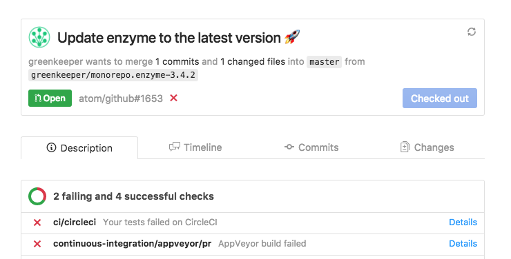
Should the CI checks be under description? Also toying with the idea of reverse the order:
Like in the context of an editor, the changes get the biggest focus. |

|
Exciting to see the PR features taking shape! I'm curious about the reasoning behind separating "Description" and "Timeline" as opposed to showing them in the same tab like we do on dotcom (under "Conversation"):
I'm all for deviating from dotcom where it makes sense, like @simurai is suggesting with reversing the order. Just want to understand the logic behind the deviation. Personally, I like the "Conversation" tab we have on the website with both the description and then any timeline events because it does feel like a conversation to me. I'm not super attached to this though. Reversing the order is an interesting suggestion. I'm not sure which I prefer at this point. This is definitely something I'd like to get some UXR data on. |

In my original write-up? Totally arbitrary, haha. I think it was mostly to have a nice even four items. Do we just want to take the conversation / commits / checks / files changed headers from dotcom, and then add in reviews later? It might be jarring to start synced up and then immediately deviate. But I do kind of like that breakdown, and it's be nice to have that instant familiarity with what users would expect to see where.
Me neither! I kind of default to wanting to start consistent in order as well? |
|
ok so another question...if we go for Conversations, Commits, Checks, Files Changed, are we going to support the Checks api since that's what lives on that tab in dotcom? Or do we just stuff the CI status checks that already exist in GitHub package on that tab? |
Yeah, the familiarity is a big plus. At the same time it could lead to confusion and frustration. If people see the same navigation as on .com, they might expect the same functionality when clicking the tabs. People will be like "Ohh.. right. I can't do this here" and the more this happens, the less they trust these tabs. If we copy .com, we kinda have to copy 100% of it. Like putting an iframe in the center pane. So by not doing the same as on .com, we can better manage expectations and it doesn't feel strange if some parts are missing or are different. This question about how close should it be to .com comes up from time to time, and we haven't really found a clear answer. Lately I started to lean more towards not trying to make it close to .com. Mainly because of our team size, it seems impossible to ever catch up. But also if we don't copy .com 1:1, it leaves some room to do things that are not possible on .com and only make sense in the context of an editor. I know, much easier said than done. 😅 |
Yeah, that's a really good point. It already feels low-key not-great that you can't comment from the Atom pane item, or add labels, etc.
Oh, yeah, hmm. It would be awesome to have proper checks support eventually! Being able to jump directly to the line where a linter failed (say) would be really handy. But you're right that that would be a bigger chunk of work to support. Maybe we could go with putting the existing status summary in a Status tab and open a new issue to enhance it with checks? |
|
okay, so:
Which leaves our tab list as:
With these tabs to be added in future PRs:
|
I like "Overview". 👍 👍 👍 Then we can change the content in the future without having to change the label. It will always stay the "overview of a PR". We could also consider keeping the build status in the Overview. Since it's something people might want to check often and wouldn't need to do an extra click. It also doesn't take up THAT much height. Then the tabs would initially only be |
To pave the way for pull request review display, let's split the IssueishPaneItem's timeline into a series of tabs, each containing a subview of the pull request:
We can render them horizontally in the workspace center and accordion-style when docked.
The text was updated successfully, but these errors were encountered: