

An easy to use and customizable welcome screen for Android apps.
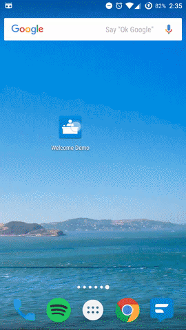
Look in the sample to see how the above welcome screen is defined. (It runs smoothly, the gif is just choppy)
Features
- Fully customizable
- RTL support
- Ability to use built in layouts or custom fragments
This library is available through jCenter.
Gradle:
compile 'com.stephentuso:welcome:0.7.1'If you use proguard, add the following to your proguard rules
-keepclassmembers class * extends com.stephentuso.welcome.ui.WelcomeActivity {
    public static java.lang.String welcomeKey();
}
To create a welcome screen, add a class to your project that extends WelcomeActivity and add it to AndroidManifest:
<activity android:name=".MyWelcomeActivity"
    android:theme="@style/WelcomeScreenTheme"/>
You must set the theme in the manifest as shown above if you want swipeToDismiss to show the activity beneath. Note that the manifest theme will be overridden and have no effect on the other styles of the welcome screen (that will probably change in 1.0).
Override the Activity's configuration() method. You can use WelcomeScreenBuilder to easily set it up, for example:
@Override
protected WelcomeScreenConfiguration configuration() {
    return new WelcomeScreenBuilder(this)
            .theme(R.style.WelcomeScreenTheme_Light)
            .defaultBackgroundColor(R.color.background)
            .titlePage(R.drawable.logo, "Title")
            .basicPage(R.drawable.photo1, "Header", "More text.", R.color.red)
            .basicPage(R.drawable.photo2, "Lorem ipsum", "dolor sit amet.")
            .swipeToDismiss(true)
            .build();
}
Note: Default typeface methods and defaultBackgroundColor() need to be called before adding pages.
Welcome screens are started with WelcomeScreenHelper. onSaveInstanceState is needed to be sure only one instance of the welcome screen is started. Add the following to the Activity you want to show the welcome screen before (probably your launcher activity):
WelcomeScreenHelper welcomeScreen;

@Override
protected void onCreate(Bundle savedInstanceState) {
    ...
    welcomeScreen = new WelcomeScreenHelper(this, MyWelcomeActivity.class);
    welcomeScreen.show(savedInstanceState);
    ...
}

@Override
protected void onSaveInstanceState(Bundle outState) {
    super.onSaveInstanceState(outState);
    welcomeScreen.onSaveInstanceState(outState);
}
If you have issues with the buttons/indicator being covered by the nav bar, use one of the .SolidNavigation welcome screen themes.
To force the welcome screen to be shown, for example, to let the user view it again when a button is pressed, create a WelcomeScreenHelper as shown above and call .forceShow().
By default, the welcome screen can be skipped, and pressing the back button will navigate to the previous page or close (skip) the welcome screen if on the first page. This can be changed with WelcomeScreenBuilder.canSkip(), backButtonSkips() (only applies if canSkip is true), and backButtonNavigatesPages(). If you disable skipping, the welcome screen will not be stored as completed when it closes.
If you want to require users to navigate through the welcome screen before using the app, call canSkip(false) and close your app if the welcome screen's result is RESULT_CANCELED.
See Results below for how to respond if a welcome screen is canceled.
All methods shown in this section are part of WelcomeScreenBuilder. See the javadoc for more info on each.
A page with an image and a title. A parallax effect can be applied to the image.
titlePage(int resId, String title)
titlePage(int resId, String title, int colorResId)
titlePage(int resId, String title, int colorResId, boolean showParallaxAnim)
titlePage(int resId, String title, int colorResId, boolean showParallaxAnim, String titleTypefacePath)A page with an image, heading, and description. A parallax effect can be applied to the image.
basicPage(int resId, String title, String description)
basicPage(int resId, String title, String description, int colorResId)
basicPage(int drawableId, String title, String description, int colorResId, boolean showParallaxAnim)
basicPage(int drawableId, String title, String description, int colorResId, boolean showParallaxAnim,
String headerTypefacePath, String descriptionTypefacePath)Similar to the basic page, but instead of an image you can supply a layout that will have a parallax effect applied to it. The speed at which the layout's children move is determined by their position in the layout, the first will move the slowest and the last will move the fastest.
parallaxPage(int resId, String title, String description)
parallaxPage(int resId, String title, String description, int colorResId)
parallaxPage(int resId, String title, String description, int colorResId, float startParallaxFactor,
    float endParallaxFactor)
parallaxPage(int resId, String title, String description, int colorResId, float startParallaxFactor,
float endParallaxFactor, String headerTypefacePath, String descriptionTypefacePath)Applies a parallax effect in the same way the normal parallax page does, but the layout you provide fills the whole fragment, and there isn't a header or description.
fullScreenParallaxPage(int resId)
fullScreenParallaxPage(int resId, int colorResId)
fullScreenParallaxPage(int resId, int colorResId, float startParallaxFactor, float endParallaxFactor)You can add your own fragments to the welcome screen with WelcomeScreenBuilder.page():
@Override
protected WelcomeScreenConfiguration configuration() {
    return new WelcomeScreenBuilder(this)
            ...
            .page(new WelcomeFragmentHolder() {
                @Override
                protected Fragment fragment() {
                    return new YourFragmentHere();
                }
            }, R.color.background-color)
            ...
}
See animations below for adding animations to custom fragments.
The provided themes are listed below.
Transparent status/navigation on API 19+. Content does not flow under status bar:
WelcomeSceenTheme- The default theme. For use with dark backgrounds; the text, indicator, and buttons are light colored.WelcomeScreenTheme.Light- For use with light backgrounds; the text, indicator, and buttons are dark colored.
Transparent status bar, solid navigation bar on API 19+. Content does not flow under status bar:
WelcomeScreenTheme.SolidNavigationWelcomeScreenTheme.Light.SolidNavigation
Transparent status bar, solid navigation bar on API 19+. Content flows under status bar:
WelcomeScreenTheme.SolidNavigation.UnderStatusBarWelcomeScreenTheme.Light.SolidNavigation.UnderStatusBar
Typefaces and a few other things (animations, button visibility) have to be set with WelcomeScreenBuilder, but everything else that is customizable can be changed with styles.
You can add styles as shown below. Optional items are in square brackets. Apply your theme to a welcome screen with WelcomeScreenBuilder.theme(R.style.YourThemeNameHere).
<style name="CustomWelcomeScreenTheme" parent="SEE THEMES ABOVE">

    <!-- Color of button text and titles/headings (in built in fragments)
        By default, this is also the color of the done/next button -->
    <item name="android:textColorPrimary">color</item>
    <!-- Color of other text
        By default, this is used for the skip button text color -->
    <item name="android:textColorSecondary">color</item>

    <!-- ** Button styles ** -->
    <!-- Background is applied to all buttons,
        to change a specific button background use the individual button styles -->
    <item name="welcomeButtonBackground">drawable</item>
    <!-- Done/skip button text -->
    <item name="welcomeButtonSkipText">string</item>
    <item name="welcomeButtonDoneText">string</item>
    <!-- Individual button styles -->
    <item name="welcomeButtonSkipStyle">@style/MyButtonSkip</item>
    <item name="welcomeButtonNextStyle">@style/MyButtonNext</item>
    <item name="welcomeButtonDoneStyle">@style/MyButtonDone</item>

    <!-- The drawable or color to fade to if swipeToDismiss is enabled -->
    <item name="android:windowBackground">drawable|color</item>

    <item name="welcomeIndicatorStyle">@style/MyWelcomeIndicator</item>
    <item name="welcomeDividerStyle">@style/MyWelcomeScreenDivider</item>

    <item name="welcomeNormalTextStyle">@style/MyNormalText</item>
    <item name="welcomeLargeTextStyle">@style/MyLargeText</item>
    <item name="welcomeTitleTextStyle">@style/MyTitleText</item>

    <!-- Add the following if you want to show the action bar.
        Use WelcomeScreenBuilder.showActionBarBackButton(true) to show
        the back button. -->
    <item name="windowActionBar">true</item>
    <item name="windowNoTitle">false</item>
</style>

<style name="MyWelcomeIndicator" parent="WelcomeScreenPageIndicator[.Light]">
    <item name="indicatorColor">color</item>
    <item name="currentPageColor">color</item>
    <item name="animated">true|false</item>
</style>

<!-- Use this to change the next button's image/color
    To support RTL, add this in values-ldrtl/styles with an image facing left -->
<style name="MyButtonNext" parent="WelcomeScreenButton.Next">
    <item name="android:src">drawable</item>
    <item name="android:tint">color</item>
</style>

<style name="MyButtonSkip|MyButtonDone" parent="WelcomeScreenButton(.Skip|.Done)">
    <item name="android:textColor">color</item>
</style>

<!-- A divider that is directly above the buttons/indicator.
The background color is transparent by default -->
<style name="MyWelcomeScreenDivider" parent="WelcomeScreenDivider[.Dark|.Light]">
    <item name="android:background">drawable|color</item>
    <item name="android:layout_height">dimen</item>
</style>

<!-- The following can apply to any of the three text styles -->
<style name="MyText" parent="WelcomeScreenText[.Large|.Title][.Centered]">
    <!-- Add any properties that can be applied to a TextView -->
</style>
If you want to use multiple welcome screens (in different parts of your app) or have updated one and want to show it again, you can assign keys (Make sure they are unique!) to welcome screens by adding the following to your welcome screen Activity.
public static String welcomeKey() {
    return "Your unique key";
}
Note: Only change this to a new value if you want everyone who has already used your app to see the welcome screen again! This key is used to determine whether or not to show the welcome screen.
You can listen for the result of a welcome screen in the Activity that started it by overriding onActivityResult:
@Override
protected void onActivityResult(int requestCode, int resultCode, Intent data) {
    super.onActivityResult(requestCode, resultCode, data);


    if (requestCode == WelcomeScreenHelper.DEFAULT_WELCOME_SCREEN_REQUEST) {
        // The key of the welcome screen is in the Intent
        String welcomeKey = data.getStringExtra(WelcomeActivity.WELCOME_SCREEN_KEY);

        if (resultCode == RESULT_OK) {
            // Code here will run if the welcome screen was completed
        } else {
            // Code here will run if the welcome screen was canceled
            // In most cases you'll want to call finish() here
        }

    }

}
One use for this is making sure users see the whole welcome screen before using your app - disable skipping and then close your main activity when the welcome screen is canceled.
Animations that play as pages are scrolled can be added to your custom fragments by implementing WelcomeScreenPage.OnChangeListener. As an example, a fade effect is shown below.
@Override
public void onScrolled(int pageIndex, float offset, int offsetPixels) {
    if (Build.VERSION.SDK_INT >= 11 && imageView != null) {
        imageView.setAlpha(1-Math.abs(offset));
    }
}
To add parallax effects similar to the included parallax page, use WelcomeUtils.applyParallaxEffect() in onScrolled. For example:
@Override
public void onScrolled(int pageIndex, float offset, int offsetPixels) {
    if (parallaxLayout != null)
        WelcomeUtils.applyParallaxEffect(parallaxLayout, false, offsetPixels, 0.3f, 0.2f);
}- Complete PreferenceWelcomeFragment
- Improve layouts of included fragments
- Refactor/clean up code and improve API
- Unit tests
Copyright 2015-2016 Stephen Tuso

Licensed under the Apache License, Version 2.0 (the "License");
you may not use this file except in compliance with the License.
You may obtain a copy of the License at

   http://www.apache.org/licenses/LICENSE-2.0

Unless required by applicable law or agreed to in writing, software
distributed under the License is distributed on an "AS IS" BASIS,
WITHOUT WARRANTIES OR CONDITIONS OF ANY KIND, either express or implied.
See the License for the specific language governing permissions and
limitations under the License.