Modal would be more useful with a dismiss method that accept a reason of type any
#59
Comments
|
After thinking about it, this could be done via a Custom Event that can be dispatched. For the dismiss "reason", we might need an extra bindable property that can be named So the Modal Custom Component could add the @customElement('abt-modal')
export class BootstrapModal {
// ...
// a new property to hold the modal data or the dismiss reason
@bindable({ defaultBindingMode: bindingMode.twoWay }) data: any;
// dismiss method, can be called by visibleChanged false
private dismiss() {
this.modal.dispatchEvent(new CustomEvent(`dismiss`, {
bubbles: true,
detail: this.data // or dismissReason
}));
}
// when modal is hiding, we can call the dismiss function
private visibleChanged(newValue: string | boolean) {
// ...
$(this.modal).modal('hide');
this.dismiss();
}Then in the code, we could use it this way in the View <abt-modal open-by="showTransactionEdit" dismiss.delegate"addItemToGrid($event.detail)">And in the ViewModel (.ts) export class MyClass {
addItemToGrid(newItem) {
// newItem is the data coming from the modal form (or in other word the dismiss reason)
console.log('New Item Object: ', newItem);
}
}If it's too confusing, I can maybe make a PR |
|
@ghiscoding <abt-button id="eventsModal">
Launch demo modal
</abt-button>
<!-- Modal -->
<abt-modal open-by="eventsModal" bs-show.call="showEvent()" bs-hide.call="hideEvent()">
<abt-modal-header>
<abt-modal-title class="modal-title-aurelia">
<h5>Aurelia Toolbelt Dialog</h5>
</abt-modal-title>
</abt-modal-header>
<abt-modal-body>
<div class="container">
Check Browser
<b>console</b>
</div>
</abt-modal-body>
</abt-modal>export class BootstrapListGroup {
private showEvent() {
console.log('Modal show');
}
private hideEvent() {
console.log('Modal hide');
}
} |
|
If the above-mentioned approach does not suffice, I would be more than happy to accept your PR. |
|
@shahabganji As far as I know, For example, let say that the parent window is a User List which has a modal component to create a new User, once the User is created and saved, I would like to pass this object (form data) back to the User List (parent window) and update the User List with this new user (without refreshing the entire User List). Most of the code is shown in my previous post. I can look at creating a PR in the coming days. Thanks |
|
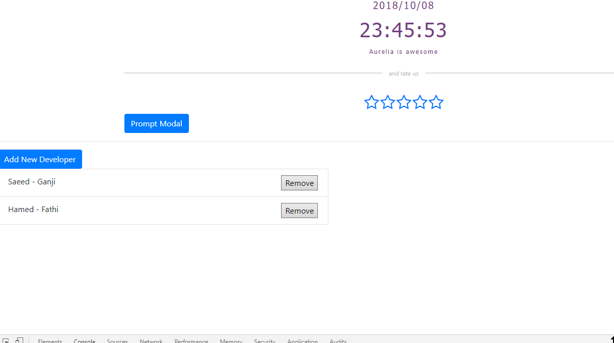
I made my hands dirty on
interface IUser {
  firstName: String;
  lastName: String;
}

export class BootstrapModalDemo {
  private showModal = false;

  private user: IUser = { firstName: '', lastName: '' };
  private users: Array<IUser> = [
    { firstName: 'Saeed', lastName: 'Ganji' },
    { firstName: 'Hamed', lastName: 'Fathi' }
  ];

  private dismiss(data: IUser) {
    this.user = data;

    let u = {};
    Object.assign(u, data);
    this.users.push(<IUser>u);
  }
} <ul>
<li repeat.for="usr of users">
${usr.firstName} - ${usr.lastName}
</li>
</ul>
<abt-button id="btnPersonModal">
Show Person Modal
</abt-button>
<abt-modal dismiss.delegate="dismiss($event.detail)" open-by="btnPersonModal" data.bind="user">
<abt-modal-header>
A modal with dismiss event handled
</abt-modal-header>
<abt-modal-body>
<div>
<label>
First Name:
</label>
<input value.bind="user.firstName" />
<label>
Last Name:
</label>
<input value.bind="user.lastName" />
</div>
</abt-modal-body>
</abt-modal>Now, may I ask you to describe more why there is such a requirement? Because I guess that it is possible to easily change Object.assign(u, data);to Object.assign(u, this.user);
|
|
@shahabganji
<compose view-model="./create"></compose>So I don't have direct access to the I'm not sure this is ideal but I manage to do it this way: From a User List (parent component), I use <template>
<compose view-model="./createUser"></compose>
<div class="container">
<div class="alert alert-info" show.bind="newTransaction">
<strong>New User:</strong> ${newUser | stringify}
</div>
</div>
<h4>User List</h4>
Create User (ts) / Modal Componentimport { autoinject, bindable } from "aurelia-framework";
import { UserDataService } from "./userDataService";
import { UserList } from './userList';
@autoinject()
export class CreateUser {
constructor(private userList: UserList, private userDataService: UserDataService) { }
save() {
// hide the modal & pass new created user to the user list parent component
this.showCreateModal = false;
this.list.newTrsn = this.transaction;
}
}
Create User (ts) / Modal ComponentWe can use DI to inject the UserList (parent component) @autoinject()
export class CreateUser {
bind(bindingContext, overrideContext) {
this.parent = overrideContext.parentOverrideContext.bindingContext;
}
save() {
// hide the modal & pass new created user to the user list parent component
this.showCreateModal = false;
this.parent.newTrsn = this.transaction;
}
}
User List (parent html)<template>
<compose view-model="./createUser" model.bind="thisList"></compose>
</template>User List (parent ts)export class TransactionList {
thisList = this;then use Create User (ts) / Modal ComponentWe can use DI to inject the UserList (parent component) @autoinject()
export class CreateUser {
activate(parentelement) {
this.parent = parentelement;
}
save() {
// hide the modal & pass new created user to the user list parent component
this.showCreateModal = false;
this.parent.newTrsn = this.transaction;
}
}Final WordConsidering, I found today how to access the Parent Component (user list) as number 3-5 shows. I'm wondering if I did not make any big projects yet with Aurelia, so I'm wondering what is the best approach to use in this case. I think number 3 might not be good to use, but 4 and 5 look interesting. What are your thoughts and do you see more reasons to use the Thanks for all :) oh by the way, what are you using to show Aurelia HTML code in GitHub? I use the 3 backticks |
|
This week, unfortunately, I am so busy. I will deep dive into what you just said, however, I had an idea of integrating what do you think? any suggestions? |
|
@shahabganji I actually never tried the Aurelia-Dialog, I was not sure if it was a simple dialog or a modal component. I also have to admit that so far, all the Aurelia project is for personal use since my work decided to go with Angular (which I disagreed and tried to push for Aurelia). So I'm a bit limited on the Aurelia knowledge and usage but I'm trying hard :) |
|
This is a working sample of I am trying to come up with a solution. |
 shahabganji
changed the title
shahabganji
changed the title
dismiss method that accept a reason of type anydismiss method that accept a reason of type any
|
I have integrated In docs scroll down to find a working sample, like your above-mentioned sample I guess, and a prompt dialog also. Feel free to reopen this thread, if you hit any bug. version 1.1.0 released on npm too. |
|
Wow very nice, it looks like exactly what I need, thank you so much. 😃 |
|
@ghiscoding can you provide me some feedbacks, sounds other developers have some problems with the new release, would you mind check it with your own project ? |
|
@shahabganji
|
shahabganji
changed the title
dismiss method that accept a reason of type anydismiss method that accept a reason of type any
|
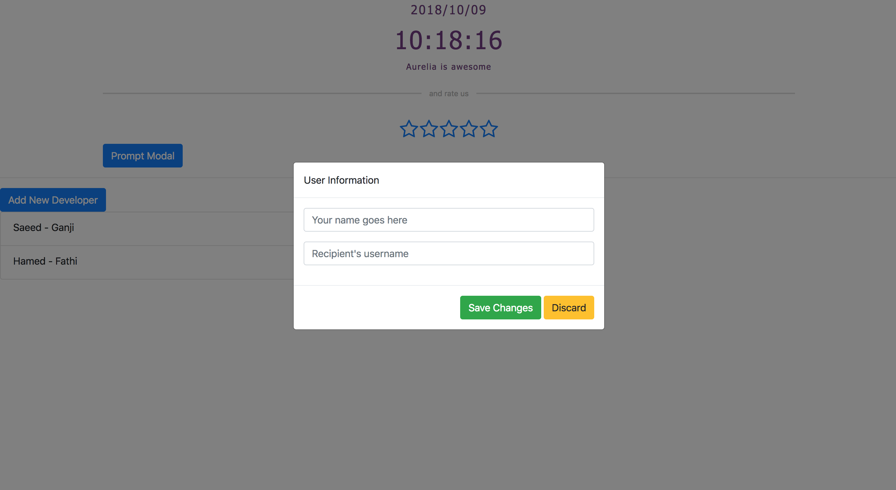
@shahabganji So I got the Prompt See below for a demo, when I click "Add Developper", it looks like it's a hidden (or white) modal dialog, I cannot click on the button in the back and I have to click "ESC" on my keyboard to get the rest of the window working again.
|
|
I'll check it today
No, it does not, I used a custom renderer Edit 1: Just a quick look I guess you must comment these lines, however I let you know exactly what's the problem |
|
The root cause of the issue is exactly what I thought ☝️ , you don't need to configure aurelia-dialog plugin, we are using its BTW, after commenting the codes in your <template>
<abt-modal>
<abt-modal-header>${question}</abt-modal-header>
<abt-modal-body>
<form submit.trigger="controller.ok(answer)">
<input type="text" value.bind="answer" style="width: 100%; line-height: 16px; font-size: 16px" attach-focus>
</form>
</abt-modal-body>
<abt-modal-footer>
<button click.trigger="controller.cancel()">Cancel</button>
<button click.trigger="controller.ok(answer)">Ok</button>
</abt-modal-footer>
</abt-modal>
</template>Maybe, we need to mention that developers need NOT to configure
|
|
@shahabganji EDIT |
Started using your great library and it's working great, however it would be even better if the Modal Component could have a
dismiss(reason: any)(or close) method. As for example, I am working on a modal window that has a form and I need to be able to use the form data into the parent. For a better example, let say we have a user which create an item and once the item is saved, we close the modal window and we use the object returned by the server to refresh the grid (without refreshing the entire grid, we just add that 1 object to the grid via typescript).I'm not totally sure on how to implement in your component but if we look at ng-bootstrap, they have the dismiss method. In their example, click on "Launch demo modal" and then click on the "Save" button and you will see the text "Closed with: Save click" appearing on the parent window via the
dismiss(reason: any)method.Currently your Modal Component can only be closed via the View, I don't see how to close the modal window in ViewModel (.ts) code.
For now, I guess I could do the same via an Event Aggregator, something like
this.ea.publish('onItemCreated', this.item);, but that would be great if the Modal Component support thedismiss(reason: any)method internally.The text was updated successfully, but these errors were encountered: