Bar graph visualization of graffiti "incidents" and corresponding cleanup efforts in NYC (2010-2011). The original data set can be accessed via the [NYC socrata open data portal] (https://nycopendata.socrata.com/Other/Graffiti-Locations/2j99-6h29).
Files in the repo represent the data (spreadsheets culled from the link above), R code (for reformating and transforming data) and the html/js markup for presenting the final time series visualization from these data.
Further explanation can be found in the step-by-step below.
View the project as rendered on this git page: http://auremoser.github.com/graphitiTime
From the NYC.gov open data portal, I selected a dataset logging the location of graffiti incidences in the 5 boroughs (including address, borough, community board, police precinct, city council district). The CSV that I exported and then loaded into Excel also included individual rows for each of the number of incidences and then the number and location of responses (clean up) of incidents mapped to the same locations. For the purpose of simplicity, I eliminated specific address data and focused on the boroughs, deciding that my visualization would represent the amount of graffiti vandalism per borough, and then the relative responsiveness of authorities to incidences, as indicated by the amount of comparative cleaning incidences that were logged.
My interest was recreational but my procedure for data cleaning could apply to other NYC gov datasets as accessed through socrata and visualized through a time series bar graph (or other graph in the HighCharts/JS family. My descriptions are a bit exhaustive but only for clarity.
![4 borroughs bar graphs] (https://raw.github.com/auremoser/images/master/Screen%20Shot%202012-10-15%20at%201.21.36%20AM.png)
To organize the data, I split the date field into multiple columns by selecting the whole column and setting my column separators to parse out the Month day and Year (eliminating the arbitrary times). I then renamed the columns to Created/ Closed Months, Days, and Years. I then loaded all of the graffiti location data into R for joining and cleanup, renamed the graffiti data columns, then pasted together the Month and Year data separated by an “_"; set up the sql data frame to organize by the data by created date and then by borough for the Created (here meaning, the date the tag/graffiti was registered as an "incident") portion of the incidents, echoing the same for the Closed date. I split the boroughs into separate files using a plyr library so that I could create separate bar graphs for each borough (illustrating the monthly incidences of graffiti vandalism vs. the monthly incidences of graffiti cleaning, per borough, over the course of a year). I merged the Created and closed tables by date, privileging the created dates because there was an extraneous count of “NA” counts in the cleaning data. This was likely a count of incidences unassociated with a borough (probably the amount of untreated incidences which I eliminated as it might included rollover data from the previous calendar year).
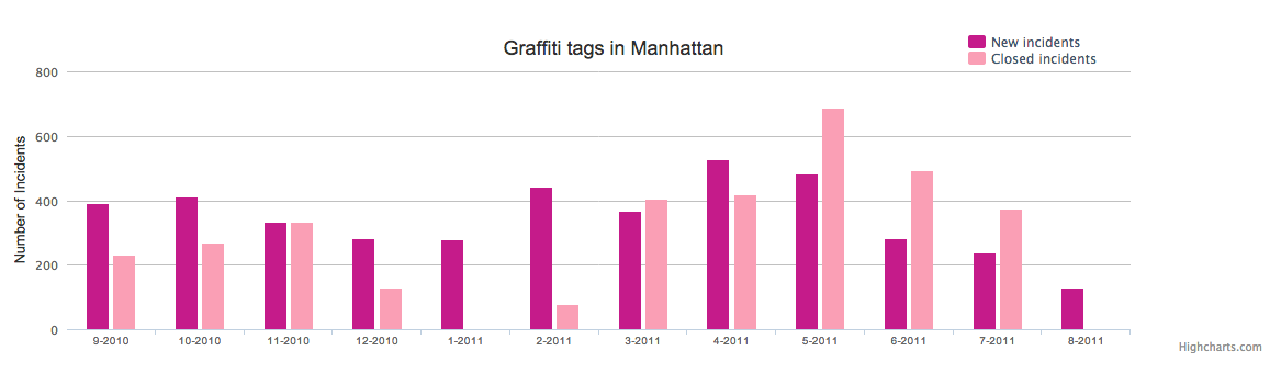
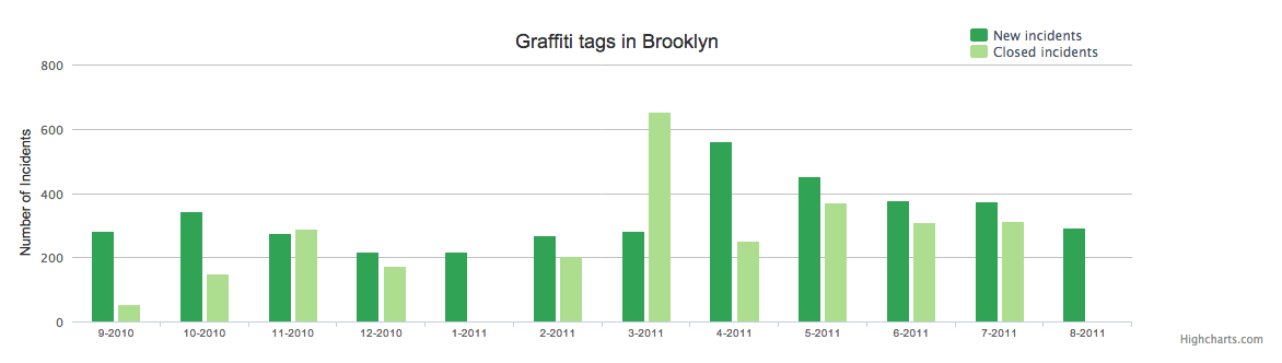
![Manhattan bar graph] (https://raw.github.com/auremoser/images/master/Manhattan.png) ![Brooklyn bar graph] (https://raw.github.com/auremoser/images/master/Bklyn.png)
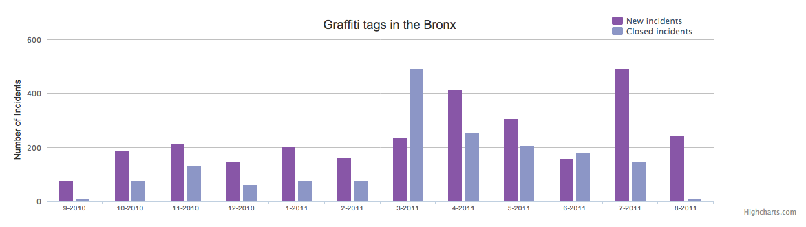
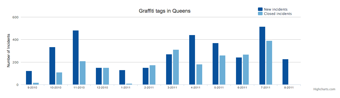
To visualize the data, I loaded up JQuery and HighCharts and Miso-Dataset.js as libraries into an html page. I borrowed some sample scripts form the High Charts Miso Bar Charts pages, and edited it to reflect font and color scheme that I found appropriate, creating a fetch function to get datasets by borough and then render them to separate divs on the html page. The resulting charts are 4 charts by borough, logging ‘# of incidences’ on the y-axis, the ‘month_year’ on the x-axis, and then charting the Created and Closed incidents per month as a pair of bars, different saturations/values of the same color (using ColorBrewer to define an appropriate set of values), the darker color being the created graffiti incidences and the lighter (more “erased”) colored bar represents the “erased” or cleaned incidences. A small key indicates the color theming, and prints the four charts on the same html page. Some interesting points for analysis related to post rendering corrections to the data. Poor formatting on the horizontal axis let me to find and replace the “_” in the date field to “-“ and reducing the font in the index.html in Sublime text so that the axis would render cleanly. Based on the data, HighCharts auto populated the scale for each graph to be different scales (so in Staten Island, where the incidents were much lower, the data displayed as comparable to the other boroughs). Some documentation lookups corrected this. NB: Staten Island data was conspicuously missing 2 months (January and February) data. Checking the tables in R and Sublime indicated that no cleaning incidents were logged in those month, and because I connected the Created and Closed data sets with a inner join (aligning Created and Closed columns) the code was breaking along an unrecognizable field of “NA” rather than a value. I replaced the inner join with a left join to align to the Created data fields (which had no NA field). ![Bronx Bar Graph] (https://raw.github.com/auremoser/images/master/Bronx.png) ![Queens Bar Graph] (https://raw.github.com/auremoser/images/master/Queens.png)
On the whole, Staten Island had the lowest incidents of graffiti. Brooklyn and Queens had the most incidences but Manhattan received the most attention/cleaning proportional to the actual incidences. It seems that almost no cleanup occurs in the months of January, August-September across all boroughs. In March-May the most responsive cleanup rate mobilizes to outweigh actual incidences. Presumably, cleanup efforts decrease during vacation times (Winter and late summer), and more time and money is proportionally invested in cleanup of Manhattan and the Bronx (where there is more population density, tourist traffic). These assumptions are speculative bases on initial evaluation of the data, but certain aspects (like the absence of cleaning/closed incidences in Staten Island in Jan-Feb would not have been as noticeable without the viz). Click here to view the finished product: http://auremoser.github.com/graphitiTime
