CSS Smart Grid
The plugin uses a UI interface that allows you to build a complex grid (table) layout for your forms.
You can add new rows with the '+' button in the row controls, delete with the 'bin' button which only appears on the 2nd row onwards.
You can re-order rows with the 'crosshair' button and you can edit the row with the 'pencil' button.
Similarly you can add columns with the '+' button on the column controls, delete with the 'bin' button (only available on the 2nd column onwards), rearrange columns within a row using the 'crosshairs' button, and edit a column using the 'pencil' button.
This plugin also introduces CF7 Form Type taxonomy to organise your forms.

It also provides a CodeMirror (codemirror.net) colour syntax html editor, providing syntax highlighting for CF7 form tags.

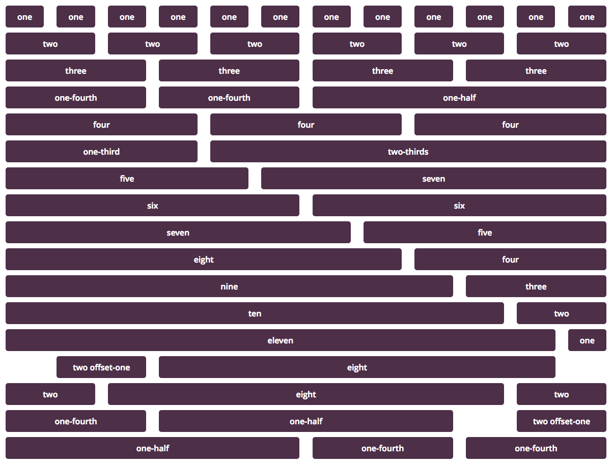
The CSS Smart Grid plugin uses css styling to build table structures (rows and columns) in a smart and intuitive way. The CSS Smart Grid builds rows using a 12 cell column structure across the width of a row. These cells can be as small as 1/12th of a row width, and can also be indented by multiple 1/12th widths of a row. The following diagram illustrates this cell structures that can be built in a row.
The CF7 Smart Grid Plugin loads all css smart grid plugin by default for all forms. However, by understanding the way the css classes are used you can create even richer layouts than what the CF7 Smart Grid UI allows you to build.
All rows are wrapped inside a
`<header id="hd">
    <div class="container">
        <h1>My Page Title</h1>
    </div>
</header>

<section id="main">
    <div class="container">
        <p>This is where my content goes.</p>
    </div>
</section>`
Grid columns are achieved by adding a column class to any element. By default, anything with the column class is one column wide. For wider columns, add a class matching the number of columns you want the element to be: two, four, etc. Additionally, there are several shorthand classes for common use cases: one-fourth, three-fourths, one-third, two-thirds, and one-half. Group rows of columns together under a parent element with the class row to make sure all of the floats are cleared.
<div class="container">
    <div class="row">
        <article id="main" role="main" class="columns two-thirds">
            <p>The beginning of the best article in the history of humanity.</p>
        </article>
        <aside id="sidebar" role="complementary" class="columns four">
            <p>Here is some additional information.</p>
        </aside>
    </div><!-- end .row -->
</div><!-- end .container -->
If you only have one row of columns in a container, you can ommit the row:
 <div class="container">
    <article id="main" role="main" class="columns two-thirds">
        <p>The beginning of the best article in the history of humanity.</p>
    </article>
    <aside id="sidebar" role="complementary" class="columns four">
        <p>Here is some additional information.</p>
    </aside>
</div><!-- end .container -->
Sometimes you need a blank column between content. Rather than add superfluous markup, you can add one of the offset-xxxxx classes to the element you want to push left. There are classes defined to offset anywhere from 1 (offset-one) to 11 (offset-eleven) columns. Note that the offsets work by padding the element they're placed on; if you change the padding in your own CSS, the offsets will not work. Just like their column counterparts, offsets only take effect in browsers that are at least 768 pixels wide.
 <div class="container row">
    <div class="columns two offset-two">
        <p>There are two blank columns to the left of this one.</p>
    </div><!-- end .two -->
    <div class="columns seven offset-one">
        <p>This column leaves one column empty between it and it's predecessor then takes up the rest of the row.</p>
    </div><!-- end .seven -->
</div><!-- end .container -->
You can mix and match columns and offsets however you want as long as the offset and column numbers add up to 12.