A Flutter widget that can be expanded or collapsed by the user.
This library helps implement expandable behavior as prescribed by Material Design:
Expandable should not be confused with
ExpansionPanel.
ExpansionPanel, which is a part of
Flutter material library, is designed to work only within ExpansionPanelList and cannot be used
for making other widgets, for example, expandable Card widgets.
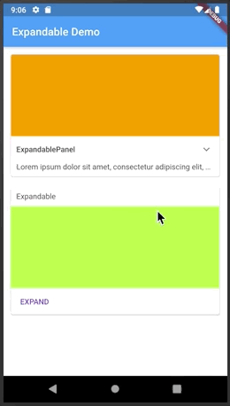
The easiest way to make an expandable widget is to use ExpandablePanel:
class ArticleWidget extends StatelessWidget {

  final Article article;

  ArticleWidget(this.article);

  @override
  Widget build(BuildContext context) {
    return ExpandablePanel(
      header: Text(article.title),
      collapsed: Text(article.body, softWrap: true, maxLines: 2, overflow: TextOverflow.ellipsis,),
      expanded: Text(article.body, softWrap: true, ),
      tapHeaderToExpand: true,
      hasIcon: true,
    );
  }
}
ExpandablePanel has a number of properties to customize its behavior, but it's restricted by
having a title at the top and an expand icon shown as a down arrow (on the right or on the left).
If that's not enough, you can implement custom expandable widgets by using a combination of Expandable,
ExpandableNotifier, and ExpandableButton:
class EventPhotos extends StatelessWidget {

  @override
  Widget build(BuildContext context) {
    return ExpandableNotifier(  // <-- Provides ExpandableController to its children
      child: Column(
        children: [
          Expandable(           // <-- Driven by ExpandableController from ExpandableNotifier
            collapsed: ExpandableButton(  // <-- Expands when tapped on the cover photo
              child: buildCoverPhoto(),
            ),
            expanded: Column(
              children: [
                buildAllPhotos(),
                ExpandableButton(       // <-- Collapses when tapped on
                  child: Text("Back"),
                ),
              ]
            ),
          ),
        ],
      ),
    );
  }
}Expandable widgets are often used within a scroll view. When the user expands a widget, be it
an ExpandablePanel or an Expandable with a custom control, they expect the expanded
widget to fit within the viewable area (if possible). For example, if you show a list of
articles with a summary of each article, and the user expands an article to read it, they
expect the expanded article to occupy as much screen space as possible. The Expandable
package contains a widget to help implement this behavior, ScrollOnExpand.
Here's how to use it:
   ExpandableNotifier(      // <-- This is where your controller lives
     //...
     ScrollOnExpand(        // <-- Wraps the widget to scroll
      //...
        ExpandablePanel(    // <-- Your Expandable or ExpandablePanel
          //...
        )
     )
  )
Why a separate widget, you might ask? Because generally you might want to show not just
the expanded widget but its container, for example a Card that contains it.
See the example app for more details on the usage of ScrollOnExpand.
If you have migration issues from a previous version, read the Migration Guide.