Cyrillic Zhe variants #1380
Comments
|
I'd like to add new variant selectors to it instead of simply syncing with Ka. |
Because only a few designers are well aware of subtleties of the Cyrillic alphabet well, and many simply mechanically reproduce the rules of writing Latin letters.
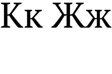
Why don't you like this behavior? These are independent Cyrillic letters. Personally, I’m against this kind of shape syncing. A Cyrillic Zhe should not have 20 variants if it is somewhat similar to another letter. The generally accepted forms of Cyrillic Zhe are circled:
Source of photo: https://info.paratype.ru/cyrillics_101/ |

Okay, here are examples of typeface design from Russians: Edrip by Andrey V. Panov:
Because I do not like it. Because I see that matching Ka and Zhe is much more frequent case.
They are not synched. be5invis has decided to introduce individual variant selector for Zhe. |


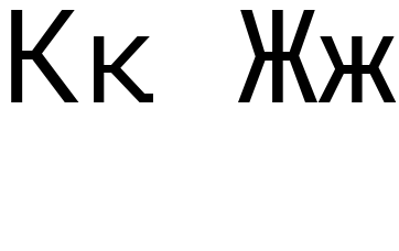
Are you sure you want to compare an interface font with an antique/serif?
But changing the shape of Cyrillic Zhe outside of the forms that I showed earlier is ugly and unacceptable in such fonts (unless it is an accident font, not Iosevka in any case). |
I do not compare fonts. I do compare glyphs for Ka and Zhe in the same font.
That's you personal opinion. You are free to use the default Zhe variant, the old one. What the problem if someone chooses another Zhe variant? Anyway, the ticket is closed, I see no point in discussing it further. |
|
Since the variant of Cyrillic Zhe is now selectable, you may want to change shape of Cyrillic Zhe (both small and capital) in Iosevka SS12 (Ubuntu Mono Style). I guess symmetric-touching Zhe will be more suitable for SS12 than default Zhe variant. |
My opinion is not to turn Cyrillic Zhe into something it has never been. Create your own fork and distort the letters of the Cyrillic alphabet as you want.
Answer:
|

Iosevka 15.5.2.
In many fonts shapes of Cyrillic Ka and Cyrillic Zhe match, e. g.:
Arimo (proportional):


Cantarell (proportional):
Carlito (proportional):
Cascadia Mono:
Cousine (monospace):
DejaVu Sans Mono:
Droid Sans Mono:
Fira Code (monospace):
Source Code Pro (monospace):
Go Mono:
JetBrains Mono:
Liberation Mono:
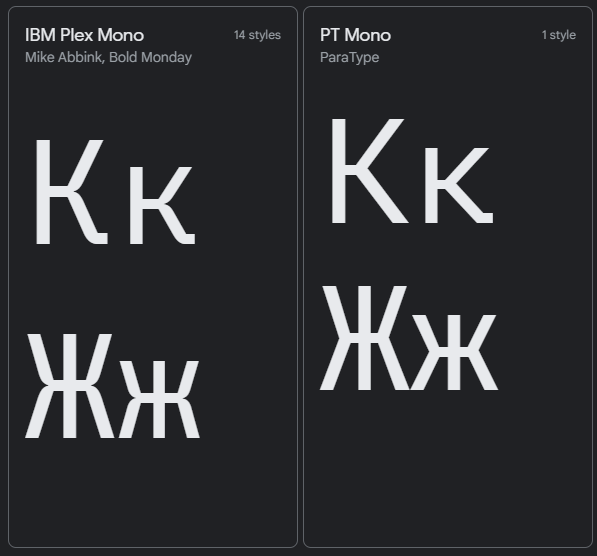
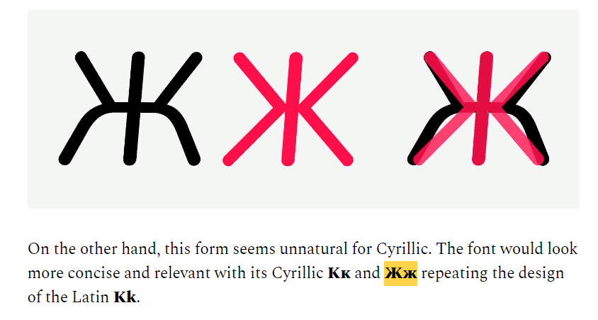
Iosevka has 20 variants of Cyrillic Ka, but only one variant of Cyrillic Zhe, so Cyrillic Zhe is "out of match" with any non-default Cyrillic Ka variant, e. g.:
curly-serifless ka:


straight-serifless ka:
symmetric-touching-serifless ka:
Regardless of chosen Cyrillic Ka variant, shape of Cyrillic Zhe remains the same. It would be nice if Cyrillic Zhe follows the shape of Cyrillic Ka.
The text was updated successfully, but these errors were encountered: