Support for Hack Zero Style #437
Comments
|
IDK whether this is the right interpretation of your desired style, the shape of Iosevka's
|

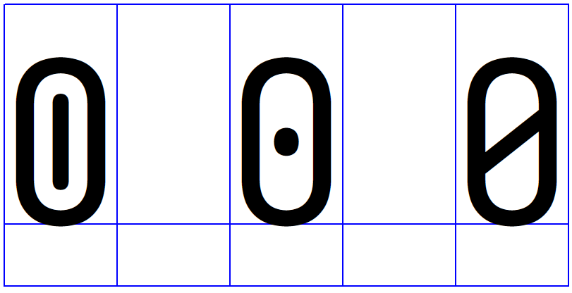

Hmmm ... I think to emulate the style better, the dot should be a vertical ellipse instead of a vertical line with rounded edges. Hack's author once called it "the eye of Sauron". 😆 Hack's specimen page shows the 0 in a huge size for a detailed look. Edit, for convenience:
But please don't overdo it if you think this is too much unneccesary work or technically not feasible to implement for such a minor detail. |

|
But don't you think an ellipse in a oval-y-with-straight-sides zero is strange? |
|
Reducing the length seems work better |

|
To be honest, the forced introduction of this dotted zero was one of the reasons I switched to Iosevka, since I like the slashed zero best. Once again, thank you for all your work here. :) I guess it comes down to how much you want to stay true to the (admittedly slightly weird) original. If you as the decision maker of this font are not fond of the ellipsis, this is a good compromise. BTW, I remember that the introduction of this glyph in Hack was a bit controversial at the time. So maybe some users of Hack will switch to this Iosevka variant. 😆 |
@be5invis Thank you very much for your hard work. |
|
OK, case closed, it will be added into version 3.1.0 under tag |
Please add support for Hack style zero glyph
Look at this picture:
The text was updated successfully, but these errors were encountered: