[Glyph Request] Variants to differentiate: d,b,q,p #462
Comments
|
Just a reminder, identical |
|
Two updates:
But your personal justification for implementing the tailed Adding a tailed
Here's the current state of Iosevka with the lovely new
I don't know a good way to maintain this style while further differentiating |

|
After a quick view of other fonts, it looks like a common strategy of differentiating
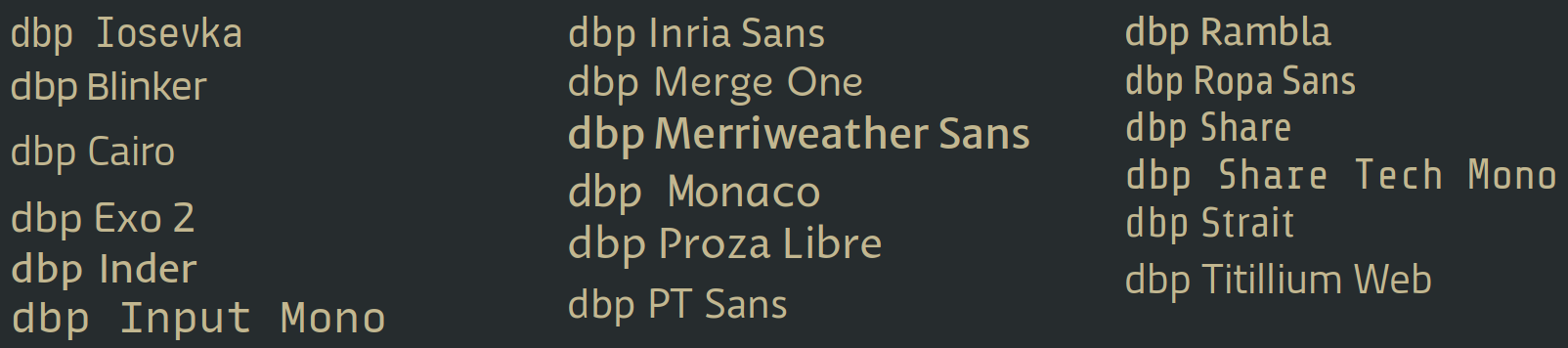
This is seen across a wide variety of type styles. Here's a diverse sampling to demonstrate: And a small subset that is maybe not too far off from Iosevka's style:
So this issue might be fully addressed by creating both:
|
|
Add this first 🤔 |

|
Beautiful! |
|
And if you want more rounded, there is choice. |

|
|

|
I really like the toothless |
|
|

|
Close as fixed |
|
Wonderful, thank you. |
For folks with dyslexia or other difficulties, it can make a big difference in legibility to use different shapes (not just different orientations) for each character.
d,b,q, andpall seem to be identical shapes, and it would be great to have to option to change that -- especially for differentiatingdfrombandqfromp, but ideally all from each other.So the small version of this request is:
dorb, andqorpand the big version of this request is:
d,b,q, andpCurrent state:
Rotated 180°:
Mirrored Horizontally:
Mirrored Vertically:
The idea is to make the letters identifiable regardless of orientation.
The text was updated successfully, but these errors were encountered: