Components:Component Options
- Component option example
- Component option fields
- Advanced configuration
- Component option helper example
- Option reference
Component options appear in the sidebar of Page Builder when a component has is on the canvas. Component options are in the prefab configuration of a component.
An example of a basic component option configuration is shown below:
{
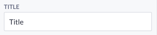
type: 'TEXT',
label: 'Title',
key: 'title',
value: 'Type your title here...'
}The type of option will configure what data type the option will accept and return. It also determines what visual interface will represent the option (text field, checkbox, dropdown, etc.). In some cases, the visual representation of the option is configurable.
The type is one of ACTION, ACTION_INPUT, TEXT, NUMBER, TOGGLE, COLOR, FONT, SIZE, SIZES, ENDPOINT, MODEL, PROPERTY, FILTER, VARIABLE or CUSTOM. Subtypes include MULTILINE, UNIT, DROPDOWN and BUTTONGROUP.
The type is a capitalized string.
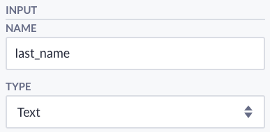
The label represents the option name shown in the sidebar of Page Builder once the component is selected.
The label has type string.
The key will refer to the option value inside a component. For example, the value of the option with key title will be available in a component as options.title.
The key has type string.
The default value of the option.
The value has type any.
Advanced configuration can be placed in a configuration object inside the option config:
{
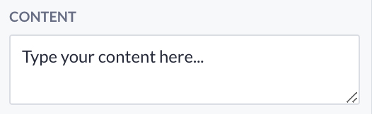
type: 'TEXT',
label: 'Content',
key: 'content',
value: 'Type your content here...',
configuration: {
as: 'MULTILINE',
placeholder: 'Mobile number or email',
}
}{
type: 'PROPERTY',
label: 'Property',
key: 'property',
value: '',
configuration: {
dependsOn: 'model'
}
}{
type: 'CUSTOM',
label: 'Currency',
key: 'currency',
value: '€',
configuration: {
as: 'BUTTONGROUP',
dataType: 'string',
allowedInput: [
{
name: 'Euro',
value: '€'
},
{
name: 'Pound',
value: '£'
},
{
name: 'Dollar',
value: '$'
}
]
}
}{
type: 'ENDPOINT',
label: 'Page',
key: 'linkTo',
value: '',
configuration: {
condition: {
type: 'SHOW',
option: 'linkType',
comparator: 'EQ',
value: 'Internal',
},
},
},The As field will render an alternative visual representation of the option. Text and variable can be rendered multiline, size as a unit, and custom options as a dropdown or button group.
The type is string.
Configure this field if the option depends on another option. This option is needed to define a model for the property, properties, filter, and variable options.
The type is string.
The output type of a custom option.
The type is string.
The possible values for a custom option.
The type is an array of objects with a name and a value.
Check the reference below for examples of these options.
The Placeholder field will render a placeholder in the text and variable option, as shown in the sidebar. You can use placeholders to specify a short hint that describes the expected value.
The type is string.
The condition object allows you to conditionally show/hide a component option based on another component option's value. The condition object consists of the following parts:
-
type, which can either be 'SHOW' or 'HIDE.' -
option, string referring to the key of the option that you want to relate. -
comparator, which at this moment can only be 'EQ.' -
value, the value you want to compare.
The allowPropertyName is by default false and can be enabled in order to select a properties label through the variable and property selector.
{
type: 'PROPERTY',
label: 'Property',
key: 'property',
value: '',
configuration: {
dependsOn: 'model',
allowPropertyName: true,
}
}The allowFormatting is by default true and can be set to false in order to hide the formatting option in the split button. This would be usefull if you don't want the user to format a number for example.
{
type: 'VARIABLE',
label: 'Created at',
key: 'created_at',
value: [''],
configuration: {
allowFormatting: true,
}
}
When allowedKinds is defined in the configuration of an option, these property kinds will be available for the user to select in the property browser.
If allowedKinds is not defined, all the property kinds will be available. If allowedKinds is an empty array, all the property kinds will disabled.
{
type: 'VARIABLE',
label: 'Value',
key: 'value',
value: [''],
configuration: {
allowedKinds: ['INTEGER', 'DECIMAL'],
}
}
Overview of all the options.
{
type: 'TEXT',
label: 'Title',
key: 'title',
value: 'Type your title here...'
}Type: string
Output: 'Type your title here...'
{
type: 'TEXT',
label: 'Content',
key: 'content',
value: 'Type your content here...',
configuration: {
as: 'MULTILINE'
}
}Type: string
Output: 'Type your content here...'
{
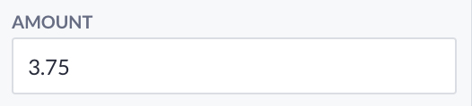
type: 'NUMBER',
label: 'Amount',
key: 'amount',
value: 27
}Type: number.
Output: 27.

{
type: 'TOGGLE',
label: 'Active',
key: 'active',
value: true
}Type: boolean.
Output: true
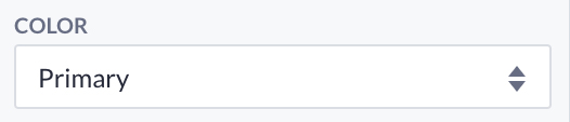
{
type: 'COLOR',
label: 'Color',
key: 'color',
value: 'Primary'
}Type: string.
Output: Primary.
Definitions:
enum Style {
White,
Light,
Medium,
Dark,
Black,
Primary,
Secondary,
Success,
Info,
Warning,
Danger,
Accent1,
Accent2,
Accent3
}Helper:
{
color: ({ options: { color } }) => style.getColor(color)
}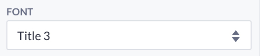
{
type: 'FONT',
label: 'Font',
key: 'font',
value: 'Title3'
}Type: string.
Output: 'Title3'.
Definitions:
enum Font {
Title1,
Title2,
Title3,
Title4,
Title5,
Title6,
Body1,
Body2
}Helpers:
{
fontFamily: ({ options: { font } }) => style.getFontFamily(font),
fontSize: ({ options: { font } }) => style.getFontSize(font),
textTransform: ({ options: { font } }) => style.getTextTransform(font),
letterSpacing: ({ options: { font } }) => style.getLetterSpacing(font),
[`@media ${B.mediaMinWidth(480)}`]: {
fontSize: ({ options: { font } }) =>
style.getFontSize(font, 'Mobile')
},
[`@media ${B.mediaMinWidth(768)}`]: {
fontSize: ({ options: { font } }) =>
style.getFontSize(font, 'Portrait')
},
[`@media ${B.mediaMinWidth(1024)}`]: {
fontSize: ({ options: { font } }) =>
style.getFontSize(font, 'Landscape')
},
[`@media ${B.mediaMinWidth(1200)}`]: {
fontSize: ({ options: { font } }) =>
style.getFontSize(font, 'Desktop')
}
}The ICON type provides an icon selector in order to easily select one out of the available icons within the platform.
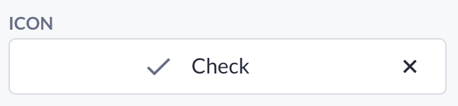
{
label: "Icon",
key: "icon",
value: "Check",
type: "ICON",
}Type: string
Output: 'Check'
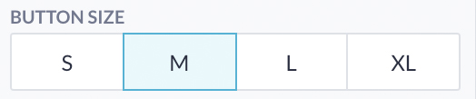
{
type: 'SIZE',
label: 'Size',
key: 'size',
value: 'M'
}Type: string
Output: 'M'
Definitions:
enum Magnitude {
XS,
S,
M,
L,
XL
}Helper:
{
margin: ({ options: { size } }) => style.getSpacing(size),
[`@media ${B.mediaMinWidth(480)}`]: {
fontSize: ({ options: { size } }) =>
style.getSpacing(size, 'Mobile')
},
[`@media ${B.mediaMinWidth(768)}`]: {
fontSize: ({ options: { size } }) =>
style.getSpacing(size, 'Portrait')
},
[`@media ${B.mediaMinWidth(1024)}`]: {
fontSize: ({ options: { size } }) =>
style.getSpacing(size, 'Landscape')
},
[`@media ${B.mediaMinWidth(1200)}`]: {
fontSize: ({ options: { size } }) =>
style.getSpacing(size, 'Desktop')
}
}
{
type: 'SIZES',
label: 'Margin',
key: 'margin',
value: ['M', 'M', 'M', 'M']
}Type: Array<string>
Output: ['M', 'M', 'M', 'M']
Helper:
const convertSizes = sizes =>
sizes.map(size => style.getSpacing(size)).join(' ');{
margin: ({ options: { margin } }) => convertSizes(margin)
}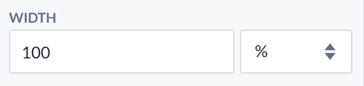
{
type: 'SIZE',
label: 'Width',
key: 'width',
value: '100%',
configuration: {
as: 'UNIT'
}
}Type: string
Output: '100%'
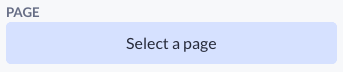
{
type: 'ENDPOINT',
label: 'Endpoint',
key: 'endpoint',
value: ''
}Type: string.
Output: '381489cd23174a5d80dfc620628d68fc'
Definitions: type id = string
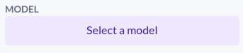
{
type: 'MODEL',
label: 'Model',
key: 'model',
value: ''
}Type: string.
Output: '917e332a484249348d2dabadfc1506bf'.
Definitions: type id = string.
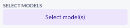
{
type: 'MODELS',
label: 'Select Models',
key: 'models',
value: [],
}Type: Array<string>
Output: ['8e952216c538439a96eff262a84c73f5', '2087e23cb9a34ae5878b607fd8f23d85']
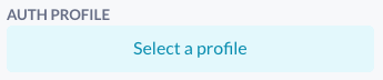
{
type: 'AUTHENTICATION_PROFILE',
label: 'Auth profile',
key: 'authProfile',
value: ''
}Type: string.
Output: '917e332a484249348d2dabadfc1506bf'.
Definitions: type id = string.
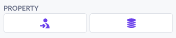
{
  type: 'PROPERTY',
  label: 'Property',
  key: 'property',
  value: '',
  configuration: {
    dependsOn: 'model'
  }
}Type: string
Output: '76c42fd76fa74227af392bdd6c7906e5'
Definitions: type id = string
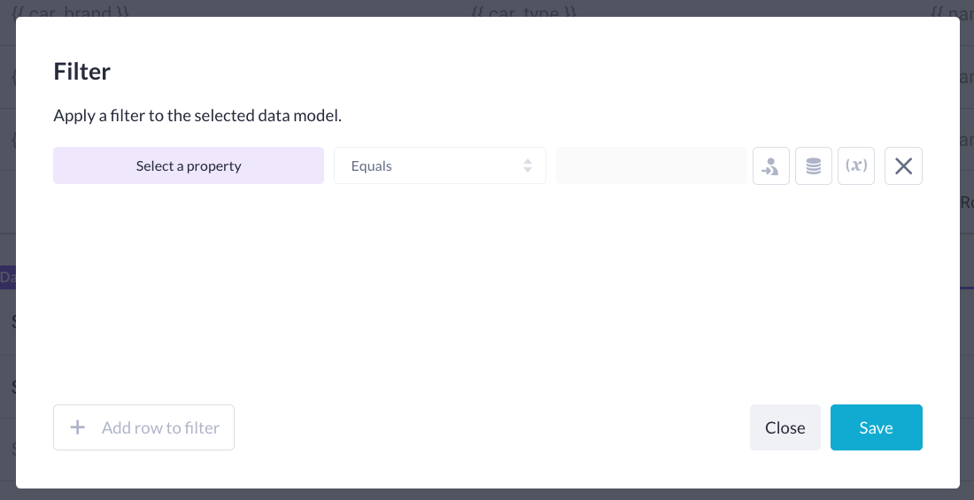
{
type: 'FILTER',
label: 'Filter',
key: 'filter',
value: {},
configuration: {
dependsOn: 'model'
}
}Type: {[property: string]: {[operator: string] : string | number | {}}
Output: {'097941e0b9894decb9e19f0e336632b9', {eq: 'green'}}
Definitions:
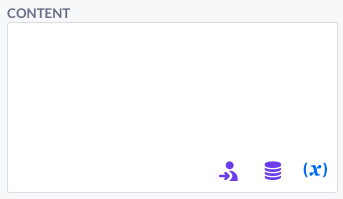
{
type: 'VARIABLE',
label: 'Variable',
key: 'variable',
value: ['Some text...'],
configuration: {
dependsOn: 'model'
}
}Type: Array<Variable|string>
Output: ['Prefix text', { type: 'PROPERTY', id: '3b23a74b4fdf47d090ec2fb5d7128c76' }, 'Postfix text']
Definitions:
interface Variable {
type: string;
id: string;
}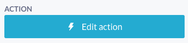
{
label: 'Action',
key: 'actionId',
value: '',
type: 'ACTION',
}or
{
label: 'Action',
key: 'actionId',
value: '',
type: 'ACTION',
configuration: {
apiVersion: 'v1',
},
}Type: string
Output: 381489cd23174a5d80dfc620628d68fc
{
label: 'Input variable',
key: 'actionInputId',
value: '',
type: 'ACTION_INPUT',
}Type: string
Output: 381489cd23174a5d80dfc620628d68fc
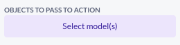
{
type: 'ACTION_INPUT_OBJECTS',
label: 'Objects to pass to action',
key: 'actionModels',
value: []
}This option is used to pass multiple objects to an action. If you select a model, an object input variable for this model is generated on the action. For this option to work, you will need an ACTION or FORMDATA option in the component as well.
Type: Array<string>
Output: ['917e332a484249348d2dabadfc1506bf', 'ea39e88ba3f74bce91f949ae63b6be70']

{
value: {
customModelId: null,
actionId: null,
modelId: null,
variableId: null,
},
label: 'Action',
key: 'formData',
type: 'FORM_DATA',
configuration: {
apiVersion: 'v1',
},
},This option is used by our form. It generates a custom model, action, and custom model variable, to handle the form data. Model ID is filled when the user chose to base the form on a model.
Type: FormDataOptionValue
Output:
{
customModelId: "d3adec164baf46ed963bf118aab6ddb0",
actionId: "d73083735ea74c26bc1322ae7df8159d",
modelId: "6c719d701ccc4f1d8f71b541ee682a0f",
variableId: "3f0dc6d53986477796b0162912948a46"
}
{
value: { label: ['Label'] },
label: 'Label',
key: 'customModelAttribute',
type: 'CUSTOM_MODEL_ATTRIBUTE',
configuration: {
allowedTypes: ['string'],
},
},We use this option in our form fields.
The label in the value is used to set the default label value for the form field.
allowedTypes is used for describing the type of data that can be send with the form field.
We support string, decimal, integer, date, date_time, file and boolean here.
After generating the custom model attribute, the value of this option will be extended with the id of this custom model attribute.
Type: CustomModelAttributeOptionValue
Output:
{
id: "d3adec164baf46ed963bf118aab6ddb0",
label: ["Label"],
}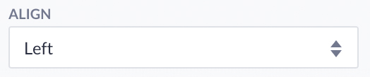
{
type: 'CUSTOM',
label: 'Align',
key: 'align',
value: 'left',
configuration: {
as: 'DROPDOWN',
dataType: 'string',
allowedInput: [
{
name: 'Left',
value: 'left'
},
{
name: 'Center',
value: 'center'
},
{
name: 'Right',
value: 'right'
}
]
}
}Type: string
Output: 'left';
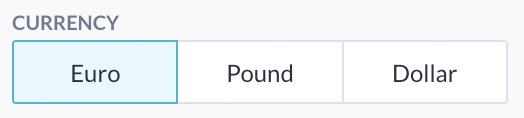
{
  type: 'CUSTOM',
  label: 'Currency',
  key: 'currency',
  value: '€',
  configuration: {
    as: 'BUTTONGROUP',
    dataType: 'string',
    allowedInput: [
      {
        name: 'Euro',
        value: '€'
      },
      {
        name: 'Pound',
        value: '£'
      },
      {
        name: 'Dollar',
        value: '$'
      }
    ]
  }
}Type: string
Output: '€';

{
 type: 'DISPLAY_LOGIC',
 label: 'Display logic',
 key: 'displayLogic',
 value: {},
}
Type: { [group: string]: [[property: string]: {[operator: string] : string | number | {}}] }
Output: { [_AND]: [{'097941e0b9894decb9e19f0e336632b9', {eq: 'green'}}] }
An option styling helper is available to retrieve theme values from option data automagically.
Setup of the style object and all possible methods.
(() => ({
  name: 'Custom',
  icon: 'CustomIcon',
  type: 'CUSTOM',
  category: 'CUSTOM',
  orientation: 'HORIZONTAL',
  allowedTypes: [],
  jsx: (() => {
    return <section className={classes.root}>{options.content}</section>;
  })(),
  styles: B => theme => {
    const style = new B.Styling(theme);

    return {
      root: {
        // Examples of all style getter methods
        color: ({ options: { color } }) => style.getColor(color), // Primary -> rgba(63, 81, 181, 1)
        margin: ({ options: { margin } }) => style.getSpacing(margin), // M -> 0.5rem
        margin: ({ options: { margin } }) => style.getSpacing(margin, 'Mobile'), // M -> 0.5rem
        margin: ({ options: { margin } }) => style.getSpacing(margin, 'Portrait'), // M -> 0.5rem
        margin: ({ options: { margin } }) => style.getSpacing(margin, 'Landscape'), // M -> 1rem
        margin: ({ options: { margin } }) => style.getSpacing(margin, 'Desktop'), // M -> 1rem
        fontSize: ({ options: { font } }) => style.getFontSize(font), // Title3 -> 1.6875rem
        fontSize: ({ options: { font } }) => style.getFontSize(font, 'Mobile'), // Title3 -> 1.6875rem
        fontSize: ({ options: { font } }) => style.getFontSize(font, 'Portrait'), // Title3 -> 2.5rem
        fontSize: ({ options: { font } }) => style.getFontSize(font, 'Landscape'), // Title3 -> 2.75rem
        fontSize: ({ options: { font } }) => style.getFontSize(font, 'Desktop'), // Title3 -> 3rem
        fontFamily: ({ options: { font } }) => style.getFontFamily(font), // Title3 -> Roboto, sans-serif
        fontWeight: ({ options: { font } }) => style.getFontWeight(font), // Title3 -> 400
        textTransform: ({ options: { font } }) => style.getTextTransform(font), // Title3 -> inherit
        letterSpacing: ({ options: { font } }) => style.getLetterSpacing(font), // Title3 -> normal
        borderSize: ({ options: { border } }) => style.getBorderSize(border), // M -> 0.125rem
        borderRadius: ({ options: { border } }) => style.getBorderRadius(border), // M -> 0.125rem
        width: ({ options: { icon } }) => style.getIconSize(icon), // M -> 3rem
      }
    };
  }
}))();