stack overflow site search
1
A somewhat straight forward suggestion if you don't want some type of Google Searchbar would be to run a script on submission of the form that searches the text in each of the web pages in your working directory to find a match, then display a page with links to the found matches.
I will use PHP for my description of how this is done.
With this in mind, first learn how to read entire pages (i.e. webpages) into a string: http://php.net/manual/en/function.file-get-contents.php
//YOU WILL HAVE TO LINE THIS UP WITH YOUR WORKING FILE NAMES
$home = file_get_contents('./home.php', FILE_USE_INCLUDE_PATH);
or I suppose you could just search for the actual webpage/URL like so:
$home = file_get_contents('http://www.example.com/');//IMAGINE THIS IS REALLY HOME.PHP
$homePageName = "home.php";//JUST HERE TO SHOW AN EXAMPLE
Example:
///YOUR FORM/INPUT BOX
<form action="search.php" method="post">
    <input type="text" name="findMe" placeholder="Search Yacht">
</form>
Now search.php
$search = $_POST['findMe'];
//$search = "example";//THIS WOULD WORK, BUT I WAS SHOWING HOW TO USE FORM

//IF WORD FOUND IN HOME PAGE
if (stripos($home, $search) !== false) {//USING EXAMPLE.COM TO SHOW IT WORKS
    echo '<a href="'.$homePageName.'">'.$homePageName.'</a>';
}
Then if you want to be simplistic and not use an array to store the found pages, take the same code above and use it for every page you want searched (i.e. home, about, products, etc..).
Now a user can search your site (or the pages you want indexed), to find all pages that have matching text. If you want specific keywords to be searched, just add them to the page metadata and the process I have described will still work as it searches everything that makes up the page.
<meta name="keywords" content="keyword1, keyword2, keyword3 " />
1
A somewhat straight forward suggestion if you don't want some type of Google Searchbar would be to run a script on submission of the form that searches the text in each of the web pages in your working directory to find a match, then display a page with links to the found matches.
I will use PHP for my description of how this is done.
With this in mind, first learn how to read entire pages (i.e. webpages) into a string: http://php.net/manual/en/function.file-get-contents.php
//YOU WILL HAVE TO LINE THIS UP WITH YOUR WORKING FILE NAMES

$home = file_get_contents('./home.php', FILE_USE_INCLUDE_PATH);
or I suppose you could just search for the actual webpage/URL like so:
$home = file_get_contents('http://www.example.com/');//IMAGINE THIS IS REALLY HOME.PHP

$homePageName = "home.php";//JUST HERE TO SHOW AN EXAMPLE
Example:
///YOUR FORM/INPUT BOX

<form action="search.php" method="post">

    <input type="text" name="findMe" placeholder="Search Yacht">

</form>
Now search.php
$search = $_POST['findMe'];

//$search = "example";//THIS WOULD WORK, BUT I WAS SHOWING HOW TO USE FORM

//IF WORD FOUND IN HOME PAGE

if (stripos($home, $search) !== false) {//USING EXAMPLE.COM TO SHOW IT WORKS

    echo '<a href="'.$homePageName.'">'.$homePageName.'</a>';

}
Then if you want to be simplistic and not use an array to store the found pages, take the same code above and use it for every page you want searched (i.e. home, about, products, etc..).
Now a user can search your site (or the pages you want indexed), to find all pages that have matching text. If you want specific keywords to be searched, just add them to the page metadata and the process I have described will still work as it searches everything that makes up the page.
<meta name="keywords" content="keyword1, keyword2, keyword3 " />
Learn the fundamentals of search bar design to help users find the content they want quickly and easily.
Have you ever landed on a website looking for something, but been unsure where to find it?
You might have skimmed the menus and scrolled down the page a bit, but ultimately you couldn’t find the exact product/post/article you had in mind. Frustrating, right?
In this situation, you would probably do two things: exit the page, or look for the trusty search bar. If you decide to stick around, a proper search function should take your query and send you to your destination. Problem solved.
It’s not a perfect experience, but it’s a hard one to avoid on larger websites that simply can’t link to every piece of content from the homepage.
This is why, when crafting a user experience for your website, the design of your search feature must be intuitive. If visitors are using it, that means they’re on a mission for something specific. And, as designers, we’re tasked with helping them get there. Our design choices can make the difference between a good or bad navigation experience, which translates to a conversion or a bounce.
In this guide, we’ll learn how to create the best search bar for your website. By implementing these design guidelines, you’ll help users locate their desired content quickly and smoothly.
Before we cover best practices, it’s important to consider whether your website would benefit from an internal site search feature in the first place.
While there’s no hard “yes” or “no” for including a search feature, larger sites generally will benefit from search more than smaller ones. This is because users are more likely to rely on search when faced with extensive click navigation.
Also, if users land on your homepage with a specific piece of content, category, or product in mind, they might prefer to type it in, rather than rely on primary and secondary click navigation.
If you’re still unsure, you can add a search feature and track user activity to determine whether your search bar is being utilized (and, if so, whether it’s being used effectively), then decide whether to keep or scrap it.
- Include a text field and a search button.
- Place in an expected location.
- Include the search icon.
- Size appropriately.
- Consider adding placeholder text.
- Consider adding autocomplete.
- Hide advanced options.
- Design for mobile.
Often, site search is a visitor’s final or only option when navigating your site, so a poor user experience can make the difference between holding their interest and sending them to a competitor. You’ll need to keep their expectations and comfort at the forefront of your design — here’s how:
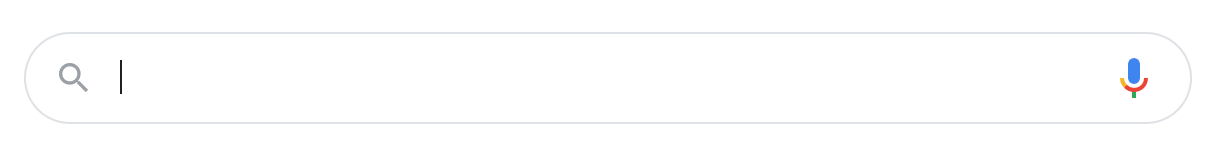
Most search bars consist of two elements: the search box, where users write their queries, and a search button, which users click to initiate a search. The elements most often are placed horizontally adjacent on a single line, like so:


You might occasionally see variations on this presentation, but the majority appear this way for simplicity and accessibility.
The search box should be just that, a box. You can take some design liberties like adding background contrast, color, or rounding the corners, but the text field should be a text input element with a height of one line of text. Users will easily recognize this.
As for the search button, strongly consider including one. It serves as a visual cue to submit a query, so users may be confused without it. Place this button to the right of the input field, as this is a convention and is logical for those who read left-to-right. Write concise button text as well — the word “Search” or a magnifying glass icon will do.
Visitors should also be able to launch their search by either clicking the search button or pressing the “Enter”/“Return”/”Go” key when the search box is in focus (i.e., the text cursor is active inside it).
A common alternative iteration on the classic search bar is a magnifying glass icon that, when clicked, expands to a full search bar and button. Here’s an example from the World Wildlife Fund:

This design saves page space and can look cleaner, but use it with caution. Some may have difficulty seeing it, and it increases interaction cost if users need to click again to focus on the text box after revealing it. However, if the search glass button stands out enough on the page, this is a viable alternative approach.
Websites that allow site searches tend to place the search bar in either the top-right or top-center of the web page. Either placement ensures the search functionality is visible and readily available for those who need it.
Some sites might opt to place other links, menus, or icons in the top right corner — think login prompts, settings, or shopping cart icons. In this case, it’s okay to move the search bar farther left to accommodate for them.
However, refrain from placing the search bar at the bottom of the page exclusively, or from hiding it inside a menu. It’s okay to put a search bar in the footer in addition to one at the top of the page, but you shouldn’t leave users searching for, of all things, your search function.
Also, it’s likely your users will want to conduct searches on other web pages besides your homepage. Placing the search bar in your header across most pages ensures users can do this from any site location.
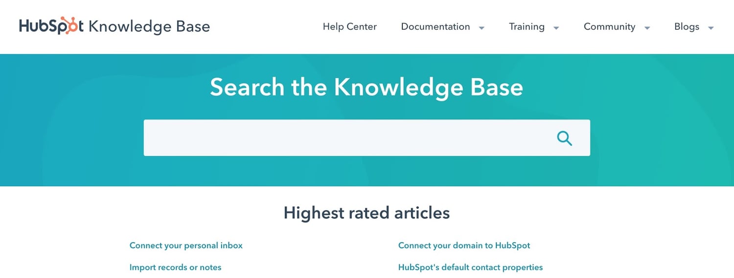
If search is essential to your site’s navigation and you expect users to navigate primarily through queries, center the search bar on the page and place it below the header for more emphasis. For example, this configuration appears on the HubSpot Knowledge Base page, since we expect most users to arrive with specific, searchable questions.
Designers use icons to visually convey what a button or other page element does. Icons save space and can be identified more quickly than text. The magnifying glass icon is a widespread symbol of search, so we recommend you place it in your interface.
There are a few ways to add this icon to your bar, You can place it on the search button:

You could place it inside the search box:
Or you could place it on a button which hides/reveals the entire search bar, we saw in our World Wildlife Fund example. Here’s another example from Pitchfork.com:

One more note: If the magnifying glass appears outside the search box, many users will assume it’s a button, so avoid doing this if the icon itself isn’t clickable.
The size of your search bar will depend on its importance on your site and the expected length of a typical query.
If search is your primary navigational tool, make it large and centered on page load. If placed in the header, the bar should be sized based on its fellow header elements: large enough to be seen on a visual scan of the page, but not so large as to steal attention.
The length of your bar is another important design choice. On one hand, you want your text field to be long enough to display more or all of the user’s typed-out query — this lets users review their query and fix any typos. On the other, the search bar shouldn’t steal space from other header elements.
A good place to start is finding or estimating the length of the average search query in characters. Are users typing in just a couple of words, or are they asking longer questions? If it’s the latter, you’ll probably want to lengthen your search box or set it to expand when clicked.
Placeholder text appears in the search box when the box is not in focus. It is meant to prompt action from the user. A placeholder can be a helpful cue for users by either listing a sample queries like “Try hats, jeans, bags…”, or by simply stating “Search…”.
If you want to add a placeholder, the text should appear a lighter shade to distinguish it from a typed query, and should disappear when the user focuses on the box or starts typing.
Autocomplete is another way to help complete a search. When user type, autocomplete provides suggestions in a menu below the search. Predictions can be tailored to your site’s specific content, so users can be confident they’re finding their desired content.
Don’t overwhelm users with the number of suggestions — while it depends on the size of your website and the amount of indexed content, one to 10 is usually a good range.
Here’s an example of autocomplete on Patagonia’s ecommerce site search:

Allow users to click the suggestion or, to make your interface more accessible, let them move up and down the suggestion list with the arrow keys and select an option with the “Enter”/ “Return” key.
Unless you expect your user base to be generally more technology-savvy than the average internet user, it’s almost always best to hide advanced search options like categories, filters, and exact matching. This keeps the UI clean and accessible.
If you must include advanced options, consider placing them in a hidden menu that appears when the search bar is selected, or provide a nearby link to an “Advanced search” page.
The rise of smartphones and tablets has impacted UI best practices across the board, and that includes site search bars. Make sure your search box and button are large enough to see and be selected. W3C provides two relevant accessibility guidelines:
- Ensure that touch targets are at least 9 millimeters high by 9 millimeters wide.
- Ensure that touch targets close to the minimum size are surrounded by a small amount of inactive space.
These guidelines apply to all touchscreen devices regardless of screen size.
Also, due to lack of space, it’s more acceptable on mobile devices to hide your entire search bar behind a search glass icon, and reveal it when the icon is tapped. Again, this icon needs to be noticeable — some user testing is helpful to ensure this.
Designing site search can be challenging because, as internet users, we’re spoiled with this feature. In all likelihood, most websites you frequent have mastered their search function and design, so the bar is quite high (pun intended). Heck, even the most popular website is literally a search interface.
That’s why, above all, your search bar needs to be simple, obvious, and easy to use. If it works well, your users won’t think about it. You’ll retain their trust in your site and your business, and push them closer to a conversion or purchase.


Originally published Oct 6, 2020 7:00:00 AM, updated October 06 2020