qt: Make warning label look clickable #217
Merged
Conversation
This file contains bidirectional Unicode text that may be interpreted or compiled differently than what appears below. To review, open the file in an editor that reveals hidden Unicode characters.
Learn more about bidirectional Unicode characters
The warning label shown on the overview page does not look clickable.
This PR makes the warning label look clickable by removing the 'flat' property.
Additionally, the Maximum Width is updated to fix the small hit-box issue.
sidhujag
pushed a commit
to syscoin/syscoin
that referenced
this pull request
Mar 5, 2021
67c59ae qt: Make warning label look clickable (Jarol Rodriguez) Pull request description: The warning icon on the overview page indicates that there is something important the user should know about, but a user may not be aware that they can click it because, on `master`, the warning label does not look clickable. As detailed in issue #23, the reason to make it look clickable is that it if they "had a more clickable-appearance (borders or beveled button edges) it could help users more quickly understand what they are being alerted to." This PR removes the `flat` property from both `QPushButton`'s to make them look like a button, and therefore clickable. Furthermore, it updates the `Maximum Width` to `45` to fix the small hit-box issue outlined in issue #215. Below are screenshots showing how the warning icon looks under `master` and this `PR`: **macOS 11.1: Qt 5.15** | Master | PR | | ----------- | ----------- | | <img width="754" alt="Screen Shot 2021-02-22 at 5 00 40 PM" src="https://user-images.githubusercontent.com/23396902/108776135-f6d50380-752f-11eb-9f96-25163c6a2a02.png"> | <img width="754" alt="Screen Shot 2021-02-22 at 3 08 40 PM" src="https://user-images.githubusercontent.com/23396902/108776068-e0c74300-752f-11eb-9545-3580e2b8f187.png"> | **Ubuntu 20.04: Qt 5.12** | Master | PR | | ----------- | ----------- | | <img width="783" alt="Screen Shot 2021-02-22 at 4 57 32 PM" src="https://user-images.githubusercontent.com/23396902/108776249-284dcf00-7530-11eb-8325-7fe13a9243a7.png"> | 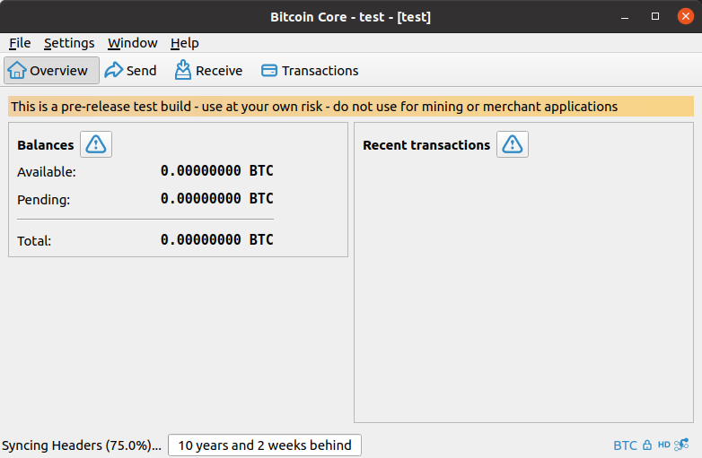 | Closes #23 Closes #215 ACKs for top commit: Talkless: tACK 67c59ae, tested on Debian Sid. Does look as expected. Tree-SHA512: 2b7302fb990ea49e2f01df6f4a23e2bc3de0797da89deaeb299742e6b285a0c21ea80d8259dc0222640cccc2bccc4ea09df443b9a11bf8b88a828e5fb2aec12c
gwillen
pushed a commit
to ElementsProject/elements
that referenced
this pull request
Jun 28, 2022
Sign up for free
to subscribe to this conversation on GitHub.
Already have an account?
Sign in.
Add this suggestion to a batch that can be applied as a single commit.
This suggestion is invalid because no changes were made to the code.
Suggestions cannot be applied while the pull request is closed.
Suggestions cannot be applied while viewing a subset of changes.
Only one suggestion per line can be applied in a batch.
Add this suggestion to a batch that can be applied as a single commit.
Applying suggestions on deleted lines is not supported.
You must change the existing code in this line in order to create a valid suggestion.
Outdated suggestions cannot be applied.
This suggestion has been applied or marked resolved.
Suggestions cannot be applied from pending reviews.
Suggestions cannot be applied on multi-line comments.
Suggestions cannot be applied while the pull request is queued to merge.
Suggestion cannot be applied right now. Please check back later.
The warning icon on the overview page indicates that there is something important the user should know about, but a user may not be aware that they can click it because, on
master, the warning label does not look clickable. As detailed in issue #23, the reason to make it look clickable is that it if they "had a more clickable-appearance (borders or beveled button edges) it could help users more quickly understand what they are being alerted to."This PR removes the
flatproperty from bothQPushButton's to make them look like a button, and therefore clickable. Furthermore, it updates theMaximum Widthto45to fix the small hit-box issue outlined in issue #215.Below are screenshots showing how the warning icon looks under
masterand thisPR:macOS 11.1: Qt 5.15
Ubuntu 20.04: Qt 5.12
Closes #23
Closes #215