FR: Implement Profile Sidebar and new Settings interface #1677
Comments
|
Would make sense to chance this for the reasons mentioned. Minor issue with the sidebar design: What if profile names are too long? I also don't see us using a profile picture. |
I'd suggest having a tooltip with the complete name (this is also a problem with the current design) and using
Yeah, these aren't user profiles...
Not sure about that one. Though we do still need the existing profile features like removing, adding, ex- and importing. Originally I was thinking of a repo management tab. I can't find the thread but we came to the conclusion somewhere that we needed a central place to manage repositories since they aren't associated to a single profile. |
|
One concern I have is listing lots of profile. Would it be possible to implement a sidebar with this widget? I did a quick mockup earlier, something like this:
I was thinking of giving profile management options like remove selected, add new inside Tools menu but your mockup makes sense. |

I agree. Having a button for adding profiles below the list view instead of inside it will be easier to implement and use. The following pattern is already used throughout the application: |
|
Leaving this here - |
@m3nu Yeah, the profile picture was more of a placeholder for any element that can be clicked to open/collapse the profile switcher. Could also be a simple hamburger button. As for long profile names, I like @real-yfprojects idea of tool-tips with complete names.
I agree that for consistency in the application and for ease of implementation this would be a better approach for adding and removing profiles.
I am still slightly unclear on the utility of profiles. I understand that someone may want to back up different repo's to a single profile, but I am unclear of a use case for wanting multiple profiles? If someone could help me understand this, then I could better understand what features a user may desire in the Profile Management section of the Settings. |
Suppose you want to backup |
|
My use case is to connect to backups of other servers to restore files. E.g. I may have 10 customer office NAS file servers that use Borg. When someone needs to grab a file from backup, I just choose that profile to pull the backup of that one file server. |
Never thought to use it like that. Have to rather tinker with cli to find that one file. Would be helpful! |
|
You might also choose to use different time intervals for archiving |
|
Thank you all for the different profile use case examples. With each of your input, I would like to start by making some new design mockups for a profile selector. @real-yfprojects I agree that it is important to keep a consistent UI design pattern. Using this design language and incorporating some of the other profile options like editing and exporting, I came up with something like this:
Are there any other design choices or options we would like to see in the profile selector? After settling on the design for for this part of the task, I can then work on moving the global settings and profile management to our new "setting" button, placed next to the profile selector. Putting it all together, this is what the UI would look like with the profile selector open:
What do we think about this? |


|
Looking good. However this isn't a sidebar but a popup window. What is your reasoning for that? |
|
AH, I think I understand what you are saying now. Just to be sure - are you suggesting to move the profile selector to a sidebar as illustrated in the original mockup, then below the list of profiles have buttons for adding/removing/editing? |
|
Something like this would remove the row of widgets at the top of the window and place them as buttons below the profile list view in the sidebar. Is this closer to what you had in mind?
|

|
Yeah, I think this was closer to what we imagined: #1677 (comment) Operationally, I put you down for Borg pytests first and then the sidebar here. Reason being that tests are well defined, while sidebar is a bit more "open", since we don't exactly know how it looks, which elements to use, etc. Hence we start with the better defined task to avoid getting lost in one "open" task for a long time. |
Ok, thank you, that is understandable. With this in mind I will focus more on reviewing the current Borg testing suite. |
|
Reigniting 🔥 this thread now as I prepare to begin this project. Here's the current project goals as, as I understand them:
Areas where I could use feedback:
|


|
I like the mockups. Sidebar needn't be collapsible. Third question needs an answer. Maybe a dropdown nests this too deep and a list like in this mockup of yours would be better? Buttons to edit profiles would be below this list. And settings button below that. Repo, source, archives tabs would stay in the same place. Just an idea. |
I agree 👍
I like this idea. That mockup doesn't make the list look like it would scroll, however in reality it would to accommodate users with large number of profiles.
Same place as they are currently in Vorta, or same place as they are in this mockup? |
|
@m3nu If I am understanding your thoughts, this is a general idea of sidebar layout, from top to bottom: "Select Profile:" Anything else that should be in the sidebar? Or any thoughts on layout? |
|
Yes, this order of elements could work. Nothing else to add, but maybe someone comes up with something later. |
|
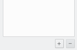
I also prefered the mockups from from the first issue post which is what you settled on if I understood that correctly. Regarding profile management: I would simply move the existing buttons to below the list. Maybe using a plus and minus icon for adding and removing profiles. I think you mixed that one up with the request for a repository management tab. There should be an open issue for that somewhere. |
|
Resolved via #1809 |
The problem
In reference to this:
https://github.com/borgbase/vorta/wiki/Google-Summer-of-Code-2023-Ideas#implement-profile-sidebar
Currently, the user selects a profile and edits it in the tabs below. However, the "misc" tabs contains global setting relating to all profiles. This mix of global settings and profile specific settings on the same tab bar can be confusing to some users. Additionally, the profile selector is a permanent fixture at the top of the application, when a cleaner implementation could tuck this selector away when not in use.
Requested Solution
This FR looks to move the profile selector and the "misc" tab to a collapsable side bar for a better user experience. This sidebar would open/close with a click of the profile icon.
The "misc" tab could be replaced with a new global settings menu accessed from the side bar. This interface could have tabs for Settings, Profile Management, and About.
Additional context
I am curious what features people would like to see added into the Profile Management tab of the settings section? Any feedback on this, or any other conceptual ideas would be greatly appreciated!
The text was updated successfully, but these errors were encountered: