Essentials
To give you a head start developing HoloLens 2 applications, we have developed a set of functionalities that we call the "BDK Essentials. These include a set on usefull scripts and examples on how to use them to make Menus, UI Elements, the BDK Hololens 2 Prefab, and a Sample scene
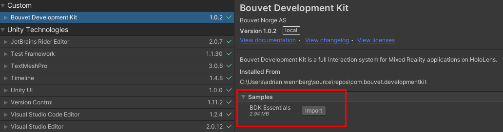
You can find this as a samples package in the Package Manager.
The sample scene is a great starting point for testing BDK and a good testbed for developers of BDK. It contains the various different sample menus and is quick and easy to build.
The floating menu is a type of panel that can hold any content or menu. It is simple to add and useful for most applications. By default it is created at a static point in space and can be moved around manually. It can also be set to follow the player.
The hand menu is another common and simple menu. It can hold several buttons and can be set to attach to either just one hand or both (depending on which triggers its activation first). The menu appears when your palm is facing the HoloLens.
The clock menu prefab is an example of a menu that appears where a watch would normally be. By default it only appears on the left hand. It is useful for giving quick information, but not as useful for buttons as hand tracking is not great when hands are overlapping.
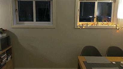
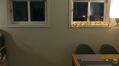
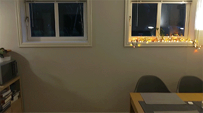
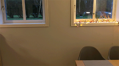
The drape menu is a menu that is attached to the left hand and can be accessed by pulling on a tab (see gif below).
The Overhand Menu will spawn over your palm and will stay there when closing the palm.
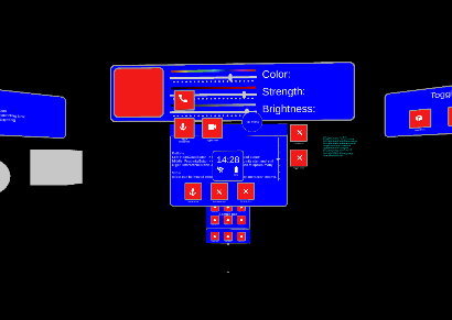
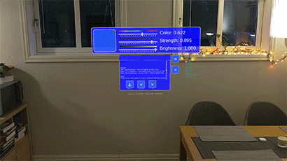
Interactable button is the main button component of BDK. It can be used to activate any piece of code attached to its OnClickEvent. The button glows when being targeted by fingers, interaction beam, head gaze and eye gaze (as long as they are toggled on in InputSettings). This button also comes in a round variety.
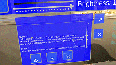
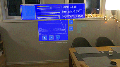
The slider prefab is a grabbable object that can only be moved along one axis. It has a float output from 0 to 1 based on its position on the bracket. It can be set to snap to the points on the track. You can set the amount of dots the script PinchSlider attached at the base of the prefab.
There are also a few useful holograms to help show bounding boxes on grabbable objects.
A prefab that shows an example of a hologram that gets a bounding box around it when the user looks at it (if head or eye tracking cursors are enabled) or moves close to it (if index cursor or interaction beam cursor are enabled).
A prefab that shows an example of a hologram that gets a bounding box frame around it when the user looks at it (if head or eye tracking cursors are enabled) or moves close to it (if index cursor or interaction beam cursor are enabled).
A generic prefab that shows the setup of a Hologram that can be interacted with both hands. This example does not have a bounding box.