
Install rnpm if not already installed on your machine
npm install rnpm -g
####Step 2
Install React Native Elements
npm i react-native-elements --save
Step 3
Link project
rnpm link
Step 4
Start using components
import {
  Button
} from 'react-native-elements'

<Button
  raised
  icon={{name: 'cached'}}
  title='RAISED WITH ICON' />
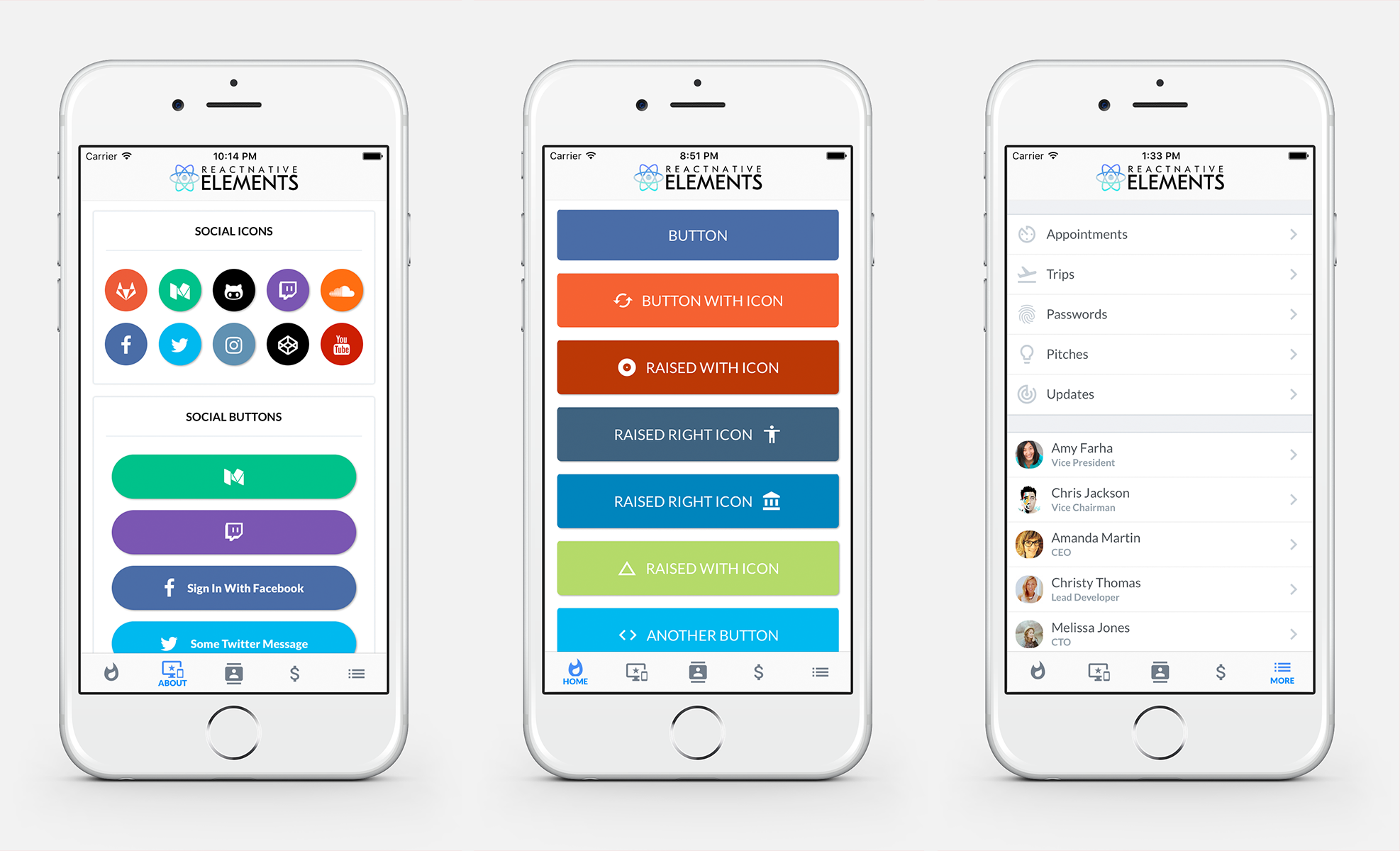
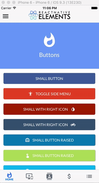
- Buttons
- Social Icons / Buttons
- Side Menu
- Form Elements
- Checkboxes
- List Element
- Linked List Element
- HTML style headings (h1, h2, etc...)
- Card component
- Pricing Component
- Add divider with inset
- Add radio buttons
- Add icons to TextInputs
- Profile Component
- Custom Picker
- Search Bar
- Side Menu Improvements
- Button Group
- Cross Platform Tab Bar
- Something you's like to see? Submit an issue or a pull request
Check out the pre built and configured React Native Hackathon Starter Project which uses all of these elements.
React Native Elements uses Lato as the default font family for iOS and Roboto as the default font family for Android.
We are working on a way to make the font family configurable through the command line.
Here is a list of fonts available out of the box for each platform, or you can install and use a custom font of your own.
To override the fontFamily in any element, simply provide a fontFamily prop:
<Button
  raised
  icon={{name: 'cached'}}
  title='RAISED WITH ICON'
  fontFamily='Comic Sans MS' />

import { Button } from 'react-native-elements'

<Button
  title='BUTTON' />

<Button
  raised
  icon={{name: 'cached'}}
  title='RAISED WITH ICON' />

<Button
  small
  iconRight
  icon={{name: 'code'}}
  title='SMALL WITH RIGHT ICON' />
| prop | default | type | description |
|---|---|---|---|
| buttonStyle | none | object (style) | add additional styling for button component (optional) |
| title | none | string | button title (required) |
| small | false | boolean | makes button small |
| fontFamily | Lato (iOS), Roboto (android) | string | specify different font family |
| iconRight | false | boolean | moves icon to right of title |
| onPress | none | function | onPress method (required) |
| icon | none | object {name(string), color(string), size(number)} | Material Icon Name (optional) |
| backgroundColor | #397af8 | string (color) | background color of button (optional) |
| color | white | string(color) | font color (optional) |
| textStyle | none | object (style) | text styling (optional) |
| fontSize | 18 | number | font size (optional) |
| underlayColor | transparent | string(color) | underlay color for button press (optional) |
| raised | false | boolean | flag to add raised button styling (optional) |
import { SocialIcon } from 'react-native-elements'

// Icon
<SocialIcon
  type='twitter'
/>

// Button
<SocialIcon
  title='Sign In With Facebook'
  button
  type='facebook'
/>
| prop | default | type | description |
|---|---|---|---|
| title | none | string | title if made into a button (optional) |
| type | none | social media type (facebook, twitter, google-plus-official, pinterest, linkedin, youtube, vimeo, tumblr, instagram, quora, foursquare, wordpress, stumbleupon, github, github-alt, twitch, medium, soundcloud, gitlab, angellist, codepen) | social media type (required) |
| raised | true | boolean | raised adds a drop shadow, set to false to remove |
| button | false | boolean | creates button (optional) |
| onPress | none | function | onPress method (optional) |
| light | false | boolean | reverses icon color scheme, setting background to white and icon to primary color |
| iconStyle | none | object (style) | extra styling for icon component (optional) |
| style | none | object (style) | button styling (optional) |
| iconColor | white | string | icon color (optional) |
| component | TouchableHighlight | React Native Component | type of button (optional) |
| fontFamily | Lato-Black (iOS), Roboto-Black (android) | string | specify different font family |
| fontStyle | none | object (style) | specify text styling |

import { List, ListItem } from 'react-native-elements'

const list = [
  {
    title: 'Appointments',
    icon: 'av-timer'
  },
  {
    title: 'Trips',
    icon: 'flight-takeoff'
  }
]

<List>
  {
    list.map((item, i) => (
      <ListItem
        key={i}
        title={item.title}
        icon={{name: item.icon}}
      />
    ))
  }
</List>
import { List, ListItem } from 'react-native-elements'

const list = [
  {
    name: 'Amy Farha',
    avatar_url: 'https://s3.amazonaws.com/uifaces/faces/twitter/ladylexy/128.jpg',
    subtitle: 'Vice President'
  },
  {
    name: 'Chris Jackson',
    avatar_url: 'https://s3.amazonaws.com/uifaces/faces/twitter/adhamdannaway/128.jpg',
    subtitle: 'Vice Chairman'
  }
]

renderRow (rowData, sectionID) {
  return (
    <ListItem
      roundAvatar
      key={sectionID}
      title={rowData.name}
      subtitle={rowData.subtitle}
      avatar={rowData.avatar_url}
    />
  )
}

render () {
  return (
    <List>
      <ListView
        renderRow={this.renderRow}
        dataSource={this.state.dataSource}
      />
    </List>
  )
}
| prop | default | type | description |
|---|---|---|---|
| containerStyle | none | object (style) | style the list container |
| prop | default | type | description |
|---|---|---|---|
| avatar | none | string | left avatar (optional) |
| avatarStyle | none | object (style) | avatar styling (optional) |
| chevronColor | #bdc6cf | string | set chevron color |
| component | View or TouchableHighlight if onPress method is added as prop | React Native element | replace element with custom element (optional) |
| containerStyle | none | object (style) | additional main container styling (optional) |
| hideChevron | false | boolean | set if you do not want a chevron (optional) |
| icon | none | object {name, color, style} | icon configuration for left icon (optional) |
| onPress | none | function | onPress method for link (optional) |
| rightIcon | chevron | string | right icon (optional) (material icon name) |
| roundAvatar | false | boolan | make left avatar round |
| subtitle | none | string | subtitle text (optional) |
| subtitleStyle | none | object (style) | additional subtitle styling (optional ) |
| title | none | string | main title for list item (required) |
| titleStyle | none | object (style) | additional title styling (optional) |
| wrapperStyle | none | object (style) | additional wrapper styling (optional) |
| underlayColor | white | string | define underlay color for TouchableHighlight (optional) |
| fontFamily | Lato (iOS), Roboto (android) | string | specify different font family |
import { SideMenu, ListItem } from 'react-native-elements'

constructor () {
  super()
  this.state = { toggled: false }
}

toggleSideMenu () {
  this.setState({
    toggled: true
  })
}

render () {
  // SideMenu takes a React Native element as a prop for the actual Side Menu
  const MenuComponent = (
    <View style={{flex: 1, backgroundColor: '#ededed', paddingTop: 50}}>
      <List containerStyle={{marginBottom: 20}}>
      {
        list.map((item, i) => (
          <ListItem
            roundAvatar
            onPress={() => console.log('something')}
            avatar={item.avatar_url}
            key={i}
            title={item.name}
            subtitle={item.subtitle} />
        ))
      }
      </List>
    </View>
  )
  return (
    <SideMenu
      MenuComponent={MenuComponent}
      toggled={this.state.toggled}>
      <App />
    </SideMenu>
  )
}
| prop | default | type | description |
|---|---|---|---|
| toggled | false | boolean | toggles side menu when true (required) |
| toggledContainerStyle | none | object (style) | toggled state menu styling |
| easing | Easing.inout | Easing method | specifies different easing method (optional) |
| duration | 250 | animation length | specifies length of animation (optional) |
| menuWidth | window width - 80 | number | the width and offset of the menu (optional) |
| MenuComponent | none | React Native Component | the actual side menu component you would like to use (required) |
| children | none | React Native Component | wrap RNSideMenu around the component you would like to animate (required) |

import { CheckBox } from 'react-native-elements'

<CheckBox
  title='Click Here'
  checked={this.state.checked}
/>

<CheckBox
  center
  title='Click Here'
  checked={this.state.checked}
/>

<CheckBox
  center
  title='Click Here'
  checkedIcon='dot-circle-o'
  uncheckedIcon='circle-o'
  checked={this.state.checked}
/>

<CheckBox
  center
  title='Click Here to Remove This Item'
  iconRight
  iconType='material'
  checkedIcon='clear'
  uncheckedIcon='add'
  checkedColor='red'
  checked={this.state.checked}
/>
This component uses FontAwesome icons out of the box. You can also specify one of the following types of icons by specifying an iconType prop: Zocial, Octicons, MaterialIcons, Ionicons, Foundation, EvilIcons, or Entypo
| prop | default | type | description |
|---|---|---|---|
| iconType | fontawesome | string | icon family, can be one of the following: zocial, octicon, material, ionicon, foundation, evilicon, entypo (required only if specifying an icon that is not from font-awesome) |
| component | TouchableOpacity | React Native Component | specify React Native component for main button (optional) |
| checked | false | boolean | flag for checking the icon (required) |
| iconRight | false | boolean | moves icon to right of text (optional) |
| right | false | boolean | aligns checkbox to right (optional) |
| center | false | boolean | aligns checkbox to center (optional) |
| title | none | string | title of checkbox (required) |
| containerStyle | none | object (style) | style of main container (optional) |
| textStyle | none | object (style) | style of text (optional) |
| onPress | none | function | onPress function for checkbox (required) |
| checkedIcon | check-square-o | string | default checked icon (Font Awesome Icon) (optional) |
| uncheckedIcon | square-o | string | default checked icon (Font Awesome Icon) (optional) |
| checkedColor | green | string | default checked color (optional) |
| uncheckedColor | #bfbfbf | string | default unchecked color (optional) |
| checkedTitle | none | string | specify a custom checked message (optional) |
| fontFamily | Lato-Bold (iOS), Roboto-Bold (android) | string | specify different font family |

import { FormLabel, FormInput } from 'react-native-elements'

<FormLabel containerStyle={styles.labelContainerStyle}>Name</FormLabel>
<FormInput onChangeText={someFunction}/>
This component inherits all native TextInput props that come with a standard React Native TextInput element, along with the following:
| prop | default | type | description |
|---|---|---|---|
| containerStyle | none | object (style) | TextInput container styling (optional) |
| inputStyle | none | object (style) | TextInput styling (optional) |
| prop | default | type | description |
|---|---|---|---|
| containerStyle | none | object (style) | additional label container style (optional) |
| labelStyle | none | object (style) | additional label styling (optional) |
| fontFamily | Lato-Bold (iOS), Roboto-Bold (android) | string | specify different font family |

import { Card } from 'react-native-elements'

<Card
  title='CARD WITH DIVIDER'>
  {
    users.map((u, i) => {}
  }
</Card>
| prop | default | type | description |
|---|---|---|---|
| flexDirection | column | string | flex direction (row or column) (optional) |
| containerStyle | none | object (style) | outer container style (optional) |
| wrapperStyle | none | object (style) | inner container style (optional) |
| title | none | string | optional card title (optional) |
| titleStyle | none | object (style) | additional title styling (if title provided) (optional) |
| dividerStyle | none | object (style) | additional divider styling (if title provided) (optional) |
| fontFamily | Lato-Bold (iOS), Roboto-Bold (android) | string | specify different font family |

import { PricingCard } from 'react-native-elements'

<PricingCard
  color={colors.primary}
  title='Free'
  price='$0'
  info={['1 User', 'Basic Support', 'All Core Features']}
  button={{ title: 'GET STARTED', icon: 'flight-takeoff' }}
/>
| prop | default | type | description |
|---|---|---|---|
| title | none | string | title (required) |
| price | none | string | price (required) |
| color | none | string | color scheme for button & title (required) |
| info | none | array of strings | pricing information (optional) |
| button | none | object {title, icon, buttonStyle} | button information (required) |
| containerStyle | inherited styling | object (style) | outer component styling (optional) |
| wrapperStyle | inherited styling | object (style) | inner wrapper component styling (optional) |
| titleFont | Lato-Black (iOS), Roboto-Black (android) | string | specify title font family |
| pricingFont | Lato-Bold (iOS), Roboto-Bold (android) | string | specify pricing font family |
| infoFont | Lato-Bold (iOS), Roboto-Bold (android) | string | specify pricing information font family |
| buttonFont | Lato (iOS), Roboto (android) | string | specify button font family |