
ng3-charts is a fork from 'n3-charts.linechart' with a couple additions. It gives you the ability to create beautiful charts for AngularJS applications in an easy and semantic way. It is built on top of D3.js.
You can find examples on the demo page.
- Install using bower :
bower install ng3-charts(or copyng3-charts.jswherever you want) - Reference
ng3-charts.jsin your index.html file - Reference the module in your app file :
angular.module('myApp', ['ng3-charts'])
A line chart is called using this syntax :
<linechart data="data" options="options" mode="" width="" height=""></linechart>The line chart directives needs two attributes : data and options. If one is missing, nothing happens.
Your data should look like this :
$scope.data = [
  {x: 0, value: 4, otherValue: 14},
  {x: 1, value: 8, otherValue: 1},
  {x: 2, value: 15, otherValue: 11},
  {x: 3, value: 16, otherValue: 147},
  {x: 4, value: 23, otherValue: 87},
  {x: 5, value: 42, otherValue: 45}
];
Options must be an object with a series array. It should look like this :
$scope.options = {
  axes: {
    x: {key: 'x', labelFunction: function(value) {return value;}, type: 'linear', min: 0, max: 10, ticks: 2},
    y: {type: 'linear', min: 0, max: 1, ticks: 5},
    y2: {type: 'linear', min: 0, max: 1, ticks: [1, 2, 3, 4]}
  },
  series: [
    {y: 'value', color: 'steelblue', thickness: '2px', type: 'area', striped: true, label: 'Pouet'},
    {y: 'otherValue', axis: 'y2', color: 'lightsteelblue', visible: false, drawDots: true, dotSize: 2}
  ],
  lineMode: 'linear',
  transition: {ease: 'elastic', duration: 1000, delay: 50},
  tension: 0.7,
  tooltip: {mode: 'scrubber', formatter: function(x, y, series) {return 'pouet';}},
  drawLegend: true,
  drawDots: true,
  columnsHGap: 5
}The axes keys can be undefined. Otherwise, it can contain an x̀ key with the following properties :
key: optional, defines where the chart will look for abscissas values in the data (default is 'x').type: optional, can be either 'date' or 'linear' (default is 'linear'). If set to 'date', the chart will expect Date objects as abscissas. No transformation is done by the chart itself, so the behavior is basically D3.js' time scale's.labelFunction: optional, allows to format the axis' ticklabels. Must be a function that accepts a single argument and returns a string.min: optional, forces the axis minimum value (default is computed from data)max: optional, forces the axis maximum value (default is computed from data)ticks: optional, configures the axis' ticks (can be either a number or an array, more on this here)
It can also contain, according to your series configuration, a y and a y2 key with the following properties :
type: optional, can be either linear' or 'log' (default is 'linear'). If set to 'log', the data may be clamped if its computed lower bound is 0 (this means the chart won't display an actual 0, but a close value - log scales can't display zero values).min: optional, forces the axis minimum value (default is computed from data)max: optional, forces the axis maximum value (default is computed from data)
The series key must be an array which contains objects with the following properties :
y: mandatory, defines which property on each data row will be used as ordinate value.stacks: an array that allows you to specify which datum you would like to stack on top of eachother. More info with example below.color: optional, any valid HTML color (if none given, the chart will set it for you).label: optional, will be used in the legend (if undefined, theyvalue will be used).axis: optional, can be either 'y' (default, for left) or 'y2' (for right). Defines which vertical axis should be used for this series. If no right axis is needed, none will be displayed.type: optional, can be one of the following values 'line', 'area', 'column', and 'rangearea'. Default is 'line'. Further information on types can be found below.striped: optional, can be eithertrueorfalse. Default isfalse. Will be ignored if the series type is not 'area'.thickness: optional, can be{n}px. Default is1px. Will be ignored if the series type is not 'area' or 'line'.lineMode: optional, can bedashed. Default is undefined. Defines whether the series is rendered as a dashed line. Removed if the series type is notlineorarea.drawDots: optional, can be eithertrueorfalse. Default is true. Defines whether the series is rendered with dots on a perseriesbasis. Overrides the global setting.visible: optional, can be eithertrueorfalse. Default is true. Defines whether the series is initially visible. Will be updated if the series gets hidden or shown through a click on the legend.dotSize: optional, must be an numerical value. Default is2. Will be ignored if the series type is notareaorline, or ifdrawDotsis set tofalse.
#####Chart Types
Within the series section for the chart you can specify 4 different chart types ('line', 'area', 'column', and 'rangearea'). The default is a line chart type.
######Line
The line chart is just that. A line that maps to your data.
######Area An area chart is just like a line chart, however, the area below the line is filled in given a specific color.
######Column Column charts are just as the name describes a way to draw a column or bar chart.
######RangeArea Range area is just like the area chart, however, in an area chart the colors will overlap each other causing the colors to lose their initial value. With a rangearea chart the colors are persistent and will not overlap. Sort of like a stream graph. One thing about rangearea charts is that you cannot use the datum in a stacked option.

####Stacks
Stacks allow you to stack your data in a chart. For example, say I would like to stack a column chart with a couple of series that I listed in my series section like so:
series: [
{id: 'ssIncome', y: 'ssIncome', axis: 'y', color: getColors().ssIncome, thickness: '2px', type: 'column', label: 'Social Security'},
{id: 'ptIncome', y: 'ptIncome', axis: 'y', color: getColors().ptIncome, type: 'column', drawDots: true, dotSize: 4, label: 'Part Time'},
{id: 'invIncome', y: 'invIncome', axis: 'y', color: getColors().invIncome, type: 'column', dotSize: 2, label: 'Investments'}]
With my series defined I can now add them to a stack using their id defined in the series:
stacks: [{axis: "y", series: ['data1', 'data2', 'data3']}]This will stack the data one on top of each other depending on their order, so for this example data1 will go from 0 to its upper limit, data2 will go from data1's upper limit to it's own upper limit, and data3 will go from data2's upper limit to it's own upper limit.
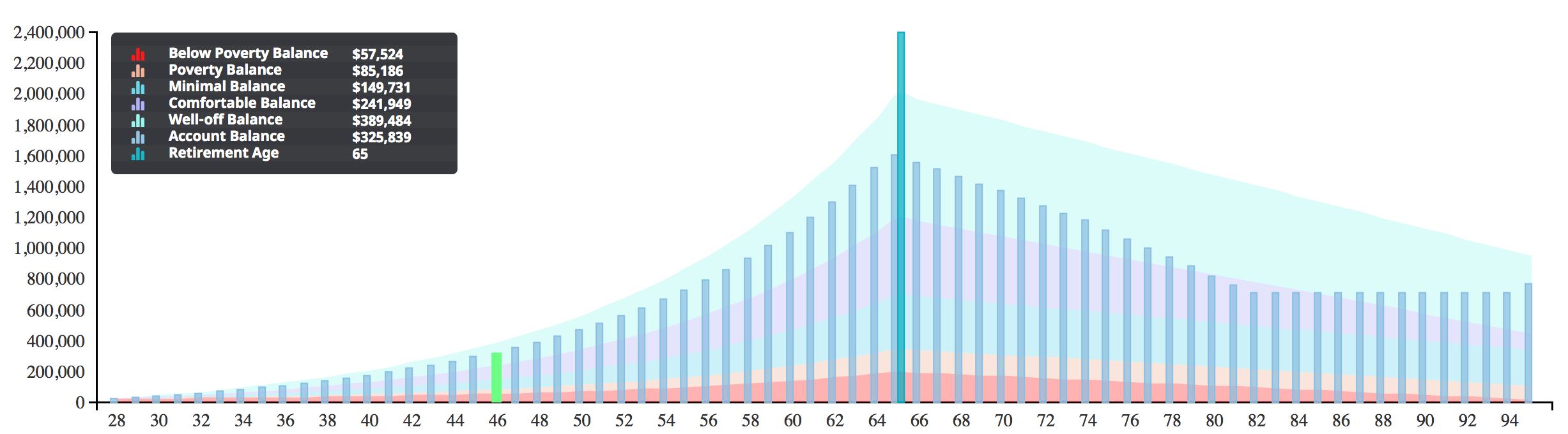
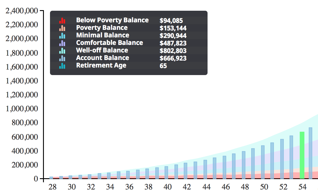
There is something that is noteworthy about stacked graphs and that is that they add their numbers together, so you will get the sum of the data when stacked like the image below:

#####Transition
The transition option must be an object which contains the following properties:
- ease : this allows you to specify which type of easing you want to use (ie - linear, elastic)
- duration : allows you to control how long you want the transition to last for in milliseconds
- delay : amount of delay before starting transition. This defaults to zero
As for right now this transitions only works for drawing column/bar charts. There will be support for other types in the near future.
Usage:
transition: {ease: 'elastic', duration: 1000, delay: 50},NOTE: These options correspond to the d3 docs on transitions found d3 transitions
The tooltip must be an object which contains the following properties :
mode: can be set tonone,axes, orscrubber. It can also be set toscrubber, which displays tooltips for all series. Default isscrubber.interpolate: can be eithertrueorfalse. Default isfalse. Will be ignored if the tooltip's mode is notaxes.formatter: optional, allows to catch the tooltip before it gets rendered. Must be a function that takesx,yandseriesas arguments and returns a string. Ignored when mode is notscrubber.
If the tooltip attribute is not the visual effect you want, for example in the case where you have multiple data series in one graph area,
and multiple tooltips are displayed; all at once; you can make use of the legendHandler which will be called by ng3-charts as the user mouse-over the graph.
This way tootip data can be displayed in one fixed place anywhere on the screen and will be able to get updated data points as the user moves his mouse over the graph area.
The user basically has full control over how to display the data, by writing his/her own html/css and just plugging in the data values.
To enable the legendHandler the tooltip mode must be set to none and a method legendHandler must be defined in options as follows:
         legendHandler: function(x, y, series, index, options) {

			// creates the external legend if not already exists
            var chartLegend = drawExternalLegend(chart, legendBoxClassName, options);

            // will update the existing legend with chart data
            updateLegendPointData(chartLegend, x,  y, series, index);

        },
The user is passes the x and y values of the given data point the mouse is currently moved over (for every data series if multiple are defined) as well as the complete data series, its index and the options object itself. This gives the user full control and the ability to draw any html/css to create a custom legend. It is recomended to use D3js instead of the traditional jQuery to modify any existing html DOM components.
If the highlightGraphs attribute (must be an array) is defined inside options e.g.:
highlightGraphs: [{seriesIndex: 5, color: "#6bff84"}],It will allow the user to highlight a specific column of a column/bar graph as the user is moving his/her mouse over the specific column within the graph.
This visual effect goes well together with the external legend in that is puts the focus on a specific column by changing the color of the given bar/column
and displaying its data value inside the external legend. The highlightGraphs attribute however can be used by iitself and does not depend on
the legendHandler attribute.
To use the highlightGraphs attribute the user must supply a list of highlight objects. Each object represent an existing graph of type column
and should have the attributes seriesIndex to identify the specific series as well as color as the highlighted color. If the user wants to have more flexability
in modifying the style or attributes of a graph colomn the user can define an additional options attribute called formatHighlight for example:
         formatHighlight: function(series, rect, columnWidth) {   // this is the svg rect object presenting the vertical bar/column


            rect.style({'fill': '#6bff84',	// fill color
                'fill-opacity': 1,
                'stroke-width': '0px'   // remove border

            });

            rect.attr({'width': columnWidth + 3});  // zoom into bar and make it look bigger
        },
This method will be called as the user is moving his/her mouse pointer over the graph. It will pass the given data series, the actual SVG bar rect object,
and the column with for the given bar/column graph. This gives the user full control over the style and any other SVG attributes as can be seen in the above example.
Additionally, you can set lineMode to a value between these :
- linear (default)
- step-before
- step-after
- basis
- basis-open
- basis-closed
- bundle
- cardinal
- cardinal-open
- cadinal-closed
- monotone
The tension can be set, too (default is 0.7). See issue #44 about that.
For more information about interpolation, please consult the D3.js documentation about that.
The drawLegend and drawDots are optional. They respectively enable/disable the chart's legend and the lines and areas dots. Default is true for both.
The columnsHGap is optional (default is 5). Sets the space between two columns. If you haven't any column series on your chart but are wondering why this option doesn't do anything, please don't send me an email.
The mode can be set to 'thumbnail' (default is empty string). If so, the chart will take as much space as it can, and it will only display the series. No axes, no legend, no tooltips. Furthermore, the lines or areas will be drawn without dots. This is convenient for sparklines.
This is more a hack. The chart usually tries to infer its own dimensions regarding its parent, but sometimes it fails like a noob. That's why these two attributes can be set. The should look like this :
<linechart width="150" height="100"></linechart>Fetch the repo :
$ git clone https://github.com/n3-charts/line-chart.gitInstall dev dependencies :
$ npm installInstall components :
$ bower install###Grunt I am currently working on getting a test suite as well as other grunt tasks to build a minified version and watch files.
Currently there are no tests for this project. I am currently working to get the pre existing tests from line-chart.js to work in this project
Written with StackEdit.