Redesign of the notification's dropdown #2131
Assignees

Labels
Comments
|
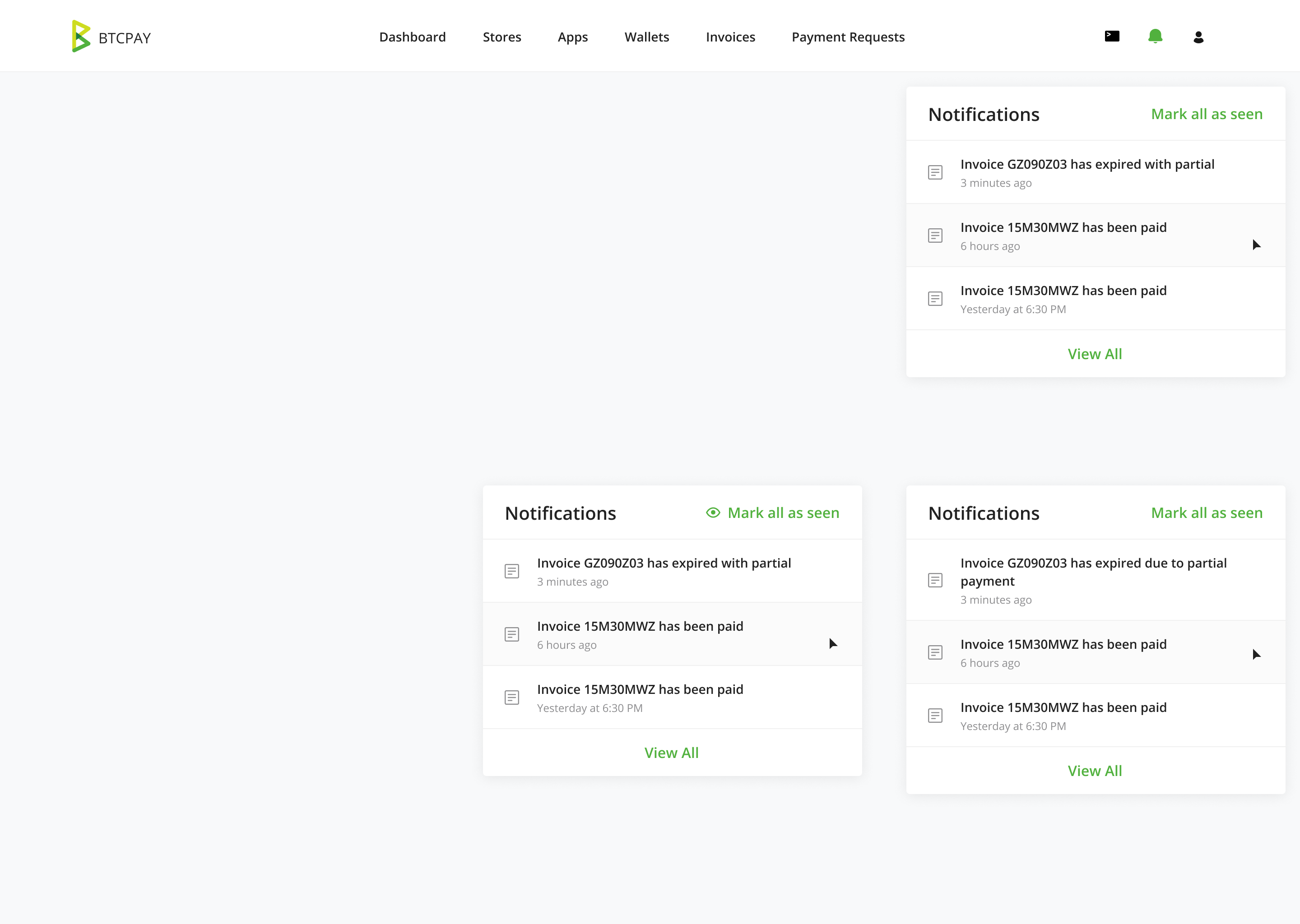
Adding the resolution of where we landed as well, top right and bottom right (for multi-line), we decided to remove the "eye" icon, so disregard, but for the sake of comparison, I left.
|
|
Starting on this. |
NicolasDorier
pushed a commit
that referenced
this issue
Jan 7, 2021
* Update notification dropdown strings

* Update notification dropdown styling

address #2131

* Update border color

* Update notification hover color

* Revert "was confirmed paid" to "has been paid" change

* Move styles to site.css

* Update style="border-bottom: 0;" to border-bottom-0

* Update heading

* Add icon sprite

* Add default icon styles

* Use "currentColor" instead of specific color for icon

* Update icon color definition

* Adjust dropdown position

* Update h4 to h5
Sign up for free
to join this conversation on GitHub.
Already have an account?
Sign in to comment
Follow up from #2101
I decided to merge @bolatovumar PR as it is a needed feature in the short term.
That said, I agree that the design is less than ideal and should be improved.
FROM @dstrukt
In my true fashion, I'm presenting a few options :)
My personal favorite is Option B, the right (with more padding), all based on the 4px base (4, 8, 16, 24, etc...).
I realize this would be a bit more work, but this notification overlay was an area I wanted to address, so I thought I'd go ahead and share something a bit more ambitious with this addition, it's all cosmetic, but if it's out of scope, I understand.
Option A, extending the current version with a similar pattern.
Option C, a modified version with everything on the bottom, which I suppose I could make an option D using the current text + date with everything on the bottom, but I'm not particularly a fan of this direction, so I didn't
As for the "eye" icon, I'm ambivalent, I could take it or leave it, with the addition of (potential) future icons however, it's cleaner not to have it, but for the current state .. shrug.
As usual, open to any and all feedback!
The text was updated successfully, but these errors were encountered: