-
Notifications
You must be signed in to change notification settings - Fork 163
New issue
Have a question about this project? Sign up for a free GitHub account to open an issue and contact its maintainers and the community.
By clicking “Sign up for GitHub”, you agree to our terms of service and privacy statement. We’ll occasionally send you account related emails.
Already on GitHub? Sign in to your account
Align help text and labels for tick elements #3965
Conversation
|
Demo starting at https://vanilla-framework-3965.demos.haus |
290b484
to
764074c
Compare
f247c8f
to
42c4570
Compare
|
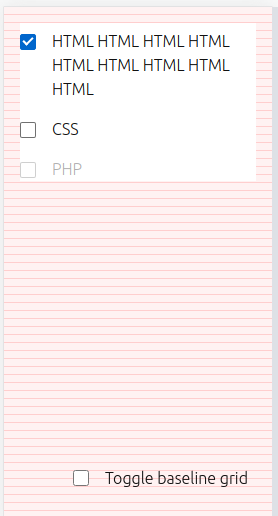
Hi @carkod the alignment of the secoind line of text looks good, but there's another problem - compare ot the Baseline grid toggle in this screenshot: The checkbox box sits slightly higher in the actual example - is this issue introduced here or present in master as well? |
|
@carkod Did you approve Percy on this PR? There is a lot of unexpected changes in screenshots that shouldn't be approved. Many of checkbox/radio examples are broken because of style changes, such as: Unfortunately I don't see the option in percy to 'unapprove' them, but you should review all the checkbox related examples and see how they are affected by the change. |
|
@carkod you should not approve percy yourself, this is another form of visual review that should be done by someone reviewing the pr. |
Sorry, which checkbox is slightly higher? |
|
@carkod in this branch, it is aligned to the baseline, making it look a bit raised: When you change from block to inline context, you need to take care of vertical-align to ensure nothing moves. |
7ae5b9e
to
1c39d04
Compare
1c39d04
to
083172f
Compare
This example shows an Accordion pattern variation with less indentation to accomodate checkboxes
083172f
to
655f58e
Compare
7fec1c0
to
a9c7f73
Compare
a9c7f73
to
a6349db
Compare
There was a problem hiding this comment.
Choose a reason for hiding this comment
The reason will be displayed to describe this comment to others. Learn more.
LGTM
There was a problem hiding this comment.
Choose a reason for hiding this comment
The reason will be displayed to describe this comment to others. Learn more.
LGTM @lyubomir-popov final design review? Bartek made some changes to the required icon
|
+1'd :) |


Done
Align help text with tick elements
Fixes #3402
Fixes #3966
QA
Open https://vanilla-framework-3965.demos.haus/docs/examples/patterns/forms/checkbox
Open and check help text https://vanilla-framework-3965.demos.haus/docs/examples/patterns/forms/radio
Check standalon versions also look the same
https://vanilla-framework-3965.demos.haus/docs/examples/patterns/forms/checkbox
https://vanilla-framework-3965.demos.haus/docs/examples/standalone/patterns/forms/checkbox
https://vanilla-framework-3965.demos.haus/docs/examples/patterns/forms/radio
https://vanilla-framework-3965.demos.haus/docs/examples/standalone/patterns/forms/radio
Review updated documentation:
Also fixed checkbox alignment issue

Check if PR is ready for release
If this PR contains Vanilla SCSS code changes, it should contain the following changes to make sure it's ready for the release:
Feature 🎁,Breaking Change 💣,Bug 🐛,Documentation 📝,Maintenance 🔨.package.jsonshould be updated relative to the most recent release, following semver convention: