
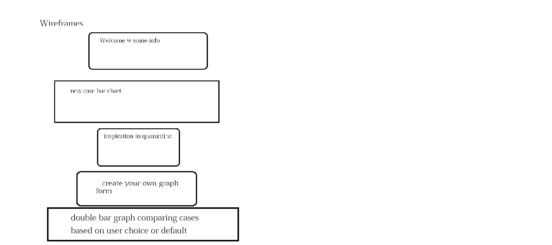
With Corona being the top story causing massive shut downs of the global economy and travel bans, I want to create a site that can track the cases with a lighthearted theme & bring some positive quarantine activities to help us all through.
- bar graph of a random selection of 8 countries’ cases cases.
- interactive and show data points.
- fun suggestions for things to do in quarantine.
- allows you to create your own graph based on chosen parameters.
- double bar graph of all the cases, vs deaths, vs recoveries based on input.
- reload image when the API is overloaded with requests
- CORONAVIRUS COVID19 API
- D3
- JS Library
- HTML
- CSS
The implementation of a graph that dynamically changes as the user hovers over each bar per country.
 Upon hovering over a bar on the graph, the country whose bar it belongs to is taken in via
 d. The transition method indicates an animated change to the DOM and is given a transition so the bar grows smoothly. The bar itself is assigned an additional class highlight to allow for a change of color and is given a new width and height so that the bar grows horizontally and vertically upon hovering and stays proportional.
function onMouseOver(d, i){
      d3.select(this).attr('class', 'highlight');
      d3.select(this)
        .transition()
        .duration(500)
        .attr("width", xScale.bandwidth()+5)
        .attr("y", function(d) { return yScale(Math.log(d.NewConfirmed).toFixed(4))-10; })
        .attr("height", function(d) { return height - yScale(Math.log(d.NewConfirmed).toFixed(4)) +10; });
     //  debugger
      g.append("text")
      .attr('class', 'value')
      .attr('x', function(){return xScale(d.Country)+20})
      .attr('y', function(){return yScale(Math.log(d.NewConfirmed).toFixed(4))-15;})
      .text(function(){
        return Math.log(d.NewConfirmed).toFixed(4);
      });
    }
Upon Mouse Leave, the dimensions of the bar that was hovered on, are reset to their original values and the text displaying the numerical statistic the bar represents is removed.
 function onMouseLeave(d, i){
      d3.select(this).attr('class', 'bar');
      d3.select(this)
      .transition()
      .duration(500)
      .attr("width", xScale.bandwidth())
      .attr("y", function(d) { return yScale(Math.log(d.NewConfirmed).toFixed(4)); })
      .attr("height", function(d) { return height - yScale(Math.log(d.NewConfirmed).toFixed(4)); });
      d3.selectAll('.value')
      .remove();
    }
The implementation of a graph that dynamically changes according to user input of X and Y Axes.
 The second graph works with two different x domains, one for the overall graph and one for the subcategories per country allowing space for two bars per country.
 xScale.domain(dom.map(d=> { return d.Country;}));
  subcatsX.domain(subcatsnames).range([0, xScale.bandwidth()]);
  yScale.domain([0, d3.max(y)*1.5]);
The section designated for each country's bars are selected and the subcategories are extracted in order to create a bar per subcategory. Each subcategory is given a specific color to differentiate the two bars above each country.
subsection.selectAll("rect")
      .data(function(c) {
        return c.subs;})
      .enter().append("rect")
      .attr("width", subcatsX.bandwidth())
      .attr("x", function(c) {
         return subcatsX(c.name)+26;})
      .attr("y", function(c) {return yScale(c.value);})
      .attr("height", function(c){return height-yScale(c.value);})
      .style("fill", function(c){ //debugger
        return color(c.name);});
On Mouse Over the position of the text is based on the graph as a whole and the position of one's mouse to determine the first subcategory bar's x coordinates xpos and this x is added to the x of the subcategory bar subcatsX(d.name) which starts at 0 if it is the first bar or the width of the first bar for the second bar. It is then given an additional 26 to center the text above its respective bar.
g.append("text")
          .attr('class', 'value')
          .attr('x', ()=>{
            let xpos = event.target.parentElement.transform.baseVal[0].matrix.e;
            return xpos+ subcatsX(d.name)+26;
             //  return event.clientX;
          })
- Day 1: figure out D3 and create 1st world line graph
- Day 2: add interactivity to graph
- Day 3: double bar graph countries based on user input
- Day 4: create form for double bar graph and make double graph interactive
- Day 5: style & make it pretty