Icons for the new citizenlab category codes #202
Comments
|
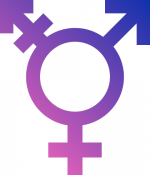
The differentiation between 'sex education' and 'lgbt' isn't super clear, otherwise these look awesome! Maybe Sex Ed could also have book? maybe LGBT could also include the trans arrow, e.g. https://www.autostraddle.com/wp-content/uploads/2012/06/Trans-Symbol-e1340119810868.png |
yeah I was feeling there could be some issues with the LGBT one too. Technically it's the "intersex" icon.
These are good suggestions. I will think a bit about it, though by adding another book, I fear it could clash with the Edit: maybe the sex education icon could look like the |
|
hey @hellais nice job on picking those icons. They all seem pretty topically on-point. I agree with @willscott and perhaps even the icon in the link he suggested. Yet, the religon icon does complicate things. To the a design-geek's eye, this definitely feels like icons from different sets tossed together- the various weights, thicknesses, and styles are not quite matching, nor are they original designs. Thus, including them in the Open Source Design Icon collection wouldn't quite make sense IMHO. All that said, I'm lacking the context of how this icon set is being used. Would you like the icons to be harmonized and tweaked a bit and included in the OONI icon-font? |
This is the edited version of the LGBT icon: Do you think the Sex Education icon works well or do you have some suggestions on how that could be improved/changed? I get the impression that adding a book and putting such a complex shape inside of it would make it be a bit too complex.
What I was suggesting was just to include the ones OONI made (marked with the blue dot), that are I think fairly consistent with the style of the font-awesome icon set (they are basically derived by stacking other font-awesome icons together).
Basically these icons would be used in data visualisations (and possibly also explorer) to visually indicate the icon used inside of a data visualisation. Here is a concrete example of the icons in use:
That would actually be very useful, but as you know my design (and especially vector drawing) skills are quite limited. I think given the fact that we currently use font-awesome in all OONI assets, they preferred style would be that of that icon set, therefore making some tweaks to the icons marked as red. |


|
I like the updated LGBT icon better than the original. Perhaps putting that same icon on one of those graduation hats for "Sex Education" would work. However, the use of these are a bit small in that screenshot. Perhaps tweaking the size of the table cells / collumns would allow for larger icons. Cool thing 😄 |
|
I tried a couple of ways of doing it, but leaving the trans arrow just makes it too noisy. Without the trans arrow I think it looks a bit cleaner, yet it still feels a little bit off-balanced. Not entirely sure what to do about that, but I think it's passable.
What do you think? |

|
The final versions of these icons turned out a little bit different. You can find them inside of the OONI Probe design system: https://github.com/ooni/design-system/tree/master/components/svgs/icons/. Feel free to re-use them as you see fit, they are licensed as CC-BY-SA 4.0 International |
I was working on some data viz for OONI and as part of that I came up with an icon set for each of the citizenlab category codes.
Most of the icons are taken from either font-awesome or material design icons (which both use SIL Open Font License) and some are designed by OONI (mostly based on stacking font-awesome icons). @bnvk do you think it would be useful to add the OONI made ones to @opensourcedesign?
Feedback an input on the iconset is greatly appreciated. Also if it would be useful I can possibly add these to the repository itself, though maybe that will just increase the size of the repo and maybe most people don't care about the icons.
The text was updated successfully, but these errors were encountered: