
In this exercise you will be able to apply all the concepts you've just learned, such as:
- using different HTML tags,
- structuring your HTML page with block elements, and
- adding content to your HTML page with inline elements.
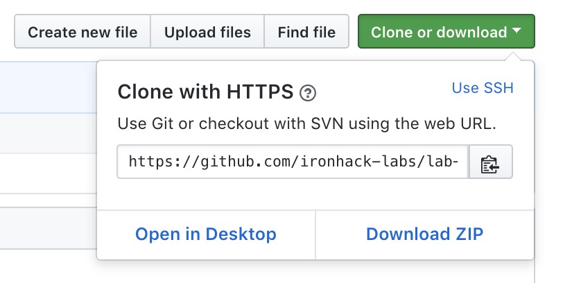
- Click on the button "Clone or download" and a window will appear:
- Click the button "Download as zip"
In this exercise, you will clone one of the previous versions of the landing page of NPM website. NPM is a package manager for NodeJS, and you will be using it heavily throughout this course.
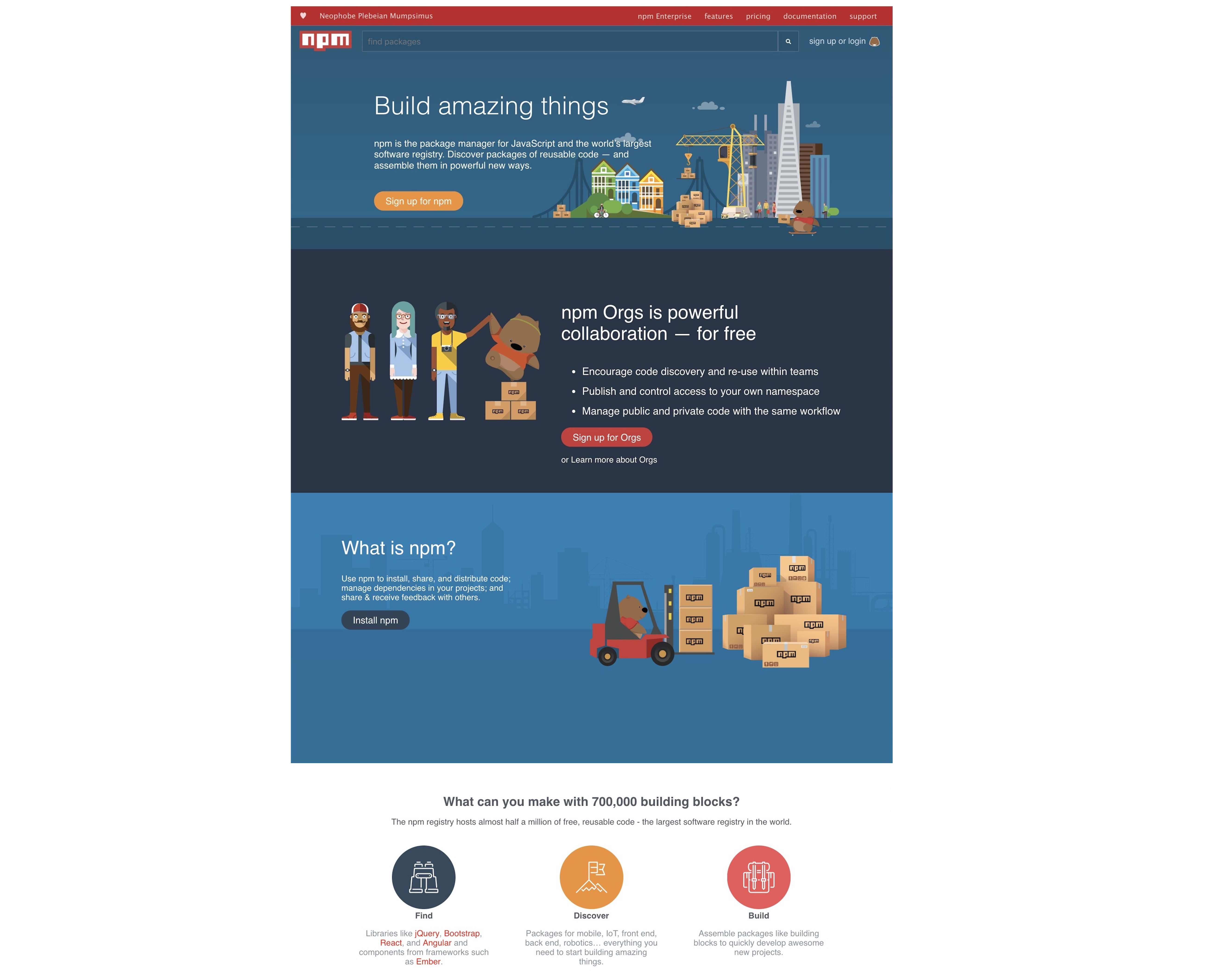
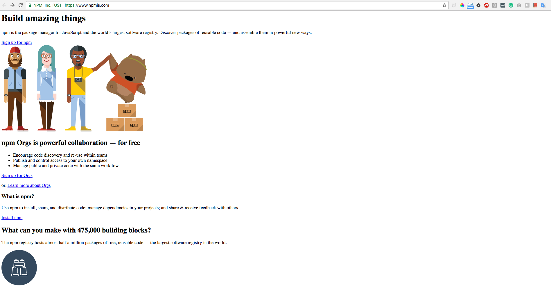
You can see the larger version of this picture here. If you're struggling to see the details, feel free to zoom in to 200%. Just by taking a look to this picture, we can conclude that we will have to apply quite a few styles on our web page: different background colors, font weight (bold, normal), and elements being positioned very deliberately with CSS.
We will devide our work into two parts:
- part I - create web page with no styles, just add HTML elements
- part II - add styles and make it perfect 😌
So let's get started!
The starter-code folder contains an index.html file with the main structure already created. We provided the images folder with all the images necessary to successfully finish the exercise.
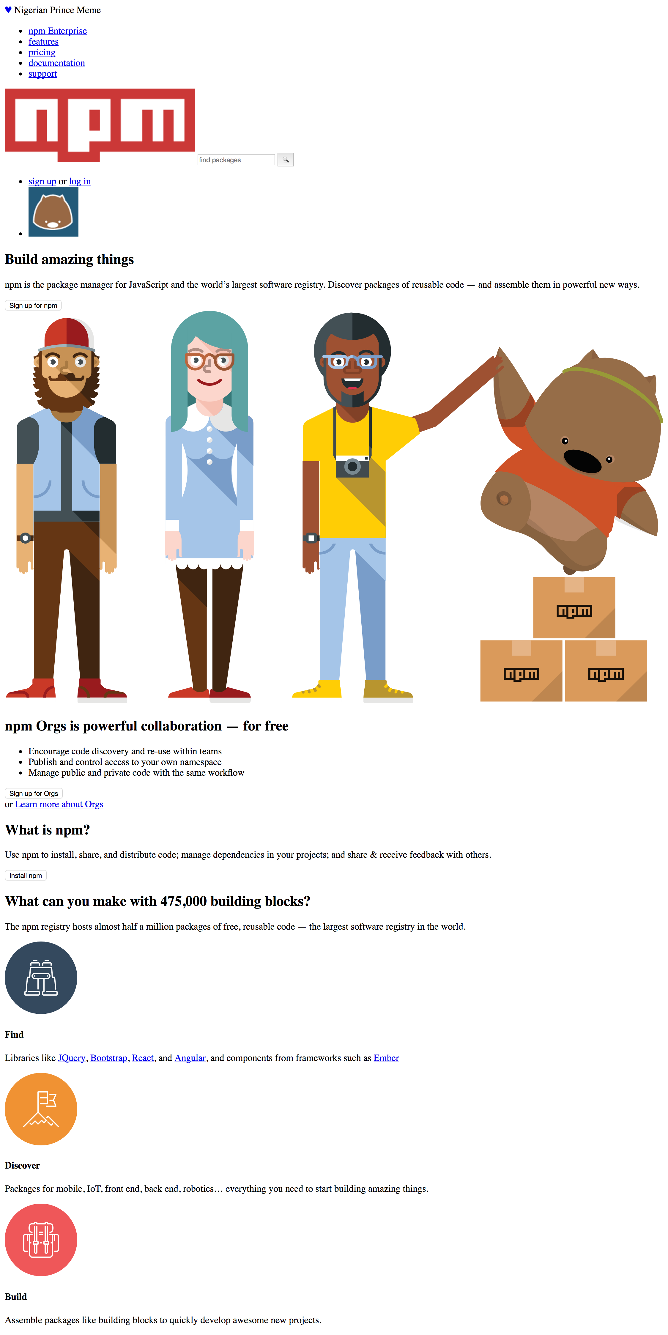
This is kind of our goal 🙃:
The most difficult part of this exercise is deciding how to structure the page and picking the correct semantic tags for the job. Picking the right semantic tags will make your job easier in the next exercise when it comes time to styling.
Our recommendation is to try to keep it simple. Try to identify the different sections, and add id's or classes to each <div>, <section>, <ul>, or <header> block elements to identify these elements:
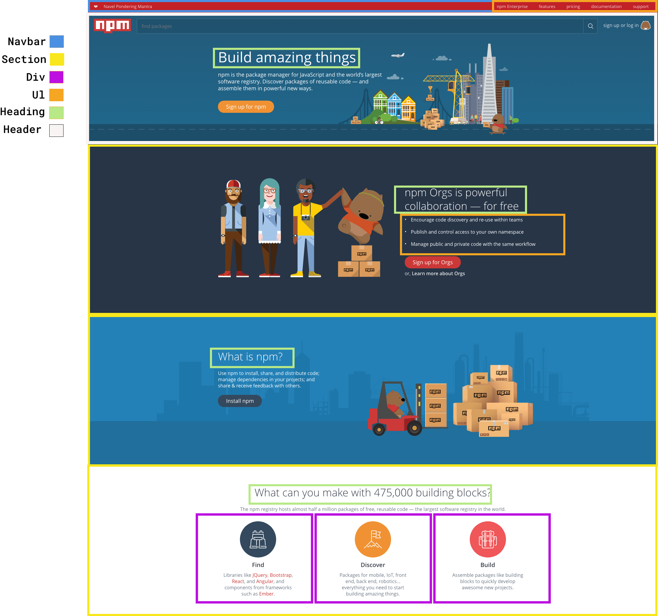
You can view a larger version of this picture here.
Your task in this iteration will be to create the nav and header, which are the first two sections of the page.
Example

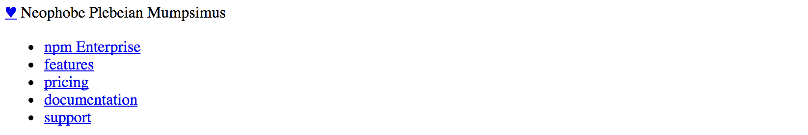
We could try to represent this navigation bar as follows:
<nav>
  <div class="top-left">
    <a class = "heart" href="#">♥︎</a>
    <span class="acronym">Neophobe Plebeian Mumpsimus</span>
  </div>
  <ul class="top-links">
    <li><a href="#">npm Enterprise</a></li>
    <li><a href="#">features</a></li>
    <li><a href="#">pricing</a></li>
    <li><a href="#">documentation</a></li>
    <li><a href="#">support</a></li>
  </ul>
</nav>
Since there are no styles applied, our final result won't look like the one on the picture, but rather somewhat like this:
After the navigation bar, create the header (on the sectioned image, it's marked with white). When done, move to the next iteration 🚀
Take a look at the sectioned image one more time and you can see we have three sections below the header. Create section tags and give each of them ids so you can identify them easily.
Fill in the content for each of these sections: lists, headings, paragraphs, divs, etc.
All images can be found in your images folder!
The final result should be similar to this:
The time has come! We'll make it pretty! 🎨
As you might recall, the first thing we have to do to add styles to our page is to create a styles.css file and link it to our index.html.
So let's begin by creating a new file, in the same folder as our HTML file, and name it styles.css
Then, we need to add the following line to the <head> of our HTML file:
<link rel="stylesheet" type="text/css" href="styles.css">
Now we are ready to start adding some styles to our page.
Hint: You might want to consider adding the following line to your CSS, just to confirm that you have linked it correctly:
body{
  background-color: red;
}
If you the changes you just made in your styles.ccs file and refresh your browser, the whole page should turn red. If this happens, you know that you have linked the CSS file correctly. (You can delete that from your CSS once you have confirmed it's working.) 😉
In the first part of this exercise, you created the navbar and it looks like this:
Right now, we are going to add some CSS to make it look a little more like this:
The first thing we notice is that the navbar has a red background and the text inside the nav is white.
Furthermore, all the words/phrases on the right side of the nav are links, but they are all white as well, and they are not underlined. And as we said, they are on the right side 😄 This positioning has to be done through CSS as well.
This is our HTML:
<nav>
  <div class="top-left">
    <a class = "heart" href="#">♥︎</a>
    <span class="acronym">Neophobe Plebeian Mumpsimus</span>
  </div>
  <ul class="top-links">
    <li><a href="#">npm Enterprise</a></li>
    <li><a href="#">features</a></li>
    <li><a href="#">pricing</a></li>
    <li><a href="#">documentation</a></li>
    <li><a href="#">support</a></li>
  </ul>
</nav>
And now we will add this to the style.css file:
nav {
  background-color: #C12127;
  color: rgba(255,255,255,0.8);
  padding-top: 15px;
  height: 100px;
}

nav a {
  color: rgba(255,255,255,0.8);
  text-decoration: none;
}
This will make your nav having the right colors, but we still have a long way to go. The next thing that becomes obvious when we do this is that our list of links all fall on the left side, one on top of each other (why don't they go next to each other? 🤯 what type of element is an <li>? block or inline? 🤔).
Hint: We also added a height property to the nav. This is just to make it easier to see while you are working on it, this is not meant to be interpreted as the correct height.
In order to move the links where they need to go, we will float the <ul> to the right and display all the links inside the list as inline-block elements, which give most of benefits of a block element, but allows them so "sit" next to each other.
.top-links {
  display: inline-block;
  float: right;
  padding: 0;
  margin: 0 20px 0 0;
}

.top-links li {
  display: inline-block;
  margin: 0 10px;
}
Now our nav should look something like this:

Which property we should add to make the navbar look like the one on picture we clone?
Think about how you are going to change the vertical alighment of both sections. You might notice that the current font is not the right one but let that not stress you, try to find some that is similar. Later in the course you'll be able to get it when inspecting the page anyway.
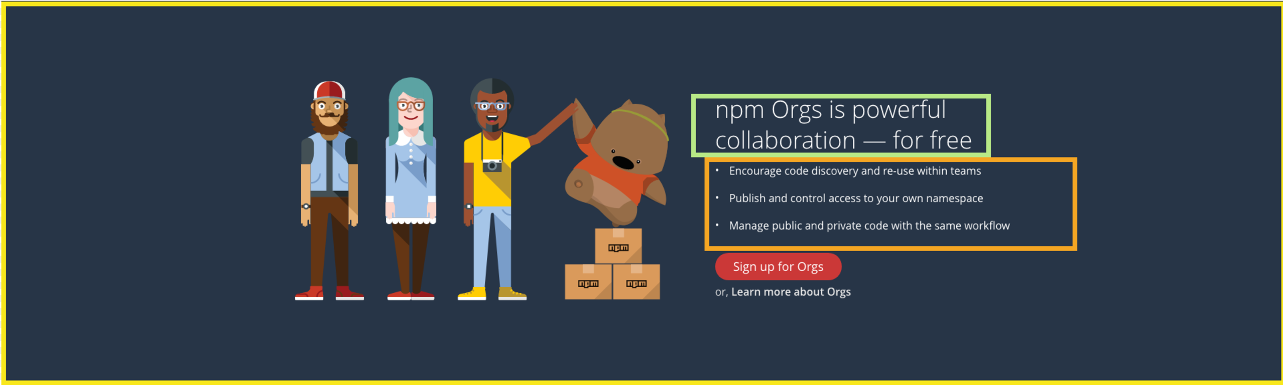
The header is composed of two seperate pieces: one with a search bar and logo, the other with some text content and a button. First, divide this section into halves using divs:
Hints
- You can center the second
divby giving it a width, and amargin: 0 auto. - The image of a city next to "Build Amazing Things" can be floated right to position it to the side of the text content.
Colors
- Font - White
- Button -
rgb(240, 146, 51) - Background -
rgb(32, 101, 136) - Search Bar Background -
rgb(31, 82, 111)
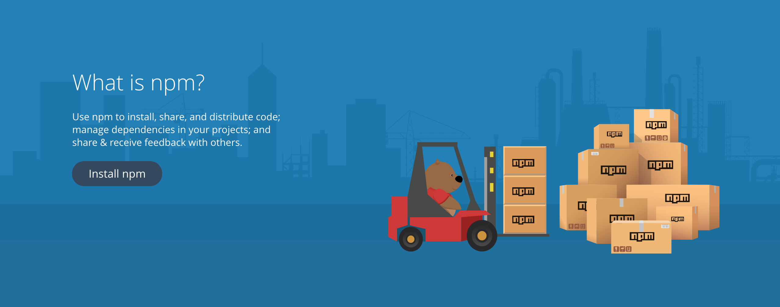
Hints
- Wrap the content in a
div, and give it either padding or a width andmargin: 0 autoto center it. - Float the div containing the heading, ul and button to the right of the image.
Colors
- Font - White
- Background -
rgb(39, 53, 71) - Button -
rgb(203, 56, 55)
Hints
- The background of this section is actually an image ❗️ so use
background-sizeproperty and set it to have valuecoverto have it cover the section. - Use absolute positioning for the
divcontaining the text. Remember, when you use absolute positioning you must position thesectionas relative.
Colors
- Font - White
- Button -
rgb(49, 68, 88)
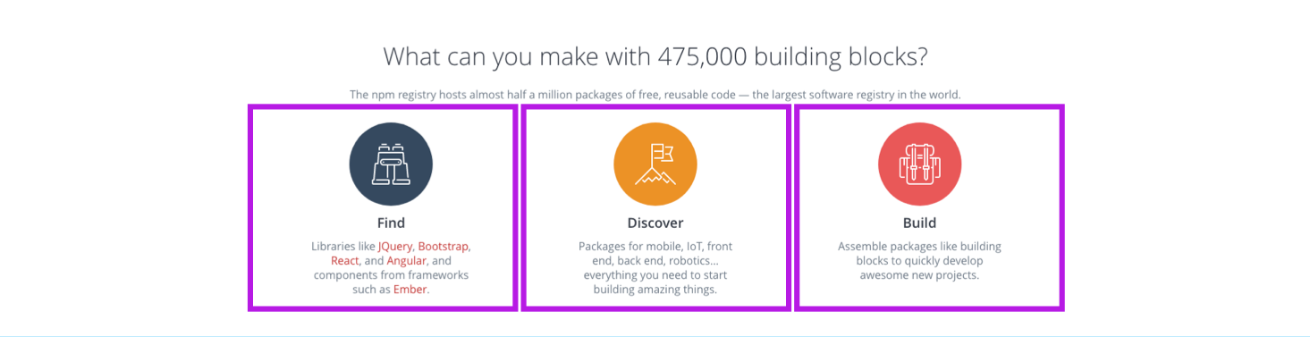
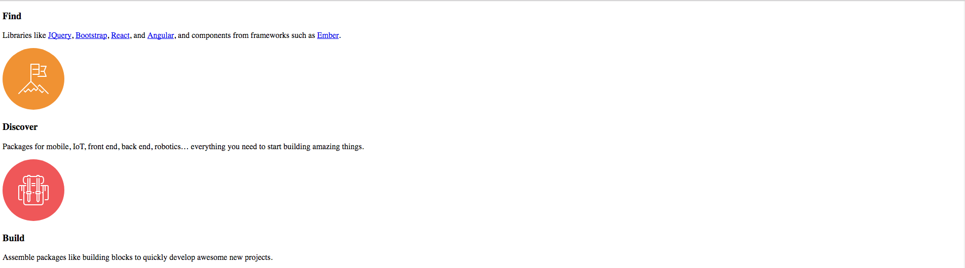
This section is composed of 2 other sections:
- one containing a heading and text content, and -the other containing 3 sections, each with a logo, a bolded description, and some descriptive text.
Hints
- First, split the
sectioninto 2 divs, one containing the heading and "The npm registry hosts...", the other containing the three different logos & their descriptions. - Once again, the content can be centered using either padding or
margin: 0 auto. There seems to be a pattern here 🙃. Make a class for this and the other divs with a similar layout. - Each
divcontaining the logo should take approximately 33% (a third) of the parent's container.
Colors
- Font: Heading -
rgb(83, 88, 98) - Font: Secondary / Paragraph text -
rgb(135, 145, 156) - Links -
rgb(208, 74, 73) - Background - White
In this exercise, you've built a clone of a piece of the npm home page. This site is very complexed so if you managed to make it look anything like the original, good job! 🏆
This concludes the HTML / CSS module. Next up is JavaScript, so get some rest, drink some coffee, and get ready to learn the muscles that make things move on a web page.
Happy coding! ❤️