Skip to content
New issue

Have a question about this project? Sign up for a free GitHub account to open an issue and contact its maintainers and the community.

By clicking “Sign up for GitHub”, you agree to our terms of service and privacy statement. We’ll occasionally send you account related emails.

Already on GitHub? Sign in to your account

Pie chart colors specified in custom template are incorrect #166

Closed
WillNilges opened this issue Sep 22, 2020 · 3 comments · Fixed by #235 or #279
Closed

Pie chart colors specified in custom template are incorrect #166

WillNilges opened this issue Sep 22, 2020 · 3 comments · Fixed by #235 or #279
Assignees
Labels
bug Something isn't working done This issue was solved but not merged in master investigation This issue is being investigated
Milestone

Comments

@WillNilges
Copy link

Describe the bug

It appears that colors specified in a template for the pie chart won't stay consistent. For example, if I set it up like so in the template:
image

The colors appear to "shift" one to the left. So that BLOCKER is green, CRITICAL is black, and so on.

To reproduce

  1. Create custom template with LibreOffice
  2. Modify the chart colors
  3. Create report on CLI using this template
  4. Observe mismatched colors

Expected behavior

Colors line up with severity levels as specified in the template

User environment

  • OS: Ubuntu 20.04
  • Project version: 3.2.2
  • SonarQube: 8.4
@WillNilges WillNilges added the bug Something isn't working label Sep 22, 2020
@WillNilges
Copy link
Author

WillNilges commented Sep 22, 2020

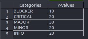
Not totally sure about this, but I think the issue might be that in the template, it's sorting by severity (or alphabetically?) but when you actually generate a report, it assigns the colors by quantity and re-arranges the tags accordingly. So for example, I just generated a new report on a different repo with a lot of major issues and only one or two blockers and critical issues, and so the blockers and criticals, which on the template are assigned to the top of the pie chart, are moved to the bottom in favor of major issues, which is then colored as black because it's where blockers are supposed to be.

image
This is how the template orders its data

image

and this is how the report orders its data

@begarco begarco added investigation This issue is being investigated bug Something isn't working and removed bug Something isn't working labels Sep 29, 2020
@Sancretor Sancretor added this to the 4.0.0 milestone Mar 25, 2021
@Sancretor Sancretor linked a pull request May 7, 2021 that will close this issue
12 tasks
@Sancretor Sancretor added the done This issue was solved but not merged in master label May 10, 2021
@Sancretor
Copy link
Contributor

Hi @WillNilges

I know it's been a very long time... but if you're still interested, you could have a look at the dev branch where the fix has just been merged.
In case you test it, don't hesitate to give us some feedback !

@WillNilges
Copy link
Author

Hey @Sancretor ,
I found this bug during my last internship, and no longer have access to the facilities or resources required to test this. I will be returning to that position sometime in the fall, and if it comes up, I'll definitely give it a go.
Thanks for fixing this!

@Sancretor Sancretor mentioned this issue Aug 27, 2021
11 tasks
Sign up for free to join this conversation on GitHub. Already have an account? Sign in to comment
Labels
bug Something isn't working done This issue was solved but not merged in master investigation This issue is being investigated
Projects
None yet
4 participants