
Live demos and docs: borisyankov.github.io/react-sparklines/

npm install react-sparklines --save
npm install
npm start
http://localhost:8080

<Sparklines data={[5, 10, 5, 20, 8, 15]} limit={5} width={100} height={20} margin={5}>
</Sparklines>
Sparklines component is a container with the following properties:
data - the data set used to build the sparkline
limit - optional, how many data points to display at once
width, height - dimensions of the component
margin - optional, offset the chart
min, max - optional, bound the chart
<Sparklines data={[5, 10, 5, 20]}>
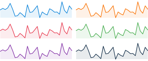
<SparklinesLine color="blue" />
</Sparklines>
<Sparklines data={[5, 10, 5, 20]}>
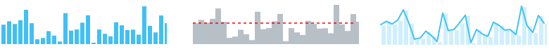
<SparklinesBars />
</Sparklines>

<Sparklines data={sampleData}>
    <SparklinesLine style={{ fill: "none" }} />
    <SparklinesSpots />
</Sparklines>
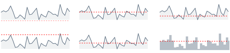
<Sparklines data={sampleData}>
    <SparklinesLine />
    <SparklinesReferenceLine type="mean" />
</Sparklines>
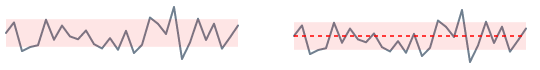
<Sparklines data={sampleData}>
    <SparklinesLine style={{ fill: "none" }}/>
    <SparklinesNormalBand />
</Sparklines>