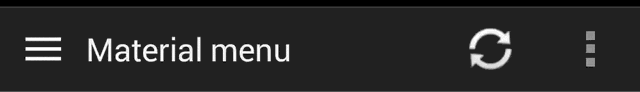
Morphing Android menu, back, dismiss and check buttons
Check for latest versions at Gradle Please and import depending on ActionBar you use
// stock actionBar
compile 'com.balysv.materialmenu:material-menu:1.2.4'

// actionBarCompat
compile 'com.balysv.materialmenu:material-menu-abc:1.2.4'

// actionBarSherlock
compile 'com.balysv.materialmenu:material-menu-abs:1.2.4'Generally, you should use MaterialMenuDrawable as a standalone drawable in your custom views, etc.
The library provides two wrappers that might ease implementation:
A plain old View that draws the icon and provides an API to manipulate its state.
Customisation is also available through attributes:
app:mm_color="color"               // Color of drawable
app:mm_transformDuration="integer" // Transformation animation duration
app:mm_pressedDuration="integer"   // Pressed circle animation duration
app:mm_scale="integer"             // Scale factor of drawable
app:mm_strokeWidth="integer" // Stroke width of icons (can only be 1, 2 or 3)A POJO that initializes the drawable and replaces the ActionBar icon. See usage in ActionBar below
There are four icon states:
BURGER, ARROW, X, CHECKTo morph the drawable state with a pressed circle animation
MaterialMenu.animatePressedState(IconState state)To morph the drawable state without a pressed circle animation
MaterialMenu.animateState(IconState state)To change the drawable state without animation
MaterialMenu.setState(IconState state)Customisation
// change color
MaterialMenu.setColor(int color)

// change transformation animation duration
MaterialMenu.setTransformationDuration(int duration)

// change pressed animation duration
MaterialMenu.setPressedDuration(int duration)

// change transformation interpolator
MaterialMenu.setInterpolator(Interpolator interpolator)Depending on the ActionBar you use, use one of the following classes:
MaterialMenuIcon, MaterialMenuIconCompat or MaterialMenuIconSherlock.
In your Activity add the following:
protected void onCreate(Bundle savedInstanceState) {
      materialMenu = new MaterialMenuIcon(this, Color.WHITE, Stroke.THIN);
}

protected void onPostCreate(Bundle savedInstanceState) {
    materialMenu.syncState(savedInstanceState);
}

protected void onSaveInstanceState(Bundle outState) {
    materialMenu.onSaveInstanceState(outState);
}

public boolean onOptionsItemSelected(MenuItem item) {
    if (item.getId() == android.R.id.home) {
        // Handle your drawable state here
        materialMenu.animatePressedState(newState);
    }
}
In order to use the new Material circle pressed state, you have to disable ActionBar item backgrounds in your theme and re-enable it for other menu icons
<style name="AppTheme" parent="android:Theme.Holo.Light.DarkActionBar">
    <item name="android:actionBarItemBackground">@null</item>
    <item name="android:actionButtonStyle">@style/ActionButtonStyle</item>
    <item name="android:actionOverflowButtonStyle">@style/OverflowButtonStyle</item>
</style>

<style name="ActionButtonStyle" parent="android:Widget.Holo.ActionButton">
    <item name="android:background">@drawable/action_bar_item_background</item>
</style>

<style name="OverflowButtonStyle" parent="android:Widget.Holo.ActionButton.Overflow">
    <item name="android:background">@drawable/action_bar_item_background</item>
</style>
Otherwise, to disable circle pressed state use
MaterialMenu.setNeverDrawTouch(true)Simply add MaterialMenuView in your custom layout and register an OnClickListener to do the
transformations.
See source of Demo for details
Balys Valentukevicius - balys.v@gmail.com @ Lemon Labs
Copyright 2014 Balys Valentukevicius

Licensed under the Apache License, Version 2.0 (the "License");
you may not use this file except in compliance with the License.
You may obtain a copy of the License at

   http://www.apache.org/licenses/LICENSE-2.0

Unless required by applicable law or agreed to in writing, software
distributed under the License is distributed on an "AS IS" BASIS,
WITHOUT WARRANTIES OR CONDITIONS OF ANY KIND, either express or implied.
See the License for the specific language governing permissions and
limitations under the License.