Skip to content
New issue

Have a question about this project? Sign up for a free GitHub account to open an issue and contact its maintainers and the community.

By clicking “Sign up for GitHub”, you agree to our terms of service and privacy statement. We’ll occasionally send you account related emails.

Already on GitHub? Sign in to your account

Redesign of /hangouts page #547

Open
lpatmo opened this issue Aug 5, 2017 · 13 comments
Open

Redesign of /hangouts page #547

lpatmo opened this issue Aug 5, 2017 · 13 comments
Assignees
Labels
[feature] hangouts issues that relate to the hangout functionality [state] in-discussion this issue is being considered and we'd welcome your thoughts and ideas [type] feature a new feature or significant change to site functionality

Comments

@lpatmo
Copy link
Member

lpatmo commented Aug 5, 2017

Some things to consider:

  • hangout cards hard to read in blocks of 3
  • Is the learnings/"current status" section on the right taking up too much space, especially if it's not being used very often?
  • Should the list of study groups (currently on the very left in the red-zebra branch take its place?
@lpatmo lpatmo added the [state] in-discussion this issue is being considered and we'd welcome your thoughts and ideas label Aug 25, 2017
@lpatmo
Copy link
Member Author

lpatmo commented Aug 25, 2017

Note: the redesign of codebuddies.org/hangouts is up for discussion. :)

@lpatmo lpatmo closed this as completed Aug 25, 2017
@lpatmo lpatmo reopened this Aug 25, 2017
@d3vild06
Copy link
Collaborator

I think the learnings/current status doesn't seem very useful at this point. I don't believe it's a feature largely used by anyone today.

@lpatmo lpatmo added the [state] backlog the issue has been raised but hasn't yet been looked at, we'll get to it label Sep 4, 2017
@lpatmo lpatmo closed this as completed Sep 4, 2017
@lpatmo lpatmo added [state] closed the issue is now closed, see comments for more information and removed [state] backlog the issue has been raised but hasn't yet been looked at, we'll get to it labels Sep 4, 2017
@lpatmo lpatmo reopened this Sep 4, 2017
@lpatmo lpatmo added [state] in-review the implementation that addresses this issue is up for review and removed [state] closed the issue is now closed, see comments for more information labels Sep 4, 2017
@ajparise
Copy link
Member

I think the scrollbars are a little distracting and maybe unnecessary?

The hangouts page seems busy/noisy with a ton of information to parse through, sometimes less is more.

What about something neat and succinct?
https://www.eventbrite.com
image

https://www.picatic.com/events
image

http://www.eventzilla.net/events
image

@lpatmo
Copy link
Member Author

lpatmo commented Nov 11, 2017

Thank you for those design screenshots/examples, @ajparise! :) I hope to work on this issue this weekend.

Noting that this issue is closely related to #696.

@mindovermiles262
Copy link

I think the learnings/current status doesn't seem very useful at this point. I don't believe it's a feature largely used by anyone today.

Agree 💯

This learnings/status feed may be more useful in replacing the root of a logged in user, like Twitter or Facebook

@angelocordon
Copy link
Contributor

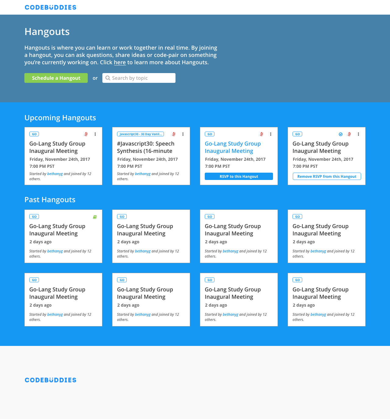
Hi here!

Drafted up something for the hangouts page -

image

As per some discussion over in #codebuddies-meta about the hangouts page, we've take out some components where we thought weren't very necessary to the page in order to make it clearer as to what the page is for. I've also introduced the idea of having a hero section to describe briefly what a hangout is with a clear primary and secondary CTA (we either want them to create a hangout or join one).

Another point of discussion is possibly limiting the number of past hangouts. I think we can limit it to eight, and the Load More button may be unnecessary. In the context of keeping old hangouts only to showcase that there are things happening within the community, I think showing the last eight events can do this quite well. The Load More button may be more useful when searching for topics and we can show more past hangout events.

Feel free to leave some thoughts - open to feedback!

@osanseviero
Copy link
Collaborator

Excellent work! Looks more organized and there isn't too much information at the same time.

@distalx
Copy link
Member

distalx commented Nov 19, 2017

@angelocordon , thanks for putting it all together.

RE: past hangouts
If system has more than 12-14~ upcoming/live hangouts scheduled already then user won't see the past hangouts section at all. user will only see the past hangouts when system will run out of upcoming/live hangouts, and would be able to browse it till the beginning of the time.

@lpatmo
Copy link
Member Author

lpatmo commented Nov 19, 2017

Love the description at the top! Hadn't thought of it before, but it makes sense to provide some context right there about what hangouts are.

One thing I wonder if we can add to the design: when a user hovers over a hangout card, show the description. That way they wouldn't have to click through to see the goals and description (i.e. what to expect) before they decide to join.

----> YES, that @lpatmo @angelocordon - some mechanism to both keep the page clean, but give people all the info they need on a hangout before they have to click through.

@angelocordon angelocordon self-assigned this Nov 19, 2017
@ghost
Copy link

ghost commented Nov 19, 2017

Ideas: That description at the top of the page should absolutely express intentions and purposes of hangouts. It's an excellent place, I think, to tackle that awkward question of "Do I have to have my mic on?" (Just because that seems to be such a deterrent for hangouts) ;D

I think that the past hangouts should have a visual contrast from live or upcoming hangouts in addition to a spatial separation and heading. I had actually had in my mind. A different card color or font color? I have been entertaining the idea of them not even being cards but rather a text-based list that has a little more room for highlights (today I learned) if they're there.

I think the Today I Learned as it relates to hangouts is incredibly important and a really cool feature. It's possible that this list can be visually separated from the hangouts they belong to and grouped on their own panel, just referencing the hangout they came from. So that way all the highlights are quite literally highlighted and in a way that shows that not only are we doing these hangouts, these hangouts are populated, but they're actually being helpful for people and we're getting things done. (I would then encourage at that point the usage of the TIL feature to also note what was discussed in a hangout where maybe coding progress was replaced by some enlightening topics of conversation)!

@angelocordon
Copy link
Contributor

@kvie - agree with your points - yes the past hangouts should visually look different than active ones to signify that they have already passed.

Regarding the TILs, I think there are a lot more questions around that that needs more thought -

Just a bit of rubber ducking here 🦆 -

While I agree that the notes from a hangout are important, I don't necessarily think we need to display all of it in a hang out card or at all.

1.) Not all hang outs have them filled out.
2.) The amount of notes vary from very little to some pretty good decent amount (question here is do we show all of it or just the top couple?)

3.) Not sure if this model
image

is the same as this model
image
(Maybe @distalx can you confirm?)

4.) Really comes back down to do notes belong in the hang out page? 50/50 on it still.

5.) And if we do - what kind of technical challenges would we encounter if we include hangout notes when querying hangouts in order to load them in the page. I'm imagining that's a huge query so may or may not be worth doing? Not familiar enough with Meteor to have bigger opinions on this but there's probably a reason why it's not being listed currently (different from being able to POST it). cc: @distalx would love your thoughts here also.

image
Can we display an icon that signifies that a hangout has notes so that

  1. smaller data point (if hangout_has_notes kind of conditional; and we don't have to include all the notes data)
  2. as a user, you can skim through hangout cards that you're interested, and only click on the ones that interest you to read through people's notes?

I also think lastly, we don't have enough traction on user behavior regarding note taking for it to be actionable enough to go beyond a simple icon for now. Maybe it would be more appropriate to revisit down the line when we have more notes?

Happy to discuss :)

@lpatmo
Copy link
Member Author

lpatmo commented Jan 1, 2018

I've got a PR for this issue at #757, but I'm going to keep this thread open because the discussion is awesome, and we haven't addressed all of the points raised by @angelocordon and @kvie yet.

@billglover
Copy link

Do we want to break out the points that haven't yet been implemented/agreed into separate issues?

@billglover billglover added the [type] feature a new feature or significant change to site functionality label Mar 1, 2019
@billglover billglover added [feature] hangouts issues that relate to the hangout functionality and removed [state] in-review the implementation that addresses this issue is up for review labels Mar 1, 2019
Sign up for free to join this conversation on GitHub. Already have an account? Sign in to comment
Labels
[feature] hangouts issues that relate to the hangout functionality [state] in-discussion this issue is being considered and we'd welcome your thoughts and ideas [type] feature a new feature or significant change to site functionality
Projects
None yet
Development

No branches or pull requests

8 participants