New issue
Have a question about this project? Sign up for a free GitHub account to open an issue and contact its maintainers and the community.
By clicking “Sign up for GitHub”, you agree to our terms of service and privacy statement. We’ll occasionally send you account related emails.
Already on GitHub? Sign in to your account
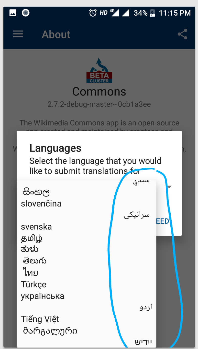
Alignment of language selection dialog in About>Translate #1713
Comments
|
@nicolas-raoul This issue need to be worked on i hope. |
|
What do you suggest to make it look better?
…On Sat, Jul 14, 2018 at 10:53 PM, Siddharth Vaish ***@***.***> wrote:
@nicolas-raoul <https://github.com/nicolas-raoul> This issue need to be
worked on i hope.
—
You are receiving this because you were mentioned.
Reply to this email directly, view it on GitHub
<#1713 (comment)>,
or mute the thread
<https://github.com/notifications/unsubscribe-auth/AAGFBiqy_nR7dv2zWAqe12-J2g81Cji4ks5uGffjgaJpZM4VPZ9V>
.
|
|
@nicolas-raoul There is some text which is right aligned so it should be aligned to the left side. |
|
I believe that each language should be shown in its natural alignment, so RTL is the best for RTL languages. |
|
@nicolas-raoul I think it looks synchronized if we align all languages LTR otherwise its looks as if its an issue rather than intentionally done. May be centrally aligned solves this confusion. |
|
I agree that centrally aligned may be the best. |
|
The consensus at https://ux.stackexchange.com/q/119565/5179 seems to be:
|
Sounds like the best solution to me. I agree with the poster who said that left-aligning RTL languages for very short phrases isn't usually an issue. |
|
@misaochan So should i align all the languages to the left? |
|
Lets wait for @nicolas-raoul to get back to us, shall we? :) |
|
@VaishSiddharth could you please implement as described in my comment #1713 (comment) ? Thanks! :-) |
|
@nicolas-raoul @misaochan Please have a look at the screenshots. Should i send a pull request? |
|
I think @nicolas-raoul meant that the alignment should depend on the alignment of the language that the user is currently using? However, IMO your current code is an improvement to the existing state anyway, as the lack of alignment makes scanning the dropdown list really difficult. So you could submit a PR with that first, but we can keep this issue open so that an enhancement for RTL languages can be put in later. |
|
@misaochan Ok |
|
@misaochan By mistake I have commited this improvement with a branch which I had already used in a Pull request previously #1695. Please tell me what to do. Should I make a new pull request now? Or add in the description of that pull request about this improvement. |
|
I would make a new PR, as they are fixing very different issues. |
|
@misaochan Do I have to do anything? |
|
Yes, please separate your PRs based on the issue they are solving. So these improvements should not be in #1695 . There are a number of ways to do this - for instance, you could use git cherry-pick on another branch and then resubmit your #1695 PR via that branch with only the relevant commits, and then do the same for the commits fixing this issue (with a different PR). Or you could just keep #1695 and revert the irrelevant commits. |
|
@misaochan Ok I will do it. |
|
@misaochan I have created a new PR please have a look. |


Summary:
The drop down menu in translate does not looks good.
Steps to reproduce:
Device and Android version:
Xiaomi Mi A1 (Android 8.0.0, API 26), with 2.7.2-debug-master~fa6353b3
Screen-shots:
Would you like to work on the issue?
I will try to fix this issue
The text was updated successfully, but these errors were encountered: