Limited connection mode banner occupies too much space #4300
Comments
|
@nicolas-raoul I'd like to work on this issue. Would it suffice to reduce the size? Or change it to something like a |
|
IMO, the size could be reduced to have a width of what a standard banner notification (48 dp height). We could so add a close button which would make it go away untill it's toggled back again. Tagging @neslihanturan @misaochan |
I think adding close button wouldn't be right. User must knew all time that their uploads are paused. |
|
@theankitbhardwaj, there is an icon on the toolbar which already does that |
Ohh. Sorry I didn't notice that. |
Reduced size sounds good to me too. Same with a close button, however I think it should not save in between sessions. E.g. if the user closes the banner, then closes the app with limited connection mode on, when they relaunch the app with limited connection mode on, the banner should display again. Otherwise there is too much potential for confusion IMO. |
|
what about changing the color of the limited-connection-mode icon on the status bar to a different color which tells it is currently turned on. The color will change previous color when it is clicked again. Also, a popup giving an alert for 2 seconds. |
|
Is someone working on this issue ? If not, I wish to work on it. |
I think we should explicitly say limited connection mode is on. So just color change seems too hidden to me and may cause confusion. I agree @misaochan about closing/removing the notification while keeping limited connection mode on may cause confusion. However I would be confused if the cross button that I clicked to remove the banner would cause my limited connection goes off too. Because my purpose to click on that button would be hiding the banner, not closing the mode. My suggested solution is, not having a remove option for this banner. It should stay there as soon as limited connection is on. However it should take less space, standard banner notification (48 dp height) seemed right to me. The cloud icon could locate next to the title text. More like this one: A wild idea: we can have turn off/deactivate button and more info button instead of explanation text in banner. Anyway my suggestion is keeping the text, not having buttons, reducing size it to 48dp and leaving it as is (as a non removable banner). |

|
@neslihanturan Shall I implement as you suggested? As a banner with 48dp height & a click to expand to show more text? |
|
Lets wait for inputs of others, if they all agree, it is yours as you were the first person who asked. |
I agree with this. :) Let us go with that for now. We can revisit the discussion later if users still feel that a removal option is needed after these changes are made. |
|
I have a concern. We can't show the title and description within 48dp. I think we can remove the description, else it would be really tiny & unreadable! Attaching a sample of how this will look :)
|

|
wouldn't hiding it while scrolling down would be an better option, them it fill alerting not alarming on the head |
|
Making the banner smaller when scrolling (like some websites do) sounds like a good idea indeed :-) |
Can this be done? I'm adding a draft PR with these changes if anyone needs to take a look :) |
|
@VishnuSanal It was just one idea, if it would bring too much complexity then the idea can be discarded :-) |
|
nice idea but you will not be able to that because of the image size , there is one same image file with ending 32 instead , but you will have to change its tint. which will be restricted to api level 32 so again its better string to linear layout , or you can simply import app and then change its tint. just a suggestion ,these were the things i ran into while review, i hope it hepls |
|
How about removing the description from the banner, but having a tooltip on the banner that, when tapped, would display the description text? @neslihanturan |
I think it is a hidden way of warning user about limited connection mode. I think it is better when written openly. Btw, which problem this suggestion prevents? There are several suggestions under this issue so I am a little lost. |
|
@VishnuSanal are you still working on this issue? if not, can i resolve this issue? |
I'm, I'd love to complete it too! I even made a draft PR too! But, I was confused right now on which suggestion to implement! If you'd like you can take it up @vinayak0505. What do you say? |
|
Just go with the one you implemented earlier , with improvements. |
|
@vinayak0505 You can take over this if you wish. I'm dropping |
|
oh okay, let me try |
|
If i am not in limited connection mode and i close the app open it again then i am able to see the banner for 1 sec or so, it should be at the visibility gone in the xml and then toggle |
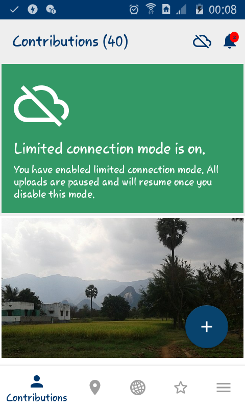
Summary:
In small-screen devices the limited connection mode banner occupies to much space. To be specific, it occupies ~50% of the space in which I view my Contributions. The worst part of it is, it's sticky and hence doesn't even move along with the contributions. 😐
Steps to reproduce:
Device and Android version: Samsung SM-J111F running Android 5.1.1.
Commons app version: 3.0.0.946~d001279
Screen-shots:
Would you like to work on the issue?
Prefer not.
The text was updated successfully, but these errors were encountered: