This project aims to analys COVID-19 data to understand the disease more and find any interesting patterns.
It's divided to two phases
Phase 1 :
- Correlation
- Similarity
- Skewness
- Progress of Infection
- Boxplots of data
Phase 2 :
- Prediction
- Attributes Generation
- Discretization
- Text to Numerical
- Tracking Idea
- Decision Tree
- Naive Bayes Classification
- K-Means Clustering
So We Gathered Our data from Johns Hopkins University Repository on Github, and it's daily updated.
- Total Confirmed Cases Upto Each Date For Each State and Country
- Total Recoverd Cases Upto Each Date For Each State and Country
- Total Death Cases Upto Each Date For Each State and Country
- Removing province/state columns
- Grouping states by countries and sum thier values
- Extract last day data from each data set to create summary dataset
- Using datasets to create new datasets for new daily cases
- Using different correlation methods like (Standard, Kendall, Spearman) we calculated the following correlations between data

- using different distance methods like (Eucledian, Manhattan, Supermum ) we calculated the following distances between the data

by plotting the number of death cases on the x axis and number of countries have the same number of cases on the y axis.
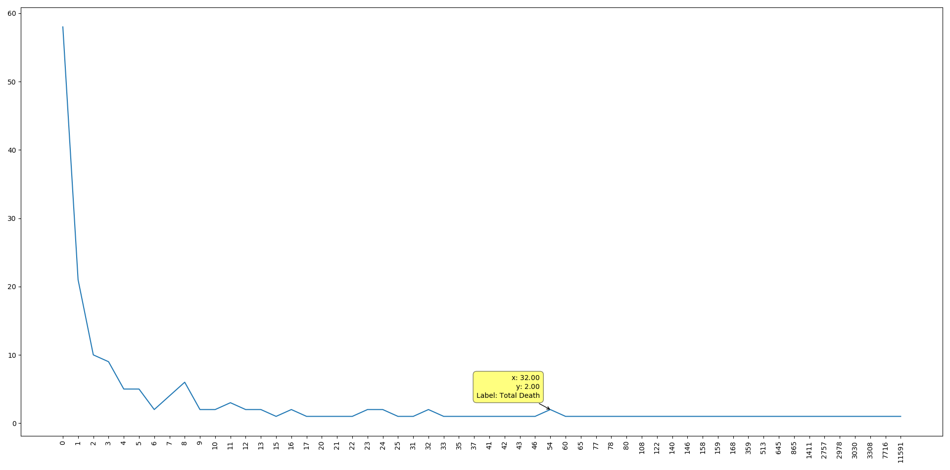 We can see that the data is positively skewed, which means that the majority of the countries have few dead cases
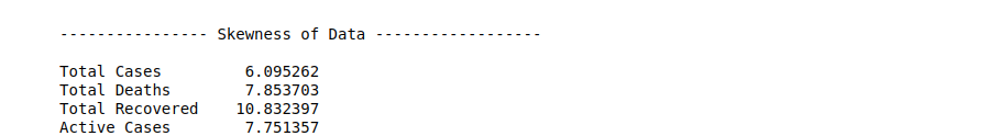
We can see that also (Total cases, Recovered cases, Active cases ) data is positivley skewed
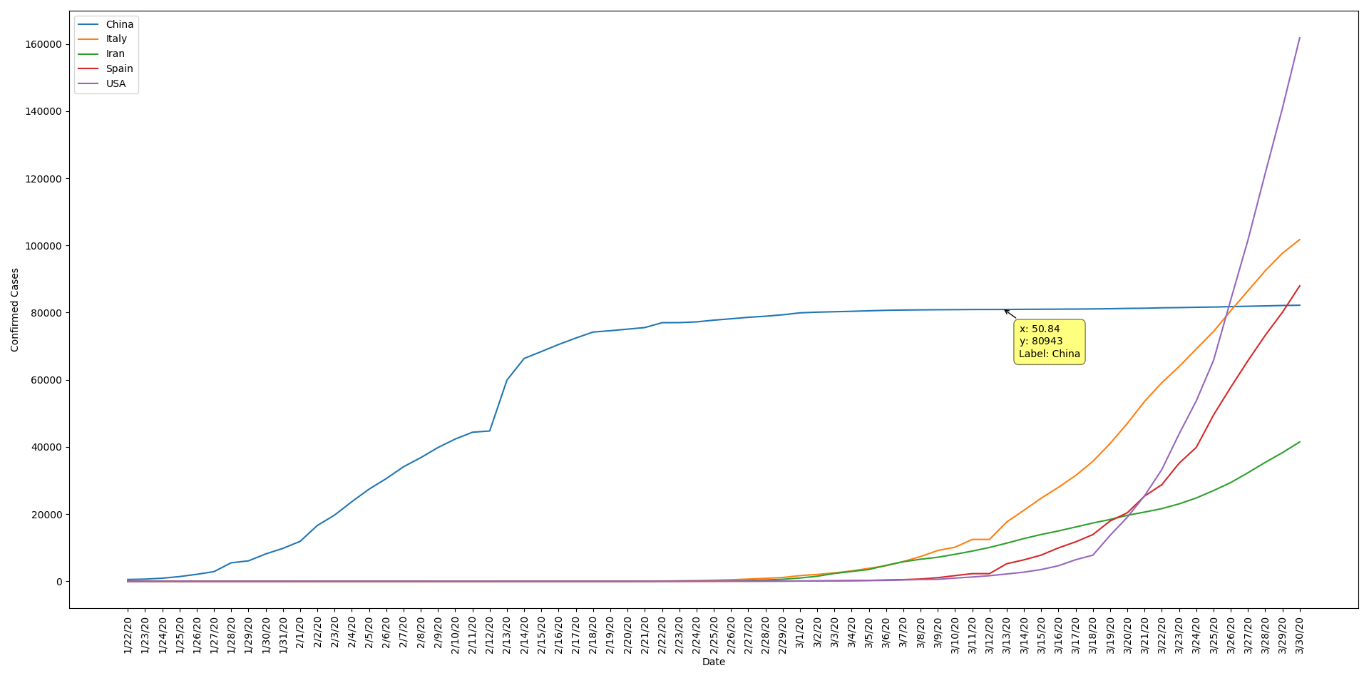
- Visualizing China's, Italy's, Iran's, Spain's & USA's Confirmed Cases Progress
- Drawing boxplots for confirmed, death, recoverd and active cases gave the follwing charts

Tried to predict the expected number of COVID-19 ( confirmed - deaths - recovered ) cases in Egypt with two approches.
- Exponential curve equation
- Logistic curve equation
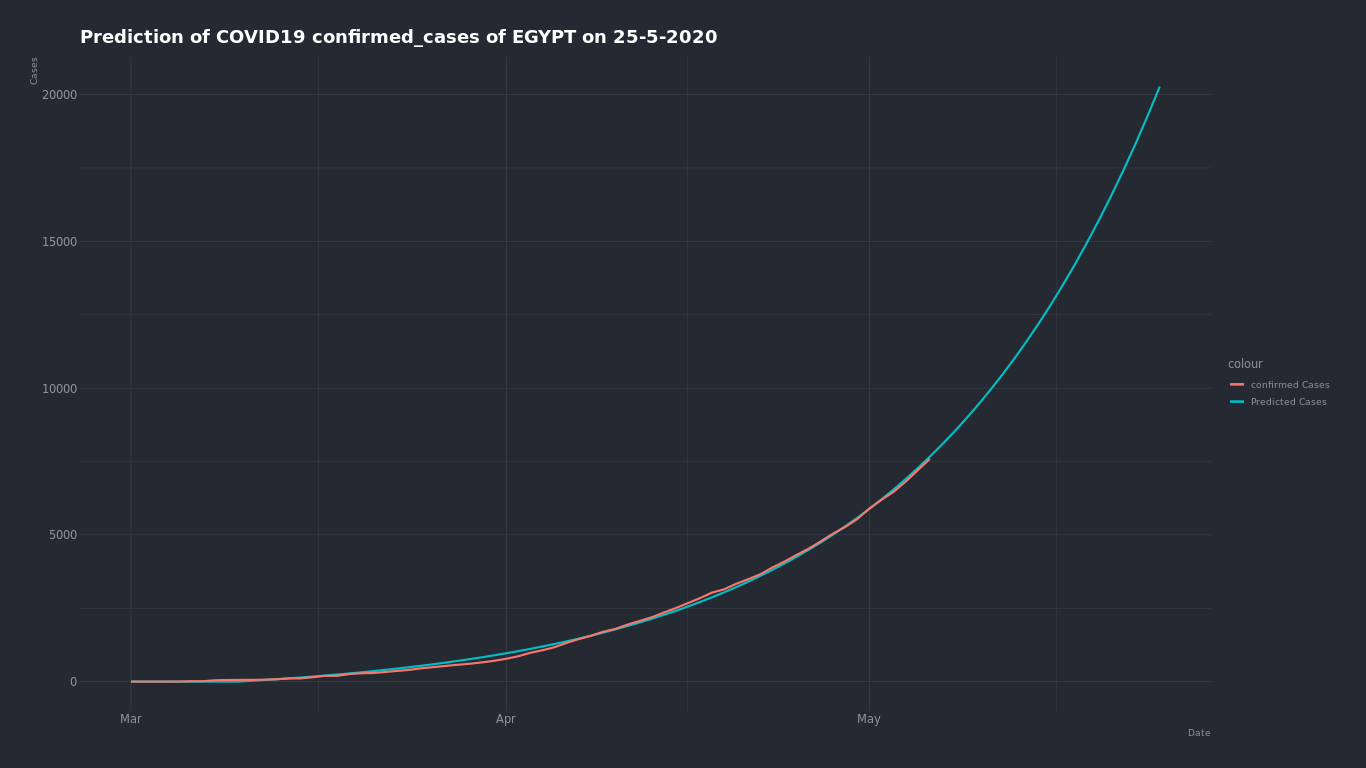
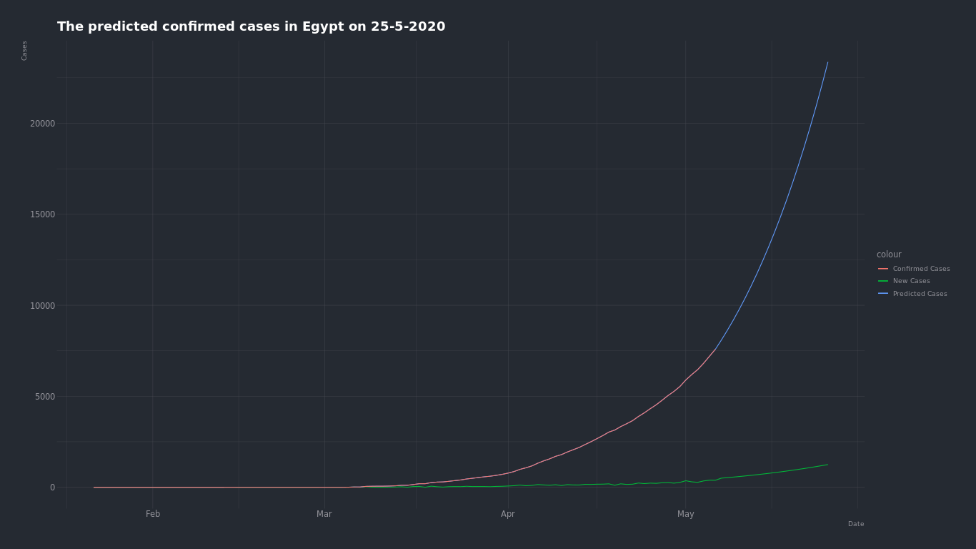
The day which we will predict the number of cases on is May 25 2020.
Tools : R lang
Here is the confirmed cases growth curve in Egypt
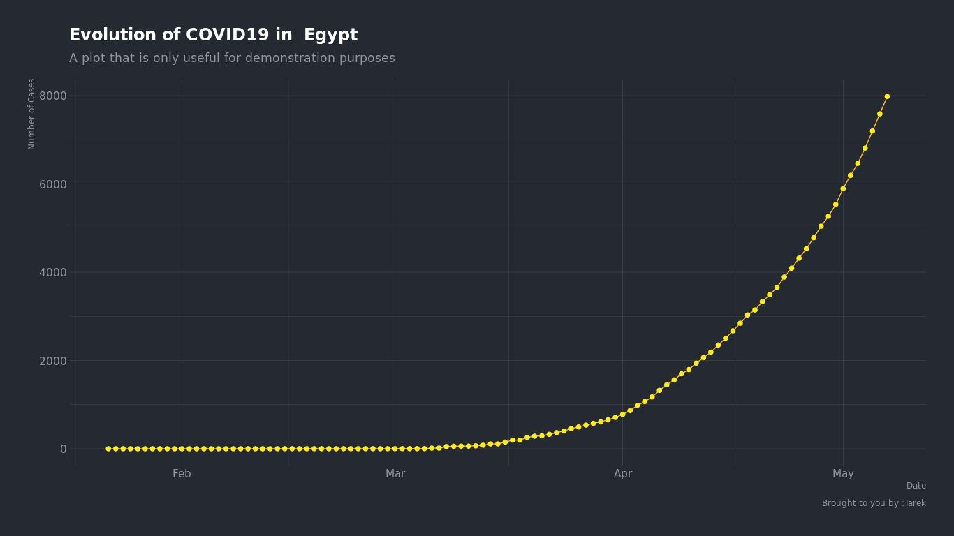
We can see by just looking that the growth of number of cases in Egypt is an expoential grwoth. so we can try to find the closest exponential curve that fits into this curve and find what number will be on that curve on May 25.
Using exponential growth equation alpha _ exp(beta _ t) + theta and R model to find the optimal alpha, beta and theta to find the closest curve fits into the growth curve of Egypt.
#Fitting a model to find the optimum value of theta
  model.0 <- lm(log(Cases - c.0) ~ Date, data = df_t)

  # Finding optimum of alpha, beta and theta
  start <-
    list(a = exp(coef(model.0)[1]),
         b = coef(model.0)[2],
         c = c.0)
  model = nls(
    formula = Cases ~ a * exp(b * Date) + c ,
    data = df_t,
    start = start
  )

  # Storing alpha, beta and theta
  t = coef(model)

  p = t["a"] * (exp(t["b"] * x)) + t["c"]
The expected confirmed cases number on May 25 is about 21,000 case
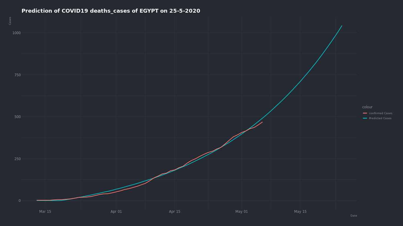
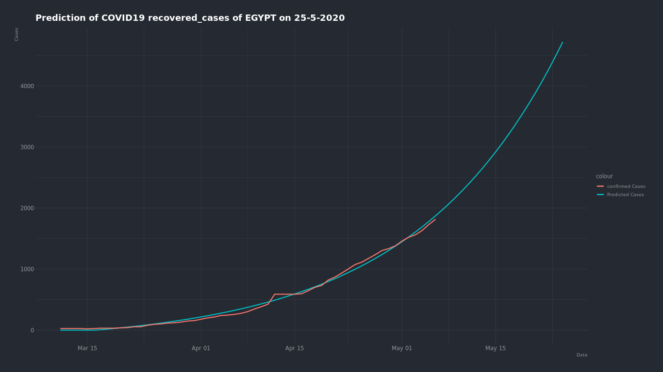
By trying the same on (death - recovered ) cases ...
the expected deaths cases number on May 25 is about 1000 cases
the expected recovered cases number on May 25 is about 4,500 cases
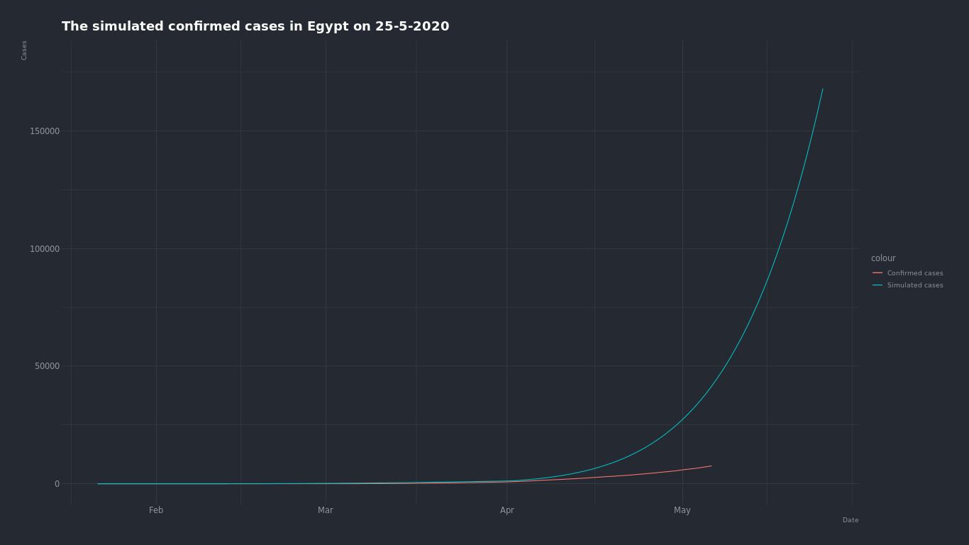
But there is no continuous exponential growth in real life, because eventualy we will reach a point where there will be so many infected people and less not infected people and the curve will start to slow until it falts when we reach the population,and here comes the logistic curve.
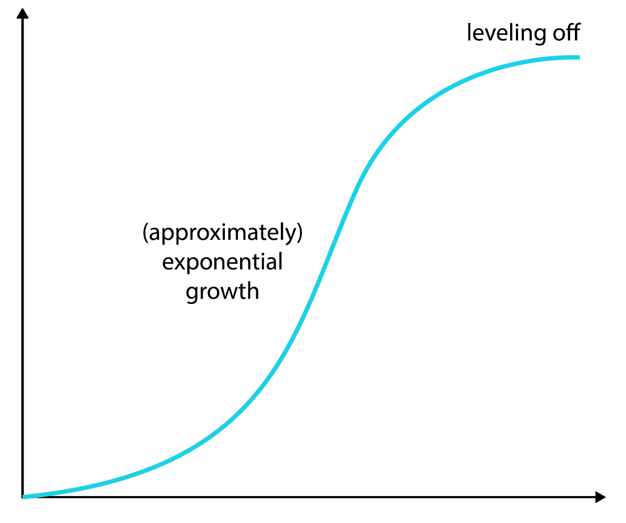
Logistic curve equation is N(d+1) = E _ P _ N(d) where ...
- N(d+1) : Number of cases in the next day
- E : Average number of people someone infectedd is exposed to every day
- P = (1 - N(d) / Population): Probabilty of each exposure becoming an infection
- N(d) : Number of cases in the current day
and we can see the logistic curve depends mostly on the E and P which together they represent the infection rate, in the begining of the infection the P is high becuase (1- (1 / 98 420 000) ) = 0.9999
We can run something like a simulation by adjusting the E and P.
So by starting from the current dat and by saying that the average number of people someone infected is exposed to every day is 7 we find that the number of confirmed cases on May 25 is about 25,000 cases and if it's 4 because of the quarntine the number is about *15,000
But by starting from the begining of the infection and by saying that the average number of people someone infected is exposed to each day is 7 before the quarntine and 2 after the quarntine. The number of Actual cases on May 25 is about 150,000 cases
- Active Cases Generation & Distance Between Recovered and Death Cases

- Max Confirmed Cases in a Day for Each Country Generation

- Max Deaths Cases in a Day for Each Country Generation

- Max Recovered Cases in a Day for Each Country Generation

minimum will be zero for all so no need to generate it
The data has no missing values, instead it's replaced with zeroes so we don't to worry about that.
| Upper limit | class name |
|---|---|
| 0 | none |
| 1000 | low |
| 20000 | medium |
| 2000000 | high |

| Upper limit | class name |
|---|---|
| 0 | none |
| 1000 | low |
| 20000 | medium |
| 2000000 | high |

| Upper limit | class name |
|---|---|
| 0 | none |
| 1000 | low |
| 10000 | medium |
| 2000000 | high |

| Upper limit | class name |
|---|---|
| 0 | none |
| 100 | low |
| 1000 | medium |
| 2000000 | high |


| Value | Instead of |
|---|---|
| 3 | none |
| 1 | low |
| 0 | medium |
| 2 | high |


| Value | Instead of |
|---|---|
| 3 | none |
| 1 | low |
| 0 | medium |
| 2 | high |

- We Have Two Ideas
As we know bluetooth has a maximum range of 10 feet so we can use this as an advantage, we can make every mobile phone keep it's bluetooth on scanning for devices always and logging how long any discovered device is available in the given range, using the data from these logs and by sending it daily to data analysis servers. when someone is tested positive for coronavirus we can know who he has been with in the last 14 days and for how long so we can predict infected people and quarantine them
By representing the persons as nodes and tarck there paths using phones SIM cards location data, whenever there is an infected person we can track his/her path for the last 14 days (starting of infection) and give every person (other node) he/she interacted with a propability of being infected based on the time and most importantly the space between them while interacting. After that we consider people with high propabilities infected and track there paths too to find suspicious people that may contain the virus.
We Made 4 Decision Trees, Each one is Based on Different Attribute as a Label


- Description

- Simple Charts

- Distribution Table

- Description

- Simple Charts

- Distribution Table

- Description

- Simple Charts

- Distribution Table

- Description

- Simple Charts

- Distribution Table

1 - K-Means using RapidMiner
- Clustering the countries based on ( Total Cases - Total Deaths - Total Recovered - Active Cases ) for each country
- Number of cluster is 3
The means for each cluster

Number of countries in each cluster

Number of countries rows which belongs to cluster 0

Plotting the clusters

2- Using R language
- Clustering the countries based on ( Total Cases - Total Deaths - Total Recovered - Active Cases ) for each country
- Number of cluster is 3
#scaling the data
df = scale(data[,2:ncol(data)])

rownames(df) = data$Country

#Setting the number of clusters to 3
km.res = kmeans(df ,centers = 3 , nstart = 15)

#aggregate the data by the cluster number
aggregate(data, by=list(cluster=km.res$cluster), mean)
dd = cbind(data , cluster = km.res$cluster)

#print number of countries in each cluster
print(table(unlist(dd$cluster)))

#visualize the clusters
fviz_cluster(km.res ,df)
| cluster | number of countries |
|---|---|
| 1 | 176 |
| 2 | 1 |
| 3 | 10 |

But we can clearly see that US is affecting the clustering because it's very high numbers so it's taking a cluster for itself
So we can try to remove it from the data and recluster the countries
data = data %>% filter(Country != "US")
| cluster | number of countries |
|---|---|
| 1 | 176 |
| 2 | 6 |
| 3 | 4 |
