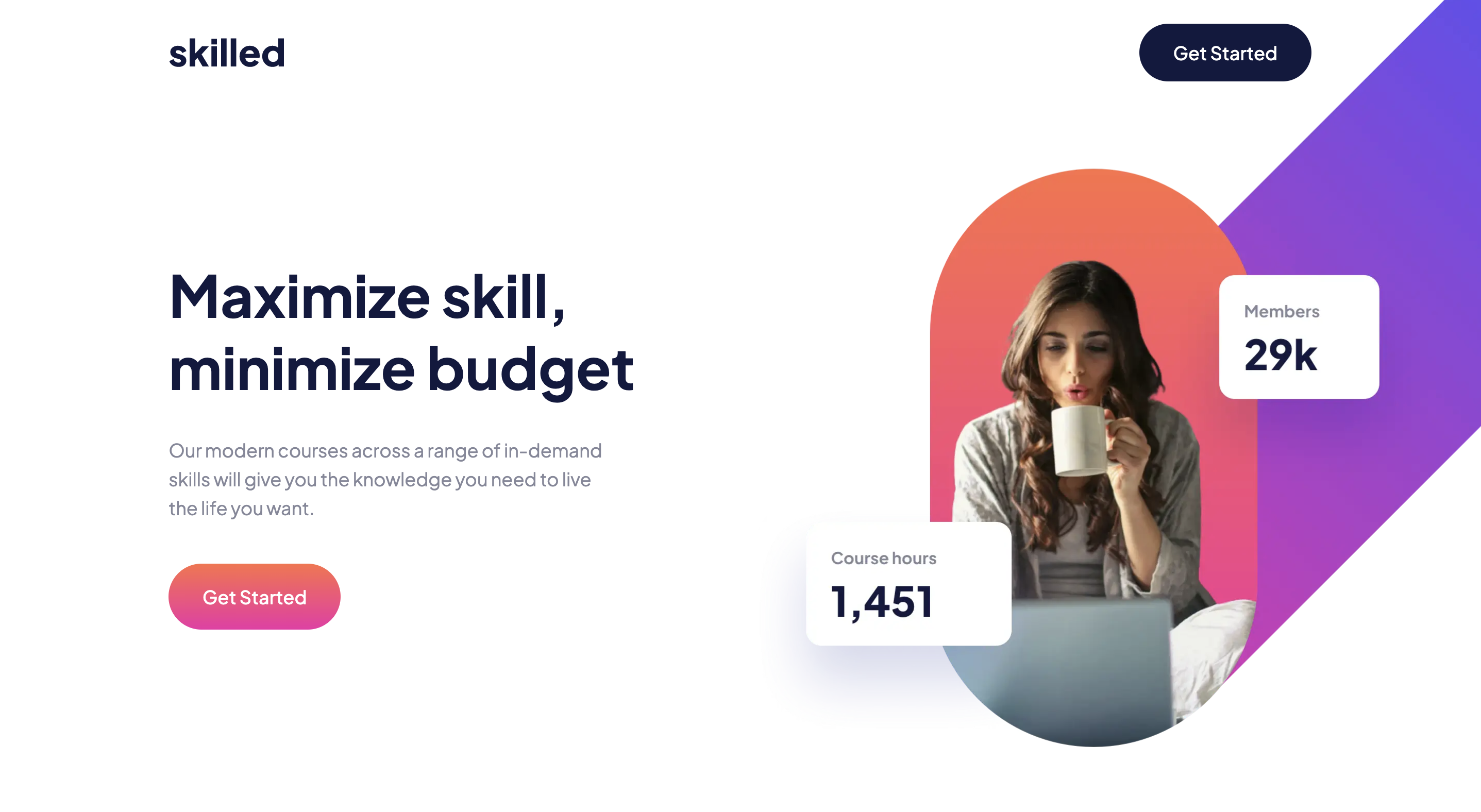
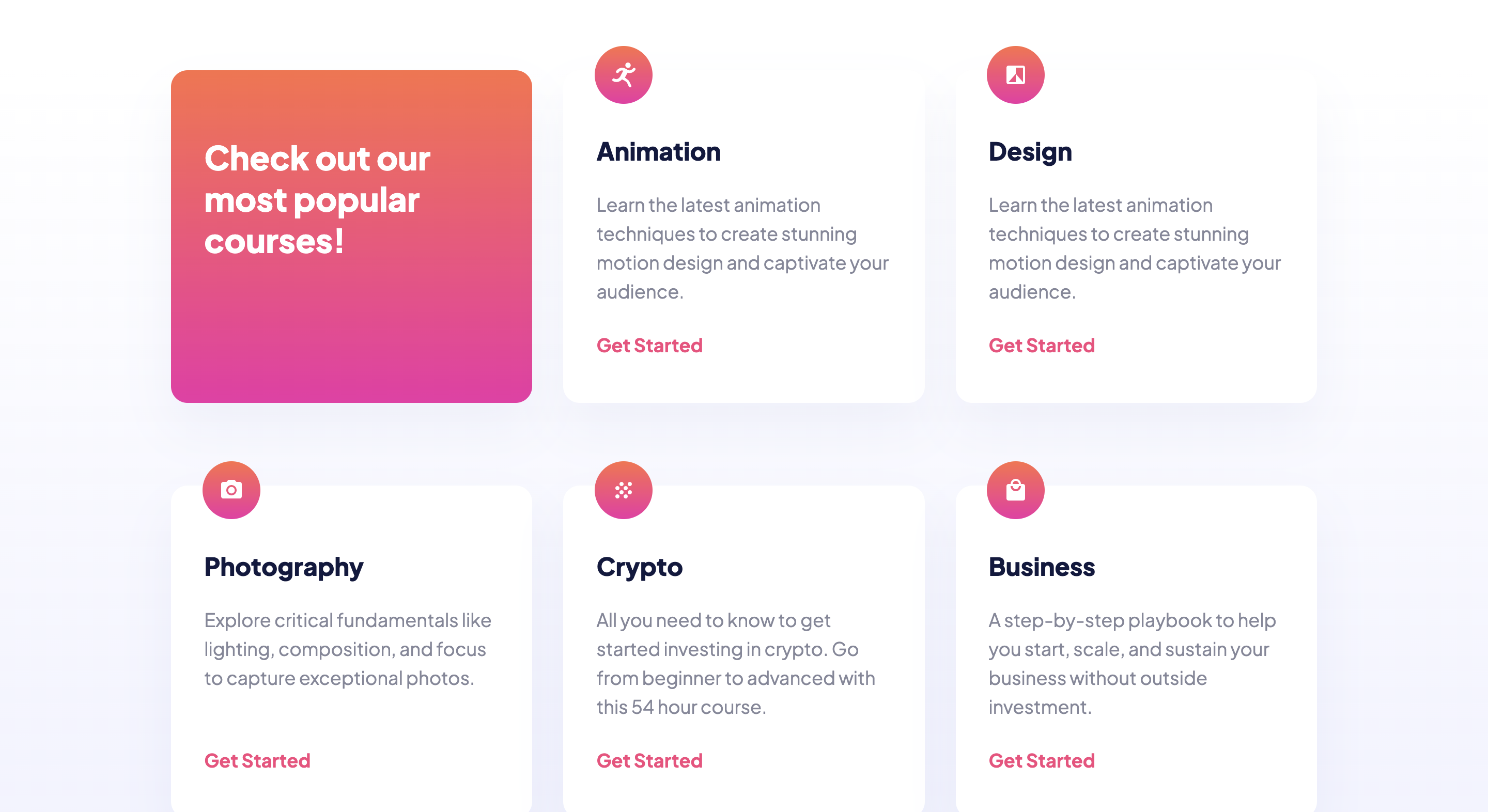
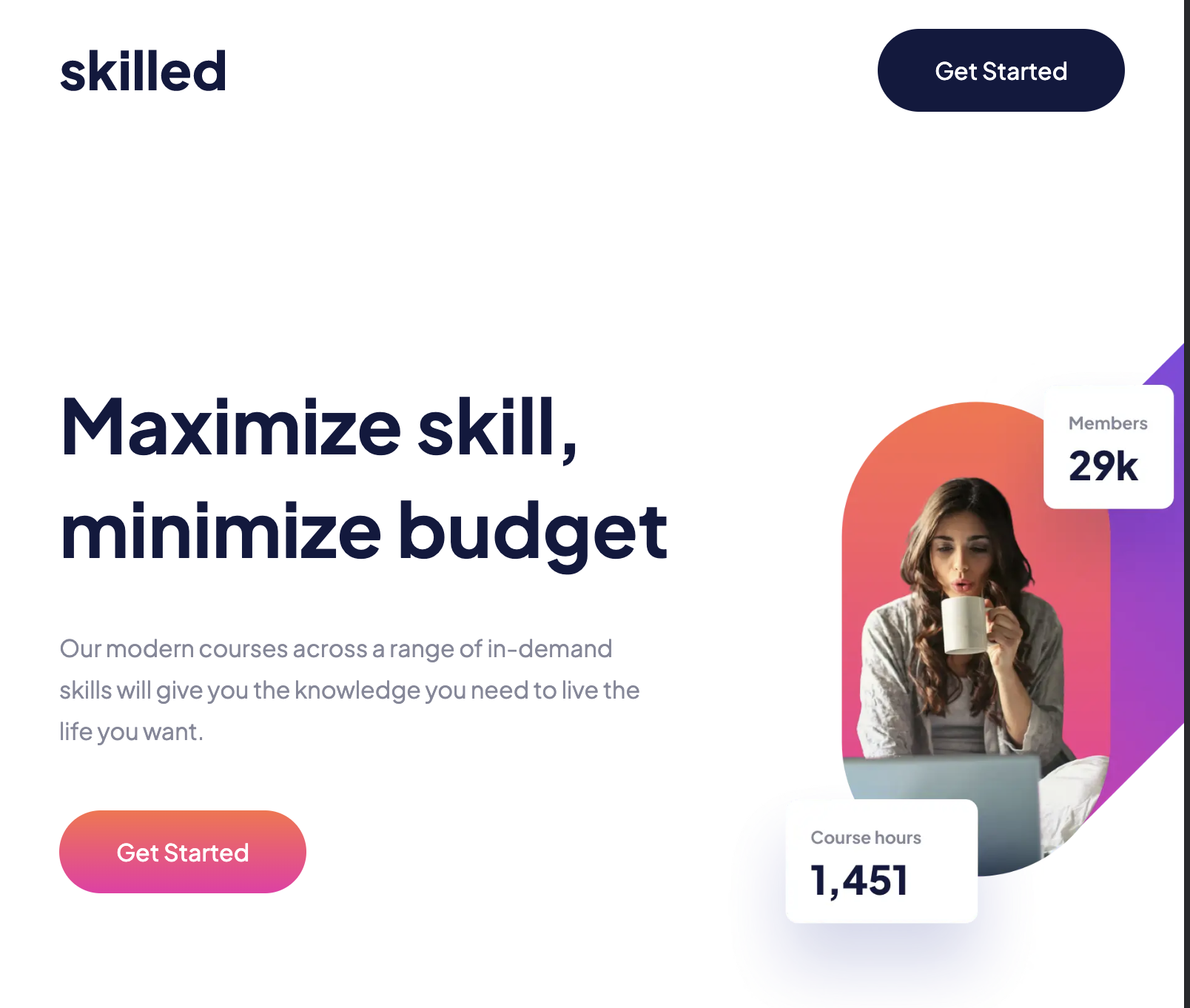
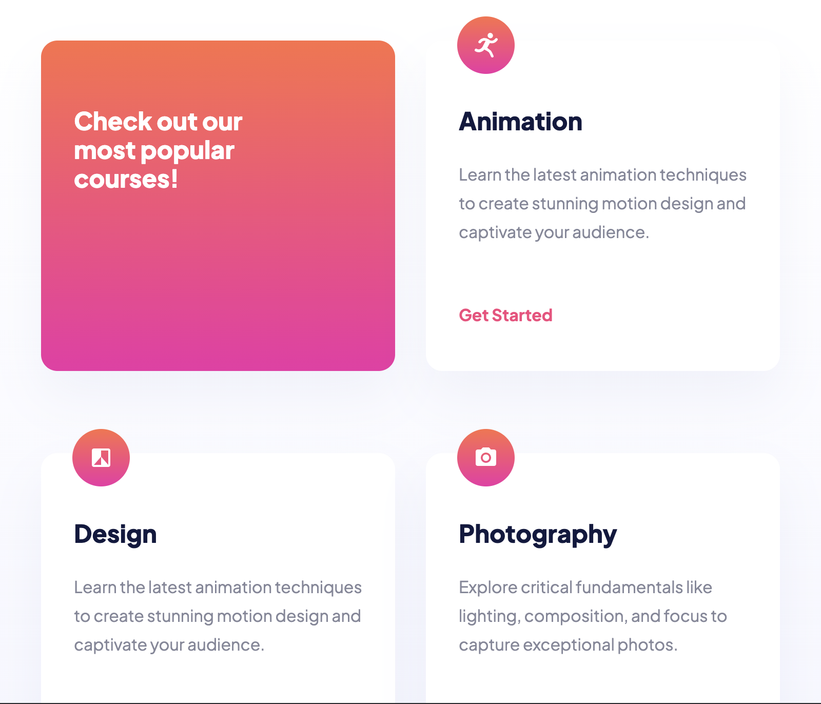
Users should be able to:
- View the optimal layout depending on their device's screen size
- See hover states for interactive elements
- Live Site URL: Click Me!
- Semantic HTML5 markup
- CSS custom properties
- Flexbox
- CSS Grid
- Accessbility
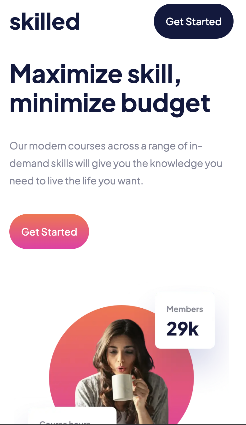
I learned how to make full size images on hero sections and how to read through a design template. Surprisingly I struggled with the image for a long time. Originally, I tried to make the image have its own img tag and position absolute it into the perfect spot. While this worked for the exact screen size I had compared to the design template I soon realized that ANY adjustment to the screen width would throw the image off and make it look really bad. Clearly I needed a way to make the image stay on the page as well as be responsive to different screen sizes. Once again I settled on using background image on the body tag and using background position and background size to adjust it to different screen sizes. This allowed me to immensely cut back on the media queries while also maintaining true to the design.
I need to practice more on accessibility as well as getting use to working with design templates. I noticed I struggled in translating some design choices into actual web elements. It's clearly due to a lack of experience working with designers and something that I will continue to work on.
- MDN ARIA - Helped with accessbility.
- MDN background position - Helped with background position.
- MDN background image - Helped with background image.
- MDN background size - Helped with background size.
- Website - Carlos Arbizu
- Frontend Mentor - @crypto-dot