LCD is a libre typeface that mimicks segmented LCD displays.
PDF file with all glyphs available in LCD
Unlike many other "digital" or "LCD" typefaces, this font is both free and true to the original.
There are many LCD fonts, but I've never seen one that meets my standards.
For example, Samuel Reynold's SFL-licensed "LCD Mono" has a number of problems. The "C" has little segments on its terminals, but the "D" pretends those don't exist. The "T" has a small spike on the top of its stem, but other characters that use the top line have no indentation, like "F" and "A". The arms of the "Y" reach all the way to the top, but this is impossible considering the "M" displays for us that those are actually split between two different segments. One of the "M" characters is written like lowercase, so it would actually need two adjacent displays to work, ruining the "one cell per character" rule. What's worse... I didn't even review every character, I just critiqued the ones in the name of the font.
Stephen Ahlf's OFL-licensed "Digital Numbers" typeface suffers from consistency issues as well. The "W" suggests a fourteen segment display, but none of the other characters do. The "X" is impossible on any display unless it was just for displaying "X"'s. "D" and "O" are indistinguishable. Puncuation marks magically have points when that's impossible given the displays, and the points are inconsistent at that. "!" and "?" have points of varying sizes. At first I planned on opening issues, but after Ahlf closed mine I decided to just make my own.
I don't even consider proprietary ones.
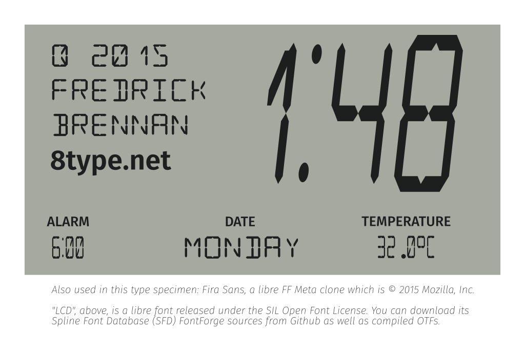
I also wanted to promote my "∞type" font foundry (https://8type.net) even though its website isn't ready yet ;-)
I imagine most people will be using this for displaying times, and countdowns (my original purpose), so I imagined two LCD dots like on every alarm clock I've ever seen. The colon does break character but I hope not too much. The font contains a "colon.alt" glyph which was the original colon made with the 14 segments if you prefer to use it.
I was very inventive (at least I think so) with this and brought the 14 segments to their limit. After @davelab6 told me I had to encode my font in Unicode for acceptance into Google Fonts, I begrudgingly did so. However, afterwards I realized how many more fun character sets I now had to encode. I then encoded Greek, Cyrillic, Runic, Hebrew, some Box Drawing Characters and some characters needed for Esperanto. Laŭ Ludoviko Zamenhof bongustas freŝa ĉeĥa manĝaĵo kun spicoj. I was going to do Arabic but I found it too challenging, so a PR is welcome for that. ;-)
While perusing the international characters you should remember that even here keeping consistency is more important than matching the actual shape of the character. Thus why I decided to use circumflex for breve. This is not a bug. Fitting in a breve is not possible given the imaginary structure of the extra segments added for accent marks and cutting the tilde in half would look very off center, not to mention I intended for the tilde to be one continuous segment.


NB: This build process has been superseded by version 2. Execute build.py instead.
- 14seg.sfd : source. If I want to add a new glyph, I normally copy 0x0 (.notdef), paste it to where I want, then delete segments until satisfied.
- 14seg-gen.sfd : this file is used as the base for generating OTF, TTF, et cetera. It is not suitable as a source because it has had Element -> Remove Overlap applied to it for a smaller filesizes and better behavior when skewed, however all my individual segments are lost so it's harder to edit. This file creates
otf/LCD.otf.
-rw-r--r-- 1 fredrick users 297K Jul 14 11:41 14seg.sfd
-rw-r--r-- 1 fredrick users 257K Jul 14 11:42 14seg-gen.sfd
For the ones below I also edit PS Names, but I barely know what I'm doing so I guess as to what the standard wants. It could be interpreted wrong on your OS. :)
- 14seg-condensed.sfd - I take
14seg-gen.sfdand apply "Element -> Transformations -> Transform...", "Origin: Glyph Origin", "Scale..." X 50%. This file createsotf/LCDCondensed.otf. - 14seg-italiccondensed.sfd - I take
14seg-condensed.sfdand apply "Element -> Transformations -> Transform...", "Origin: Glyph Origin", "Skew", Clockwise 12.5 degrees. This file createsLCDItalicCondensed.otf. - 14seg-italic.sfd - I take
14seg-gen.sfdand apply "Element -> Transformations -> Transform...", "Origin: Glyph Origin", "Skew", Clockwise 12.5 degrees. This file createsotf/LCDItalic.otf.
To-do:
14 Segment Family:Condensed;Italic;Italic Condensed.
- 7 Segment Family:
- Condensed;
- Italic;
- Italic Condensed.
SIL Open Font License v1.1. See LICENSE.txt
This font was made with entirely free software, FontForge and vim (yes I am one of those people that edits SFD files against the advice of the manual).