-
Notifications
You must be signed in to change notification settings - Fork 167
New issue
Have a question about this project? Sign up for a free GitHub account to open an issue and contact its maintainers and the community.
By clicking “Sign up for GitHub”, you agree to our terms of service and privacy statement. We’ll occasionally send you account related emails.
Already on GitHub? Sign in to your account
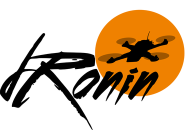
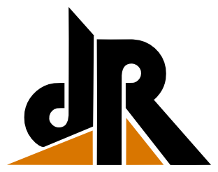
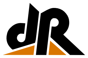
dRonin Logo #58
Comments
|
I like it!! |
|
I like the logo. However, I think it may be too complex. Ideally, the logo should look good using only 1 or 2 colors, so it can easily be printed on t-shirts, silkscreens etc. Also, it's good if the logo is compact / abstract, so it can e.g. be used in an app icon (without the d-ronin text). |
|
one color is also ideal for transparency on youtube (for example, the BrainFPV green.) I do like this though :) |
|
I like the dR here. http://www.dafont.com/digital-ninja.font?text=dRonin&psize=l Maybe not the specific typeface, but.. the elements mirrored between the d and r, the diagonal line separating them, etc. |
|
since this was not posted here: https://github.com/VArcht/varcht.github.io/blob/ol_test/images/logo_proof_01.png |
|
👍 for 2️⃣ 5️⃣ logo25 from me! |
|
need consensus on final "ONIN" too |
|
Perhaps a brighter/less brown orange would be good, and make it look less retro. |
|
pick an orange? |
|
i like current orange. whatever we decide needs to work with white and black backgrounds |
|
also after we pick a screen color we should pick a pantone color just for reference. |
|
Maybe something inbetween? I like the weight of the second but there isn't enough gap between the characters to look OK on board silk, etc. Also not sure i like the orange fill / black stroke on the line / perhaps that line has too much weight. |
|
the bar above the o looks stupid. |
|
I don't like the bar over the O. other than that I agree. On 4 December 2015 at 16:34, Michael Lyle notifications@github.com wrote:
|
|
I like H3 as well |
|
The consensus appears to be H3. |
|
I'm with @tgreer, I don't like the bar over the o. For me as a native German speaker, it looks like "dRönin". Also, I'm concerned that if the left part of the logo (dR with stuff around it) is printed in a single color with limited resolution (e.g. silkscreen) it may become one large blob and it may be difficult to make out the letters. |
|
we could up the spacing a bit for silk |
|
@VArcht ok, that looks good :) |
|
Closing in favor of other branding issue. Logo is done, becoming familiar, and looks great! |


dRonin needs a logo.
The text was updated successfully, but these errors were encountered: