Simple color picker for Angular 2 with ng-bootstrap dependency
The module relies on ng-bootstrap for dropdown functionality. (https://ng-bootstrap.github.io)
To include in your project install via NPM with:
npm install --save ng2-color-picker-4th
You will then need to include the module to your app.module.ts:
import { ColorPickerModule } from 'ng2-color-picker-4th';

// ...

@NgModule({
    imports: [
        ColorPickerModule
    ]
})
///...
Finally, include the component in your HTML as per the next section.
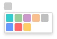
Once the module is installed, you will need to add HTML markup to include the picker in a component. The minimum requirement is an [(ngModel)] attribute, which should provide a string representation of a color.
<color-picker
    [(ngModel)]="color">
</color-picker>
It is possible to configure ng2-color-picker by providing a configuration object to the [pickerConfig] attribute (see the next section for more details on this object):
<color-picker
    [(ngModel)]="color"
    [pickerConfig]="pickerOptions">
</color-picker>ng2-color-picker exposes an interface to provide an indication of valid configuration properties, this can be referenced as a type for your configuration object by importing it:
import { IPickerConfiguration } from 'ng2-color-picker-4th';Which can then be used as the configuration object type in your component:
public pickerOptions: IPickerConfiguration;Current list of configuration options, types and default values:
| Property | Type | Default | Description. |
|---|---|---|---|
| width | number |
25 | Width of the picker control. |
| height | number |
25 | Height of the picker control. |
| borderRadius | number |
4 | Radius of the picker control border. |
| availableColors | string[] |
['#f00', '#0f0', '#00f'] |
Default list of colors available from the dropdown menu. |