A knowledge base located at the intersection of web application development and infographics.
This informal knowledge base contains an assortment of resources and guidance on creating applications that include infographics.
What is an infographic? A graphic is an abstract visual representation of something. A drawing of an apple is a graphic, a photorealistic image of an apple is also sort of a graphic. An infographic is a graphic where some or all of the properties are bound to data.
-
The documentation was updated recently.
-
The library that needs no introduction.
It's a framework that binds DOM nodes to data points, essentially creating a declarative way of making charts / graphs / other infographics. It's also got a wide variety of helpers such as color scales, linear scales, etc. If you're creating infographics in HTML/JavaScript and not using D3, you're likely reinventing the wheel.

The above photo of a stock ticker tells us a lot of interesting things about the use of color and font.
White text on dark blue is used to indicate "serious, yet totally digital" information. Paleolithic amateurs print stuff out on white paper using black ink. Chad high-data-volume low-latency-chart enjoyers from the future print data out onto dark computer monitors in gray, dark gray, or darkest color that's feasibly visible. Computer monitors always have a dark grey or dark blue background because chad data enjoyers are looking at them all the time and their eyes get tired. Light on dark themes also make you look like you're a sophisticated security expert - obfuscating your workspace with darkness just like you use cryptography and misdirection to obfuscate the secretive business dealings of your clients.
However you could still have a black-text-on-white-background table. This just indicates that you and your associates are extremely old school. You don't care about using computers or even design at all, you're too focused on making money for your clients. Based! A lot of internal tables and charts in banks and other financial behemoths probably use dark-on-light.

This chart by Chart Director is exceedingly ugly and hard to understand. What better way to say you are a very serious business, concerned only with important business thigns, than to produce so ugly a chart? 👏
This is one of the ugliest infographics ever made. It tells us a lot about what not to do!
- Green and red are used to group bars into associative groups instead of indicating gain/loss. Very confusing.
- Red, blue, green, purple -all the colors are primary instead of belonging to one unified color palette such as pastel
- Neon colors on a white background - shameful.
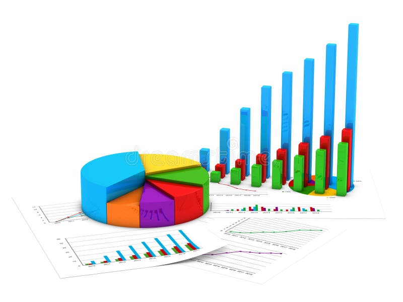
- Both graphics are very poor infographics. Due to their angle and design, they don't really tell us anything about the dataset in question.
- The pie chart is stygian, using every possible color for no useful reason. It would be much better to color this with different shades of the same color, such as blue.

Please, please, never make an infographic that looks like this.
The cadillac of colors, it does it all - a background for light text, a text color for a light background, indicate somethimg has gone up, gone down, stayed the same - all with dark gray. The color most at the intersection of futurism and professionalism. 👑👑👑
White can be used to color a numeral where no change over time occurs.
White can be used to draw legends / borders on dark blue backgrounds.
Green indicates a change over time where the value of a security has increased.
Red indicates a change over time where the value of a security has decreased.
Putting red in financial charts or tables puts clients ill-at-ease. Use only when needed.
Pink generally does not contribute to financial infographics.
Like pink, it is not useful.
Purple is not a professional color.
A pretty good color, but why wouldn't you use dark gray?
Dark blue makes a good background color. The background color of financial infographics is very important.
Used in conjunction with dark blue for backgrounds.
Consider the contrasting business impression made by similar charts, one with a serious dark blue background, and one with a jubilant pink background.