This is a set of widgets to render different customizable charts quickly. You can render tens of diagrams per frame with no janks. Charts can also animate changes in compatible data series.
- Provides fast rendering of
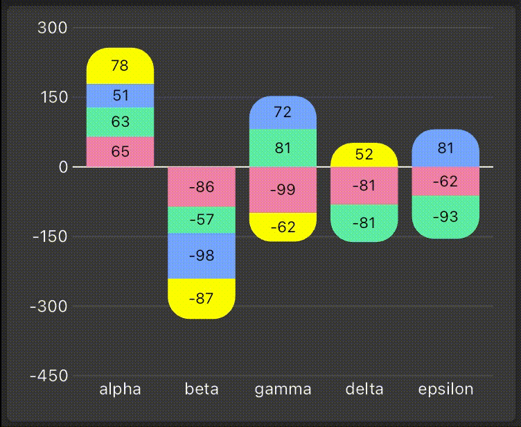
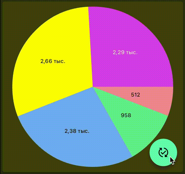
| Grouped bar charts | Stacked bar charts | Radial stacked bar charts | Pie charts |
|---|---|---|---|
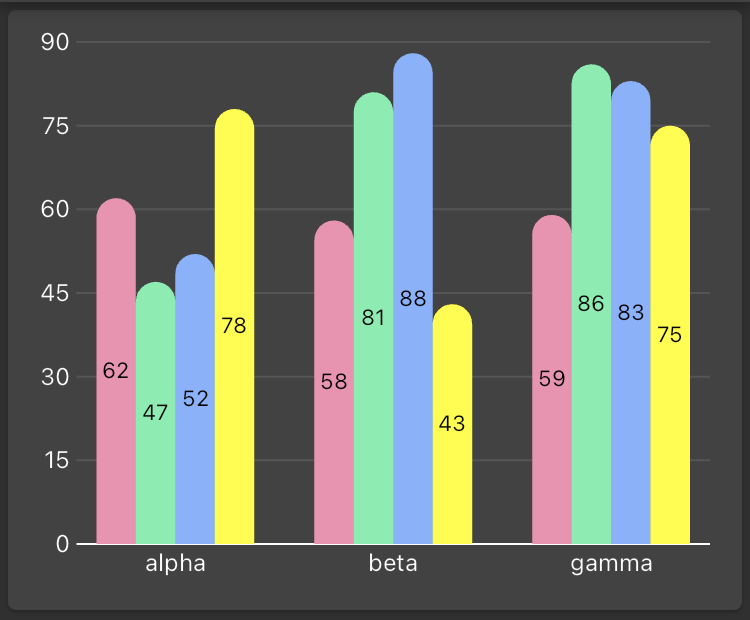 |
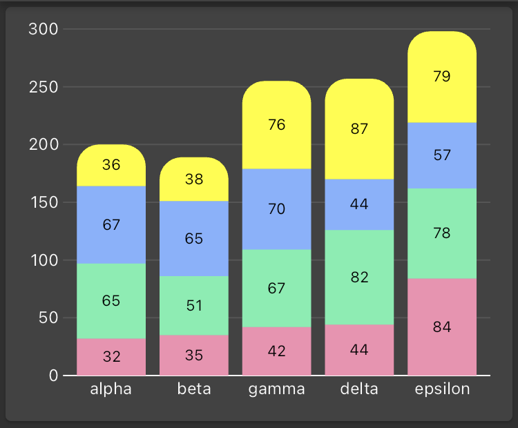 |
 |
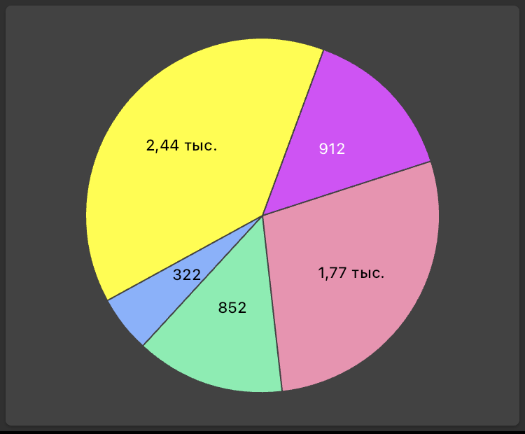 |
- Horizontal and vertical orientations of bar charts.
- Inverting the main scale of bar charts.
- Animation of changes in compatible data series.
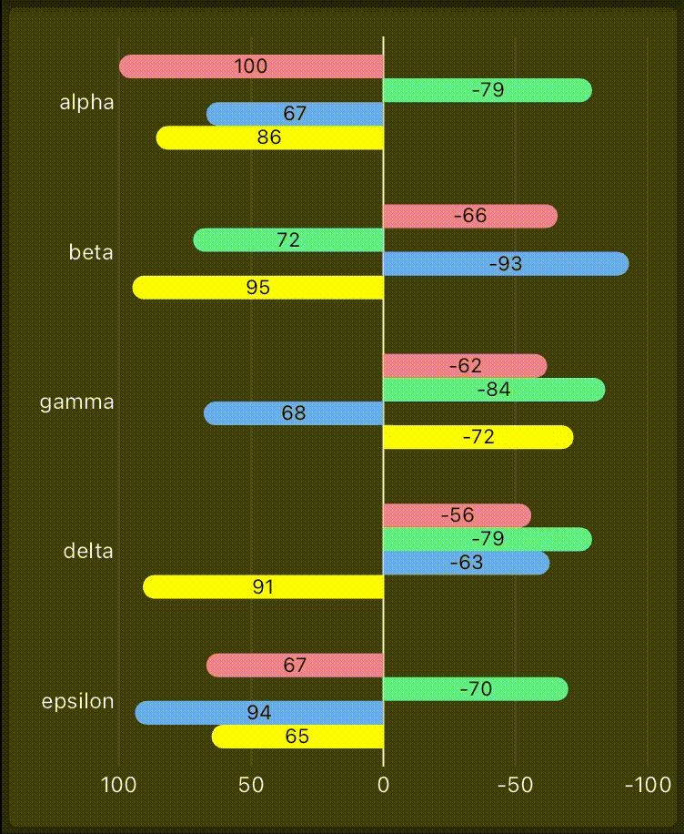
| Grouped bar charts | Stacked bar charts | Radial stacked bar charts | Pie charts |
|---|---|---|---|
 |
 |
 |
 |
- Different customization including colors, shapes and labels.
Import the following package:
import 'package:fast_charts/fast_charts.dart';Prepare the data and pass it to the chart widget:
final data = Series(
  data: { 'alpha': 11, 'beta': 17, 'gamma': 41 },
  colorAccessor: (domain, value) => colors[domain],
  measureAccessor: (value) => value.toDouble(),
  labelAccessor: (domain, value, percent) => ChartLabel('${percent}%',
    style: TextStyle(fontSize: 10),
  ),
);
return PieChart(data: data);Pie charts require a single series wheras bar charts can be provided with several series of data. Each series represents a set of values, each value corresponds to the specivic domain (usually X-axis) and represents some measure (usually Y-axis).
final data = {
  DateTime(2023, 1): (income: 47300, expense: 15000),
  DateTime(2023, 2): (income: 81000, expense: 14500),
  DateTime(2023, 3): (income: 32050, expense: 37400),
};
final expenses = Series(
  data: data,
  measureAccessor: (value) => value.expense.toDouble(),
  colorAccessor: (domain, value) => Colors.red,
);
final incomes = Series(
  data: data,
  measureAccessor: (value) => value.income.toDouble(),
  colorAccessor: (domain, value) => Colors.green,
);You can choose the color of each value in series depending on domain or value or both of them. E.g. for pie chart you'll probably need to chose divverent colors for every value, whereas for stacked bar chart you'll prefer choose the color for each series. Anyway, you have to make choice every time the series asks you the color in the special functor colorAccessor.
final incomes = Series(
  data: data,
  measureAccessor: (value) => value.income.toDouble(),
  colorAccessor: (domain, value) => value.income < value.expense ? Colors.amber : Colors.green,
);
You may also specify the style of labels. If you don't do that, there won't be any labels on the diagram, but if you provide the series with the labelAccessor functor, you can choose label position, style and text. The labelAccessor provide you with domain, value and percent of total sum of values among the series (can be useful in pie charts).
final data = {
  DateTime(2023, 1): (income: 47300, expense: 15000, color: Colors.redAccent),
  DateTime(2023, 2): (income: 81000, expense: 14500, color: Colors.greenAccent),
  DateTime(2023, 3): (income: 32050, expense: 37400, color: Colors.blueAccent),
};
final expenses = Series(
  data: data,
  measureAccessor: (value) => value.expense.toDouble(),
  colorAccessor: (domain, value) => value.color,
  labelAccessor: (domain, value, percent) => ChartLabel('$percent%',
    style: TextStyle(
      fontSize: 11,
      color: ThemeData.estimateBrightnessForColor(value.color) == Brightness.dark
        ? Colors.white
        : Colors.black,
    ),
    position: LabelPosition.inside,
    alignment: Alignment.center,
  ),
);
You can find other customizations in the /example folder.