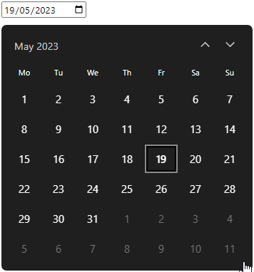
A react custom date picker with Windows 10 skin and customizable colors
- Navigate through dates or months
- Switch from dates to months or months to dates
- Set up a min and max range for clickable dates/months
- Multiple language support to translate months and weekdays (english and french for now)
npm i react-windatepickerimport "react-windatepicker/style.css";
import { WinDatePicker } from "react-windatepicker";
const App = () => {
function handleDateChange(date) {
console.log(date)
}
return (
<WinDatePicker
inputProps={{
onDateChange: handleDateChange
}}
/>
)
}| Props | Description | Required |
|---|---|---|
| inputProps | props to apply on input | true |
| calendarColors | custom colors to apply on calendar | false |
| Key name | Type | Description | required |
|---|---|---|---|
| setTodayByDefault | boolean | Sets input value to today, default to false | false |
| onDateChange | function | Date update callback. The argument will give back an object with the raw retrieved date and the date formatted as a YYYY-MM-DD string format | true |
| React input props | any | You can pass any react input props to complete | false |
| Key name | Type | Description |
|---|---|---|
| background | string | Calendar background color |
| headerButtons | string | Color of calendar header buttons (up/down arrows and months/dates switch) |
| headerButtonsHover | string | Color of header buttons on hover |
| weekDays | string | Color of weekdays |
| datesButtonsBorderHover | string | Color of date/month buttons border on hover |
| datesFromChosenMonthButtons | string | Color of date/month buttons from the chosen month/year |
| datesFromChosenMonthButtonsBackground | string | Background color of date/month buttons from the chosen month/year |
| datesFromChosenMonthButtonsBorder | string | Border color of date/month buttons from the chosen month/year |
| date/monthsOutsideChosenMonthButtons | string | Color of date/month buttons outside the chosen month/year |
| selectedDateButton | string | Color of selected date/month button |
| selectedDateButtonBackground | string | Background color of selected date/month button |
| selectedDateButtonBorder | string | Border color of selected date/month button |
| todayButton | string | Color of today's date/month button |
| todayButtonBackground | string | Background color of today's date/month button |
| todayButtonBorder | string | Border color of today's date/month button |
| todayButtonSecondBorder | string | Second border color of today's date/month button (smaller than the first one) |
| weekendsButtonsBackground | string | Background color of weekend date/month buttons |
| disabledButtons | string | Color of disabled date/month buttons (dates / month and up/down arrows buttons) |
| disabledButtonsBackground | string | Background color of disabled date/month buttons |
| clickedButton | string | Color of clicked date/month button |
type Color = string

interface CalendarColors {
    background?: Color
    headerButtons?: Color
    headerButtonsHover?: Color
    weekDays?: Color
    datesButtonsBorderHover?: Color
    datesFromChosenMonthButtons?: Color
    datesFromChosenMonthButtonsBackground?: Color
    datesFromChosenMonthButtonsBorder?: Color
    datesOutsideChosenMonthButtons?: Color
    selectedDateButton?: Color
    selectedDateButtonBackground?: Color
    selectedDateButtonBorder?: Color
    todayButton?: Color
    todayButtonBackground?: Color
    todayButtonBorder?: Color
    todayButtonSecondBorder?: Color
    weekendsButtonsBackground?: Color
    disabledButtons?: Color
    disabledButtonsBackground?: Color
    clickedButton?: Color
}

type OnDateChange = {
    /** "YYYY-MM-DD" format */
    formatted: string | ""
    /** Date format */
    raw: Date | null
}

WinDatePickerProps {
  inputProps:
  /** Any react input props */
  ComponentProps<"input"> & {
    /** required date update callback */
    onDateChange: (date: OnDateChange) => any
    /** sets input value to today, default to false */
    setTodayByDefault?: boolean
  }
  calendarColors?: CalendarColors
}You can find some examples here : Link
Basic (With TypeScript): Link
Colors : Link
Range : Link
- More translated langs
- Accessibility improvement with keyboard navigation