Smart select allows you to easily convert your usual form selects into dynamic pages with various choices input. This widget is inspired by Smart Select component from Framework7.
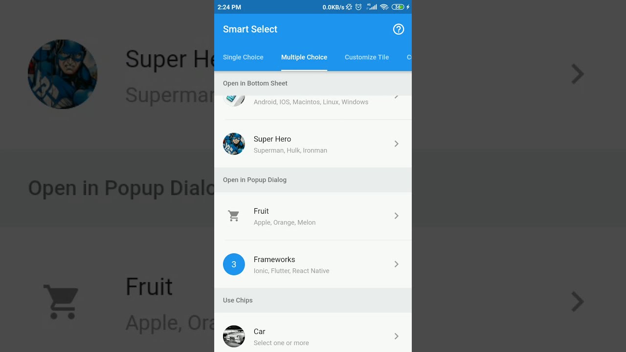

- Select single or multiple choice
- Open choices modal in full page, bottom sheet, or popup dialog
- Various choices input (radio, checkbox, switch, chips)
- Grouping choices with sticky header
- Customizable trigger/tile widget
- Customizable modal style
- Customizable modal header style
- Customizable choices style
- Flexible option input
- Filterable option
- Async option
- and many more
- Full support async option using Future
For a complete usage, please see the example.
To read more about classes and other references used by smart_select, see the API Reference.
SmartSelect<T>.single()
String value = 'flutter';
List<SmartSelectOption<String>> options = [
  SmartSelectOption<String>(value: 'ion', title: 'Ionic'),
  SmartSelectOption<String>(value: 'flu', title: 'Flutter'),
  SmartSelectOption<String>(value: 'rea', title: 'React Native'),
];

@override
Widget build(BuildContext context) {
  return SmartSelect<String>.single(
    title: 'Frameworks',
    value: value,
    options: options,
    onChange: (val) => setState(() => value = val)
  );
}
SmartSelect<T>.multiple()
List<int> value = [2];
List<SmartSelectOption<int>> frameworks = [
  SmartSelectOption<int>(value: 1, title: 'Ionic'),
  SmartSelectOption<int>(value: 2, title: 'Flutter'),
  SmartSelectOption<int>(value: 3, title: 'React Native'),
];

@override
Widget build(BuildContext context) {
  return SmartSelect<int>.multiple(
    title: 'Frameworks',
    value: value,
    options: options,
    onChange: (val) => setState(() => value = val),
  );
}
options property is List<SmartSelectOption<T>>, it can be input directly as in the example below, more info about SmartSelectOption can be found on the API Reference
SmartSelect<T>.single/multiple(
  ...,
  ...,
  options: <SmartSelectOption<int>>[
    SmartSelectOption<int>(value: 1, title: 'Ionic'),
    SmartSelectOption<int>(value: 2, title: 'Flutter'),
    SmartSelectOption<int>(value: 3, title: 'React Native'),
  ],
);
options also can be created from any list using helper provided by this package, like the example below
List<Map<String, String>> days = [
  { 'value': 'mon', 'title': 'Monday' },
  { 'value': 'tue', 'title': 'Tuesday' },
  { 'value': 'wed', 'title': 'Wednesday' },
  { 'value': 'thu', 'title': 'Thursday' },
  { 'value': 'fri', 'title': 'Friday' },
  { 'value': 'sat', 'title': 'Saturday' },
  { 'value': 'sun', 'title': 'Sunday' },
];

SmartSelect<T>.single/multiple(
  ...,
  ...,
  options: SmartSelectOption.listFrom<T, Map<String, String>>(
    source: days,
    value: (index, item) => item['value'],
    title: (index, item) => item['title'],
  ),
);
By default SmartSelect will open choices modal in full page. You can change it by changing the modalType property with this value:
SmartSelect<T>.single/multiple(
  ...,
  ...,
  // open in full page
  modalType: SmartSelectModalType.fullPage,
  // open in popup dialog
  modalType: SmartSelectModalType.popupDialog,
  // open in bottom sheet
  modalType: SmartSelectModalType.bottomSheet,
);
By default SmartSelect will use radio for single choice and checkbox for multiple choice, but it can change by changing the choiceType with this value:
SmartSelect<T>.single(
  ...,
  ...,
  // default use radio
  choiceType: SmartSelectChoiceType.radios,
  // use chips
  choiceType: SmartSelectChoiceType.chips,
);
SmartSelect<T>.multiple(
  ...,
  ...,
  // default use checkbox
  choiceType: SmartSelectChoiceType.checkboxes,
  // use chips
  choiceType: SmartSelectChoiceType.chips,
  // use switch
  choiceType: SmartSelectChoiceType.switches,
);
Copyright (c) 2019 Irfan Vigma Taufik

Permission is hereby granted, free of charge, to any person obtaining a copy
of this software and associated documentation files (the "Software"), to deal
in the Software without restriction, including without limitation the rights
to use, copy, modify, merge, publish, distribute, sublicense, and/or sell
copies of the Software, and to permit persons to whom the Software is
furnished to do so, subject to the following conditions:

The above copyright notice and this permission notice shall be included in all
copies or substantial portions of the Software.

THE SOFTWARE IS PROVIDED "AS IS", WITHOUT WARRANTY OF ANY KIND, EXPRESS OR
IMPLIED, INCLUDING BUT NOT LIMITED TO THE WARRANTIES OF MERCHANTABILITY,
FITNESS FOR A PARTICULAR PURPOSE AND NONINFRINGEMENT. IN NO EVENT SHALL THE
AUTHORS OR COPYRIGHT HOLDERS BE LIABLE FOR ANY CLAIM, DAMAGES OR OTHER
LIABILITY, WHETHER IN AN ACTION OF CONTRACT, TORT OR OTHERWISE, ARISING FROM,
OUT OF OR IN CONNECTION WITH THE SOFTWARE OR THE USE OR OTHER DEALINGS IN THE
SOFTWARE.