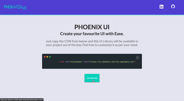
This is a Component library which can be used to effortlessly build the great UIs.


This Component library is built with plain HTML and CSS to make the projects building process easy and fun. Also for the sake of consistancy in the projects which would be built using this Library. This component library is in its initial stages and would surely evolve on the way. I've built this for the personal use but if people can benifit from it would be my pleasure.
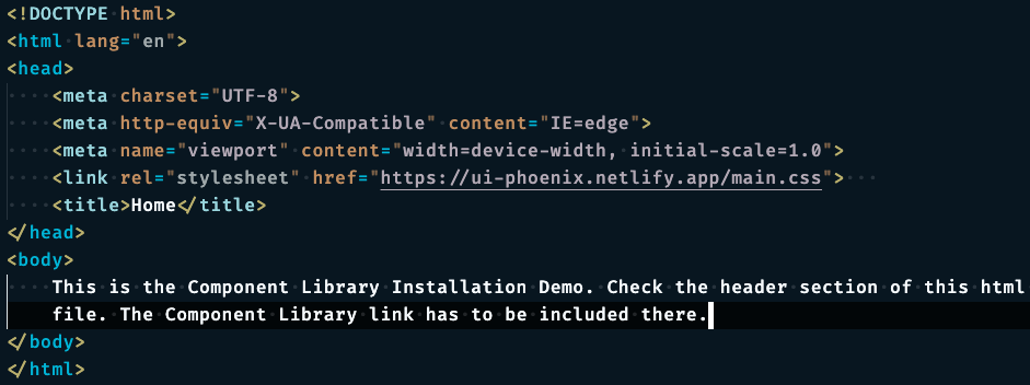
Just the link from below and paste in the header section of your html file as illustrated below
<link rel="stylesheet" href="https://ui-phoenix.netlify.app/main.css">
In addition to including the whole component library in your project, Phoenix UI also gives you an option to import only the component you need. Suppose you need to use the CARDS components only, You can do that by only adding the stylesheet CDN only for the CARDS component.
EXAMPLE
<link rel="stylesheet" href="https://ui-phoenix.netlify.app/components/card/card.css">
The CDN link for each component is mentioned in the documentation.
- Clone the repository by running the command in your terminal.
git clone git@github.com:devsurajrai/phoenix_ui.git
- A directory named "phonenix_ui" will be created on your machine.
- Go to the index.html and use the live server to run the project.
- HTML
- CSS
Building this project had a great learning curve. Things which I never knew :
- Design System: Very Very Important for maintaining the consistancy in the project.
- OOCSS: Using this paradigm to optimize CSS code.
- BEM Naming Convention- Block Element Modifier, I never thought this would be so easy to spot the classes by using this convention.
- Relative Units: Using Relative units helps to a very much extent to make our project responsive.
- Computed Values and Specificity: Knowing how cascading happens and values gets calculated helps alot in debugging.
- CSS Layout methods: Flexbox and Grid.
- Color Selection: Monochromatic,Analogous and Complemnentary Color Schemes.
- Contrast Ratio: Using anywhere between 5 to 10 contrast ration for better UX.
- Consistency: Consistency is the key.
The icons/images used in this component library are stored locally in the project. So, in order for you to be able to use that just make a small change in the image source url as stated below:
Imagine you are using E-Commerce Nav Component, then to use the svg icons used in that nav bar just do the following:
<img src="../../Assets/svg/navigation/search.svg" alt="search">

The default source of the image is "../../Assets/svg/navigation/search.svg"
Simply change the source to "https://ui-phoenix.netlify.app/Assets/svg/navigation/search.svg"

<img src="https://ui-phoenix.netlify.app/Assets/svg/navigation/search.svg" alt="search">
This project is not opensource yet.