

- Navigation Menu in
FlutterDemo - Why? 🤷
- What? 💭
- Who? 👤
- How? 👩💻
- Prerequisites? 📝
- Run it! 🏃♂️
- What we are building 🧱
- 1. Customizing the
AppBar - 2. Changing the
HomePagepage - 3. Creating pages to navigate to
- 4. Adding the navigation menu
- 4.1 Using the
drawerattribute inScaffold - 4.2 Slider menu with animation
- 5. Adding a dynamic section to the menu
- 6. Adding
i18nto our app - 7. Fixing decoration when expanding titles
- 8. Adding basic navigation for each menu item
- Star the repo! ⭐️
This small demo is meant for anyone who wants to see a quick implementation of progressive UX/UI.
We want to add an easy onboarding experience
for users when they start using our
app.
As we are using Flutter to develop our app,
this demo will focus on a Dart implementation of this,
focussing on the navigation menu component.
This quick demo is aimed at people in the @dwyl team who need to understand how to create a basic app navigation that is progressive.
This demo assumes you have foundational knowledge
of Flutter.
If this is your first time using Flutter,
we highly suggest you check out
dwyl/learn-flutter
for a primer on how to get up-and-running with Flutter.
This demo assumes you have already
have created a new project
(we've called our application "app")
and are ready to roll!
If you're not sure how to setup
a new Flutter project,
please visit:
https://github.com/dwyl/learn-flutter#0-setting-up-a-new-project.
We assume you've cloned this project, since you seem to want to run it 😉.
To run on a real device, check https://github.com/dwyl/flutter-stopwatch-tutorial#running-on-a-real-device.
To run on a simulator, check https://github.com/dwyl/learn-flutter#0-setting-up-a-new-project.
You can run this app
and check two different approaches
to implementing a navigation menu.
To check both of them,
all you have to do is
head over to main.dart
and change the following line.
void main() {
  runApp(const App());
}
By default, the app will run with the Drawer Menu. If you want to check the Sliding Menu, you simply change this line to.
import 'package:app/sliding_main.dart';

void main() {
  runApp(const SlidingApp());
}The purpose of this demo stems from the discussion for developing a basic app navigation held in dwyl/app#305.
Long story short,
we want to make a simple navigation menu
that is opened whenever an action occurs -
in our specific case,
checking a Todo item as complete.
The design we're doing should look like the following.


We will focus on implementing the navigation bar, so our main page won't look quite similar.
Regardless, the following constraints ought to be considered:
- we will adopt a
Progressive UI
approach,
where the person will only
be shown the option to open the menu
after doing a specific action
(in this case, completing a simple
todotask). - the menu ought to be full-screen, making it distraction-free.
- the text within the menu should constrast the background properly.
Now that we know what we want, let's roll 🍣!
Let's start by customizing the AppBar
with an avatar and the
DWYL logo.
Assuming you've already setup the project,
go to lib/main.dart
and rename the following classes.
MyHomePagetoHomePage.MyApptoApp.
This is to be consistent with other classes that we will create further on.
By looking at the wireframes,
we know we need to add the avatar and logo
to the AppBar.
We are going to be opting
by adding the images locally.
Let's create a folder in the root directory
called assets.
Inside assets,
create another folder called images.
Create two images:
avatar.jpeg, with any avatar you want.dwyl_logo.png, thedwyllogo that can be found inassets/images/dwyl_logo.pngof this repo.
Next, in pubspec.yaml,
locate the flutter section
and add the path to the folder of images
under a new section called assets,
like so:
flutter:

  uses-material-design: true

  # Add these two lines
  assets:
    - assets/images/
We are now ready to use local images! 🍱
In the build() function
of the _HomePageStateClass,
locate the appbar attribute
of the Scaffold
and use the code:
appBar: AppBar(
        title: Row(
          mainAxisAlignment: MainAxisAlignment.center,
          children: [
            Image.asset("assets/images/dwyl_logo.png", fit: BoxFit.fitHeight, height: 30),
          ],
        ),
        leading: const Padding(
          padding: EdgeInsets.all(8.0),
          child: CircleAvatar(
            backgroundImage: AssetImage("assets/images/avatar.jpeg"),
          ),
        ),
        backgroundColor: Colors.black,
        elevation: 0.0,
        actions: [
          IconButton(
            onPressed: () {},
            icon: const Icon(
              Icons.menu,
              color: Colors.white,
            ),
          ),
        ],
      )
The
AppBar
consists of several components.
The one's we're going to be using
are leading, title and actions.

In the title component
(which is in the middle),
we've added the dwyl logo,
by calling the function
Image.asset()
and passing the path to the dwyl_logo.png file
we defined earlier.
Do notice we are containing the image using BoxFit.
The image is inside a Row
that spans the whole space,
centering the Image in the middle.
In the leading component,
we are using
CircleAvatar
to add a circular image.
We've used AssetImage
to import the image,
just to showcase another way of importing images locally.
AssetImage doesn't allow you to scale
the image like Image.asset() does,
but for this scenario is enough
because we don't need to.
In the actions component,
we can pass
an array of actions,
which is a list of widgets to display in a row
to the right the title widget - typically IconButtons,
which is the case here.
We've added a simple white one
with an Icon.menu.
Note You may use
NetworkImageif you prefer to load images from the internet, instead of locally.
If you run your application, you should be able to see the following screen.

Your main.dart file should look like this.
import 'package:flutter/material.dart';

void main() {
  runApp(const App());
}

class App extends StatelessWidget {
  const App({super.key});

  @override
  Widget build(BuildContext context) {
    return MaterialApp(
      title: 'Flutter Demo',
      theme: ThemeData(
        primarySwatch: Colors.blue,
      ),
      home: const HomePage(title: 'Flutter Demo Home Page'),
    );
  }
}

class HomePage extends StatefulWidget {
  const HomePage({super.key, required this.title});

  final String title;

  @override
  State<HomePage> createState() => _HomePageState();
}

class _HomePageState extends State<HomePage> {
  int _counter = 0;

  void _incrementCounter() {
    setState(() {
      _counter++;
    });
  }

  @override
  Widget build(BuildContext context) {
    return Scaffold(
      appBar: AppBar(
        title: Row(
          mainAxisAlignment: MainAxisAlignment.center,
          children: [
            Image.asset("assets/images/dwyl_logo.png", fit: BoxFit.fitHeight, height: 30),
          ],
        ),
        leading: const Padding(
          padding: EdgeInsets.all(8.0),
          child: CircleAvatar(
            backgroundImage: AssetImage("assets/images/avatar.jpeg"),
          ),
        ),
        backgroundColor: Colors.black,
        elevation: 0.0,
        actions: [
          IconButton(
            onPressed: () {},
            icon: const Icon(
              Icons.menu,
              color: Colors.white,
            ),
          ),
        ],
      ),
      body: Center(
        child: Column(
          mainAxisAlignment: MainAxisAlignment.center,
          children: <Widget>[
            const Text(
              'You have pushed the button this many times:',
            ),
            Text(
              '$_counter',
              style: Theme.of(context).textTheme.headline4,
            ),
          ],
        ),
      ),
      floatingActionButton: FloatingActionButton(
        onPressed: _incrementCounter,
        tooltip: 'Increment',
        child: const Icon(Icons.add),
      ),
    );
  }
}According to the wireframes we saw earlier,
we don't want a counter app,
nor will we implement a full todo app in this demo
(it's out of its scope).
However,
we can make it simpler
and have a simple todo item
to enable menu navigation,
as per our Progressive UI requirement.
Let's delete the _incrementCounter() function
and _counter variable
inside _HomePageState
and the floatingActionButton attribute
in the Scaffold of the build() function.
After this,
we are going to be adding
a showMenu variable in _HomePageState,
a flag that will let us know if we should show
the option for the person to open the menu.
class _HomePageState extends State<HomePage> {
  bool showMenu = false;
Next up,
we are going to be wrapping
the IconButton of the menu
with a
Visibility
widget.
This will allow us to dynamically hide the icon
while maintaining the width,
so the AppBar stays consistent.
If we had removed the IconButton instead,
the title component would fill the remaining space,
which is not what we want ❌.

The actions component
of the appbar attribute
in the Scaffold of the build() function
inside _HomePageState should look like this:
    actions: [
        Visibility(
        maintainSize: true,
            maintainAnimation: true,
            maintainState: true,
            visible: showMenu,
        child: IconButton(
            onPressed: () {},
            icon: const Icon(
            Icons.menu,
            color: Colors.white,
            ),
        ),
        ),
    ],
Now we can change our _HomePageState body
with a simple todo item
that will toggle this menu button.
In the Scaffold
and body attribute,
change it to the following.
body: Center(
child: Column(
mainAxisAlignment: MainAxisAlignment.center,
children: [
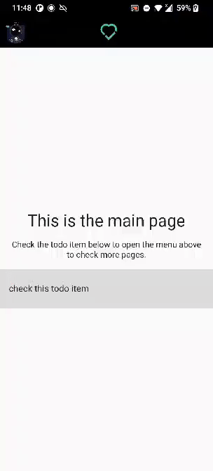
const Text(
"This is the main page",
style: TextStyle(fontSize: 30),
),
const Padding(
padding: EdgeInsets.all(16),
child: Text(
"Check the todo item below to open the menu above to check more pages.",
textAlign: TextAlign.center,
style: TextStyle(fontSize: 15, color: Colors.black87),
),
),
ListTile(
title: Text(
'check this todo item',
style: TextStyle(decoration: showMenu ? TextDecoration.lineThrough : TextDecoration.none),
),
minVerticalPadding: 25.0,
tileColor: Colors.black12,
onTap: () {
setState(() {
showMenu = true;
});
},
)
],
),
),We've added some Text,
and a ListTile that,
when pressed,
toggles the IconButton to be shown.
If you run the application
and click the todo item,
the menu icon should be toggled on.

Your _HomePageState class
now looks like this.
class _HomePageState extends State<HomePage> {
  bool showMenu = false;

  @override
  Widget build(BuildContext context) {
    return Scaffold(
      appBar: AppBar(
        title: Row(
          mainAxisAlignment: MainAxisAlignment.center,
          children: [
            Image.asset("assets/images/dwyl_logo.png", fit: BoxFit.fitHeight, height: 30),
          ],
        ),
        leading: const Padding(
          padding: EdgeInsets.all(8.0),
          child: CircleAvatar(
            backgroundImage: AssetImage("assets/images/avatar.jpeg"),
          ),
        ),
        backgroundColor: Colors.black,
        elevation: 0.0,
        actions: [
          Visibility(
            maintainSize: true,
                maintainAnimation: true,
                maintainState: true,
                visible: showMenu,
            child: IconButton(
              onPressed: () {},
              icon: const Icon(
                Icons.menu,
                color: Colors.white,
              ),
            ),
          ),
        ],
      ),
      body: Center(
            child: Column(
              mainAxisAlignment: MainAxisAlignment.center,
              children: [
                const Text(
                  "This is the main page",
                  style: TextStyle(fontSize: 30),
                ),
                const Padding(
                  padding: EdgeInsets.all(16),
                  child: Text(
                    "Check the todo item below to open the menu above to check more pages.",
                    textAlign: TextAlign.center,
                    style: TextStyle(fontSize: 15, color: Colors.black87),
                  ),
                ),
                ListTile(
                  title: Text(
                    'check this todo item',
                    style: TextStyle(decoration: showMenu ? TextDecoration.lineThrough : TextDecoration.none),
                  ),
                  minVerticalPadding: 25.0,
                  tileColor: Colors.black12,
                  onTap: () {
                    setState(() {
                      showMenu = true;
                    });
                  },
                )
              ],
            ),
          ),
    );
  }
}
We've now got the home page sorted and the progressive UI requirement knocked out of the park!
However, we're not done! In fact, we need to get into the bread and butter of this demo: implementing the navigation menu.
Let's do it!
In the wireframe, the menu currently has three items that the person can click to navigate into the referring page:
- the Todo List
- the Feature Tour page
- the Settings page
Let's create two simple pages that will represent the last two.
Create a new file
in lib/ called pages.dart
add the following two classes
at the end of the file.
Each class will represent each page.
import 'package:flutter/material.dart';

class TourPage extends StatelessWidget {
  const TourPage({super.key});

  @override
  Widget build(BuildContext context) {
    return Scaffold(
      body: Center(
        child: Column(
          mainAxisAlignment: MainAxisAlignment.center,
          children: [
            const Text(
              "This is the Tour page 🚩",
              style: TextStyle(fontSize: 30),
            ),
            const Padding(
              padding: EdgeInsets.all(16),
              child: Text(
                "As you can say, this is just a sample page. You can go back by pressing the button below.",
                textAlign: TextAlign.center,
                style: TextStyle(fontSize: 15, color: Colors.black87),
              ),
            ),
            ElevatedButton(
              onPressed: () {
                Navigator.pop(context);
              },
              child: const Text('Go back'),
            ),
          ],
        ),
      ),
    );
  }
}

class SettingsPage extends StatelessWidget {
  const SettingsPage({super.key});

  @override
  Widget build(BuildContext context) {
    return Scaffold(
      body: Center(
        child: Column(
          mainAxisAlignment: MainAxisAlignment.center,
          children: [
            const Text(
              "This is the Settings page ⚙️",
              style: TextStyle(fontSize: 30),
            ),
            const Padding(
              padding: EdgeInsets.all(16),
              child: Text(
                "As you can say, this is just a sample page. You can go back by pressing the button below.",
                textAlign: TextAlign.center,
                style: TextStyle(fontSize: 15, color: Colors.black87),
              ),
            ),
            ElevatedButton(
              onPressed: () {
                Navigator.pop(context);
              },
              child: const Text('Go back'),
            ),
          ],
        ),
      ),
    );
  }
}
Both pages are very similar. They have some text and a button that will allow the person to navigate back.
These pages will be later used to implement the navigation menu.
Both pages are similar and should look like this.

Speaking of which, it's time to go over that! ✍️
For this demo, we are going to be over two different ways of doing a navigation menu. Both of these options will start from the code we left earlier.
Let's go! 🏃♂️
Creating a
navigation drawer
in Flutter is remarkably simple.
Head over to lib/main.dart,
locate the _HomePageState class.
We are going to be adding a
GlobalKey,
which will be used to identify the Scaffold in the entire app,
but most specifically to be used
to close the drawer we're implementing programatically.
In _HomePageState,
add the following line.
final GlobalKey<ScaffoldState> _scaffoldKey = GlobalKey<ScaffoldState>();In the build() function,
add this key to the
key attribute of Scaffold.
    return Scaffold(
      key: _scaffoldKey,
      drawerEnableOpenDragGesture: false,
We've also disabled drawerEnableOpenDragGesture,
so the Drawer isn't opened with the right-to-left gesture,
so the person has to click the button to open the menu.
In the IconButton,
in the actions attribute of the Scaffold,
we can change the onPressed function
to the following.
child: IconButton(
    onPressed: () {
    _scaffoldKey.currentState!.openEndDrawer();
    },
    icon: const Icon(
    Icons.menu,
    color: Colors.white,
    ),
),
We are calling the openEndDrawer(),
which will make the drawer appear on screen.
Speaking of which, let's add it!
In the Scaffold widget,
add the following line:
endDrawer: SizedBox(width: MediaQuery.of(context).size.width * 1.0, child: const Drawer(child: DrawerMenu())),We are using the endDrawer
attribute instead of drawer
because we want the drawer to
go from right-to-left,
not the other way around,
which is what drawer does.
In the previous section
we've used DrawerMenu(),
which is not implemented.
Let's do it right now!
Inside lib,
create a file called menu.dart
and use the code shown below:
import 'package:flutter/material.dart';

import 'main.dart';
import 'pages.dart';

class DrawerMenu extends StatelessWidget {
  const DrawerMenu({super.key});

  @override
  Widget build(BuildContext context) {
    return Scaffold(
      appBar: AppBar(
          backgroundColor: Colors.black,
          leading: Padding(
            padding: const EdgeInsets.all(8.0),
            child: Image.asset("assets/images/dwyl_logo.png", fit: BoxFit.fitHeight, height: 30),
          ),
          actions: [
            IconButton(
              onPressed: () {
                Navigator.pop(context);
              },
              icon: const Icon(
                Icons.menu_open,
                color: Colors.white,
              ),
            ),
          ]),
      body: Container(
          color: Colors.black,
          child: ListView(padding: const EdgeInsets.only(top: 32), children: [
            Container(
              padding: const EdgeInsets.only(top: 15, bottom: 15),
              decoration: const BoxDecoration(border: Border(bottom: BorderSide(color: Colors.white), top: BorderSide(color: Colors.white))),
              child: const ListTile(
                leading: Icon(
                  Icons.check_outlined,
                  color: Colors.white,
                  size: 50,
                ),
                title: Text('Todo List (Personal)',
                    style: TextStyle(
                      fontSize: 30,
                      color: Colors.white,
                    )),
              ),
            ),
            Container(
              margin: const EdgeInsets.only(top: 100),
              padding: const EdgeInsets.only(top: 15, bottom: 15),
              decoration: const BoxDecoration(border: Border(bottom: BorderSide(color: Colors.white))),
              child: ListTile(
                leading: const Icon(
                  Icons.flag_outlined,
                  color: Colors.white,
                  size: 40,
                ),
                title: const Text('Feature Tour',
                    style: TextStyle(
                      fontSize: 25,
                      color: Colors.white,
                    )),
                onTap: () {
                  Navigator.push(
                    context,
                    MaterialPageRoute(builder: (context) => const TourPage()),
                  );
                },
              ),
            ),
            Container(
              padding: const EdgeInsets.only(top: 15, bottom: 15),
              decoration: const BoxDecoration(border: Border(bottom: BorderSide(color: Colors.white))),
              child: ListTile(
                leading: const Icon(
                  Icons.settings,
                  color: Colors.white,
                  size: 40,
                ),
                title: const Text('Settings',
                    style: TextStyle(
                      fontSize: 25,
                      color: Colors.white,
                    )),
                onTap: () {
                  Navigator.push(
                    context,
                    MaterialPageRoute(builder: (context) => const SettingsPage()),
                  );
                },
              ),
            ),
          ])),
    );
  }
}
The menu is essentially consisted of an
AppBar and ListView,
with many ListTile children,
each one pertaining to the different page
the person can navigate into.
The AppBar is similar to the one
found in the _HomePageState class.
Each ListTile is wrapped in a Container class
with proper spacing to better resemble
the wireframes detailed in the beginning of this document.
Each item uses a Navigator.push() function
to navigate to the pages
defined in lib/pages.dart.
And that's it! Wasn't it easy?
If you run the app in an emulator or device, you will see something similar to what's shown in the gif below.

Let's, for a minute,
assume that you prefer
having the Drawer
show up **below the AppBar.
There are a couple of ways you could do this.
- you could add a
Paddingto the drawer. This works but it's "hacky" and dirty. Additionally, this value would have to be updated if theAppBarheight changed, becoming coupled.
drawer: Padding(
    padding: const EdgeInsets.fromLTRB(0, 80, 0, 0),
child: Drawer(),- you could wrap your main
Scaffoldin anotherScaffold, and use theDrawerof the *childScaffold. This, however is not recommended, as it can cause unnecessary behaviour.
return Scaffold(
      primary: true,
      appBar: AppBar(
        title: Text("Parent Scaffold"),
        automaticallyImplyLeading: false,
      ),
      body: Scaffold(
        drawer: Drawer(),
      ),
    );
Since both of these scenarios are not ideal, we ought to implement this another way. We are going to build our own drawer menu that is animated, with all the links that are defined in the wireframe.
Let's go over each step to get this working!
Let's start by simplifying the HomePage
and App class.
We don't really need the title variable
that was boilerplated when we first created the application.
Change these two classes so they look like this.
class App extends StatelessWidget {
  const App({super.key});

  @override
  Widget build(BuildContext context) {
    return MaterialApp(
        title: 'Navigation Flutter Menu App',
        theme: ThemeData(
          primarySwatch: Colors.blue,
        ),
        debugShowCheckedModeBanner: false,
        home: const HomePage());
  }
}

class HomePage extends StatefulWidget {
  const HomePage({super.key});

  @override
  State<HomePage> createState() => _HomePageState();
}We are going to be creating an
AnimationController
to play the animation in forward,
reverse and know its progress systematically.
With this in mind, let's create our AnimationController!
In _HomePageState,
add the following code:
  late AnimationController _menuSlideController;

  @override
  void initState() {
    super.initState();

    _menuSlideController = AnimationController(
      vsync: this,
      duration: const Duration(milliseconds: 150),
    );
  }

  @override
  void dispose() {
    _menuSlideController.dispose();
    super.dispose();
  }

  /* ------- Animation builder functions ------- */
  bool _isMenuOpen() {
    return _menuSlideController.value == 1.0;
  }

  bool _isMenuOpening() {
    return _menuSlideController.status == AnimationStatus.forward;
  }

  bool _isMenuClosed() {
    return _menuSlideController.value == 0.0;
  }

  void _toggleMenu() {
    if (_isMenuOpen() || _isMenuOpening()) {
      _menuSlideController.reverse();
    } else {
      _menuSlideController.forward();
    }
  }
When HomePageState is instanciated,
initState() is called,
and sets up _menuSliderController -
our AnimationController! 🎉
The dispose()
method is called when the object
is removed from the tree permanently.
We are disposing our _menuSliderController here
to avoid any unexpected behaviour.
In addition to this,
we are create functions
to toggle open the menu
and knowing the status of the animation in real-time.
We are accessing the
status
and value
properties for this.
Warning You might notice an error pop up in your IDE stating
The argument type '_HomePageState' can't be assigned to the parameter type 'TickerProvider'. This is because we need to pass avsyncargument when creating anAnimatedControllerobject. The presence ofvsyncprevents offscreen animations from consuming unnecessary resources.To fix this, we need to extend the class by adding the
SingleTickerProviderStateMixinmixin. Change the class definition so it looks like the following:class _HomePageState extends State<HomePage> with SingleTickerProviderStateMixin.For more information, check https://docs.flutter.dev/development/ui/animations/tutorial#animationcontroller.
Now that we have our own AnimatedController,
we are ready to use it!
For this,
we are going to be using the
AnimatedBuilder class.
We are going to be using
AnimatedBuilder in two distinct places
inside _HomePageState:
- on the
IconButtonin theAppBar, to toggle the animation on and off. - on the
bodyof theScaffold, to create a sliding animation from right to left.
Let's start with AppBar.
Locate it, check for the actions attribute
and change it to the following piece of code:
    actions: [
        AnimatedBuilder(
        animation: _menuSlideController,
        builder: (context, child) {
            return Visibility(
            maintainSize: true,
            maintainAnimation: true,
            maintainState: true,
            visible: showMenu,
            child: IconButton(
                onPressed: _toggleMenu,
                icon: _isMenuOpen() || _isMenuOpening()
                    ? const Icon(
                        Icons.menu_open,
                        color: Colors.white,
                    )
                    : const Icon(
                        Icons.menu,
                        color: Colors.white,
                    ),
            ),
            );
        },
        ),
    ],
We have wrapped the IconButton
(which was previously wrapped with the Visibility class)
with AnimatedBuilder, using the _menuSliderController we created earlier.
When the IconButton is pressed,
we call _toggleMenu.
We also change the icon according
to the status of the menu,
whether it is opened or not!
Pretty simple, right?
Now let's go over the second change we ought to make.
Inside the Scaffold,
lcoate the body attribute
and change it to the following:
body: Stack(
        children: [
          Center(
            child: Column(
              mainAxisAlignment: MainAxisAlignment.center,
              children: [
                const Text(
                  "This is the main page",
                  style: TextStyle(fontSize: 30),
                ),
                const Padding(
                  padding: EdgeInsets.all(16),
                  child: Text(
                    "Check the todo item below to open the menu above to check more pages.",
                    textAlign: TextAlign.center,
                    style: TextStyle(fontSize: 15, color: Colors.black87),
                  ),
                ),
                ListTile(
                  title: Text(
                    'check this todo item',
                    style: TextStyle(decoration: showMenu ? TextDecoration.lineThrough : TextDecoration.none),
                  ),
                  minVerticalPadding: 25.0,
                  tileColor: Colors.black12,
                  onTap: () {
                    setState(() {
                      showMenu = true;
                    });
                  },
                )
              ],
            ),
          ),
          AnimatedBuilder(
            animation: _menuSlideController,
            builder: (context, child) {
              return FractionalTranslation(
                translation: Offset(1.0 - _menuSlideController.value, 0.0),
                child: _isMenuClosed() ? const SizedBox() : const SlidingMenu(),
              );
            },
          ),
        ],
      ),
We have wrapped Center
with a
Stack,
which is extremely useful to overlap children
in a simple way.
Which is exactly what we want!
We've added an AnimatedBuilder
as the second child
which uses
FractionalTranslation
to create a translation from right to left.
In here,
we are translating a SlidingMenu(),
which we have not created.
Let's do that!
Let's create a new file
in lib
and name it sliding_menu.dart.
import 'package:flutter/material.dart';

import 'pages.dart';

class SlidingMenu extends StatelessWidget {
  const SlidingMenu({super.key});

  @override
  Widget build(BuildContext context) {
    return Container(
        color: Colors.black,
        child: ListView(padding: const EdgeInsets.only(top: 32), children: [
          Container(
            padding: const EdgeInsets.only(top: 15, bottom: 15),
            decoration: const BoxDecoration(border: Border(bottom: BorderSide(color: Colors.white), top: BorderSide(color: Colors.white))),
            child: ListTile(
              leading: const Icon(
                Icons.check_outlined,
                color: Colors.white,
                size: 50,
              ),
              title: const Text('Todo List (Personal)',
                  style: TextStyle(
                    fontSize: 30,
                    color: Colors.white,
                  )),
              onTap: () {
                // Do nothing
              },
            ),
          ),
          Container(
            margin: const EdgeInsets.only(top: 100),
            padding: const EdgeInsets.only(top: 15, bottom: 15),
            decoration: const BoxDecoration(border: Border(bottom: BorderSide(color: Colors.white))),
            child: ListTile(
              leading: const Icon(
                Icons.flag_outlined,
                color: Colors.white,
                size: 40,
              ),
              title: const Text('Feature Tour',
                  style: TextStyle(
                    fontSize: 25,
                    color: Colors.white,
                  )),
              onTap: () {
                Navigator.push(
                  context,
                  MaterialPageRoute(builder: (context) => const TourPage()),
                );
              },
            ),
          ),
          Container(
            padding: const EdgeInsets.only(top: 15, bottom: 15),
            decoration: const BoxDecoration(border: Border(bottom: BorderSide(color: Colors.white))),
            child: ListTile(
              leading: const Icon(
                Icons.settings,
                color: Colors.white,
                size: 40,
              ),
              title: const Text('Settings',
                  style: TextStyle(
                    fontSize: 25,
                    color: Colors.white,
                  )),
              onTap: () {
                Navigator.push(
                  context,
                  MaterialPageRoute(builder: (context) => const SettingsPage()),
                );
              },
            ),
          ),
        ]));
  }
}
We are creating a StatelessWidget
that will be our menu.
Our menu is a ListView
with ListTiles as children.
Each ListTile is wrapped with a Container
to provide the proper spacing
in-between the items
so they resemble the wireframe design more closely.
Now you can simply import this new menu
in the lib/main.dart file.
import 'sliding_menu.dart';And we're done!
Now that we've created everything we need, let's test it out and see if it in action! Run the application and you should see the following result!
You now have working menu!
But what if we want to make it dynamic
by reading contents from a JSON file
and persisting it on local storage?
This is what we are going to be focusing on for the next section.
Before this, let's make some preparations:
-
let's move the
sliding_main.dartandsliding_menu.dartfiles to a folder calledalt. This folder is localed inlib, making itlib/alt. We're doing this because we are going to be using theDrawermenu, so we'll just tidy up our workspace. -
make sure that in your
main.dart, you're calling the app like so.
void main() {
  runApp(const App());
}-
install the
shared_preferencespackage. This will make it easy for us to save stuff in the device's local storage! -
open
pubspec.yamland add- assets/to theassets:section.
  assets:
    - assets/images/
    - assets/
And now you're ready!
Let's start with an initial view
of how the JSON file will look like.
We are assuming we are going to have
nested menus up to 3 levels deep.
For each Menu Item we will need:
- a
title. - an
id. - a field
index_in_levelreferring to the index of the menu item within the level. - a
tilesfield, pertaining to the childmenu items/tilesof it.
If you want to see how the file should look like,
do check assets/menu_items.json.
Let's create a file called settings.dart inside lib.
In this file we will create functions
that will load the information from the JSON file,
save it in the device's local storage
and update it accordingly.
In this file we will create a class called MenuItemInfo.
This is the class that will represent
each menu item that is loaded from the JSON file.
Open lib/settings.dart
and add the following code to it.
/// Class holding the information of the tile
class MenuItemInfo {
  late int id;
  late int indexInLevel;
  late String title;
  late List<MenuItemInfo> tiles;

  MenuItemInfo({required this.id, required this.title, this.tiles = const []});

  /// Converts `json` text to BasicTile
  MenuItemInfo.fromJson(Map<String, dynamic> json) {
    id = json['id'];
    indexInLevel = json['index_in_level'];
    title = json['title'];
    if (json['tiles'] != null) {
      tiles = [];
      json['tiles'].forEach((v) {
        tiles.add(MenuItemInfo.fromJson(v));
      });
    }
  }

  Map<String, dynamic> toJson() {
    final Map<String, dynamic> data = <String, dynamic>{};
    data['id'] = id;
    data['index_in_level'] = indexInLevel;
    data['title'] = title;
    if (tiles.isNotEmpty) {
      data['tiles'] = tiles.map((v) => v.toJson()).toList();
    } else {
      data['tiles'] = [];
    }
    return data;
  }
}
We are creating a class field
for each key of the object within the JSON file.
The functions fromJson and toJson
convert the information from the JSON file
into a MenuItemInfo and decode into a json string,
respectively.
Awesome! 🎉
Now that we have our own class, let's create a function to load these menu items from the file!
In the same settings.dart file,
create the following function.
const jsonFilePath = 'assets/menu_items.json';
const storageKey = 'menuItems';

Future<List<MenuItemInfo>> loadMenuItems() async {
  final SharedPreferences prefs = await SharedPreferences.getInstance();

  final String? jsonStringFromLocalStorage = prefs.getString(storageKey);

  String jsonString;
  // If local storage has content, return it.
  if (jsonStringFromLocalStorage != null) {
    jsonString = jsonStringFromLocalStorage;
  }

  // If not, we initialize it
  else {
    // Setting local storage key with json string from file
    final String jsonStringFromFile = await rootBundle.loadString(jsonFilePath);
    prefs.setString(storageKey, jsonStringFromFile);

    jsonString = jsonStringFromFile;
  }

  // Converting json to list of MenuItemInfo objects
  List<dynamic> data = await json.decode(jsonString);
  final List<MenuItemInfo> menuItems = data.map((obj) => MenuItemInfo.fromJson(obj)).toList();

  // Return the MenuItemInfo list
  return menuItems;
}
In our application,
we will persist the JSON file string
into the device's local storage
and update it accordingly.
With this in mind,
in the beginning of this function
we check if there is any
JSON string in the device's local storage.
If the JSON string is saved into our local storage,
we simply use it to later decode it
into a list of MenuItemInfo (class we've created previously).
If the JSON string is not saved into our local storage,
we fetch it from the assets/menu_items.json file
and then later decode it in a similar fashion.
This function returns
a list of MenuItemInfo.
If the person wants to reorder the menu items, we need to update these changes into our local storage so it's always up-to-date and reflects the true state of the list.
When a person reorders a menu item in any level except the root,
we update the tiles list field (which pertains to the children menu items)
of the parent.
Note
Reordering root menu items is much easier because we don't need to traverse the tree of menu items. We just need to update the indexes of each men item on root level.
Since we are importing information from the JSON file,
we don't know upfront how many levels the nested menu has.
Therefore,
we need a way to traverse it.
According to the image,
we traverse the tree of menu items
until we find the menu item with the given id.
After the menu item is found,
we update its children with the reordered list.
Let's create a
recursive
function that will traverse the tree
of menu items and update
a menu item with a given id.
Inside the same file settings.dart,
add the following function.
MenuItemInfo? _findAndUpdateMenuItem(MenuItemInfo item, int id, List<MenuItemInfo> updatedChildren) {
  // Breaking case
  if (item.id == id) {
    item.tiles = updatedChildren;
    return item;
  }

  // Continue searching
  else {
    final children = item.tiles;
    MenuItemInfo? ret;
    for (MenuItemInfo child in children) {
      ret = _findAndUpdateMenuItem(child, id, updatedChildren);
      if (ret != null) {
        break;
      }
    }
    return ret;
  }
}
This function _findAndUpdateMenuItem receives
the id of the menu item we want to update the children of
and the updatedChildren list of menu items.
The function recursively traverses the tree
until it finds the menu item with the id.
When it does,
it updates it and stops traversing.
After execution, this function returns the updated menu item.
This function will be extremely useful to update menu item list at any level.
Let's use it!
We are going to have widgets that will render each menu item.
We are going to have two "types" of menu items:
- root menu items, self-explanatory.
- n-th level menu item, which is nested from the second level upwards.
Because we can have multiple root menu items, we need to create two functions to update menu items:
- for root items, we simply receive the reordered root menu item list and update our local storage.
- for nested menu items,
we iterate over each root menu item
and recursively try to find the
idof the menu item to update its children. We then save the updated list to local storage.
Let's implement these functions!
In settings.dart,
add the next two functions:
/// Updates the root menu item list [menuItems] in shared preferences.
updateRootObjectsInPreferences(List<MenuItemInfo> menuItems) async {
  final jsonString = json.encode(menuItems);
  final SharedPreferences prefs = await SharedPreferences.getInstance();
  prefs.setString(storageKey, jsonString);
}

/// Update deeply nested menu item [item] with a new [updatedChildren] in shared preferences.
updateDeeplyNestedObjectInPreferences(MenuItemInfo itemToUpdate, List<MenuItemInfo> updatedChildren) async {
  // Fetch the menu items from `.json` file
  List<MenuItemInfo> menuItems = await loadMenuItems();

  // Go over the root items list and find & update the object with new children
  MenuItemInfo? updatedItem;
  for (var item in menuItems) {
    updatedItem = _findAndUpdateMenuItem(item, itemToUpdate.id, updatedChildren);
    if (updatedItem != null) {
      break;
    }
  }

  // Saving updated menu items encoded to json string.
  final jsonString = json.encode(menuItems);
  final SharedPreferences prefs = await SharedPreferences.getInstance();
  prefs.setString(storageKey, jsonString);
}
updateRootObjectsInPreferences receives the reordered menu item list.
It simply saves the updated list to the local storage.
On the other hand, updateDeeplyNestedObjectInPreferences
receives the item to update and the reordered children list.
Inside this latter function,
we go over each root menu item and traverse down the tree
to update the menu item's children.
After this, similarly to the previous function,
the updated menu item list is saved to local storage.
We are going to be using these handful functions later when we are rendering these menu items!
e.g.
lib/settings.dart
Note
We didn't create an utils class like you can do in other languages. For this class to be statically accessed, it would only have static members.
In Flutter, we should avoid having classes with only static members.. Luckily, Dart allows functions to exist outside of classes for this very reason.
Let's call the loadMenuItems() function
we've defined in settings.dart
in menu.dart.
Everytime the menu is opened,
we are going to load the menu items
and list them accordingly
in the drawer menu.
Open menu.dart.
We are going to convert the
DrawerMenu class into a stateful widget.
class DrawerMenu extends StatefulWidget {
  const DrawerMenu({super.key});

  @override
  State<DrawerMenu> createState() => _DrawerMenuState();
}

class _DrawerMenuState extends State<DrawerMenu> {
  late Future<List<MenuItemInfo>> menuItems;

  @override
  void initState() {
    super.initState();
    menuItems = loadMenuItems();
  }

  @override
  Widget build(BuildContext context) {
    // ...
  }
}
By converting this widget into a stateful
widget.
The loadMenuitems() function
is used in the initState() overridden function
to fetch the menu items from the json or local storage
whenever the menu is mounted.
These menuItems are going to be used in the build() function.
Speaking of which, we are going to change this method now!
First, let's wrap the widgets
inside the body: paramater
with a Column and Expanded widget,
making it like so:
body: Column(
        children: [
          Expanded(
            child: Container(
                color: Colors.black,
                child: ListView(key: todoTileKey, padding: const EdgeInsets.only(top: 32), children: [
                  //...
                ]
              )
            )
          )
        ]
)
This is needed because
we don't know how much height the dynamic menu will
have within the drawer menu.
Hence why we use Expanded to expand
the contents as necessary.
Inside the ListView,
we have an array of children where some menu items
were created (Feature Tour, Settings).
We are going to add the dynamic menu below these.
Add the following piece of code at the end of the array.
Container(
color: Colors.black,
child: FutureBuilder<List<MenuItemInfo>>(
    future: menuItems,
    builder: (BuildContext context, AsyncSnapshot<List<MenuItemInfo>> snapshot) {
      // If the data is correctly loaded,
      // we render a `ReorderableListView` whose children are `MenuItem` tiles.
      if (snapshot.hasData) {
        List<MenuItemInfo> menuItemInfoList = snapshot.data!;

        return DrawerMenuTilesList(key: dynamicMenuItemListKey, menuItemInfoList: menuItemInfoList);
      }

      // While it's not loaded (error or waiting)
      else {
        return const SizedBox.shrink();
      }
    }))
e.g.
lib/main.dart
Because loadItems() is an asynchronous operations,
we have to wait for it to conclude to properly display the menu items.
For this, we are using the
FutureBuilder
class to handle the possible states
of the Future class variable that loadItems() returns.
We can generally display a loading button
when fetching the menu items
(for example, it fetches the menu items from an API).
However, to keep it simple here,
we will only render the menu items
if they are correctly fetched (snapshot.hasData).
If not, we don't render anything.
Here, we are rendering a class
called DynamicMenuTilesList.
We haven't created it yet.
Let's do that!
Inside lib,
create a file called dynamic_menu.dart
and create a simple class.
import 'dart:ui';

import 'package:flutter/material.dart';

import 'settings.dart';


// Widget with the list of Menu Item tiles
class DynamicMenuTilesList extends StatefulWidget {
  final List<MenuItemInfo> menuItemInfoList;

  const DynamicMenuTilesList({super.key, required this.menuItemInfoList});

  @override
  State<DynamicMenuTilesList> createState() => _DynamicMenuTilesListState();
}

class _DynamicMenuTilesListState extends State<DynamicMenuTilesList> {
  late List<MenuItemInfo> menuItemInfoList;

  @override
  void initState() {
    super.initState();
    menuItemInfoList = widget.menuItemInfoList;
  }

  @override
  Widget build(BuildContext context) {
    return Container();
  }
}
This class simply receives
the list of menu items that were loaded
from the local storage
and uses it in its state.
For now, let's just render a
simple Container so we know the project builds.
If we run our app, we should see everything still looks the same. After all, we're not rendering our dynamic menu items yet.

Note
We've removed the
margin: const EdgeInsets.only(top: 100),in the second container of theListViewchildren array just so we can see the dynamic menu better without having to scroll.
Now let's get to the bread and butter of this whole section: dispaying our menu items.
In lib/dynamic_menu.dart,
locate the build() function
in the _DynamicMenuTilesListState class
and change it like so:
  Widget build(BuildContext context) {
    return ReorderableListView(
        padding: const EdgeInsets.only(top: 32),
        onReorder: (oldIndex, newIndex) {},
        children: menuItemInfoList
            .map(
              (tile) => MenuItem(key: ValueKey(tile.id), info: tile),
            )
            .toList()
          ..sort((a, b) => a.info.indexInLevel.compareTo(b.info.indexInLevel)));
  }
We are rendering a
ReorderableListView
which, in turn,
renders a list of MenuItems
(don't worry, we'll create this class right away).
Since DynamicMenuTilesList receives a list
of MenuItemInfo,
we use indexInLevel to sort it by the index
that is defined in the JSON file/local storage.
Essentially,
DynamicMenuTilesList
is rendering the root menu items.
Nested menu items will be rendered
in the MenuItem class.
This MenuItem class
receives a key
and the MenuItemInfo object.
Let's create MenuItem right now!
In the same file,
create the stateful widget MenuItem.
/// Widget that expands if there are child tiles or not.
class MenuItem extends StatefulWidget {
  final Key key;
  final MenuItemInfo info;
  final double leftPadding;

  const MenuItem({required this.key, required this.info, this.leftPadding = 16}) : super(key: key);

  @override
  State<MenuItem> createState() => _MenuItemState();
}

class _MenuItemState extends State<MenuItem> {
  bool _expanded = false;

  late List<MenuItemInfo> menuItemInfoList;

  @override
  void initState() {
    super.initState();
    menuItemInfoList = widget.info.tiles;
  }

  @override
  Widget build(BuildContext context) {
    // If the tile's children is empty, we render the leaf tile
    if (menuItemInfoList.isEmpty) {
      return Container(
        key: widget.key,
        decoration: const BoxDecoration(border: Border(bottom: BorderSide(color: Colors.white))),
        child: ListTile(
            contentPadding: EdgeInsets.only(left: widget.leftPadding),
            title: Text(widget.info.title,
                style: const TextStyle(
                  fontSize: 25,
                  color: Colors.white,
                ))),
      );
    }

    // If the tile has children, we render this as an expandable tile.
    else {
      return Container(
        decoration: const BoxDecoration(border: Border(bottom: BorderSide(color: Colors.white))),

        // Rendering `ExpansionTile` which expands to render the children.
        // The children are rendered in a `ReorderableListView`
        // so they can be reordered on the same level.
        child: ExpansionTile(
          tilePadding: EdgeInsets.only(left: widget.leftPadding),
          title: Text(widget.info.title,
              style: const TextStyle(
                fontSize: 25,
                color: Colors.white,
              )),
          trailing: Icon(
            _expanded ? Icons.expand_less : Icons.arrow_drop_down,
            color: Colors.white,
          ),
          children: [
            ReorderableListView(
              shrinkWrap: true,
              onReorder: (oldIndex, newIndex) {},
              children: menuItemInfoList.map((tile) => MenuItem(key: ValueKey(tile.id), info: tile, leftPadding: widget.leftPadding + 16)).toList()
                ..sort((a, b) => a.info.indexInLevel.compareTo(b.info.indexInLevel)),
            )
          ],
          onExpansionChanged: (bool expanded) {
            setState(() => _expanded = expanded);
          },
        ),
      );
    }
  }
}
Phew! 😅 That's a lot to unpack!
The reason MenuItem is receiving a
Key
is because ReorderableListView
needs it for when the person is reordering items.
If you want to learn more about why,
please read
https://stackoverflow.com/questions/59444423/reorderablelistview-does-not-identify-keys-in-custom-widget.
Note
We're going to implement reordering items in the next section!
Additionally,
the leftPadding field is used
to add padding in nested menu items.
In the State class, we have two fields:
_expanded, a boolean pertaining to whether the menu item is expanded or not.childrenMenuItemInfoList, pertaining to the list of children menu items of the given menu item. This list can be empty.
Since childrenMenuItemInfoList can be empty,
we need to conditionally render a menu item accordingly.
If it's empty, we simply render
a ListTile with the title of the menu.
If it's not empty,
we render an ExpansionTile that can be expanded or not
(hence why we use the _expanded boolean variable)
wrapped around a ReorderableListView
that lists MenuItems.
This is a recursive behaviour.
We are rendering MenuItems
that serve as an ExpansionTile
or simple ListTile.
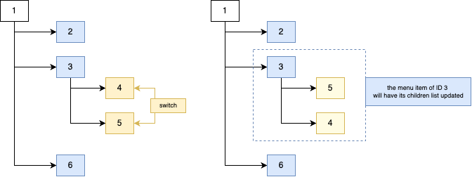
Take the following image.

Every orange box
is a root menu item
that are rendered in the DynamicMenuTilesList class.
Each blue box
is a MenuItem that can either be an ExpansionTile
(which renders a list of MenuItems in itself)
or a ListTile
(which refers to a "leaf node", an item that has no children).
Let's run the app. We should be able to see our dynamic menu and expand each menu item!

Awesome! 🎉
Because we are using ReorderableListView
to render our lists of (nested or not) menu items,
we should be able to allow the people using the app
to reorder the items!
Open _DynamicMenuTilesListState
and locate the build() function.
Change it to the following:
Widget build(BuildContext context) {
  return ReorderableListView(
      shrinkWrap: true,
      physics: const NeverScrollableScrollPhysics(),
      padding: const EdgeInsets.only(top: 32),
      onReorder: (oldIndex, newIndex) => _reorderTiles(oldIndex, newIndex, menuItemInfoList),
      children: menuItemInfoList
          .map(
            (tile) => MenuItem(key: ValueKey(tile.id), info: tile),
          )
          .toList()
        ..sort((a, b) => a.info.indexInLevel.compareTo(b.info.indexInLevel)));
}
Because we're adding nested ReorderableListViews
inside ReorderableListViews,
for reordering to properly work on menu items
on the same level,
we need to add physics: const NeverScrollableScrollPhysics().
For more information, visit
https://stackoverflow.com/questions/56726298/nesting-reorderable-lists.
In ReorderableListView, when the person long presses the menu item
and drags it,
the onReorder callback function is invoked.
We are calling a function called
_reorderTiles, which is not yet implemented.
Let's do that!
In the same class...
  void _reorderTiles(int oldIndex, int newIndex, List<MenuItemInfo> menuItemInfoList) {
    // an adjustment is needed when moving the tile down the list
    if (oldIndex < newIndex) {
      newIndex--;
    }

    // get the tile we are moving
    final tile = menuItemInfoList.removeAt(oldIndex);

    // place the tile in the new position
    menuItemInfoList.insert(newIndex, tile);

    // update the `indexInLevel` field of each item to be in order
    menuItemInfoList.asMap().forEach((index, value) => value.indexInLevel = index);

    // Update state
    setState(() {
      menuItemInfoList = menuItemInfoList;
    });

    // update the menu item object with updated children in the `json` file.
    updateRootObjectsInPreferences(menuItemInfoList);
  }
The callback receives the oldIndex and the newIndex
of the menu item being changed.
If you want to understand how the reordering happens,
no better than this 4-minute explanation
on https://youtu.be/wwUR7841Ajs?t=292.
What's important to understand here
is that the indexInLevel field
of the menu item's children
are updated to match the person's reordering
and then it's updated
on the person preferences
by calling updateRootObjectsInPreferences.
The latter function
receives the updated menu items.
Remember we're dealing with root menu items,
so we just pass the updated dynamic list.
We are going to repeat this process in the MenuItem class.
Scroll to MenuItem,
locate the build() function
and find the ReorderableListView.
// ....
children: [
  ReorderableListView(
    shrinkWrap: true,
    physics: const NeverScrollableScrollPhysics(),
    onReorder: (oldIndex, newIndex) => _reorderTiles(oldIndex, newIndex, widget.info),
    children: childrenMenuItemInfoList.map((tile) => MenuItem(key: ValueKey(tile.id), info: tile, leftPadding: widget.leftPadding + 16)).toList()
      ..sort((a, b) => a.info.indexInLevel.compareTo(b.info.indexInLevel)),
  )
],
Similarly to before,
we've added the physics parameter
and referenced a function on onReorder,
which we will need to implement.
In the same class,
add _reorderTiles.
  void _reorderTiles(int oldIndex, int newIndex, MenuItemInfo menuItemInfo) {
    List<MenuItemInfo> menuItemInfoList = menuItemInfo.tiles;

    // an adjustment is needed when moving the tile down the list
    if (oldIndex < newIndex) {
      newIndex--;
    }

    // get the tile we are moving
    final tile = menuItemInfoList.removeAt(oldIndex);

    // place the tile in the new position
    menuItemInfoList.insert(newIndex, tile);

    // update the `indexInLevel` field of each item to be in order
    menuItemInfoList.asMap().forEach((index, value) => value.indexInLevel = index);

    // Update state
    setState(() {
      menuItemInfoList = menuItemInfoList;
    });

    // update the menu item object with updated children in the `json` file.
    updateDeeplyNestedObjectInPreferences(menuItemInfo, menuItemInfoList);
  }
As you can see,
it's extremely similar
to the function we've written in the
DynamicMenuTilesList class.
The only difference is that
we are calling updateDeeplyNestedObjectInPreferences,
which we've created previously.
This reordering happens at menu items that are nested.
Now let's see what these changes led us to! Run the app and you should be able to reorder menu items by long pressing and dragging them on the same level. And because we are calling the functions to update the local storage, these updates are persisted whenever the person closes and reopens the drawer menu! 🥳

Hurray!
Everything seems to be working.
Let's tweak just one more thing:
the background color when the person performs the drag over.
For this,
we need to override the
proxyDecorator
parameter of the ReorderableListView.
In the same file lib/dynamic_menu.dart,
outside the classes we've created,
create this function:
Widget _proxyDecorator(Widget child, int index, Animation<double> animation) {
  return AnimatedBuilder(
    animation: animation,
    builder: (BuildContext context, Widget? child) {
      final double animValue = Curves.easeInOut.transform(animation.value);
      final double elevation = lerpDouble(0, 6, animValue)!;
      return Material(
        elevation: elevation,
        color: const Color.fromARGB(255, 76, 76, 76),
        child: child,
      );
    },
    child: child,
  );
}
Note
For more information about this, please visit flutter/flutter#45799.
We're keeping the default settings,
just changing the color to a dark gray.
Now we only need to use this function
inside each ReorderableListView
in both DynamicMenuTilesList and MenuItem classes!
  ReorderableListView(
    proxyDecorator: _proxyDecorator, // add this line to both
    physics: const NeverScrollableScrollPhysics(),
    onReorder: (oldIndex, newIndex) => _reorderTiles(oldIndex, newIndex, widget.info),
    //...
  )
Your file should look like
lib/dynamic_menu.dart.
And we're through! If we run the app, you'll verify that the background of the menu item when dragged is different!

And we're done! We've successfully added a dynamic menu to our app! Give yourself a pat on the back! 👏
Let's add further customization to our dynamic menu. This process can be applied to other types of customization pertaining to each menu item.
In this small section, we will focus on adding different text colour to each menu item.
We need to first add this information to the JSON file.
For each object,
add a field called "text_color":
  {
    "id": 1,
    "index_in_level": 0,
    "title": "People",
    "text_color": "#Ffb97e",  // add this line
    "tiles": []
}This field has an hex triplet string pertaining to a color.
We now need to parse this information
into our MenuItemInfo class.
For this, open lib/settings.dart
and make the following changes:
class MenuItemInfo {
  late int id;
  late int indexInLevel;
  late String title;
  late Color textColor;   // add this line
  late List<MenuItemInfo> tiles;

  MenuItemInfo({required this.id, required this.title, this.tiles = const []});

  MenuItemInfo.fromJson(Map<String, dynamic> json) {
    id = json['id'];
    indexInLevel = json['index_in_level'];
    title = json['title'];
    textColor = hexToColor(json['text_color']);  // add this line
    if (json['tiles'] != null) {
      tiles = [];
      json['tiles'].forEach((v) {
        tiles.add(MenuItemInfo.fromJson(v));
      });
    }
  }

  Map<String, dynamic> toJson() {
    final Map<String, dynamic> data = <String, dynamic>{};
    data['id'] = id;
    data['index_in_level'] = indexInLevel;
    data['title'] = title;
    data['text_color'] = '#${textColor.value.toRadixString(16)}';  // add this line
    if (tiles.isNotEmpty) {
      data['tiles'] = tiles.map((v) => v.toJson()).toList();
    } else {
      data['tiles'] = [];
    }
    return data;
  }
}
Here we are making use of two functions:
- when importing information from
JSONfile, we usehexToColor. We will implement this function to convert the hex string to aColorsclass. - when encoding the class into a
JSONformat, we convert theColorto a an hex string by using thetoRadixStringfunction. For more information, check https://stackoverflow.com/questions/55147586/flutter-convert-color-to-hex-string.
Let's implement hexToColor.
In the same file,
add this function.
Color hexToColor(String hexString) {
  try {
    final buffer = StringBuffer();
    if (hexString.length == 6 || hexString.length == 7) buffer.write('ff');
    buffer.write(hexString.replaceFirst('#', ''));
    return Color(int.parse(buffer.toString(), radix: 16));
  } catch (e) {
    return const Color(0xFFFFFFFF);
  }
}
This will receive a string
and try to convert to a Color object.
If it fails (whether because the string
is empty or invalid),
we default to the color white.
All that's left is to
use this new field of the MenuItemInfo
in our widget that renders the menu items!
For this, open lib/dynamic_menu.dart
and locate ListTile in both widgets
that render the menu item.
Change the for the following:
style: TextStyle(
  fontSize: 25,
  color: widget.info.textColor,
))),
We are thus using the widget.info item menu class
we've changed earlier to render the
converted textColor (which is a Color object).
Check
e536a8dfor the needed changes.
If you run the app now,
nothing seems to change.
This is because we are fetching the information from the local storage.
The changes we've made to assets/menu_items.json
aren't saved because we have our local storage with the previous JSON state.
To fix this,
we simply need to add one line to
loadMenuItems() function in lib/settings.dart.
Add it like so:
Future<List<MenuItemInfo>> loadMenuItems() async {
  final SharedPreferences prefs = await SharedPreferences.getInstance();

  await prefs.remove(storageKey); // add this line
}
This will remove the local storage content
and force the app to fetch the information from the JSON file.
Run this one time and comment the line again.
This is important, you need to comment the line again.
Or else the tests will fail and your menu will always reset
to the contents of the JSON file
and ignore your drag and drop actions.
And that's it! If you run the app, you should see the titles of the menu item changing!

Similarly to what we've done before, let's allow the person to customize the icon for each menu item. We are expecting this feature to allow support for:
emoji.icons.images(up to64x64pxsize).
For this, we are going go need to pass this information
in the JSON file assets/menu_items.json.
{
"id": 1,
"index_in_level": 0,
"title": "People",
"text_color": "#Ffb97e",
// This section is added
"icon": {
"colour": "#Ffb97e",
"code": 61668,
"emoji": "🧑🤝🧑",
"url": "https://cdn-icons-png.flaticon.com/512/4436/4436481.png"
},
}We are adding an "icon" field
that has four parameters:
- a
colourfield, pertaining to an hex colour code. If this field is missing or invalid, it defaults to a white colour. - a
code, referring to an int pertaining thematerial iconclass. You can find each code in https://api.flutter.dev/flutter/material/Icons-class.html#constants. - an
emojiin string format. - an image
url, that is downscaled automatically to64 x 64px.
We are going to need a class in Dart
so we can use this new information.
In lib/settings.dart, create the following class.
class MenuItemInfoIcon {
  late final int? code;
  late final String? emoji;
  late final String? url;
  late final String? colour;

  MenuItemInfoIcon({this.code, this.emoji, this.url, this.colour});

  MenuItemInfoIcon.fromJson(Map<String, dynamic> json) {
    code = json['code'];
    emoji = json['emoji'];
    url = json['url'];
    colour = json['colour'];
  }

  Map<String, dynamic> toJson() {
    final Map<String, dynamic> data = <String, dynamic>{};
    data['code'] = code;
    data['emoji'] = emoji;
    data['url'] = url;
    data['colour'] = colour;

    return data;
  }
}
This is a simple class with each field that we've explained earlier.
Now let's add a field in MenuItemInfo
with this new class.
In the same file lib/settings.dart,
change MenuItem so it looks like so:
class MenuItemInfo {
  late int id;
  late int indexInLevel;
  late String title;
  late Color textColor;
  late MenuItemInfoIcon? _icon;
  late List<MenuItemInfo> tiles;

  MenuItemInfo({required this.id, required this.title, this.tiles = const []});

  /// We've migrated the `hexToColor` function to here...
  Color _hexToColor(String hexString) {
    try {
      final buffer = StringBuffer();
      if (hexString.length == 6 || hexString.length == 7) buffer.write('ff');
      buffer.write(hexString.replaceFirst('#', ''));
      return Color(int.parse(buffer.toString(), radix: 16));
    } catch (e) {
      return const Color(0xFFFFFFFF);
    }
  }

  Widget? getIcon() {
    bool iconExists = _icon != null;

    // Check if any icon information exists
    if (iconExists) {

      // Icon parameters
      int? iconCode = _icon?.code;
      String? emojiText = _icon?.emoji;
      String? imageUrl = _icon?.url;
      String? colourHex = _icon?.colour;

      // Icon colour
      Color colour = _hexToColor(colourHex!);

      if (iconCode != null) {
        return Icon(
          IconData(iconCode, fontFamily: 'MaterialIcons'),
          color: colour,
        );
      }

      if (emojiText != null) {
        return Text(emojiText.toString(), style: TextStyle(color: colour, fontSize: 30));
      }

      if(imageUrl != null) {
        return Container(
          padding: const EdgeInsets.only(top: 8.0, bottom: 8.0),
          child: Image.network(imageUrl, fit: BoxFit.fitHeight, height: 64));
      }
    }

    // If there's no icon information, return null
    else {
      return null;
    }
  }


  MenuItemInfo.fromJson(Map<String, dynamic> json) {
    id = json['id'];
    indexInLevel = json['index_in_level'];
    title = json['title'];
    textColor = _hexToColor(json['text_color']);
    if (json['tiles'] != null) {
      tiles = [];
      json['tiles'].forEach((v) {
        tiles.add(MenuItemInfo.fromJson(v));
      });
    }

    // Add these new liens
    _icon = null;
    if (json['icon'] != null) {
      _icon = MenuItemInfoIcon.fromJson(json['icon']);
    }
  }

  Map<String, dynamic> toJson() {
    final Map<String, dynamic> data = <String, dynamic>{};
    data['id'] = id;
    data['index_in_level'] = indexInLevel;
    data['title'] = title;
    data['text_color'] = '#${textColor.value.toRadixString(16)}';
    if (tiles.isNotEmpty) {
      data['tiles'] = tiles.map((v) => v.toJson()).toList();
    } else {
      data['tiles'] = [];
    }

    // Add these new lines
    if (_icon != null) {
      data['icon'] = _icon!.toJson();
    }

    return data;
  }
}
We've made a few changes to this class:
- we've first migrated the
hexToColourfunction to be a private function insideMenuItemInfoclass. - added an
_iconfield with typemenuItemInfoIcon(class we've just defined). - in the
MenuItemInfo.fromJson()function, we've added lines to parse theiconfield from theJSONfile. - in the
MenuItemInfo.toJson()function, we've added lines to encode the_iconfield into theJSONfile. - added a
getIcon()function that, depending on the fields that are present in theiconobject, will render a referring widget. Ordering by priority, theiconwill take precedence over theemojiand the latter from the imageurl. Thecolourfield will change theiconcolour, if there's any. If none of these fields are found, nothing is rendered.
The getIcon() function will be used in the widgets
in lib/dynamic_menu.dart.
In the _MenuItemState class,
add leadileading: widget.info.getIcon(),
to the Containers.
See the changes in 081a7ea.
And you should be done! If you run the application, you will see that we can now add icons to the menu items!

Great job! 🥳
Note
Similarly to what we've done in the previous section, you need to clear the local storage to get the most up-to-date
JSONfile contents.Use
await prefs.remove(storageKey);for this.
Even though English is the most popular language currently, there are still billions of people who don't speak this language. It's not fair to leave them out! So let's add a way for users to toggle between languages.
The official
Flutterdocs have a page explaining how internationalization works onFlutterapps. Although necessary, it's an interesting read and will surely give you context to what we're about to implement!Visit https://docs.flutter.dev/accessibility-and-localization/internationalization for more information.
To keep things simple, we'll allow users to toggle between Portuguese and English.
Let's start by adding
flutter_localizations
to our pubspec.yml file
in the dependencies section.
dependencies:
  flutter:
    sdk: flutter
  flutter_localizations:
    sdk: flutter
We're going to be storing our translation files
inside the assets/i18n folder.
Let's give our app access to this folder
by adding this new folder to pubspec.yml
in the assets folder.
  assets:
    - assets/images/
    - assets/i18n/
    - assets/menu_items.json
Now that we have everything ready, let's start writing some code! 🧑💻
Let's head over to main.dart and
under the MaterialApp widget,
let's set the
supportedLocales
property.
This property has a list of locales that the app
has been localized for.
By default, if you're running the app on a simulator, American English is supported. Let's add another one.
MaterialApp(
  // ...
  supportedLocales: const [
    Locale('en', 'US'),
    Locale('pt', 'PT'),
  ],
)
We now need to verify if the person's device locale is supported by our app or not.
MaterialApp has a property called
localeResolutionCallback
for this.
We will loop through the supportedLocales
and check if our app supports the person's device locale or not.
If not, we default to English.
MaterialApp(
  // ...
  localeResolutionCallback: (deviceLocale, supportedLocales) {
    for (var locale in supportedLocales) {
      if (locale.languageCode == deviceLocale!.languageCode && locale.countryCode == deviceLocale.countryCode) {
        return deviceLocale;
      }
    }
    return supportedLocales.first;
  },
)
The last setting we need to define under MaterialApp
relates to delegates.
A localization delegate
is responsible for providing localized values to the app as per the person's locale.
It's essentially a bridge between the app and the localization data.
Flutter allows us to create MaterialApps or CupertinoApps, for example.
These have in-built widgets that should also be translated.
For these to be correctly translated,
we need to add delegates for these.
Luckily, Flutter provides us default delegates,
as well as a special delegate
(GlobalWidgetsLocalizations)
which handles
the direction of the text
(useful in the Arabic language, for example).
Under MaterialApp,
add the following code:
MaterialApp(
        // ...
  localizationsDelegates: const [
    GlobalMaterialLocalizations.delegate,
    GlobalWidgetsLocalizations.delegate,
    GlobalCupertinoLocalizations.delegate,
    AppLocalization.delegate
  ],
)
We've also added a delegate from AppLocalization.
This class doesn't exist.
Let's create it!
This AppLocalization class will handle
everything i18n related under-the-hood!
Let's create our own custom delegate to help translate our app's labels into any language we like.
For this, create a file called app_localization.dart
inside lib.
import 'dart:convert';

import 'package:flutter/material.dart';
import 'package:flutter/services.dart';

class AppLocalization {
  late final Locale _locale;

  AppLocalization(this._locale);

  static AppLocalization of(BuildContext context) {
    return Localizations.of<AppLocalization>(context, AppLocalization)!;
  }

  late Map<String, String> _localizedValues;


  Future loadLanguage() async {
    String jsonStringValues = await rootBundle.loadString('assets/i18n/${_locale.languageCode}.json', cache: false);

    Map<String, dynamic> mappedValues = json.decode(jsonStringValues);

    // converting `dynamic` value to `String`, because `_localizedValues` is of type Map<String,String>
    _localizedValues = mappedValues.map((key, value) => MapEntry(key, value.toString()));
  }


  String? getTranslatedValue(String key) {
    return _localizedValues[key];
  }

  static const LocalizationsDelegate<AppLocalization> delegate = _AppLocalizationDelegate();
}


class _AppLocalizationDelegate extends LocalizationsDelegate<AppLocalization> {
  const _AppLocalizationDelegate();


  @override
  bool isSupported(Locale locale) {
    return ["en", "pt"].contains(locale.languageCode);
  }


  @override
  Future<AppLocalization> load(Locale locale) async {
    AppLocalization appLocalization = AppLocalization(locale);
    await appLocalization.loadLanguage();
    return appLocalization;
  }


  @override
  bool shouldReload(_AppLocalizationDelegate old) => false;
}
Here we are creating two classes:
AppLocalization, which is our main localization class
in which we will provide _AppLocalizationDelegate,
our custom delegate class.
Let's go over the latter first.
Because we are extending the
LocalizationsDelegate class,
we need to override the isSupported, load and shouldReload functions.
These functions are self-explanatory:
isSupportedchecks if a given locale is supported.load, which given a locale, it loads the language labels to be displayed (it calls a function inAppLocalizationthat does this).shouldReload, returns true if the resources for this delegate should be loaded again by calling theloadmethod.
In the AppLocalization class,
we offer the custom delegate class
we've defined earlier
and three public functions:
of, which is a useful method to access the methods of the class from widgets in an easier manner.loadLanguage, which loads the translation file according to the given locale.getTranslatedValue, which will be used to display the label translated to the current chosen locale of the device.
Now we need to add the translation files!
We are going to create two files in assets/i18n:
en.json and pt.json,
the translations for English and Portuguese, respectively.
Check both files inside assets/i18n.
Now we need to display the localized label
across our app!
We just need to find all the Text instances
we want to change according to the locale
and use
AppLocalization.of(context).getTranslatedValue("JSON_KEY_HERE").toString().
Do this on across the app.
Check
c60546
to see the lines you need to change.
We've just added i18n capabilities to labels
that are present in the static pages and menus,
not on the dynamic menu.
If you look at what happens with Gmail,
you can create labels
and nest each one like our dynamic menu.

However, these labels aren't translated. And for good reason. Do they actually need to be translated? If the person has defined them, he understands what he means.
However, we understand that you might want to give the person the option to toggle between translations from the dynamic menu items that they provide. In this case, we give two ideas that you can try to implement this on your own!
Note
These are suggestions for implementation and should be thought as a fun exercise. Feel free to skip this, these are very much optional.
One option is to have the label translations
from the file that is parsed in the app menu_items.json.
Here's how the file would look like:
{
"id": 1,
"index_in_level": 0,
"title": {
"en": "People",
"pt": "Pessoas"
},
"text_color": "#Ffb97e",
"icon": {
"colour": "#Ffb97e",
"code": 61668,
"emoji": "🧑🤝🧑",
"url": "https://cdn-icons-png.flaticon.com/512/4436/4436481.png"
},
}You would need to then parse the title
as a late Map<String, dynamic> class variable.
You would later need to create a function
inside AppLocalization to handle these labels,
like so:
  String getMenuItemTitle(MenuItemInfo item) {
    final Map<String, dynamic> title = item.title;

    return title[_locale.languageCode] ?? "";
  }
And use it on the dynamic_menu.dart widgets,
like:
Text(AppLocalization.of(context).getMenuItemTitle(widget.info))Another possible venue is to have a set of pre-determined values that the app will translate automatically.
For example, the person is using the app in Portuguese
and has a menu item called Definitions.
In our dictionary, the app would detect this word
and translate it to Definições.
For this, you would need to have
files to translate from both PT to EN
and EN to PT.
The number of these types of files would grow exponentially
as more languages would be supported.
For example:
// en-pt.json
{
    "settings": "definições",
    "home": "início",

    "people": "pessoas",
    "online now": "online agora"
}
// pt-en.json
{
"settings": "definições",
"home": "início",
"people": "pessoas",
"online now": "online agora"
}We could use these key-value pairs
to translate the menu item title automatically.
If the person had PT setup,
we would look at the en-pt.json file
and try to translate if any of the keys were found.
However, as it was previously mentioned,
this method isn't sustainable at scale.
If we added another language,
we would need to look at en-pt.json
and fr-pt.json, for example.
We are going to use Riverpod,
a state management library,
to make it easy for the person
to change languages within the app.
If you're not aware of what a state management library is
and/or don't know how Riverpod works,
we recommend you visit
dwyl/flutter-todo-list-tutorial
to build foundational knowledge on this subject.
In layman's terms, Riverpod
will allow us to create and manage
global state across the widget tree.
Any widget in this tree will be able to access and modify this state.
We'll save the current locale in this state,
so any widget can change it.
After installing Riverpod,
let's wrap our app with a ProviderScope
in main.dart,
so it's providers created with Riverpod
are accessible throughout the widget tree.
void main() {
  runApp(const ProviderScope(child: App()));
}
Below the main() function,
we'll create our Provider
which will hold the current locale that is chosen by the person.
final currentLocaleProvider = StateProvider<Locale>((_) => const Locale('en', 'US'));Now let's use this provider!
In the App class,
change the interface it extends.
Instead of:
class App extends StatelessWidgetChange it to:
class App extends ConsumerWidgetThis interface is from Riverpod,
which will make it easy for us
to access the provider in the App widget.
While we're at it,
let's also change the HomePage
and _HomePageState extending interfaces.
class HomePage extends ConsumerStatefulWidget {
  const HomePage({super.key});

  @override
  ConsumerState<HomePage> createState() => _HomePageState();
}

class _HomePageState extends ConsumerState<HomePage> with SingleTickerProviderStateMixin
Now it's time to use our provider value!
Inside App's build() function,
let's access the provider
and use it in the
locale
parameter of MaterialApp.
Widget build(BuildContext context, WidgetRef ref) {
  final currentLocale = ref.watch(currentLocaleProvider); // add this

  return MaterialApp(
      title: 'Navigation Flutter Menu App',
      theme: ThemeData(
        primarySwatch: Colors.blue,
      ),
      debugShowCheckedModeBanner: false,
      locale: currentLocale, // add this
  )
}
Finally,
all that's left is add the two buttons
to toggle between Portuguese and English.
In _HomePageState,
add the following piece of code
at the end of the children array
under Column.
  Padding(
    padding: const EdgeInsets.only(top: 24.0),
    child: Row(
      mainAxisAlignment: MainAxisAlignment.spaceAround,
      children: [
        ElevatedButton(
            onPressed: () {ref.read(currentLocaleProvider.notifier).state = const Locale('pt', 'PT');},
            style: ElevatedButton.styleFrom(backgroundColor: const Color.fromARGB(255, 161, 30, 30)),
            child: const Text("PT")),
        ElevatedButton(
            onPressed: () {ref.read(currentLocaleProvider.notifier).state = const Locale('en', 'US');},
            style: ElevatedButton.styleFrom(backgroundColor: const Color.fromARGB(255, 18, 50, 110)),
            child: const Text("EN")),
      ],
    ),
  )
We're creating two ElevatedButtons
and updating the provider value
by using ref.read(currentLocaleProvider.notifier).state = newValue.
Check
lib/main.dartto see how the visit should look like after these changes.
And that's it!
If we run the app,
we can see our i18n properly working
across all the widget tree! 🎉

You might have noticed that, by having the borders always showing on top and bottom of each menu item, when expanding menu items an overlap is noticeable.

You can clearly see
that under Work and Everyone,
the border is repeated.
This is not intended...
So let's fix this!
For this,
we are going to install
collection.
This package will give us handy utils
to operate on lists.
We'll be using the mapIndexed function,
which will allows us to know the index
of a given list element whilst iterating over it.
Head over to lib/dynamic_menu.dart,
locate the MenuItem class
and add two fields:
isLastInArray, a boolean which states if the element is last in the array of menu items.isFirstInArray, self-explanatory.
class MenuItem extends StatefulWidget {
  final Key key;
  final MenuItemInfo info;
  final double leftPadding;
  final bool isLastInArray;    // add this
  final bool isFirstInArray;   // add this

  const MenuItem({required this.key, required this.info, this.leftPadding = 16, this.isLastInArray = false, this.isFirstInArray = false})
      : super(key: key);

  @override
  State<MenuItem> createState() => _MenuItemState();
}
Now we need to set these new fields
when instantiating MenuItems.
Find _MenuItemState and its build() function.
When rendering a ReorderableListView,
we are going to change the children parameter
to map over the children list of menu items
to use the mapIndexed function.
children: childrenMenuItemInfoList.mapIndexed((index, tile) {
  // Check if item is first or last in array
  final isLastInArray = index == childrenMenuItemInfoList.length - 1;
  final isFirstInArray = index == 0;

  // Render menu item
  return MenuItem(
    key: ValueKey(tile.id),
    info: tile,
    leftPadding: widget.leftPadding + 16,
    isLastInArray: isLastInArray,
    isFirstInArray: isFirstInArray,
  );
}).toList()
Awesome!
Now all that's left is making use of these variables
when rendering the decoration.
Let's migrate the behaviour of the decoration to a private function.
In the same class,
locate both
decoration parameters
and change them like so:
decoration: _renderBorderDecoration(),In the same class _MenuItemState,
let's implement this function!
BoxDecoration _renderBorderDecoration() {
  if (widget.isLastInArray) {
    return const BoxDecoration();
  }

  if (widget.isFirstInArray) {
    return const BoxDecoration(border: Border(top: BorderSide(color: Colors.white), bottom: BorderSide(color: Colors.white)));
  }

  return const BoxDecoration(border: Border(bottom: BorderSide(color: Colors.white)));
}
As you can see, we are rendering the container borders depending on its position within the list. This way, we prevent the overlap issue that was occuring earlier.
If you want to see the changes made, check
6cdd78b.
If you run the app, you will see that the problem is resolved!

Now the menu items look consistent across the nested menu item lists! 🥳
As of now, our menu items aren't really useful at all. Sure, they are being displayed correctly but they aren't navigating anywhere.
Luckily for us, we can easily implement this! We'll just create a sample page that will display the title of the given menu item with a button that will allow the person to go back.
Head over to lib/pages.dart
and create a new stateless widget class.
class DynamicMenuPage extends StatelessWidget {
  final MenuItemInfo menuItem;

  const DynamicMenuPage({super.key, required this.menuItem});

  @override
  Widget build(BuildContext context) {
    return Scaffold(
      key: dynamicMenuPageKey,
      body: Center(
        child: Column(
          mainAxisAlignment: MainAxisAlignment.center,
          children: [
            Text(
              menuItem.title,
              style: const TextStyle(fontSize: 30),
              textAlign: TextAlign.center,
            ),
            Padding(
              padding: const EdgeInsets.only(top: 16.0),
              child: ElevatedButton(
                onPressed: () {
                  Navigator.pop(context);
                },
                child: const Text('Go back'),
              ),
            ),
          ],
        ),
      ),
    );
  }
}
This is a simple class, similar to the other pages,
that simply renders a Text with the given menu item title.
Now we only need to use this page
when rendering a leaf menu item!
Head over to lib/dynamic_menu.dart,
find the _MenuItemState class
and its build() function,
and make these changes:
  if (childrenMenuItemInfoList.isEmpty) {
    return Container(
      key: widget.key,
      decoration: _renderBorderDecoration(),
      child: ListTile(
          contentPadding: EdgeInsets.only(left: widget.leftPadding),
          leading: widget.info.getIcon(),

          // Add this `onTap` parameter
          onTap: () {
            Navigator.push(
              context,
              MaterialPageRoute(builder: (context) => DynamicMenuPage(menuItem: widget.info)),
            );
          },

          title: Text(widget.info.title,
              style: TextStyle(
                fontSize: 25,
                color: widget.info.textColor,
              ))),
    );
  }
We've just added an onTap parameter,
which is invoked whenever the user taps on the menu item.
This simply pushes the page we've just created
in the navigation stack,
showing our brand new page!
If you run the app, and click on a leaf menu item (meaning it's not expandable), the page should be shown!

Hurray! We've got ourselves a solid dynamic menu! Give yourself a pat on the back 👏.
If you find this package/repo useful, please star on GitHub, so that we know! ⭐
Thank you! 🙏