Prefer usage of dialogs without ? for confirmation dialogs in PDE #149
Comments
|
I'm not sure I follow what these links are suggesting nor what changes you are actually suggesting. I do wonder how those recommendations correspond to these guidelines https://wiki.eclipse.org/User_Interface_Guidelines Will this approach/change make PDE different from say JDT or the Platform and all the other projects? |
|
The way we currently work is that we start somewhere and continue improving. |
|
That doesn't answer the question though. Could you explain the improvement, perhaps with a specific example of what you plan to change so that someone other than you can understand what you plan to do and what you consider an improvement. After all, if it's an improvement, everyone should do it and then everyone is likely to have an opinion about it... |
|
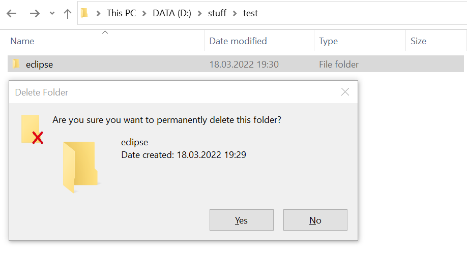
@akurtakov I think you have screenshots from the native behavior? Can you share them here? |
|
|


|
This is pure native Windows 10:
This uses a question mark. So if this were PDE, it would be changed how? One doesn't normally say yes/no in response to a statement but rather in response to a question, which is generally terminated by a question mark. So is just the question mark removed or is a yes/no dialog deprecated? |
|
The issue is only to remove the ? mark from the dialog which is not included in the WIndows UI guidelines (I finally found it): https://docs.microsoft.com/en-us/windows/apps/design/controls/dialogs-and-flyouts/dialogs Yes / No dialogs are still fine even though I think action orientated buttons are preferrable. |
|
The goal should be to use SWT's MessageBox directly as it already follows the underlying OS guidelines and thus Eclipse shows dialog that doesn't differ from what rest of the apps on the system show. |
|
Screenshot from the UI guidelines of Microsoft.
|

|
That dialog has three question marks (oops I mean two). Is that bad? |
|
Our goal should be to defer to the OS as SWT was initially designed - "The primary design goals are high performance, native look and feel, and deep platform integration. " |
|
Ah, sorry @merks I mean the question mark icon on the left side of the dialog. Sorry for not being clear, it was obvious to my mind as I head multiple times about this in the last years. I added a screensho to the intial comment to make it clear to others. |
|
I see now where the wires got crossed! Thanks for clarifying. |
Using a help icon for confirmation dialogs is not recommended in the
latest UI guidelines for Mac, Linux and Windows.

References:
https://developer.apple.com/design/human-interface-guidelines/components/presentation/alerts/
https://developer.gnome.org/hig/patterns/feedback/dialogs.html
https://docs.microsoft.com/en-us/windows/apps/design/controls/dialogs-and-flyouts/dialogs

Currently the text is way to much on the left with this patch, therefore
this change depends on
eclipse-platform/eclipse.platform.ui#116

For #149
|
Done for all dialogs I regulary see, will open new PR if I see others which can be updated. |
Using a ? icon for confirmation dialogs is not recommended in the lateset UI guidelines for Mac and Linux and I do not see that used in Windows.
References:
https://developer.apple.com/design/human-interface-guidelines/components/presentation/alerts/
https://developer.gnome.org/hig/patterns/feedback/dialogs.html
I suggest we do not use ? icons anymore in our PDE dialogs whenever possible.
The text was updated successfully, but these errors were encountered: