Skip to content
New issue

Have a question about this project? Sign up for a free GitHub account to open an issue and contact its maintainers and the community.

By clicking “Sign up for GitHub”, you agree to our terms of service and privacy statement. We’ll occasionally send you account related emails.

Already on GitHub? Sign in to your account

Bell Curve Histogram #2704

Closed
pickypg opened this issue Jan 20, 2015 · 8 comments
Closed

Bell Curve Histogram #2704

pickypg opened this issue Jan 20, 2015 · 8 comments
Labels
Feature:New Vis Request for a new visualization type Team:Visualizations Visualization editors, elastic-charts and infrastructure

Comments

@pickypg
Copy link
Member

pickypg commented Jan 20, 2015

The idea is that, for a given query, to build a bell curve.

The X-axis would be the metric value (time) and Y-axis is relative frequency (or reversed if that makes more sense).

I'm not looking for a perfect bell curve, but two queries on the same filter (one for percentiles and one with a range aggregation based on the histogram) could do it nicely.

@jc-ns
Copy link

jc-ns commented Jan 21, 2015

This would be a really powerful feature! I'd love to be able to see what my response time distribution would be.

It would be even better if you could overlay multiple queries (so compare the performance distribution curve of one data center vs another for example)

@AlexIoannides
Copy link

How would this be different to using a bar chart with time-based ranges on the X-Axis and 'count of documents' on the Y-Axis?

@jc-ns
Copy link

jc-ns commented Feb 12, 2015

It would always be a bell curve, but the x axis scale would vary with what the percentiles were.

Also, this is not for count, but for the evaluation of a metric.

@dagguh
Copy link

dagguh commented May 21, 2015

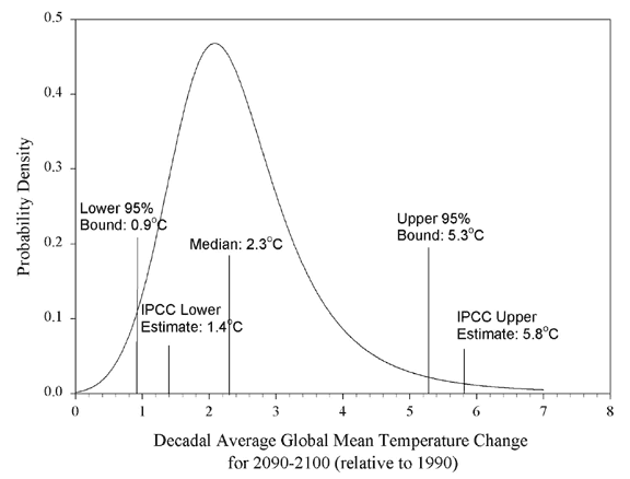
The "Bell Curve" AKA probability density function differs from a Count aggregate over Histogram buckets, because the Y axis shows relative frequencies instead of absolute counts, e.g.:
probability density function example.
This is very useful if you need to compare distributions via Split Lines, but the absolute counts are orders of magnitude different, so one series squashes the other:
example of absolute value squashing
The log scale often is not enough.

@spalger spalger added Feature:Visualizations Generic visualization features (in case no more specific feature label is available) release_note:enhancement and removed discuss labels Jan 2, 2017
@thomasneirynck
Copy link
Contributor

For a summary of statistical properties of the data, we could also consider the boxplot alternative. It shows similar metrics, but makes less explicit of an assumption that the data is normally distributed. If you'd agree, I would close this one in favor of #4157 then.

@camerondavison
Copy link

@thomasneirynck the box plot would be really helpful but really all that is needed to to divide each bucket by the total values seen in the whole chart. This would just make the Y axis a percentile of the total instead of a raw count.

@tbragin tbragin added the Feature:New Vis Request for a new visualization type label Feb 24, 2017
@timroes timroes added the Team:Visualizations Visualization editors, elastic-charts and infrastructure label Sep 16, 2018
@timroes timroes removed Feature:Visualizations Generic visualization features (in case no more specific feature label is available) labels Oct 1, 2018
@wylieconlon
Copy link
Contributor

Is this related to the Cumulative Distribution function? #3905

@thomasneirynck
Copy link
Contributor

Lens now has support for formulas, which allow you to normalize the values per bucket, either compared to the overall, or on a per-bucket basis.

https://www.elastic.co/guide/en/kibana/current/lens.html#lens-formulas

this allows you to compute relative frequencies.

E.g. something like count()/overall_sum(count()) will, for each grouping (e.g. a time-window), compute the relative frequency.

For full in-app docs, please find the little info-button in the Formula tab (Side-note: grouping is the terminology used in Lens to bucket).

image

As you can add multiple lines, this also allows you to compare relative frequencies of multiple distributions.

Sign up for free to join this conversation on GitHub. Already have an account? Sign in to comment
Labels
Feature:New Vis Request for a new visualization type Team:Visualizations Visualization editors, elastic-charts and infrastructure
Projects
None yet
Development

No branches or pull requests

10 participants