Cumulative distribution function #3905
Comments
|
This is not something we want to introduce a new visualization for, rather this is a transformation on existing data as applied to a line chart. Can you explain some use cases? Give some examples on where you'd use this? Concrete questions it would solve? |
|
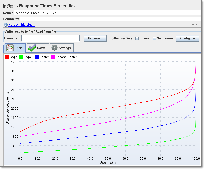
E.g. A/B testing. These are actual comparisons we did using JMeter: |


|
Do we have any update or method or plugin to plot Cumulative distribution function (CDF) or probability density function(PDF) plot for the KPI? |
|
+1. Much of the analysis we do is based on percentile distribution, exactly like @dagguh shows. Basically a histogram where the X-Axis are the bucketed percentiles (e.g. p25, p50, p75) of a field, and the Y-Axis uses some number function like average of that same field or median of some other field (counts would be equal between percentiles). This lets you answer questions like "what is the gain on the 25% of users who have the worst latency to our service." It'd be super powerful. This is older ticket, any chance this is now doable with pipeline agg, and maybe Vega / Canvas visualizations? |
|
I believe a CDF chart should be doable with the Percentiles aggregation in Elasticsearch. A CDF is just the "continuous" function describing percentiles at any arbitrary position. So Kibana could ask the percentiles agg for 0-100 percentile in small increments (0, 5, 10, 15, ... 100) that will approximate the CDF. Smaller increments == better approximation. Asking for more percentiles is essentially free other than some minor computation and a larger response size. The percentile sketches collect all the information from the shards, and when we construct the response Elasticsearch interrogates the CDF of the sketches to generate specific percentiles. So asking for more percentiles just interrogates the sketch a bit more, which is mostly neglibible (within reason) compared to building the sketch itself. It could also be done with PercentileRanks agg (which is basically the inverted chart), but that requires you to know the extents of data ahead of time. Would be easier to use Percentiles since you know the data is always 0-100, then invert the graph client-side if desired. I agree that a complete plot of the full CDF is very useful in many analysis. |
|
@polyfractal cc @AlonaNadler the issues with the bare Would there be a way for Kibana to choose to do a "quantile histogram", give a few parameters like the granularity or specific percentile value to bucket at, and then ES would do the full aggregation in 1 go? |
|
I'm not sure I follow? A request like this basically gives you the CDF: GET /test/_search
{
"size": 0,
"aggs": {
"cdf": {
"percentiles": {
"field": "value",
"percents": [ 10, 20, 30, 40, 50, 60, 70, 80, 90, 100 ]
}
},
"stats": {
"stats": {
"field": "value"
}
}
}
}{
"aggregations" : {
"cdf" : {
"values" : {
"10.0" : 2.6,
"20.0" : 8.0,
"30.0" : 15.0,
"40.0" : 15.0,
"50.0" : 15.0,
"60.0" : 19.499999999999996,
"70.0" : 20.8,
"80.0" : 41.300000000000004,
"90.0" : 67.99999999999999,
"100.0" : 80.0
}
},
"stats" : {
"count" : 9,
"min" : 1.0,
"max" : 80.0,
"avg" : 24.666666666666668,
"sum" : 222.0
}
}
}All Kibana needs to do is convert that into a line chart. E.g. a point at We can't make a "bucket" version of percentiles because it's one of those operations that you don't know the real percentile values until all the shards have been merged together. And at that point it's too late to collect documents into buckets because we're merging on the coordinating node. If we had multi-pass aggs it is theoretically possible, but would still require two passes (it'd just happen in ES) If a "bucketed" percentiles are needed today, it could be done by Kibana with two passes: one to get the percentiles, second to setup a |
|
@polyfractal right your last description is what I mean. Drawing a pure CDF is one thing and you are right that it would answer the original premise of this ticket. But I think it'd be very limiting in what you can do with it - I attempted to describe a more generic approach that would let you do more interesting things here elastic/elasticsearch#50386 You could draw the CDF 2 ways: |
|
For anyone who is trying to get this type of chart in Kibana, I have a workaround using Vega. As mentioned earlier in this thread, Elasticsearch already supports the most basic level of fetching data that we can use to render a chart. Vega can do the calculation in your browser and render the chart. Here's my example.
Full Vega-Lite spec |

|
Closing this because it's not planned to be resolved in the foreseeable future. It will be tracked in our Icebox and will be re-opened if our priorities change. Feel free to re-open if you think it should be melted sooner. |
Cumulative distribution function, e.g.:
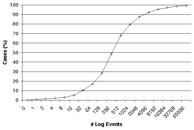
This function is invertible, e.g. you can swap the axes:
I am unable to visualise neither function in Kibana build 6998, commit d029b34. I understand that the axes depend on each other, ie. must be about the same field and must be a pair of percentiles and percentile ranks. I'm aware of the fact that e.g. the Line Chart visualisation isolates the axes from each other.
This is why I propose a new visualisation type: Cumulative Distribution. This is very similar to #2704 which would also need a separate visualisation type. Maybe it can be generalised into a Distribution visualisation type.
Both of them only need a single field as an input. Both would benefit greatly from Split Lines and Split Charts.
If ElasticSearch doesn't give such capabilities, please let me know, I'll raise an issue there.
The text was updated successfully, but these errors were encountered: