The easiest way to control your app theme, this package provides couple of widgets to change between system and light/dark theme.


- Installation
- Getting Started
- Handling App Start
- Let's Theme Toggle Widget
- Let's Theme Toggle Widget Customization
- Changing Theme Mode
- Toggle Theme Mode
- Changing Themes
- Reset Theme
- Handling Theme Changes
Add this to your packages pubspec.yaml file:
dependencies:
lets_theme: <^last>import 'package:lets_theme/lets_theme.dart';
import 'package:flutter/material.dart';
void main() async {
runApp(MyApp());
}
class MyApp extends StatelessWidget {
@override
Widget build(BuildContext context) {
return LetsTheme(
light: ThemeData.light(useMaterial3: true),
dark: ThemeData.dark(useMaterial3: true),
initialMode: ThemeMode.light, // bad: I'll explain why in more detail below, but you need to know that this would be fine if we don't save any preferences.
builder: (ThemeData light, ThemeData dark) => MaterialApp(
title: "Let's Theme Demo",
theme: light,
darkTheme: dark,
home: MyHomePage(),
),
);
}
}When you change your theme, the next app run won't be able to pick the most recent theme directly before rendering with
default theme first time. This is because at the time of initialization, we cannot run async code to get previous theme
mode. However, it can be avoided if you make your main() method async and load previous theme mode asynchronously.
The Below example shows how it can be done.
void main() async {
  WidgetsFlutterBinding.ensureInitialized();
  final ThemeMode savedThemeMode = await LetsTheme.getThemeMode();
  runApp(MyApp(savedThemeMode: savedThemeMode));
}
class MyApp extends StatelessWidget {
const MyApp({this.savedThemeMode, super.key});
final ThemeMode savedThemeMode;
@override
Widget build(BuildContext context) {
return LetsTheme(
light: ThemeData.light(useMaterial3: true),
dark: ThemeData.dark(useMaterial3: true),
initial: savedThemeMode ?? ThemeMode.light, // good
builder: (ThemeData light, ThemeData dark) => MaterialApp(
title: "Let's Theme Demo",
theme: light,
darkTheme: dark,
home: MyHomePage(),
),
);
}
}Notice that I passed the retrieved ThemeMode to my MaterialApp so that I can use it while initializing the default
theme. This helps avoid theme change flickering on app startup.
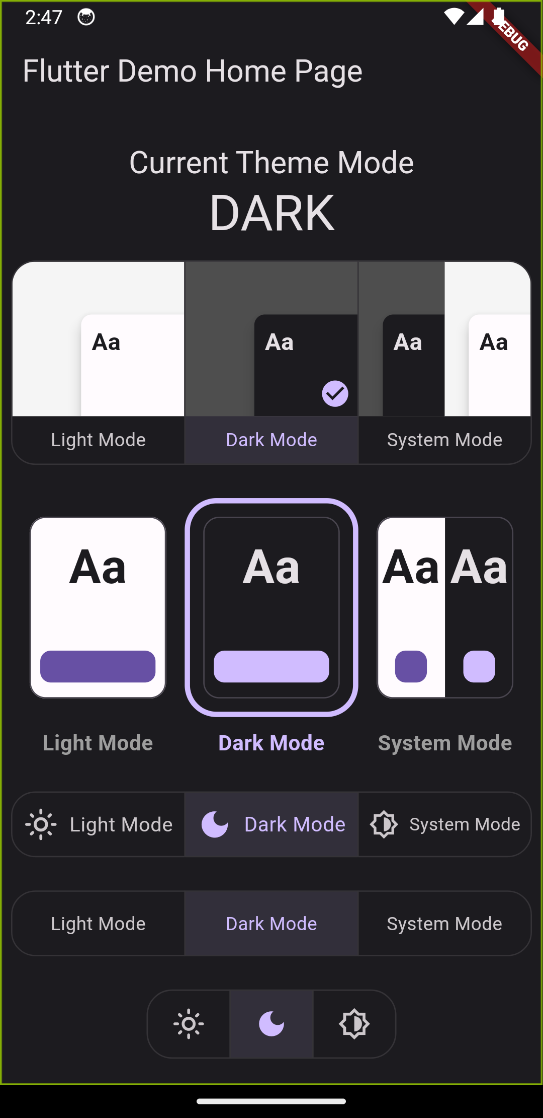
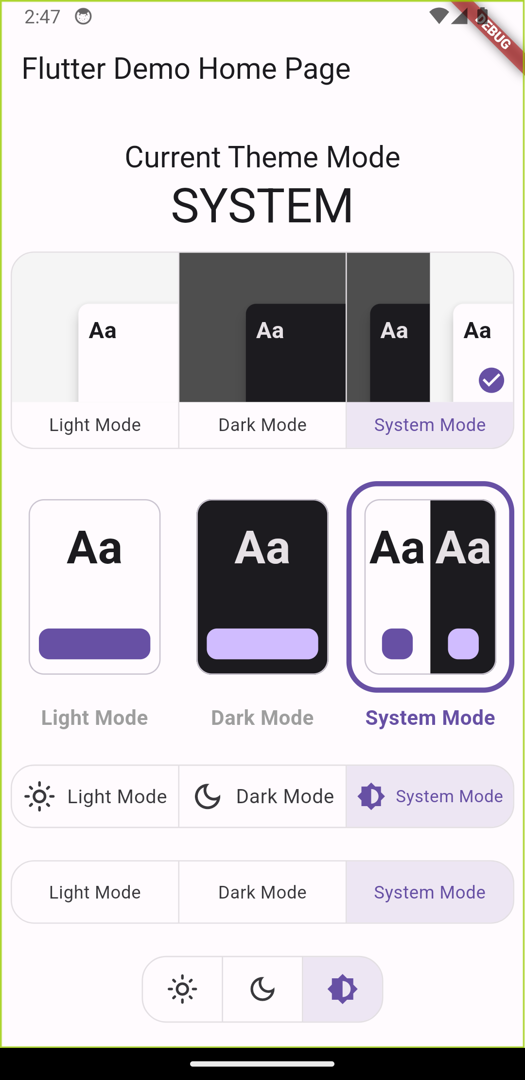
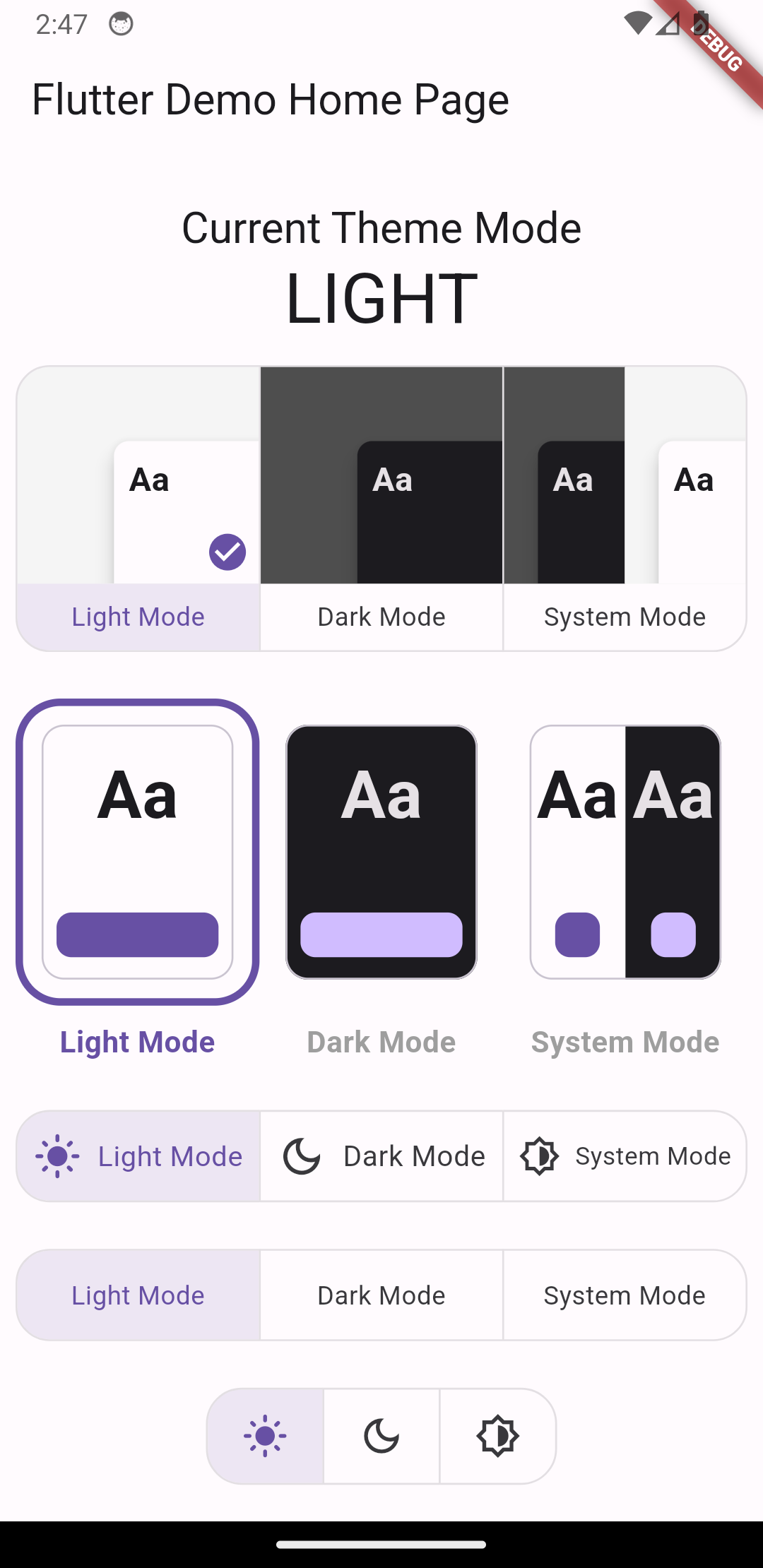
A full-featured widget to play with for changing theme mode, this widget will save your time, since it already includes the following widgets out of the box.
| Light | Dark |
|---|---|
 |
 |
| System Light | System Dark |
|---|---|
 |
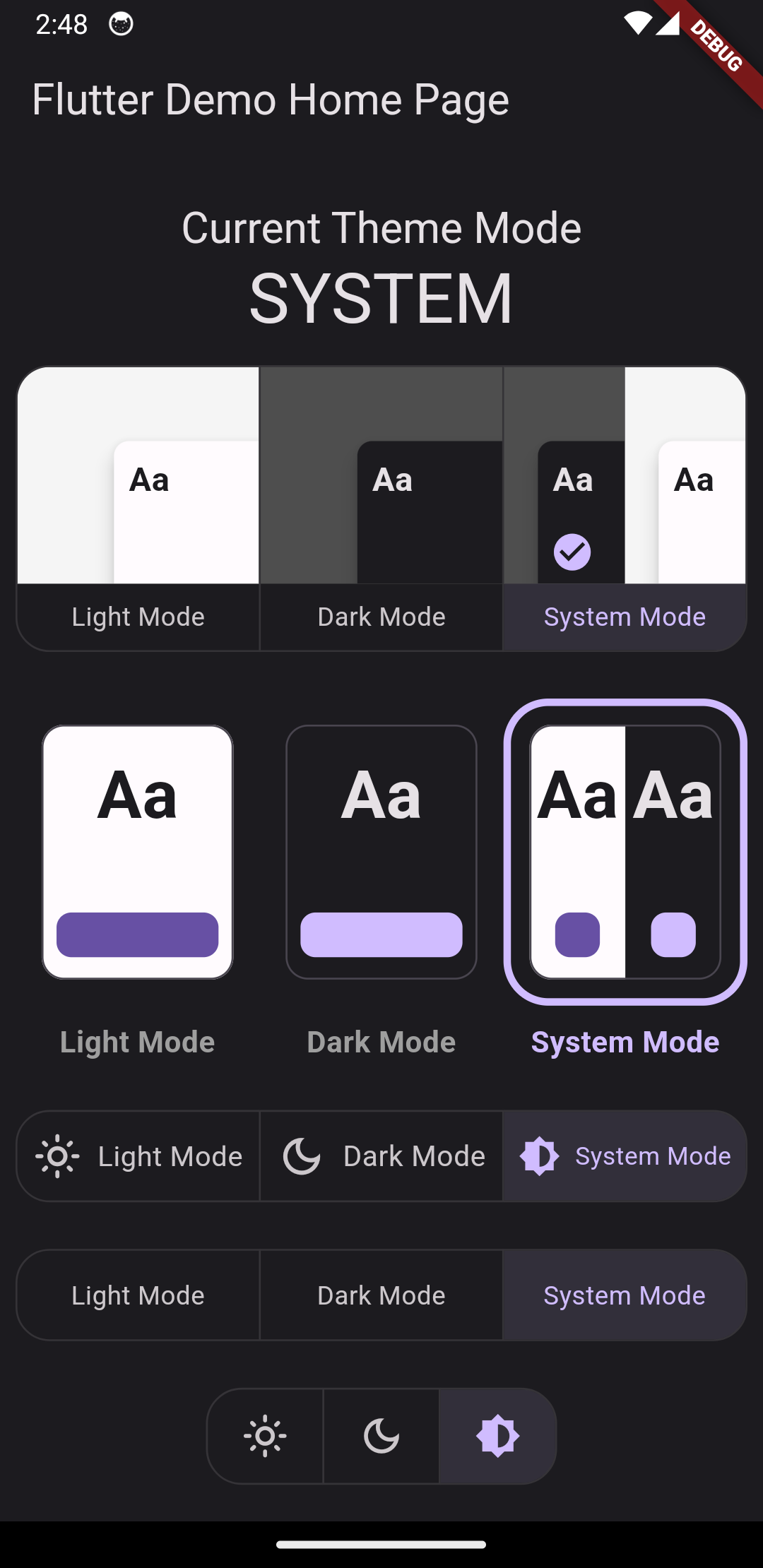 |
@override
Widget build(BuildContext context) {
  return Scaffold(
    appBar: AppBar(
      title: Text(widget.title),
    ),
    body: Column(
      children: [
        const SizedBox(height: 12),
        Text(
          'Current Theme Mode',
          style: Theme.of(context).textTheme.titleLarge,
        ),
        const SizedBox(height: 24),
        Padding(
          padding: const EdgeInsets.symmetric(horizontal: 8),
          child: Text(
            LetsTheme.of(context).mode.name.toUpperCase(),
            style: Theme.of(context).textTheme.displaySmall,
          ),
        ),
        const SizedBox(height: 24),
        const LetsThemeToggle(),
        const SizedBox(height: 24),
        const LetsThemeToggle.card(), // New since v0.0.2
        const SizedBox(height: 24),
        const LetsThemeToggle.compact(),
        const SizedBox(height: 24),
        const LetsThemeToggle.label(),
        const SizedBox(height: 24),
        const LetsThemeToggle.icon(),
      ],
    ),
  );
}
Yes, this is all that you need 👆 the LetsThemeToggle widget will manage everything for you!
As per example, there are multiple types of LetsThemeToggle such as LetsThemeToggle.compact so try them by yourself 😇
As for now, there are no too many things to customize, but you still be able to customize the labels and icons. I show you how:
const LetsThemeToggle() // before

// after
const LetsThemeToggle(
  labels: [
    'Day Mode',
    'Night Mode',
    'Auto Mode',
  ],
)| Before | Afters |
|---|---|
 |
|
Tip: icons are not available in LetsThemeToggle() also labels are not available LetsThemeToggle.icon()
One last customization, you can control the behavior of how the toggles dose the changes.
There is 2 types of changing. One is infinite and next is spesific, the first dose accepts clicks on any Toggle,
and everytime you click any one of the toggles, the selection moves to the next. The Second one instead,
moves straight away to the toggle you clicked on, changing the theme to what you have clicked on.
toggle_selection_mode_demo.mp4
const LetsThemeToggle(
  selectionMode: LetsThemeToggleSelectionMode.infinite,
)

// defaults
const LetsThemeToggle.compact(
  selectionMode: LetsThemeToggleSelectionMode.specific,
)Now that you have initialized your app as mentioned above. It's very easy and straightforward to change your theme modes: light to dark, dark to light or to system default.
// sets theme mode to dark
LetsTheme.of(context).setDark();

// sets theme mode to light
LetsTheme.of(context).setLight();

// sets theme mode to system default
LetsTheme.of(context).setSystem();

// sets theme mode to light if current theme is dark and vice-versa.
LetsTheme.of(context).changeThemeMode();LetsTheme allows you to toggle between light, dark and system theme the easiest way possible.
LetsTheme.of(context).toggleThemeMode();Everytime you call this method the ThemeData will change starting from Light to Dark
ending with System Defaults
If you want to change the theme entirely like changing all the colors to some other color swatch,
then you can use setTheme method.
LetsTheme.of(context).setTheme(
  light: ThemeData(
    useMaterial3: true,
    brightness: Brightness.light,
    colorSchemeSeed: Colors.blue,
  ),
  dark: ThemeData(
    useMaterial3: true,
    brightness: Brightness.dark,
    colorSchemeSeed: Colors.blue,
  ),
);LetsTheme is smart enough to keep your hardcoded default themes provided at the time of initialization.
You can fall back to those default themes in a straightforward way.
LetsTheme.of(context).reset();This will reset your ThemeData as well as ThemeMode to the initialMode values
provided at the time of initialization.
You can listen to the changes in the theme mode via a ValueNotifier. This can be useful when designing theme settings
screen or developing ui to show theme status.
LetsTheme.of(context).themeModeNotifier.addListener(() {
  // put your logic.
});
Or you can use it to react on UI with
ValueListenableBuilder(
  valueListenable: LetsTheme.of(context).themeModeNotifier,
  builder: (_, mode, child) {
    // update your UI
    return Container();
  },
);