Author: Emma L. Strand
Last Updated: 20190525
See finished products here.
Welcome to my tidbits on designing and creating effective infographics. This is an evolving document and additions will be made over time. Please feel free to reach out to me (emma_strand@uri.edu) if you have any questions or suggestions! Or if you're interested in working together on a design or an infographic for your publications, research projects, dissertation, lab topics, etc.
With all design and image ideas, please be sure you are following the correct copyright guidelines.
The disconnect between the general public and the scientific community is essentially an advertising issue. You can't get someone to actively makes changes and be involved in/support a movement if they don't care about it. And you can't get someone to care about something if they don't know about it.
This is all advertising. Ditch your scientific tendencies to write everything you know onto the page. Less is more and how you present the information makes a difference for an effective infographic that gets someone's attention. Think about when you're at a conference during a poster session. You have some posters that you will go see no matter what they look like because of the topic, but the rest you'll wander the session scanning the titles and top half of the poster. The posters you approach outside of your specific field are likely to be the ones that look the best and aren't overwhelmed with text. You can't wow them with your insane scientific knowledge if you can't get their attention to begin with. Design draws the attention, and content keeps it.
One of the most effective scientific marketing strategies I've seen is The Ocean Agency. Their design is clean, simple, and repetitive with themes. Why was Chasing Coral so successful compared to other similar documentaries? Visuals and presentation is everything.
Each infographic will be created for a different audience and this is what will be the biggest driver of your content rather than design. For any science field, this means leaving out jargon and explaining your topic in a way that allows people to relate to what you are depicting. The trick with effective science communication is to figure out what your audience's base knowledge is, and then to build off of that rather than starting with your own base knowledge or what you think you would have known before you got into this field.
Infographics can be difficult to tell who your audience will be since the general public could include science literate and non-scientists. However, no one will ever complain about you being too clear. The goal is to grab attention, and those that want more information and stimulating conversation about the topic will be inclined to get involved by reaching out or, in the case of a lab infographic, look up that lab's webpage.
Most of the time this will be a judgement call based on whatever purpose your infographic serves.
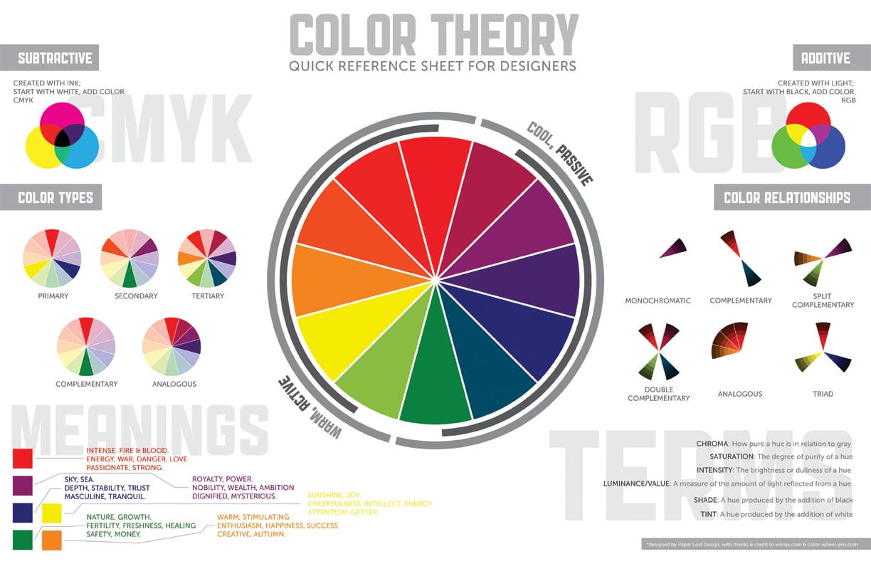
Different colors convey different meanings, emotions, feelings. Choose Only a few and either contrasting colors (opposite on the color wheel, for example: red and green) or analogous colors (next to each other, for example: three different shades of green). Color matters and can often make or break your infographic aesthetic. Check the following link about the color wheel and calculating colors: https://www.canva.com/colors/color-wheel/.
Great examples of choosing color:
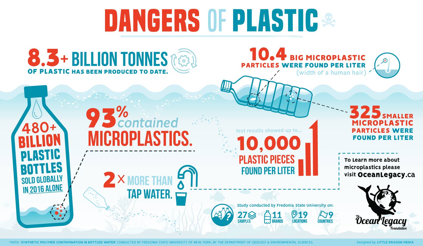
This infographic uses red and blue as contrasting colors so that the numbers in red pop out of the ocean background. The goal here is for the viewer to be surprised by the statistics that are in red. The artist does this by choosing several font sizes and the color red. Red is commonly associated with danger (conveniently used in this graphic too), intense emotion, passionate, anger. The artists want you to be upset about the statistics that describe the dangers of plastic in the ocean. See the below graphics about Color Theory and Emotion.
Below is the infographic I made for my advisor's lab. I chose a dark blue and contrasting pink color to separate information about the lab in blue and coral graphics in pink. Naturally our brains look to sort information into categories or groups, and color can be a great way to do this. As an artist, you can guide your viewer through your infographic subconsciously and this will also aid in the graphic's aesthetic. Separating text into different colors helps the reader feel less overwhelmed by the amount of information on the graphic. Matching all the coral graphics in the same color creates a motion through the infographic that I will expand on later in this document.

More on Color Theory:
https://99designs.com/blog/tips/the-7-step-guide-to-understanding-color-theory/
https://designstudio.com/color-theory-basics/
How to Design for Color Blindness:
The best advice I've seen to account for color blindness is to keep it simple. Use the same concepts from the color theory section above to choose few, contrasting colors and several shades and intensity levels of color.
Be careful with the following color combinations:
- Green and Red
- Green or Red and Brown
- Blue and Purple
- Green and Blue
- Light Green and Yellow
- Blue and Grey
- Green and Grey
- Green and Black
See the following link for examples on how adjusting contrast and hues can make a huge difference:
https://design.tutsplus.com/articles/design-and-illustration-for-the-color-blind--cms-30201
More helpful links on this:
https://usabilla.com/blog/how-to-design-for-color-blindness/
https://www.youtube.com/watch?v=suAgMCcjZ8I
Test your graphic on this color blindness simulator:
http://www.color-blindness.com/coblis-color-blindness-simulator/
If you look closely, most visuals in an infographic are actually simple shapes put together to create an image. The trick is to use different shades of the same color to give a three dimensional look.

Each infographic needs to have a central focus. In the Putnam Lab graphic shown in a previous section, the focus is directly on the adult coral in center of the graphic and on the words "Putnam Lab". Your theme should be your 2 or 3 most important ideas in the graphic. What at the very, very least do you want your viewer to walk away remembering? The rest of the infographic should be focused around these 2-3 ideas, but leaving those ideas as the centerpieces.
The concept of spacing and flow goes hand in hand with color combinations. Your job as the artist is the guide the viewer's eyes through the content you want them to see and through the reaction you want them to have.
For example, in the Putnam Lab infographic shown in a previous section, your eye immediately goes to the focal points: "Putnam Lab" and the adult coral in the center of the image. Your eye then either goes through the cycle of spawning and reproduction, settlement and calcification, then transgenerational plasticity OR holobiont integration, coral polyp, then epigenetics. Each piece of those pathways are connected so that the viewer's eye continues to move smoothly across the image until the viewer has read the entire graphic. If the five ideas in lighter blue text weren't connected, the graphic would be a lot harder to look at and not as aesthetically pleasing. In my opinion, choosing color and creating a flow are the most important concepts in infographic design.
Go easy on the eyes and ditch all the text.
Below are examples of good levels of content. Color can be your best friend here too. If you have too much text but don't want to cut out information, you can try grouping by color or adding boxes around the text.


There are many resources for finding design ideas. I get most of my inspiration and brainstorming from photos in the field and google searches. For example if I wanted to create an image of a bicycle, just looking at a photo would be difficult to copy. But, if I did a google search of "bicycle cartoon" or "bicycle illustration", I could find simplified images (likely made from simple shapes) that would be more helpful in creating a design.
Figure Design: BioRender
https://www.youtube.com/channel/UCL-iaNP1DKUb8QXReKrwUzA
Vector and Icon Stock Images:
https://streamlineicons.com/ux/
https://www.vectorstock.com/
Adobe Illustrator is a great tool for making graphics, and is the tool I use the most. I would suggest exploring the following links to do tutorials and learn basic functions in Illustrator. Youtube will be your best friend when trying to learn specific tasks.
https://helpx.adobe.com/illustrator/tutorials.html
https://helpx.adobe.com/illustrator/how-to/illustration-techniques.html
https://trydesignlab.com/tutorials/illustrator/
https://design.tutsplus.com/articles/10-essential-tips-tools-all-adobe-illustrator-beginners-should-learn--cms-23163

There are many other programs that might be more effective for your purpose. See the below links for suggestions.
Piktochart:
https://piktochart.com/blog/how-to-create-an-infographic-and-other-visual-projects-in-5-minutes/
Canva:
https://www.canva.com/create/infographics/
18 Tools to Making Infographics:
https://www.creativebloq.com/infographic/tools-2131971
Be Funky:
https://www.befunky.com/