Dark theme update #2426
Dark theme update #2426
Conversation
@ryestew I thought we need to switch .text-dark and .text-light colors in dark theme. But if you want I can revert this change |
There was a problem hiding this comment.
OK I think I understand the confustion...
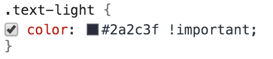
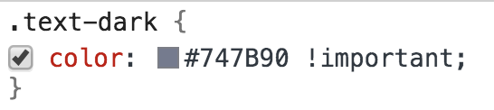
previously in the dark theme the colors of text-dark and text-light were wrong - they were:
and currently you have them as
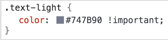
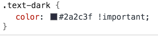
The new text-light is correct.
But the new text-dark should be a lighter color of gray than the new text-light.
This is because on a light theme text-dark was chosen to be contrasty to the background and text-light less contrasty to the background. But on a dark theme the background is reversed. So on a dark theme - text-light should be a dark gray and text-dark should be a lighter gray.
| @@ -196,7 +196,7 @@ class PluginManagerComponent extends ViewPlugin { | |||
| <div id='pluginManager'> | |||
| <header class="form-group ${css.pluginSearch} plugins-header py-3 px-4 border-bottom"> | |||
| <input onkeyup="${e => this.filterPlugins(e)}" class="${css.pluginSearchInput} form-control" placeholder="Search"> | |||
| <button onclick="${_ => this.openLocalPlugin()}" class="${css.pluginSearchButton} btn bg-transparent text-dark border-0 mt-2 text-underline"> | |||
| <button onclick="${_ => this.openLocalPlugin()}" class="${css.pluginSearchButton} btn bg-transparent text-dark border-0 mt-2 text-underline plugins-connect-btn"> | |||
There was a problem hiding this comment.
I don't think you need to add this class - but to use the color of plugins-connect-btn as the color of text-dark.
|
text-dark - is still too dark - please use #babbcc |
ok, but "Connect to a Local Plugin" button has #A2A3BD color |
|
@ryestew Updated text-dark color |
|
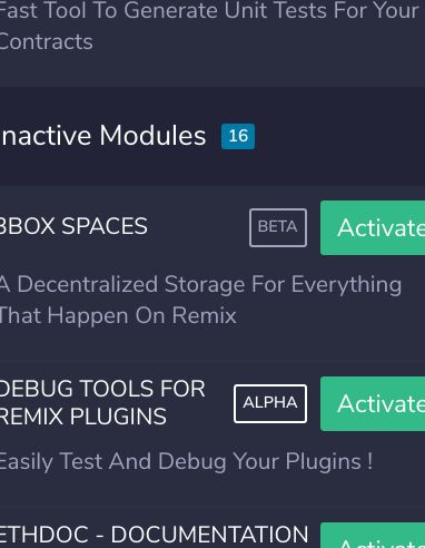
Actually there is an issue the alpha and the beta tags are different colors - alpha is missing a class that is in beta. |
|
|
|
@ryestew I'll check it |
No description provided.